Every month on our¯¿½ photography forum members nominate images that they like. Then at the end of the month I choose an excellent image and talk about why it rocks. The photo I choose is not necessarily the best one of the month. I¯¿½ve come to realize it¯¿½s not really logical to pit images from totally different genres against each other. That¯¿½s why there are categories in photo contests. I just choose a photo that has extremely strong elements that we can learn from.
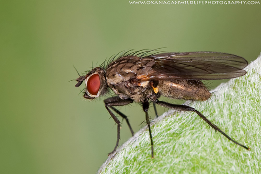
I chose this image for several reasons:
The eye is tack tack sharp and that’s hard to do on a subject this small, because focusing (and dof) is a challenging task at this size and distance to subject. Sharpness is lovely in many places; leg hairs, thorax, abdomen. Blurred background shows no distractions.
The subject has a definite impact on the viewer. It’s likely very creepy for many viewers, probably because of sharpness. My eye is focused on one thing, that fly.
Good composition all around which can be challenging at this size as well.
Nice highlight control on whatever the fly is resting on and the overall exposure is well handled with supplementary lighting.
For all these reasons, this is my choice for image of the month. Since we all have opinions, some members may disagree with my choice. That’s cool but THIS thread is not the place for debate over my pick, NOR is it the place to further critique the image. The purpose here is to suggest strong elements in the photo that we may learn from.
Congrats again OWLP for creating this striking image!
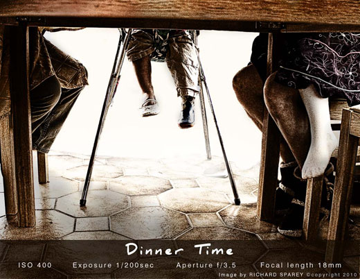
I¯¿½d also like to include these 2 images as honourable mentions as they also came so so close to being picked.
Colorless Beauty by Kat
![]()
Dinner time by Richard
![]()
Power At Sunrise by Mad Aussie


These are all wonderful pictures, and I think that you did a great job picking them.
I find the image of the fly interesting because of the sharpness and intensity of the color. First off, we aren’t used to seeing a fly that size, and the color further abstracts it from the realms of the normal. It ends up looking like some bizarre creature from a science-fiction novel. It’s striking.
Also–I love the dynamic composition in ‘Colorless Beauty’. That one fuzz coming off of the head helps to give the image an engaging active element. It wouldn’t be as strong without.
These are truely magnificent shots. My falicitations.
These are beautiful photos even the fly. Congrats to the winners.