Every month on our photography forum members nominate images that they like. Then at the end of the month I choose an excellent image and talk about why it rocks. The photo I choose is not necessarily the best one of the month. I’ve come to realize it’s not really logical to pit images from totally different genres against each other. That’s why there are categories in photo contests. I just choose a photo that has extremely strong elements that we can learn from.

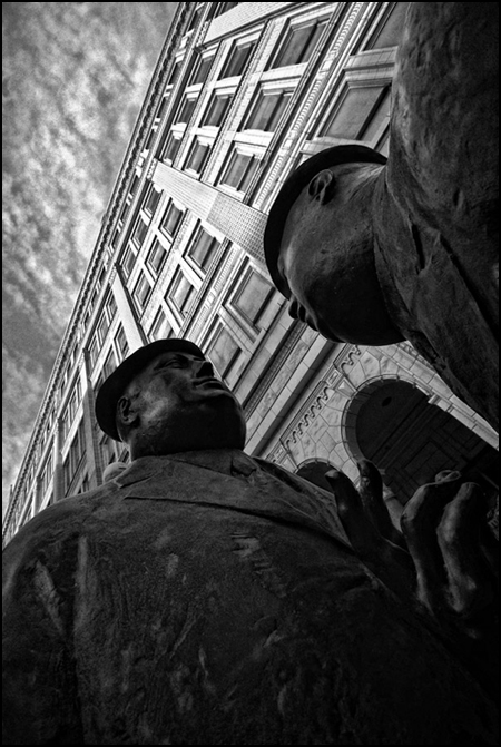
This month’s choice The Conversation is by casil403.
I chose this image for several reasons.
First and foremost, I was drawn in by the unusual angle and point of view of this shot. This angle works very well for me! I love how just above the left statue’s head the office windows are nicely lit. This gives me the feeling of a well-told story, better than the similar story told by the straight on shot seen many, many times. The story is office politics/or work talk etc.
I very much like the lines of the building’s roof and the lines created by the windows. I’m loving this interesting composition. The way that ‘roof-line’ cuts out of the scene to create an isosceles-like triangle at top left (hey I dug geometry) is fan-friggen-tastic. It adds interest to this scene and makes it dynamic.
The sky is beautifully controlled here. It adds flavour to the shot without overwhelming it in any way.
The black and white is very well controlled here and works for me with this subject matter. If I had one teeny nit, I might bring up the highlights in the statues’ faces and hand.
Thousands of people pass these statues every day and scores of tourists are likely snapping away daily… and none of them are likely to lie down on the ground or get on their knees to get this superb angle.
For all these reasons, this is my choice for image of the month.
Since we all have opinions, some members may disagree with my choice. That’s cool but THIS thread is not the place for debate over my pick, NOR is it the place to further critique the image. The purpose here is to suggest strong elements in the photo that we may learn from.
Congrats again casil403 for creating this beautiful image!


This is a very unique angle in a well done shot.