I’ve been wanting a new logo for my own personal photography for quite some time now. There’s just something about ‘signing your work’ that I feel is important. For me, a signature provides a sense of closure. There are so many ways to tweak/modify/enhance a photograph that sometimes you’re not sure if your version is the finished version. A signature allows you to say, OK enough now, I’m done with this image, let’s move on.
I’d like to thank Sylvain Grand’Maison BIG TIME for the great work that he did for me. For those of you that don’t know Sylvain, he has one of the most popular French Podcasts (even though he’s perfectly bilingual) in Quebec called le Quebec en Baladodiffusion. He also helps businesses and individuals get started in the social media space and works as a consultant in this regard. So why did I ask him to create my logos?‚ That’s because his background is in graphic design and he still takes on the occasional graphic design gig.

So now I need YOUR help. I really dig both of these logos and I think I know which one I like best but I’d like some opinions. Which one of these above logos do you like better, the left one or the right one?
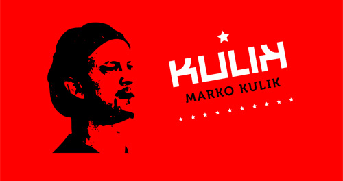
In choosing these logos Sylvain presented me with a bunch of different choices on totally different themes. Here is another design Sylvain created. I love this one as well — it has a serious Russian feel. I’m not sure what I’ll use this red design for, but I do know what my next Facebook avatar will look like.


I prefer the image on the right. It just seems more powerful and the letter “K” stands out more while still allowing the effect of the iris to be easily identifiable.
The “red” poster is quite interesting. Your image reminds me of “Che”.
Celui de droite. Plus fort, plus simple, plus efficace.
Merci bien Louis!
Personnellement je prÆ’‚©fÆ’‚¨re celui de droite(noir).
Je trouve que Æ’‚§a fait plus chique, plus classe.