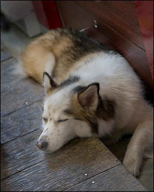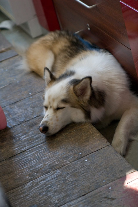
Below is the original image (with distractions) — added as a result of the comments ![]()

The top image tries to follow the ‘rules’ from photo podcast #46 where we talked about distracting elements in photographs. This is a shot of a dog sleeping in a local convenience store. I spent about 15 minutes ‘cleaning up’ this photo. By cleaning up I’m specifically talking about removing distracting elements. In this case the distracting elements were brightness problems. I wanted the focus of the shot to be on the dog’s face and snout so I burned in (darkened) almost everything that was brighter than the face and snout. By doing this I’m actively guiding the viewer’s eye to where I want it to go.
Did I do a good job? Comments? Questions?


I like this photos so much! Thank you for sharing
The original photo has been added as a result of the comments. many thanks! You should know that the original raw file looks much better than the compressed jpeg…
I thought that the nails added something into the shot but I can see how people may feel they are distracting. Thanks again! Marko
Nice shot! It would be nice to see the before and after to get a feel for how the image has been improved.
I am still somewhat distracted by the nail heads in the floor. I suggest that you also clone those out with the neighboring wood.
I like the picture! Could you post a “before” image?
Did you think about the floor nails (screws?) that are near the bottom of the frame? I find the light reflected off them distracting as well.