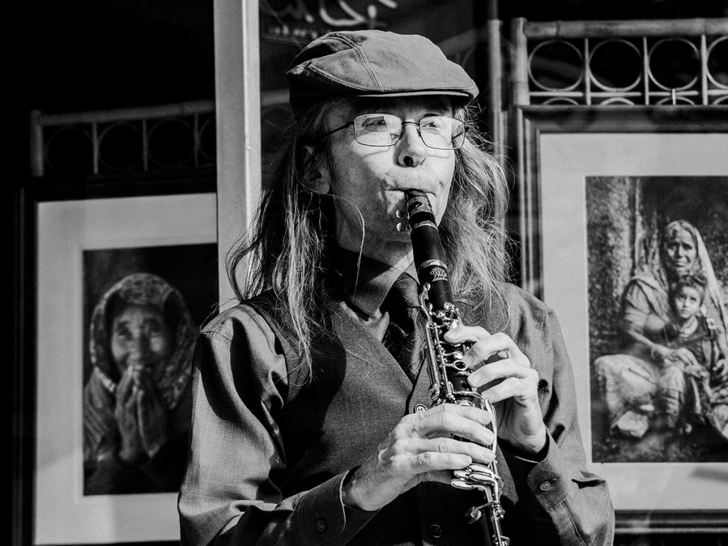
Sorry, I'm tipping my hat to myself a bit as I feel good for guessing correctly on what Marko was going to suggest. I loved how that woman seemed to echo the position of the musician since her hands were up much like his.
This is a discussion on Some street shots from the last few months within the Street - Urban Photography forums, part of the Show your photo (Color) - Landscape & Nature (flowers, mountains, storms etc.) category; Sorry, I'm tipping my hat to myself a bit as I feel good for guessing correctly on what Marko was ...
Sorry, I'm tipping my hat to myself a bit as I feel good for guessing correctly on what Marko was going to suggest. I loved how that woman seemed to echo the position of the musician since her hands were up much like his.
I anticipated your reply correctly. to be honest I was so focused on the musician while taking the shot i didn't notice the background until i got it on my computer and my thoughts were the same as yours. I wished i have framed it a little differently. so... going through my shots of that day i came across the one I'm posting now. Don't know why I passed it by on my first round of culling. That's the way i work sometimes.. just not the best at organizing. Anyway I like this one except that I wish I would have backed up just a bit. I do like that the portraits on both sides seem to be looking at him. I do seem to vaguely remember thinking that when i took this one. The first post is without cropping so I had nothing I could put back into the image. This one I'm posting now has only a slight crop for straightening. Another note is that he is the artist of the portraits seen in the background. He is standing in front of his studio. He travels to Vite Nam and India from time to time to do photography and he owns a local herb store. I have a color shot of him from a different angle that I printed a 12 X 18 for him that he was really pleased with. ... so what are you thoughts on this one?

I think this shot wins over its predecessor. That second portrait at right adds to the image....and the fact they they are HIS images...this one wins.
If it were mine....I really like cropping 1 inch into the matting on the left photo, (versus the current hard and dark edge) and i might take off the same amount from the top if i wanted to respect the original proportions.
Hope that helps - BOTH are wonderful images. Well done.
- Please connect with me further
Photo tours of Montreal - Private photography courses
- Join the new Photography.ca Facebook page
- Follow me on Twitter http://twitter.com/markokulik
- Follow me on Google+ https://plus.google.com/u/0/111159185852360398018/posts
- Check out the photography podcast
"You have to milk the cow quite a lot, and get plenty of milk to get a little cheese." Henri Cartier-Bresson from The Decisive Moment.

Bookmarks