Hey All,
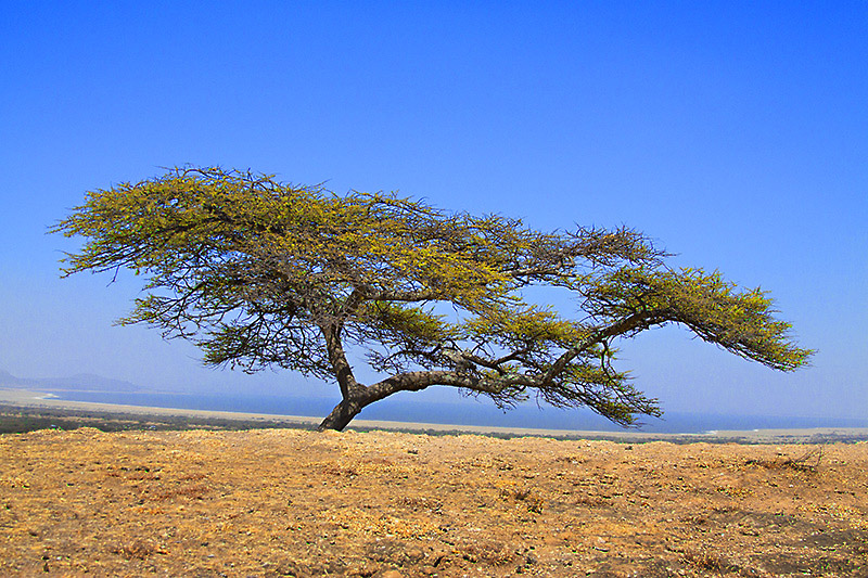
I took this some time ago. The light was really harsh and I thought it didn't work. Now, after some tweaks it seems acceptable. What do you think?

This is a discussion on Acacia Tree within the Show your photo (Color) - Landscape & Nature (flowers, mountains, storms etc.) forums, part of the Photography & Fine art photography category; Hey All, I took this some time ago. The light was really harsh and I thought it didn't work. Now, ...
Hey All,
I took this some time ago. The light was really harsh and I thought it didn't work. Now, after some tweaks it seems acceptable. What do you think?

"Because the people crazy enough to think they can change the world, are the ones who do." Steve Jobs
Great shot, colors are awesome.
Edit - I posted a critique but I was viewing it on my iphone, so it was way off
Last edited by theantiquetiger; 06-19-2013 at 05:36 AM.
"The worst thing about taking a great image is that your next one has to be better!"
I do see some artifacting in the ground and tree foliage and I'm guessing this may have been underexposed. That said, overall
I think you've made some nice tweaks here and the colours seem acceptable for light this harsh.
- Please connect with me further
Photo tours of Montreal - Private photography courses
- Join the new Photography.ca Facebook page
- Follow me on Twitter http://twitter.com/markokulik
- Follow me on Google+ https://plus.google.com/u/0/111159185852360398018/posts
- Check out the photography podcast
"You have to milk the cow quite a lot, and get plenty of milk to get a little cheese." Henri Cartier-Bresson from The Decisive Moment.
Thanks Marko. Yeah, it was not that easy to start with.
"Because the people crazy enough to think they can change the world, are the ones who do." Steve Jobs
It looks like the forum compressed this image, because I see some blocking. Aside from the forum messing it up it looks good.
My only nit is the horizon does not appear level. Other than that lovely picture.
That was actually what I said in my first post before editing the post. I was viewing it on my iPhone and it looked like it needed leveling because the curved bay in the background messes with it. I thought I looked good when I viewed it on my computer. I could make out the differences between the foreground and background.
"The worst thing about taking a great image is that your next one has to be better!"

Bookmarks