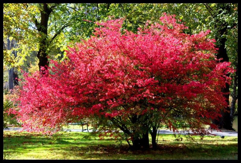
Some more autumn leaves...

This is a discussion on Autumn Leaves within the Show your photo (Color) - Landscape & Nature (flowers, mountains, storms etc.) forums, part of the Photography & Fine art photography category; Some more autumn leaves......
Some more autumn leaves...

Last edited by Iguanasan; 10-25-2010 at 08:12 AM.
hey did anyone else feel the speed bump?
nice photos Iggy. I really like the second one with the brown leaves. The first one is nice but the out of focus leaves in the front are distracting to me. The third is a beautiful bush!
Feel free to make comments on any of my shots
my blog: http://bambesblog.blogspot.com/
My flickr photostream: http://www.flickr.com/photos/bambe1964/
A painter takes their vision and makes it a reality. A photographer takes reality and makes it their vision.
what Bambi said. too bad about the foreground blur in shot 1. The background looks awesome.
- Please connect with me further
Photo tours of Montreal - Private photography courses
- Join the new Photography.ca Facebook page
- Follow me on Twitter http://twitter.com/markokulik
- Follow me on Google+ https://plus.google.com/u/0/111159185852360398018/posts
- Check out the photography podcast
"You have to milk the cow quite a lot, and get plenty of milk to get a little cheese." Henri Cartier-Bresson from The Decisive Moment.
Love love love the colors!
2nd one for me please...and I agree about the thoughts on the first shot.
"Life is like photography, we develop from the negatives"-anonymous
My website: www.albertaandbeyond.com
Thanks all, the blurry foreground wasn't an accident. I tried it that way on purpose as I thought it added to the shot... live and learn. Thank for the feedback. I've seen shots with blurry foregrounds before and most of the time I don't like them but every once in a while I find it cool. I have to figure out that balance.
I didn't think it was an accident and i agree. If we only did things when we knew they'd be perfect it would be awful! And besides, just because it didn't work for me doesn't mean you should chuck it
for me - on second look- it might work better if it didn't take up so much of the photo. rather then leading the eye in, it seems to block it.
Feel free to make comments on any of my shots
my blog: http://bambesblog.blogspot.com/
My flickr photostream: http://www.flickr.com/photos/bambe1964/
A painter takes their vision and makes it a reality. A photographer takes reality and makes it their vision.
Thanks. I won't chuck it... I still love the colour and the light. I'll just try something different next time.
Nice set Iggy, I would add that the first shot blurring would work well if It was for a magazine and you were laying out copy (text) on to the foreground. The colours throughout are lovely.

Bookmarks