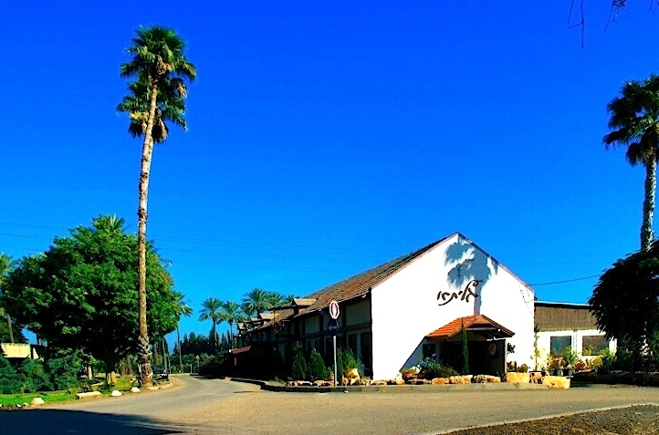
How would you have fixed this image better? i can't seem to find how to lower the red on the image.
Full image (6.5M) on my picasa:
Picasa Web Albums - Adi
Thank you.
This is a discussion on Chocolade factory within the Post -processing forums, part of the Photo assignments category; How would you have fixed this image better? i can't seem to find how to lower the red on the ...
How would you have fixed this image better? i can't seem to find how to lower the red on the image.
Full image (6.5M) on my picasa:
Picasa Web Albums - Adi
Thank you.
Feel free to visit my blog @ http://adispi.wordpress.com
okay here are my 2:
1. I would make it level-it's tilted
2. I would get rid of the tree in the right, it's just a dark blob and doesn't add
3. I can't help you with the red but others can.
hmmmm, is that 3 cents???
Feel free to make comments on any of my shots
my blog: http://bambesblog.blogspot.com/
My flickr photostream: http://www.flickr.com/photos/bambe1964/
A painter takes their vision and makes it a reality. A photographer takes reality and makes it their vision.
Hmmm... I think a re-shoot would be more beneficial (if possible). The perspective of this image doesn't work for me; I would consider a 2-3 image pano with the camera leveled and sqared rather than such a short focal-length. I would also consider a different time of day, preferably earlier in the day when the shadows aren't quite so extreme. With respect to your question of the red, it depends on your software, but essentially it should just be a matter of selecting the red channel and adjusting the level to suit (if you tell us what application you're using, someone can walk you through the steps).
To adjust a single colour in CS4:
Image > Adjustments > Colour Adjustments and move the sliders
Image > Adjustments > Curves, select the Red channel and move the control points
Feel free to make comments on any of my shots
my blog: http://bambesblog.blogspot.com/
My flickr photostream: http://www.flickr.com/photos/bambe1964/
A painter takes their vision and makes it a reality. A photographer takes reality and makes it their vision.
I hope you don't mind, but I have altered your image slightly to show how it appears to be "tipping". The two lines with arrow heads should be the same distance from the vertical benchmark and the edge of the building, the bottom appears shorter and this gives us the impression of the building tipping. Various other visual clues confuse our eyes as well, such as the curved trees. It also appears you were on a lower grade by some 3 to 4 feet shooting up, causing the main roof peak "line" to sink into the background left . Also the windows in back extension of the building do appear square, but tipped up. Hope this helps (these are not observations as a photographer, but rather a tradesman who is involved in the building/renovation of commercial buildings.
Cheers,
Edouard
Hi,
I took some liberties, but here's what I came up with.
..... john


Bookmarks