Does it work for you or not?

This is a discussion on Portrait of a Bride within the People photography (portraits, sports etc.) forums, part of the Show your photo (Color) - Landscape & Nature (flowers, mountains, storms etc.) category; Does it work for you or not?...
Does it work for you or not?

First off - welcome to the forum.
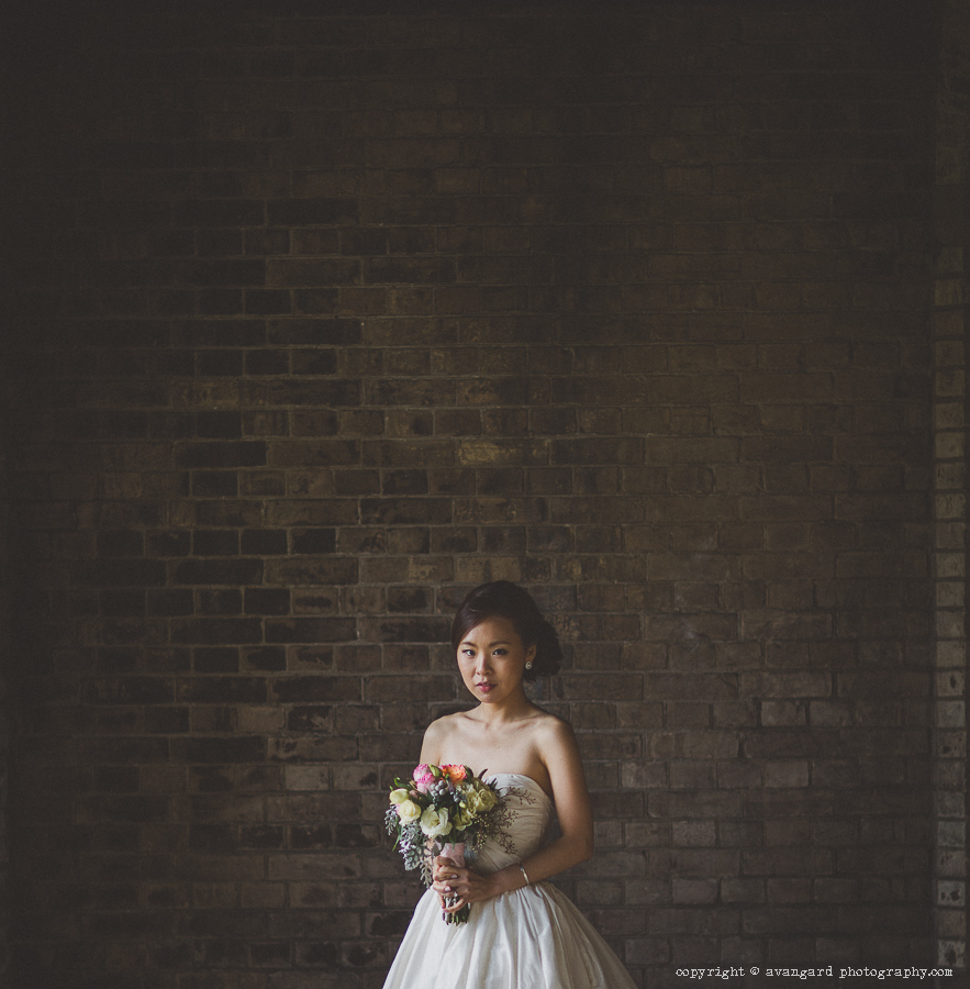
Your image, It does not work for me even though the lighting on the bride is good.
The bride's parents paid 3 grand for that dress and people want to see it.
You cropped the dress and instead included a huge expanse of blank wall.
Nobody cares about the wall.
Hope that may help.
- Please connect with me further
Photo tours of Montreal - Private photography courses
- Join the new Photography.ca Facebook page
- Follow me on Twitter http://twitter.com/markokulik
- Follow me on Google+ https://plus.google.com/u/0/111159185852360398018/posts
- Check out the photography podcast
"You have to milk the cow quite a lot, and get plenty of milk to get a little cheese." Henri Cartier-Bresson from The Decisive Moment.
First, welcome!!!
I agree with Marko, besides the bride, the most important thing in the wedding is the dress (probably more than the groom).
There is WAY too much background and her position in the frame is not working. If you would just crop out the ridge of bricks on the right side of the frame, it would be a lot better, more uniformity.
Another thing I see is her expression. She looks uncomfortable. This is supposed to be her happiest day of her life, make sure you capture it.
"The worst thing about taking a great image is that your next one has to be better!"
Your bride doesn't know anything about how to hold a bouquet--what normal people do, right ? But I think you should have got her to drop it down a bit so you can at least see the shape of the top portion of her dress. I forget to do this far too often.
The negative space is a little weird, but I think weirdness is allowed. Not every shot has to show the entire dress--I'm sure you have others that do. The trendy (and I use this as an epithet) processing that doesn't make much sense for print seems counter productive here, because if you're showing off the texture of the wall, flattening the shadows seems to work against that a little.
See Christopher Steven B. Photography for recent wedding and engagement photos.
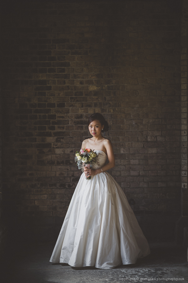
Here is the photo as it was taken. I was just experimenting with the square cropping. Thanks for your all comments.

Great original, but like i said in my post above, I would crop in just a tad to get rid of the line of bricks on the right. It attracts my eye to it, stealing from the bride.
"The worst thing about taking a great image is that your next one has to be better!"
I like this original as it was taken except it's still just a little too much on the top. I'd take it little off but not a lot. The lighter line of bricks on the right is so subtle that it's not really a distraction to me. A great job on processing too.
I actually quite like it and like the unconventional composition. In fact I would even suggest going a little more extreme with a 4 x 6 vertical crop with her located just off centre to the right (let me know if you would like me to show you what I mean)
Please bear in mind I am no wedding photographer, and perhaps from a traditional wedding perspective I get what the others are saying, but if you have plenty of the dress and several other more traditional shots then why not push the boundaries like this for those extra shots.
I like the processing too.
I too like the lst crop myself. Sure the masses want to see the dress, but your the photographer and how you see is more important than the masses. The hands are strong and we want soft hands when it comes to posing a pretty girl. On the other hand ;-) strong hands in a portrait can make that image.

Bookmarks