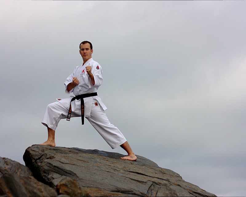
I spent some time on the weekend with a friend from my karate club. We were shooting some shots to use to create a poster for our karate club and this is what we came up with...

This is a discussion on The Karate Kid within the People photography (portraits, sports etc.) forums, part of the Show your photo (Color) - Landscape & Nature (flowers, mountains, storms etc.) category; I spent some time on the weekend with a friend from my karate club. We were shooting some shots to ...
I spent some time on the weekend with a friend from my karate club. We were shooting some shots to use to create a poster for our karate club and this is what we came up with...

Well I think 3 is the best of this set it has a good composition. Number 1 could be great, but to me the face is a little blurry and it needs a bit of fill in flash. And number 2 is a nice crisp silhouette. I think if you can get number one perfect, you'll have the perfect poster right there!
I concur with Realist exactly!
Feel free to make comments on any of my shots
my blog: http://bambesblog.blogspot.com/
My flickr photostream: http://www.flickr.com/photos/bambe1964/
A painter takes their vision and makes it a reality. A photographer takes reality and makes it their vision.
I like this set. Technically, I favour shot 3 here.
But if the goal is to promote Karate in Halifax, maybe the concept in shot 1 is best.
If that is the case then it occurs to me if reshooting is easy, that it might be cool if the model's leg was level with the green roof and close enough that there is no space between the roof and the leg.
That way it might look like he's karate kicking the roof in. Just a thought.
- Please connect with me further
Photo tours of Montreal - Private photography courses
- Join the new Photography.ca Facebook page
- Follow me on Twitter http://twitter.com/markokulik
- Follow me on Google+ https://plus.google.com/u/0/111159185852360398018/posts
- Check out the photography podcast
"You have to milk the cow quite a lot, and get plenty of milk to get a little cheese." Henri Cartier-Bresson from The Decisive Moment.
Thanks, Realist, Bambi, and Marko. Critique right on the mark. I think we'll probably drop the cityscape ones anyway because I suspect it'll make the poster too busy. I've handed over all my reasonable images from the day to a friend of a friend who's going to do the design for free. I'll try to remember to post the final result.
I like your idea Marko. Giving the town clock the boot would have been cool. I hadn't thought of that.
I think everyone pretty much covered my thoughts.I too prefer three technically but like the idea of them all!
My new blog as of Nov/10
http://katchickloski.wordpress.com/
Thanks, kat and Runmonty.
I favor shots 2 and 3. In 2 the silhouette is sharp and the kick perfectly matches the horizon (I don't know how difficult that was to achieve). Number 3, the stance, the slanting rocks, the focused expression on his face and the sharness is dead on. You have two different concepts accomplished beautifully.
#1 - I like the idea but I find in this composition the background a bit distracting.
#2 - Like this one, but I find the tree on the right a bit distracting.
#3 - The best. Simple but effective.

Bookmarks