
 LinkBack URL
 About LinkBacks
I have 2 suggestions....
Complementary colours:
Create a photo with the main colours being opposites from the colour wheel.
red and green
yellow and purple
orange and blue
etc......
Ton sur Ton
One colour: making a photo using variations of one colour without the use of PP.
Ton sur Ton
One colour: making a photo using variations of one colour without the use of PP.
I like this but not sure I fully understand.
- are you simply talking about capturing/creating images that look rather monochrome at the outset?
OR how strict is the ONE colour thing? I mean if you frame a green leaf shot so that 100% of the shot is the leaf, if the leaf has a hint of yellow or brown at the edges can it still be used?
If that is the case maybe the title could be changed to Predominantly 1 colour (No PP)
If I've misunderstood can you please clarify further - Thanks!
i think ton sur ton would be nice. if i understand it correctly, if i took a photo of a white cat against a white or black bg, the only color i would see would be the cat's blue or green eyes? it is like shooting something black and white in color.
The idea is to make a photo in one colour and its variations so different shades of white or green grey etc.
when Ed says.."it is like shooting something black and white in color.", he is bang on right!
Here's an example:
http://www.flickr.com/photos/fred_dela/2906888962/
Heres and example from me:
Ok then - thanks for the example +1
Ton sur Ton sounds interesting . Your example is beautiful!
Oh.I'm still confused but it peaks my interest!
Tor sur ton sounds like an interesting option, although I'm stumped for ideas at the moment.
Since nobody else is putting forth ideas and it's nov 30, - looks like Ton sur Ton will be this month's level 2 assignment.
Since some people are confused by what it is, can we still keep yr example in the thread casil?


 Reply With Quote
 - Please connect with me further
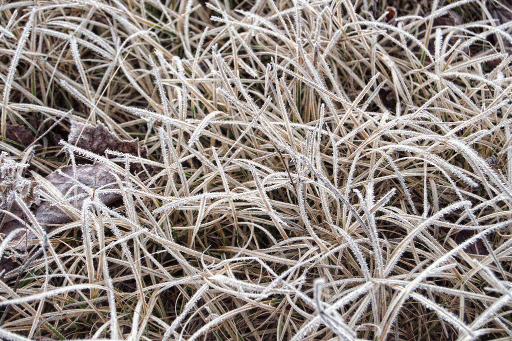


 C said that it like shooting in black in white but in colour. a B&W photo is just variations of gray (mostly) so this assignment is taking a shot that is just variations of one colour. the elements are indicated via shades and gradients only.
  I hope I got that right


Bookmarks