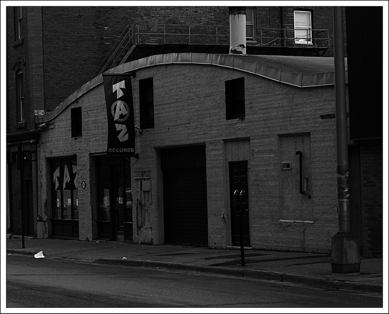
I'm not very good with the whole B&W thing but this image deserved it. Feel free to rip it apart...

This is a discussion on Taz Records within the Critiques forums, part of the Photography & Fine art photography category; I'm not very good with the whole B&W thing but this image deserved it. Feel free to rip it apart......
I'm not very good with the whole B&W thing but this image deserved it. Feel free to rip it apart...

well I won't rip it apart, but I will say that it lacks the wide tonal array that I prefer in monochromatic shots. for me part of the appeal in a B&W is to take advantage of the white whites and the black blacks and showcase those as well as the grays in between. Of course tastes may vary, but you might try playing with the color sliders to bring up or down the tonal element they bring. I do this in Lightroom, but whatever app you use will probably have something similar. I use it all the time to bring a monochrome shot to life.
as far as the subject goes, I like it although it is hard to see here. I would straighten the curb line and crop very slightly to isolate the building, but that's just me.
Exactly what WD said. First impression...way too dark and not enough going on.
- Please connect with me further
Photo tours of Montreal - Private photography courses
- Join the new Photography.ca Facebook page
- Follow me on Twitter http://twitter.com/markokulik
- Follow me on Google+ https://plus.google.com/u/0/111159185852360398018/posts
- Check out the photography podcast
"You have to milk the cow quite a lot, and get plenty of milk to get a little cheese." Henri Cartier-Bresson from The Decisive Moment.
Well, Marko already said it in the right words:
way too dark and not enough going on
I agree with what they have said above but the building does have a really nice texture so perhaps a reshoot along the lines of minimalism or architectural fragments would give you more oomph.
The whole lack of contrast thing can easily be fixed by messing with levels.
A few thing make me wonder though. It's a pretty neat and good picture of the building. Now, I could be missing something, but why this particular building? What was it you liked about it? I must say, I'm unfamiliar with "Taz records" so like I said, I may be missing something here.But I always wonder what the photographer is trying to tell me with the picture...
Listen, three eyes, don't you try to outweird me, I get stranger things than you free with my breakfast cereal.
So, this would be a bit better?? I may have had an advantage of starting from the RAW image.
As for why the shot originally appealed to me? I liked the way the smaller building was kinda wedged between the two taller ones surrounding it. It was also brighter than them as well. And last, this is 2010 and it's a record store. Now, it was early morning on my way to work and it was a grey and rainy day and very few were out and about around this building.
Thanks for the input, everyone.
wow, what a difference between interpretations. I like TheAnswertoTheQuestion's version for the texture it brings out in the bricks. I like Iguanasan's because it's so bold that it makes me look longer. Nice work dudes.
I like your re-editied version here Iggy. The contrasting in tones works and brings out the detial in the brick....nice work.
I see so much cool texture in this image that is just begging for some closer shots...lol...I would so be all over this like wrinkles on linen.
I really like the detail in the broken bit of building under the banner and beside the garage door especially. I think a close up of that including the banner and the door would make for a killer and gritty BW image.
If you can and do go back for a reshoot, as a small favour to me, could you take some shots of that area and post them? I am really interested in seeing how they would look.
If not, no worries.
"Life is like photography, we develop from the negatives"-anonymous
My website: www.albertaandbeyond.com
Definately much better! Very nice work!
As for compo, I do like the idea of a smaller building wedged between the two larger ones. It might be an idea to show just a little bit more of those two larger buildings. It's not that hard to miss the connection with the other buildings now because so little is shown of them. Just a thought...
Also, you know it 2010, but I don't know that. The picture might be shot 10 years ago. There's no reference...
You've got a really nice picture here. Don't get me wrong...
Listen, three eyes, don't you try to outweird me, I get stranger things than you free with my breakfast cereal.

Bookmarks