I just signed up, and like hearing feedback....heres a few newies


This is a discussion on Im new....so be nice....please comment! within the Critiques forums, part of the Photography & Fine art photography category; I just signed up, and like hearing feedback....heres a few newies...
I just signed up, and like hearing feedback....heres a few newies


Hi there photo_die,
I must say that these are all quite good. The styles are so different that it shows you are experimenting. Good for you. That's the best way to learn.
OK Marko's critique
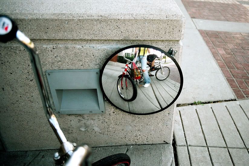
1 - the mirror - This is a fun shot. It's interesting and well exposed. My only suggestion would be to crop tighter on the right side, maybe until the sidewalk.
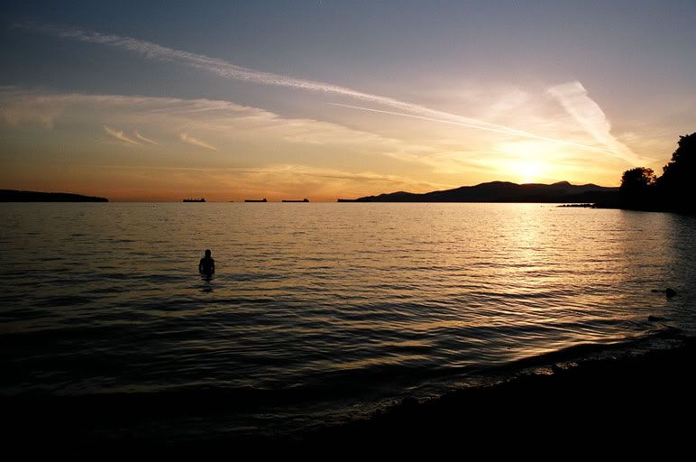
2 - This is a nice postcard style shot with very good compositional elements.
3 - Light on the beach - I like this one too but it has too much unused space in my opinion. I think it would have been better if you had shot it vertically from an angle. (The exact opposite angle of the next picture with the poster).
4 - the poster - You turned an otherwise boring shot into a good shot by changing your angle. I would have removed the red trash on the bottom left middle as it's a bit distracting.
In general these are very impressive shots for someone just starting out.
Good work and keep shooting!
Marko
I love the last two.
The only problem I have with the "fire twirler" is that it seems to be unlevel. I'd lower the left hand side of the photo, as it seems a bit tilted.
The last one is great, and you pov leads your eye from the painted figure deeper into the photo. Great job.
If someone shows you who they are, believe them. - Maya Angelou
I like number 2 the best. It is beautifull. I can see the camera strap of the photographjer in the mirror of photo 1.
wow number ne is beautiful, get final prints done for mounting forsure. the rest are pretty cool but more like experimental shots. a tripod woulda helped the fire twerl picture alot but its a fun idea.
number 2 is beatuiful thats supposed to say..
These are ALL fantastic!
You have a natural eye for the photojournaistic approach which adds power to your framing and perspective.
Keep it up! You might have a job in this field if you do!

Bookmarks