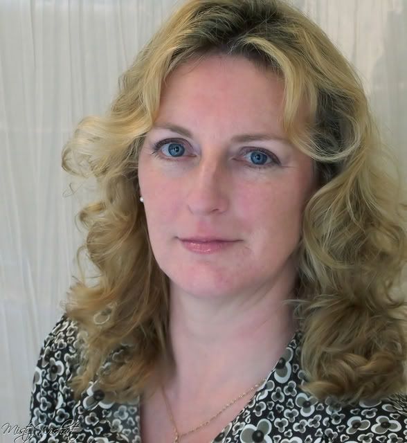
Took these pics yesterday. I am personally happy with how they turned out. What do you think?

This is a discussion on blue eyed beauty within the Critiques forums, part of the Photography & Fine art photography category; Took these pics yesterday. I am personally happy with how they turned out. What do you think?...
Took these pics yesterday. I am personally happy with how they turned out. What do you think?

Last edited by Misty-Bug; 02-13-2008 at 12:21 PM. Reason: subscribing
Hi Misty,
I've said this many times in the past and I'll say it again. If YOU are happy and the model is happy (if the shhot was for the model) then that's the most important thing.
Some things that I might suggest to make future phots even better...is have the model stand MUCH further away (maybe 5 or more feet) from the background. This adds separation and depth to the photo.
shot 1
I like the softness of the skin and eyes here and i assume it was deliberate. The position of the head however is very awkward.
Shot 2
Here the eyes look very good though they could be a wee bit sharper. The skin looks a bit reddish here though.
Was the model happy? Again, if it was for her, then that's the key question.
best!
Marko
- Please connect with me further
Photo tours of Montreal - Private photography courses
- Join the new Photography.ca Facebook page
- Follow me on Twitter http://twitter.com/markokulik
- Follow me on Google+ https://plus.google.com/u/0/111159185852360398018/posts
- Check out the photography podcast
"You have to milk the cow quite a lot, and get plenty of milk to get a little cheese." Henri Cartier-Bresson from The Decisive Moment.
yes she is happy but what I was more looking for is pointers on the shots. Which you gave. I can't get better if I don't get the help. kwim
The first shot flatters the model more than the second shot and the lighting makes her face look thinner. Her neck also looks better in the first pose than the second. As to pointers, portraiture is attention to the smallest detail and over the years of looking at why some portraits are great and some are not, certain guidelines have been developed.
The first shot has what is called a masculine head tilt which means that the head is tilted toward the lower shoulder which fits a male better than a female. The classic approach for this shot is a 3/4 angled body with the higher shoulder facing the camera and the head very slightly tilted toward the higher shoulder.
The colour temperature is too much on the blue side which can easily be seen in the eyes. The white of the eyes needs to be truly white and not a blue hue. Selecting the eye and doing a colour adjust in your photo editor might solve the problem. If you are shooting in future under the same lighting conditions you may want to move to warmer colour such as the shadow option in some camera menus.
Speaking of colour the skin is much too pink particularly in the first one. This also can be adjusted in a photo editor.
In the second shot the white piece of the far earing is a distraction and needs to be cloned out in an editor. The end of the necklace is cut off and the necklace itself unfortunately emphasizes the lenght of her neck. The creases in her neck near the chin line are also unattractive and can be cloned out as well. The usual camera approach is to have the model jut her chin a little forward or even flex her neck muscles a bit to tighten the look and then shoot from a different angle like the top one. A silk scarf or a higher neckline would also de-emphasize the long neck. Softening the light reflection on her lips would help too as well as backing up a bit so that the shot is not quite so tight.
I am not sure you wanted that many pointers.
Tegan
The two pictures are so different it looks to me as if it were not the same woman.
The first shot is no doubt more flattering. In the second one, light coming from the front and from below flattens her face, and reveals this long long neck.
If you can get her to pose again, I would suggest lighting her from above. Try a low key approach perhaps - blue eyes coming out of pitch darkness kind of thing.
In any case, down with the the background and the distracting 70s shirt.

Bookmarks