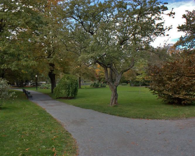
Been a while since I put myself out there for full critique... have at 'er!

This is a discussion on Path in the Park within the Critiques forums, part of the Photography & Fine art photography category; Been a while since I put myself out there for full critique... have at 'er!...
Been a while since I put myself out there for full critique... have at 'er!

Alright!
The very first thing that hit me here was the lack of contrast.
Closer inspection and I noticed the colours were off also ... the path for instance. Overall it appears to have a slight green cast and the reds are subdued.
I think a good Curves treatment would solve most of that.
The sky is a bit blown out but that's to be expected. Although maybe a slightly higher aperture might have avoided some of the colour/contrast issues as well as saving some of the sky detail.
I think it could be sharper as well.
I do like the composition here though. The path is a good leading line drawing us further into the photo and encouraging us to look at the seats and trees as we go.
I'm curious to know what you cropped out. The aspect has been changed so I know you cropped some stuff out.
Here's the original. It was a little dark as I was trying to keep the sky from getting blown out. I have it in Canon RAW (CR2) still so I can post process but I need to do some learning. Time to do a little research maybe:
All I've done with it is brighten it up and trimmed it to 8x10 as when I print, I tend to print 8x10, and added a border.
Settings:
f5.7
1/250s
ISO 200
WB: Auto

Nice picture but I agree with MA that more contrast and stronger colors would improve it. I like your composition.
I too agree with MA, but there is so much potential in this shot (which is what you must think as well). This would be a good one to play with GIMP to see if you can give it the boost you are looking for.
the other nice part is that you can return and take this shot again and again. and again.
Looks like you tried the right idea realizing you were going to get that blown out sky.
Here's my effort ... all I did was use the shadow/highlight filter in PS and then boost the yellows and reds. I cropped it in an 8x10 ratio also as a direct comparison.

it could be the monitor but I still find the tone a bit dull.
that's true. sorry for being impatient
Time to purchase a filter to help with that sky so she's not so blown and the rest so dark.
As mentioned lovely composition but I find it just a bit dark.

Bookmarks