I could use some input on this one.

This is a discussion on Rumblebuffin's Palette within the Critiques forums, part of the Photography & Fine art photography category; I could use some input on this one....
I could use some input on this one.

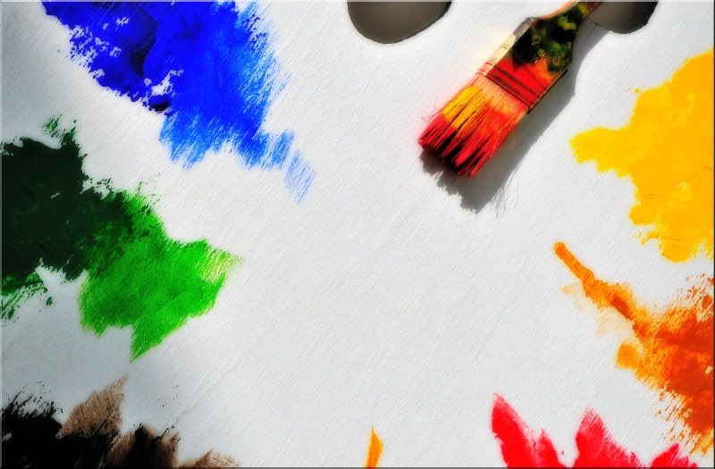
I like the colours and the idea of the image. The brush is cool. I like the white easel and the texture, but for me there is a bit too much blank area in the middle. Maybe if the white area wasn't so dead center it would be better? Maybe if we could see a little more of the easel towards the top? More of those wonderful colours would be nice too. I hope that all makes sense and is of some use.
Me on Flickr http://www.flickr.com/photos/mtb_antz
Wonderful bright colours - and I lilke the structure in it.
Antz nailed this one.
hindsight is 20/20 of course but had the paintbrush created a brush stroke that went from the center to its current position...it might well have worked.
- Please connect with me further
Photo tours of Montreal - Private photography courses
- Join the new Photography.ca Facebook page
- Follow me on Twitter http://twitter.com/markokulik
- Follow me on Google+ https://plus.google.com/u/0/111159185852360398018/posts
- Check out the photography podcast
"You have to milk the cow quite a lot, and get plenty of milk to get a little cheese." Henri Cartier-Bresson from The Decisive Moment.
It would do great with text in the middle, for designers this picture would be fantastic, for photographers there is something missing.
I’m not posting images here, or anywhere else for that matter, very much anymore because I’ve become dissatisfied with simply recording scenes for the sake of trying to be technically perfect. Once you’ve practiced that for a while, it becomes second nature. You can compose a beer can lying on a ditch bank that fulfills those perceived requirements, but should it be left to the viewer to pull something from the photograph or should the photographer have had something in mind beforehand for the viewer to consider?
I’m in favor of the latter even if my attempts fail. To me, this image displays the separations existing in the different cultures world wide with the brush acting as an instrument that might help to bring them all together. I would’ve liked for others to have seen this, but I guess I’m not quite there yet.
I don't think it's because you are not there that we did not see this. I think you are expecting too much from the viewer. Your intent is crystal clear to you, but imo there's no way the elements clearly portray your intent.
I'm not sure you should stop posting images for that reason though. The image is well shot. People will take from it what they will and you did ask for a critique....expecting the viewer to be on the same page as the creator is a lofty goal and may never happen. That said, for me, this aspect is not important.
When I see something in a song, film, photo painting etc. that's meaningful to me, it remains meaningful regardless of the artist's intent. If someone sees something in my work that they like that I did not intend, that makes me happy. People come from different cultures and perceive 'art' in very different ways. Perception is very personal. If they don't notice something I DID but I know it's there, I still remain happy because it's MY baby. Just myThx - Marko
- Please connect with me further
Photo tours of Montreal - Private photography courses
- Join the new Photography.ca Facebook page
- Follow me on Twitter http://twitter.com/markokulik
- Follow me on Google+ https://plus.google.com/u/0/111159185852360398018/posts
- Check out the photography podcast
"You have to milk the cow quite a lot, and get plenty of milk to get a little cheese." Henri Cartier-Bresson from The Decisive Moment.
I love your thinking Barefoot. Attempting to take your photography to that sort of level is a huge challenge I imagine. I have to imagine because I'm not capable of it myself.
I can't see anything in the photo that would ever have led me to see the colours as cultures or the brush as a conduit or instrument to bring them together though. I often don't agree with everything jlabel says but in this case I thought his thought was spot on.
In the end I agree very much with what Marko has said.
Hey, Barefoot.
I sincerely hope you don't stop sharing as I enjoy your work too much to have it disappear. One of the reasons I keep coming back to this community is the inspiration. I see things here that inspire me to keep looking for my own voice.
Once you explained your intent, it was quite an interesting thought on the matter. Had you entitled your piece "The Cultural Palette" or some such it may have inspired us to dig deeper for the meaning. As photographer's, especially in a critique thread, we spend a lot of time nitpicking the details instead of looking at the whole scene. (forest meet trees)
I think it's time to leave your technical brain at the home page. Keep your photos out of the critique thread and let us enjoy your artistry.
Remember, if you weren't posting I wouldn't have had the opportunity to enjoy some of the following:


Bookmarks