 LinkBack URL
 About LinkBacks
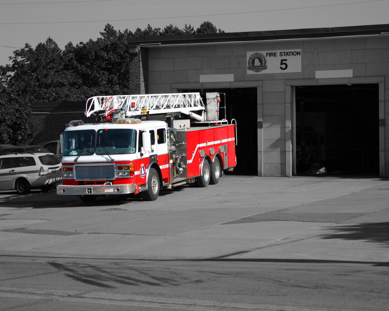
Saw some of the selective colouring shots recently and thought I would take what I thought was not a very interesting shot and see if the selective colouring would make it more interesting. I think it did. Your thoughts???

This is a discussion on More Selective Colouring within the Critiques forums, part of the Photography & Fine art photography category; Saw some of the selective colouring shots recently and thought I would take what I thought was not a very ...
 Moderator
Saw some of the selective colouring shots recently and thought I would take what I thought was not a very interesting shot and see if the selective colouring would make it more interesting. I think it did. Your thoughts???
Administrator
The truck looks decent (a bit too saturated or lively for my personal taste, but still decent)
The rest of the image though is quite muddy and could use a medium sized contrast boost imo. Hope that helps - Marko
- Please connect with me further
Photo tours of Montreal - Private photography courses
- Join the new Photography.ca Facebook page
- Follow me on Twitter http://twitter.com/markokulik
- Follow me on Google+ https://plus.google.com/u/0/111159185852360398018/posts
- Check out the photography podcast
"You have to milk the cow quite a lot, and get plenty of milk to get a little cheese." Henri Cartier-Bresson from The Decisive Moment.
Senior Member
Hmmm... to be honest, this one really doesn't do much for me. The technique is well executed, but the image just doesn't have the grab to pull it off.
Moderator
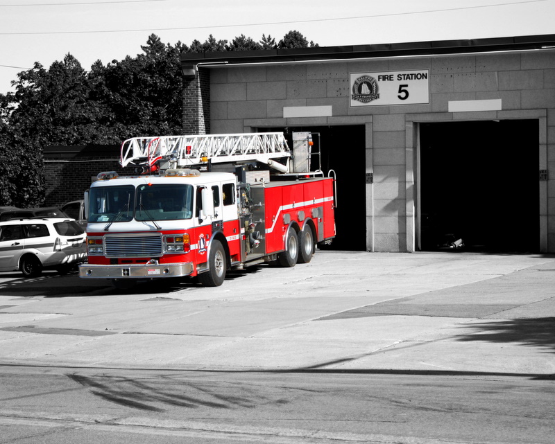
My PP skills are quite lacking. What do you mean by "quite muddy" and a "medium sized contrast boost". I really don't understand what you are saying but I want to understand. I've heard you use the "muddy" term before but I really don't get it. Can you explain?Originally Posted by marko

Administrator
Muddy means greyish (at least to me). When people say a print is muddy it refers to a low contrast image (as opposed to an image with a full range of tones). So for me, a medium contrast boost, means it needs considerably more contrast as opposed to a ton or a wee bit.
If you are familiar with b/w darkroom printing we used filters to adjust contrast. In this case, if you used a #2 filter I'd suggest a 3 1/2.
In this case for this print, everything besides the truck needs more contrast imo.
Hope that makes sense - Thx Marko
Photo tours of Montreal - Private photography courses
- Join the new Photography.ca Facebook page
- Follow me on Twitter http://twitter.com/markokulik
- Follow me on Google+ https://plus.google.com/u/0/111159185852360398018/posts
- Check out the photography podcast
"You have to milk the cow quite a lot, and get plenty of milk to get a little cheese." Henri Cartier-Bresson from The Decisive Moment.
Moderator
I boosted the contrast and the brightness to, hopefully, make it less muddy. I think I begin to see the difference. I mean I can definitely see the difference between the two photos, but I'm not sure I can recognize what the issue is to start yet. Is this closer?
Senior Member
It makes thing jump a bit more imo. When you can see all the shades between black and white without them all being in the same range it brings out the photo.
My new blog as of Nov/10
http://katchickloski.wordpress.com/
 Posting Permissions


 Reply With Quote
Bookmarks