 LinkBack URL
 About LinkBacks
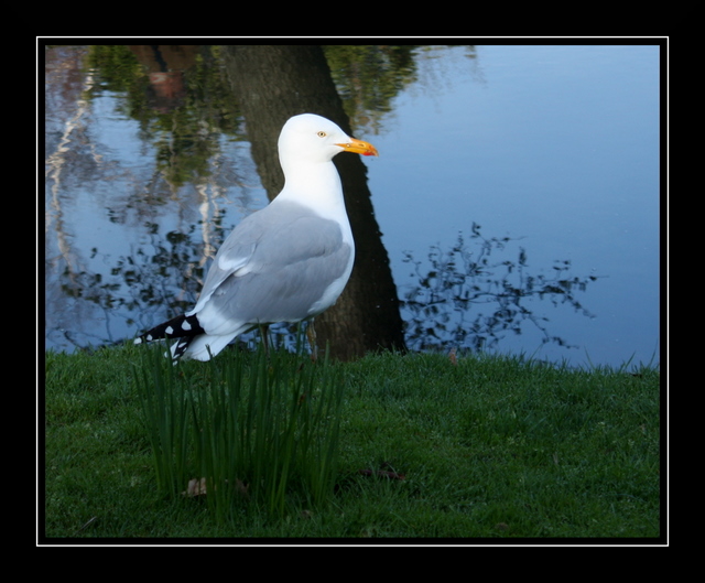
A little bigger (white spot removed) and ready for critique

This is a discussion on Annoying Photographer - Critique Thread within the Critiques forums, part of the Photography & Fine art photography category; A little bigger (white spot removed) and ready for critique...
 Moderator
A little bigger (white spot removed) and ready for critique
Senior Member
Nice composition - fine background for the bird. Only the white parts have a bit too much light in it.
Administrator
Agree with Moinx2 on the light head, just a tad too light. The reflection in the water looks great. The grass and lowest part of the bird's body is a bit too dark. I think the bird would look even better if he/she were just to the right of the tree, but sometimes they just don't do what you want them to do so ya just gotta click the shot or they fly fly away - hope that helps - Marko
- Please connect with me further
Photo tours of Montreal - Private photography courses
- Join the new Photography.ca Facebook page
- Follow me on Twitter http://twitter.com/markokulik
- Follow me on Google+ https://plus.google.com/u/0/111159185852360398018/posts
- Check out the photography podcast
"You have to milk the cow quite a lot, and get plenty of milk to get a little cheese." Henri Cartier-Bresson from The Decisive Moment.
Member
Ive just started to get interested in this type of photography so Im not comfortable critiquing. Personally I also feel that the head is a bit too white. It really jumps out at me more so than anything else in the photo. Although, I really kind of like it the way it is. It just gives the impression that the bird (seagull?) was lit by the daylight more so around the neck and head, but the lighting in the photo tells an entirely different scenario. So I suppose a little darker on the neck and head would look a bit more natural. I feel that Id like it a bit more if the image overall was a tad brighter.
I really love the shot though I feel that it would be nice in a frame on the wall. The composition works for me.
 Posting Permissions


 Reply With Quote
Bookmarks