Results 1 to 9 of 9

Fruit! Feedback please!

This is a discussion on Fruit! Feedback please! within the Critiques forums, part of the Photography & Fine art photography category; I'm wondering about how the colors appear on yall monitors, weather or not the shot of the oranges is too ...

  1. #1
    ridicwilco's Avatar
    ridicwilco is offline Member
    Join Date
    Mar 2009
    Location
    South Shore, MA
    Posts
    51

    Question Fruit! Feedback please!

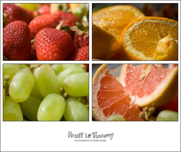
    I'm wondering about how the colors appear on yall monitors, weather or not the shot of the oranges is too dark omcpared and if the grapes are too distracting in the grapefruit shot, what you think of the hand writing element and if the fruit actually looks yummy or if it looks unhealthy and old


    thanksya

  2. #2
    AntZ's Avatar
    AntZ is offline Senior Member
    Join Date
    Mar 2009
    Location
    Australia
    Posts
    2,290
    My Photos
    Please feel free to edit my photos
    Critiques
    Critique my photos anywhere in the forum

    Default

    At first glance I like the overall look. The text is OK, but could be a little bigger. The individual shots seem technically OK(DOF, Composition,Focus,Exposure). The colours are good, except I think the strawberries could be redder.

    But as you suspected the fruit look a bit old. The citrus look a little dried out. There is a prominent bruise on the main strawberry, and the grapes look like they need a wash as they are a bit white. The grapes in the grapefruit are a bit of a distraction. I noticed them before I read your question regarding them.

  3. #3
    kat
    kat is offline Senior Member
    Join Date
    Jan 2009
    Location
    Vancouver
    Posts
    4,329
    My Photos
    Please ask before editing my photos
    Critiques
    Only critique photos posted in the critique forum

    Default

    Antx summed it up very well I think. The first thing I noticed was they dryness of the fruit.
    My new blog as of Nov/10
    http://katchickloski.wordpress.com/

  4. #4
    jlabel is offline Senior Member
    Join Date
    Feb 2009
    Location
    Brazil - Sao Paulo
    Posts
    298

    Default

    For me the color is ok, contrast is lacking a bit.

  5. #5
    Marko's Avatar
    Marko is offline Administrator
    Join Date
    May 2005
    Location
    Montreal, QC. Canada
    Posts
    14,870
    My Photos
    Please do NOT edit my photos
    Critiques
    Critique my photos anywhere in the forum

    Default

    This looks like a fun shot - here goes the answers to questions

    - The oranges look a wee bit dark (10% perhaps) on my monitor compared to the rest of the shots.
    - The grapes are not a distraction for me in the grapefruit shot.
    - The handwriting looks cute at the bottom and i like the font though it could be a bit bigger.
    - The oranges and the grapefruit do indeed look a bit old. If I look carefully The front strawberry looks bruised. Only the grapes look fresh.

    Hope that helps - Marko
    - Please connect with me further
    Photo tours of Montreal - Private photography courses
    - Join the new Photography.ca Facebook page
    - Follow me on Twitter http://twitter.com/markokulik
    - Follow me on Google+ https://plus.google.com/u/0/111159185852360398018/posts
    - Check out the photography podcast


    "You have to milk the cow quite a lot, and get plenty of milk to get a little cheese." Henri Cartier-Bresson from The Decisive Moment.

  6. #6
    ridicwilco's Avatar
    ridicwilco is offline Member
    Join Date
    Mar 2009
    Location
    South Shore, MA
    Posts
    51

  7. #7
    edbayani11's Avatar
    edbayani11 is offline Senior Member
    Join Date
    Feb 2009
    Location
    Philippines
    Posts
    347
    My Photos
    Please feel free to edit my photos

    Default

    they all said it. and agree with them.
    maybe should've sprayed with a fine mist of water before shooting?

  8. #8
    casil403's Avatar
    casil403 is offline Senior Member
    Join Date
    Feb 2009
    Location
    Calgary Canada
    Posts
    6,612
    My Photos
    Please do NOT edit my photos
    Critiques
    Only critique photos posted in the critique forum

    Default

    I think it looks "just okay".
    Being a chef, I believe the colours could be more vibrant and healthy looking and "pop" right off the page. It (the fruit) should look like I want to eat it right off the page and I'm getting a bit of "it's been in the fridge way too long....especially with the citrus and the strawberries. I think the empty stem of the grapes in the grapefruit shot is distracting to me. Also, remove the seeds in the grapefruit out.Ii think Ed is also right in stating that they should also be misted.

    I think done correctly, this could be a great photo. one suggestion...try using different fruit as well? Kiwi cut in half looks awesome, as does a group pf blackberries or watermelon...If you want to get really funky, try finding some dragonfruit or starfruit.
    "Life is like photography, we develop from the negatives"-anonymous
    My website: www.albertaandbeyond.com

  9. #9
    hoyinsiu is offline Junior Member
    Join Date
    Apr 2009
    Location
    Toronto
    Posts
    29

    Default

    i like the composition but i agree with the others. It's a little bit not too fresh look, maybe because it's a bit under exposed and also it's not too sharp.

Bookmarks

Posting Permissions

  • You may not post new threads
  • You may not post replies
  • You may not post attachments
  • You may not edit your posts
  •  

1 2 3 4 5 6 7 8 9 10 11 12 13 14 15 16 17 18 19 20 21 22 23 24 25 26 27 28 29 30 31 32 33 34 35 36