Results 1 to 6 of 6
Like Tree1Likes
  • 1 Post By Runmonty

newbie with first pic post

This is a discussion on newbie with first pic post within the Critiques forums, part of the Photography & Fine art photography category; Hi, i'm a newbie & a tad nervous to do this - so ripping the band aid off! my first ...

  1. #1
    Ophelia is offline Junior Member
    Join Date
    Jan 2015
    Location
    Switzerland
    Posts
    6
    My Photos
    Please feel free to edit my photos
    Critiques
    Only critique photos posted in the critique forum

    Default newbie with first pic post

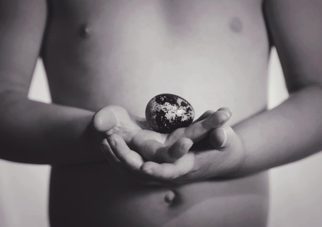
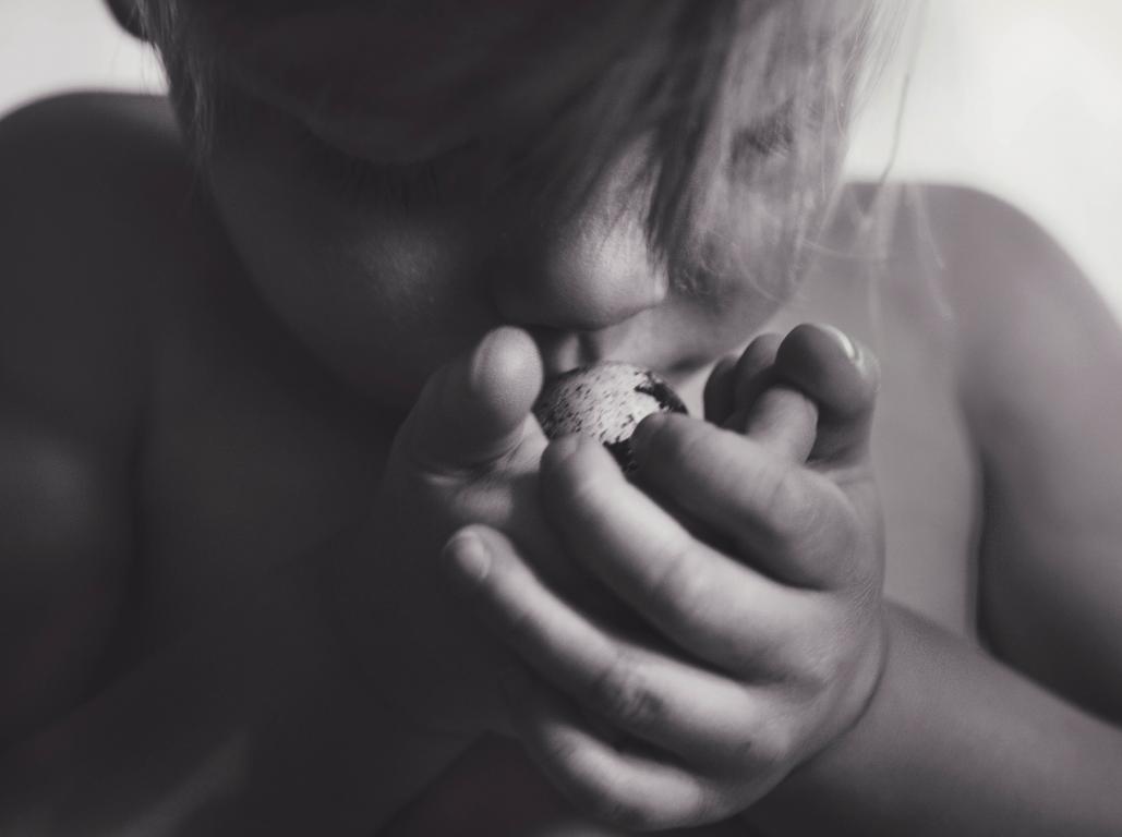
    Hi, i'm a newbie & a tad nervous to do this - so ripping the band aid off! my first pic post - I only started photography 3 1/2 months ago - my husband surprised me with a camera my first DSLR - im still trying to learn my way around with it and learn everything i possibly can whilst dealing with my kids, my youngest is 20 months. I get my eggs from a local farmer and he stopped by on the weekend, we had a few tiny eggs in the mix as well and my son was most fascinated by it and thought it was a dinosaur egg!

    I am new - so i hope i did the sizing ok??
    Name:  4.jpg
Views: 396
Size:  36.9 KB


    Name:  444.jpg
Views: 385
Size:  37.7 KB

  2. #2
    theantiquetiger's Avatar
    theantiquetiger is offline Moderator
    Join Date
    Aug 2011
    Location
    Baton Rouge
    Posts
    2,774
    My Photos
    Please feel free to edit my photos
    Critiques
    Critique my photos anywhere in the forum

    Default

    Once again, welcome to the forum.

    One thing that may help with critiques is if you can provide the EXIF info (speed, f/stop, focal length, ISO).

    #1 - I like it a lot. I like the softness of the skin with the harshness of the black and white egg shell. I am still wondering if the image was still too big when you uploaded it, because the it is a little soft. You have nice light on the egg but it needs a little more sharpness and maybe a little less contrast. You do get the viewer to look at the egg (which is a good thing, if that is your purpose).

    #2 - If it wasn't for the first image, I wouldn't know what was going on in this image. I just don't get this one. Even though #1 is a very basic view, it has something interesting (I don't know what, it just does). I feel you missed it on the second one. There are several minor things in this image, when put all together, it really hurts the image. First, the crop is so tight, it looks like the kid is squeezed into a box. Second, if the hands were super sharp, it would made for a much stronger image. Third, the lighting is strange. He is half in and half out of the light. Maybe if the shadows were a little more extreme, making the shadows much darker. I am wondering if this image was too large as well when you uploaded it.

    It is funny, but you normally don't see two images, where the face is seen in one and the head is cut off of the other and the one with the cut off head is a stronger image.

    Now remember this, a lot of my critique was on content, not technique, so it is more of taste and some one may have a different opinion.
    "The worst thing about taking a great image is that your next one has to be better!"

  3. #3
    Runmonty's Avatar
    Runmonty is offline Senior Member
    Join Date
    Dec 2011
    Location
    Adelaide, South Australia
    Posts
    4,095
    My Photos
    Please do NOT edit my photos
    Critiques
    Critique my photos anywhere in the forum

    Default

    Quote Originally Posted by theantiquetiger View Post

    Now remember this, a lot of my critique was on content, not technique, so it is more of taste and some one may have a different opinion.
    I have a different opinion - I really quite like both of these images. They are a bit soft but on this occasion that doesnt harm the images in my opinion. The light in the 2nd shot really works well to me and the tight crop adds to to the intimacy of the shot IMO.

    The image resizing is fine I think, but I agree with AT about having access the EXIF data. That is my fault as it was stripped off during resizing. When you use "export to web" ensure that the drop down box called metadata say "all" to include the metadata
    Lorey likes this.
    I welcome all critique and comments on any of my photos

    Links to other places you can also find me :


  4. #4
    Runmonty's Avatar
    Runmonty is offline Senior Member
    Join Date
    Dec 2011
    Location
    Adelaide, South Australia
    Posts
    4,095
    My Photos
    Please do NOT edit my photos
    Critiques
    Critique my photos anywhere in the forum

    Default

    I juts looked at the image information and it appears that the image size was still larger than 1028 pixels. When saving the image ensure that the largest edge is less than 1028 pixels
    I welcome all critique and comments on any of my photos

    Links to other places you can also find me :


  5. #5
    Marko's Avatar
    Marko is offline Administrator
    Join Date
    May 2005
    Location
    Montreal, QC. Canada
    Posts
    14,870
    My Photos
    Please do NOT edit my photos
    Critiques
    Critique my photos anywhere in the forum

    Default

    Hi Ophelia,

    Whenever you post directly 2 things must happen.
    the width cannot exceed 1028 (and yours is 1029) and the image cannot exceed 320k. If you post greater than that the forum compresses the image and it looks softer.
    Personally I post landscape oriented images at 1000 pixels wide at about 250k. (portrait oriented images I post at about 600 pixels wide at 250k)

    (OR post them to flickr or similar site and attach them from there.)

    Onto critique - right away I like both compositions as they both show good creativity and I also like the lighting in both images . GREAT start for only having 3.5 months under your belt!!!!! Don't be shy to post additional images!

    1 - I like this image, it's my fave of the set. My main comment would be that I see a 'splotch' below the right side of the belly button. It's a distraction for me so if it were mine, I'd burn it in(darken it to match colour) or clone it out. My second comment is that the egg should be sharper imo.

    2 - I agree with AT, the 'egg' is a little bit too obscured for me. If the object he is kissing were more identifiable, imo the image would be stronger.
    I also agree with RM, that there is nothing tack sharp in this image...and yet I still like it.

    That said, because you are just beginning, you should try to know the 'rules' before you break them. Completely blurry images like this one break the rules. - And one of the 'rules' suggests that one of the focal points in the image should be sharp. This choice should be an active one and never the result of chance. Learn this early and your images will shoot up in quality real fast.

    Hope that helps and welcome again.
    - Please connect with me further
    Photo tours of Montreal - Private photography courses
    - Join the new Photography.ca Facebook page
    - Follow me on Twitter http://twitter.com/markokulik
    - Follow me on Google+ https://plus.google.com/u/0/111159185852360398018/posts
    - Check out the photography podcast


    "You have to milk the cow quite a lot, and get plenty of milk to get a little cheese." Henri Cartier-Bresson from The Decisive Moment.

  6. #6
    Ophelia is offline Junior Member
    Join Date
    Jan 2015
    Location
    Switzerland
    Posts
    6
    My Photos
    Please feel free to edit my photos
    Critiques
    Only critique photos posted in the critique forum

    Default

    Thanks for the feedback I think the splotch has something to do with where we were standing? - we were in our living room so on his right was our dining table and on the left is a wooden wall and buffet thing, behind him was the french doors that open out to the balcony and his right is another set of windows but smaller - so the light was coming in from the right and behind him and i think the shadows we see are the shadows from my chairs and table - it wasnt planned so grabbed the camera quickly and snapped a few images of him interacting with the dinosaur egg - he wasnt posing so was moving around which is why i think it wasnt so sharp - i will def try and improve and ill try and burn it in a bit as now that you have mentioned it i can see it as well - so much to learn!!! I do have another of my daughter i can post that a took the other day as well. Also thanks for the tips for sizing i thought i might have done something wrong - thank you guys for the critic

Bookmarks

Posting Permissions

  • You may not post new threads
  • You may not post replies
  • You may not post attachments
  • You may not edit your posts
  •  

1 2 3 4 5 6 7 8 9 10 11 12 13 14 15 16 17 18 19 20 21 22 23 24 25 26 27 28 29 30 31 32 33 34 35 36