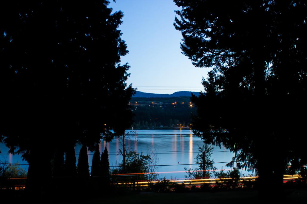
I'm new and was looking for some critique on my photos & looks like I found the place. I've attached 5, since that is the max, but hopefully someone will/is able to check out the rest in my album. TIA for any constructive criticism
This is a discussion on Newbie looking for Critique... within the Critiques forums, part of the Photography & Fine art photography category; I'm new and was looking for some critique on my photos & looks like I found the place. I've attached ...
I'm new and was looking for some critique on my photos & looks like I found the place. I've attached 5, since that is the max, but hopefully someone will/is able to check out the rest in my album. TIA for any constructive criticism
First off, welcome to the forum, Angie!!!
As for critiques, it is usually better to ask for a critique of one or two images (if they are of same subject or just different post process) per thread. It just makes it easier.
As far as my critiques...
They are all nice images, great exposure, composition, etc. really not much technically to critique on these. Granted I am viewing theseon my iPhone, so any sharpness missed, I will not notice.
All I really can comment on is the subject matter, which is more on taste then technique.
#1 - beautiful color, composition, and exposure. That being said, I'm not feeling what you may have felt when you took it. I hate to say it, but the image is kind of boring.
#2 - amazing image, best of the bunch!!! Even though it is just of a partial door and hinges, it just has something that keeps the viewer's eye. That's an instant wall hanger right there.
#3 - another great shot, but you maybe a little under exposed on the buffalo. Remember, the human eye is attracted to light, so with the very bright background, it draws attention away from the subject.
#4 - I know what you were trying for, but I feel like you missed it, with the background leading lines too much out of focus. Another viewer may disagree with me, it's more of just taste.
#5 - Nice long exposure but there two elements hurting this image (IMO). It's the large trees and the power lines. You can't see enough of the landscape due to the trees and the part you can see are sliced in half by powerlines.
Over all, all great images, beautiful colors and compositions. Like I said, my critiques were mostly on taste because they are all great technically. Now go get #2 printed and framed!!!
"The worst thing about taking a great image is that your next one has to be better!"
Hi Angie - AT is right, the best critiques will come when only 1 or 2 images are posted per thread. (but feel free to start as many threads as you like)
My fave of this lot is shot 4. It's clean and nicely exposed with decent lines.
My super quick critique on the others would be;
1 - blacks are too dark and and there's a lot of black in this image. I also agree with AT, not the most exciting image.
2 - Not crazy about the comp here - the left side is quite blurry and not adding much for me. The lock itself is where it's at imo. Colours are fab though!
3 - Bison is underexposed
5 - This one is a big miss for me I'm afraid. It's way too busy with near black silhouetted trees that do not add anything to the image IMO.
Hope that may help and it's just my opinion.
- Please connect with me further
Photo tours of Montreal - Private photography courses
- Join the new Photography.ca Facebook page
- Follow me on Twitter http://twitter.com/markokulik
- Follow me on Google+ https://plus.google.com/u/0/111159185852360398018/posts
- Check out the photography podcast
"You have to milk the cow quite a lot, and get plenty of milk to get a little cheese." Henri Cartier-Bresson from The Decisive Moment.
OK, now that I am home and can see them on my large computer screen, I see some other concerns.
First off, what size were these images when you uploaded them? The reason I ask is because if they are too big (has to be smaller than 325 k and 1029 pixels wide), the site resizes the image to make it fit the site and causes it to be soft (out of focus).
As for #1 being boring, it is a great scene to shoot but it looks like you just took it by standing over them, not thinking out the composition. There are many ways to have shot this to make it more interesting. For example, the large log that is sawed off and the butt is facing us. I would love to see mostly that end with all that moss hanging out of it and the back ground way out of focus.
"The worst thing about taking a great image is that your next one has to be better!"
Thank you both! I'll add 1 photo (or multiples of the same image) for future critiques. Thanks again!
I'm late to the game but I wanted to welcome you just the same, Angie. Awesome to see someone with lots of enthusiasm.
AT and Marko already covered all the pertinent details so I won't get into the critique of these images but I do want to say that I agree with Marko. Number 4 is my favourite and I do like the bison shot as well but the lighting conditions were just not helpful to you on that one.

Bookmarks