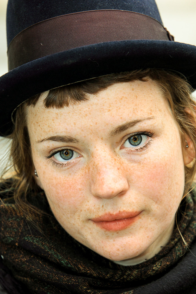
This is a discussion on Freckles - Critique my post process within the Critiques forums, part of the Photography & Fine art photography category; Here are three examples of a street portrait I took in New Orleans. I have been trying to learn some ...
"The worst thing about taking a great image is that your next one has to be better!"
I get what you are trying to do, but I actually prefer the softer untouched image for this subject. The third image emphasizes the freckles too much IMO. Maybe this processing may work better with say an old man where you were trying to emphasize his wrinkles or the ruggedness of a working man for example. It almost looks like a bleach bypass effect
I find the colour more natural in shot 1 over shot 2.
Others may disagree with this.
The first edit (freckles) I followed the video step by step. The cowboy, I tried to do it from memory and forgot a couple steps.
If anything, I really like the eye treatment (pretty simple)
Here is the video
"The worst thing about taking a great image is that your next one has to be better!"
There are some neat tricks in there. The great thing about Photoshop is the multiple ways of achieving similar (but subtly different) results. Each new trick adds to the armoury. (the problem is remembering them when it time to use them).
Last edited by Runmonty; 04-11-2014 at 06:00 AM.
After all said and done, I realize the video is called "Gritty Portrait", so I figure I did it correctly, just don't like the results.
On another forum, a few said the cowboy is overly sharp and too saturated. I don't see it at all.
Does anyone here see it?
"The worst thing about taking a great image is that your next one has to be better!"
Not a fan of the PP here AT, I just don't see why altered reality beats reality.
The natural originals are much more pleasing to my eye. The cowboy might need a hint of burning in but shot 1 rocks as is.
- Please connect with me further
Photo tours of Montreal - Private photography courses
- Join the new Photography.ca Facebook page
- Follow me on Twitter http://twitter.com/markokulik
- Follow me on Google+ https://plus.google.com/u/0/111159185852360398018/posts
- Check out the photography podcast
"You have to milk the cow quite a lot, and get plenty of milk to get a little cheese." Henri Cartier-Bresson from The Decisive Moment.
The cowboy definitely is a better subject for this process. Saturated? Yeh... just a frag, I'd have backed the reds off a little maybe. I like this processing myself and go for similar results in my work (by that I mean my daily job) at times. In this case I think I'd have gone for a blend of this result and the original (which I'd have processed a little anyhow with basic curves or levels at least) to just soften some of those darker areas and bring back detail to the hat and his dark left side. Not too much, but just a bit.
I think the better question is "which one do you like?" Your photography skills are coming along quite nicely, AT and I think you achieve excellent results most of the time. The place where you seem to be stuck now is that you are IMHO way too concerned about what others think of the image. You develop your style by deciding what you like and creating images that please you.
As for my opinion, I would like something in between. Such as the following:


Bookmarks