Results 1 to 4 of 4

Snow Day - Practicing Portraits

This is a discussion on Snow Day - Practicing Portraits within the Critiques forums, part of the Photography & Fine art photography category; Thats right, we have snow days down here in Louisiana. Granted, it didn't snow, but it sleeted all day yesterday ...

  1. #1
    theantiquetiger's Avatar
    theantiquetiger is offline Moderator
    Join Date
    Aug 2011
    Location
    Baton Rouge
    Posts
    2,774
    My Photos
    Please feel free to edit my photos
    Critiques
    Critique my photos anywhere in the forum

    Default Snow Day - Practicing Portraits

    Thats right, we have snow days down here in Louisiana. Granted, it didn't snow, but it sleeted all day yesterday and has not been above freezing since Monday night. all roads and stores are closed. City is shut down until at least tomorrow morning.

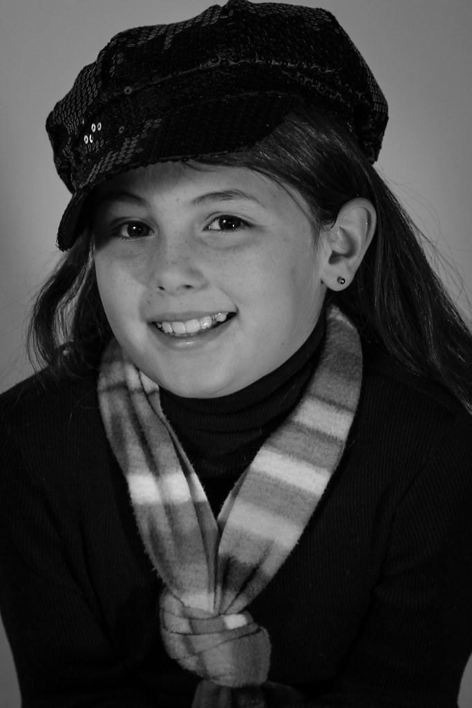
    My wife wants some BW portraits of the girls


    morgan portrait1 by Theantiquetiger, on Flickr


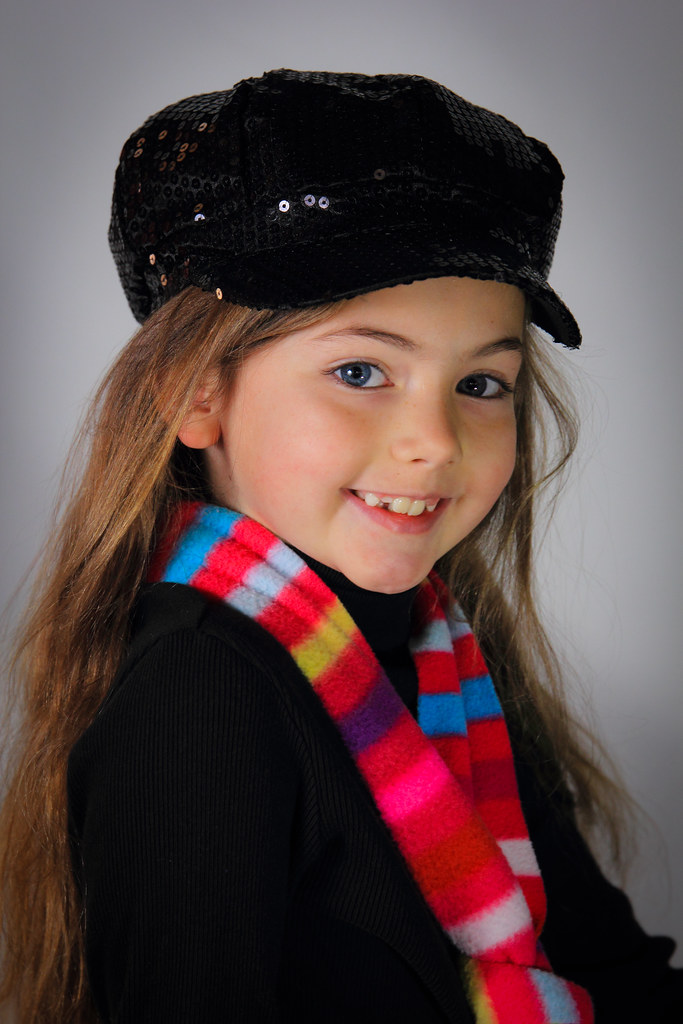
    maddy portrait1-2 by Theantiquetiger, on Flickr


    maddymorgan portrait1 by Theantiquetiger, on Flickr
    Last edited by theantiquetiger; 01-29-2014 at 02:19 PM.
    "The worst thing about taking a great image is that your next one has to be better!"

  2. #2
    Marko's Avatar
    Marko is offline Administrator
    Join Date
    May 2005
    Location
    Montreal, QC. Canada
    Posts
    14,870
    My Photos
    Please do NOT edit my photos
    Critiques
    Critique my photos anywhere in the forum

    Default

    Here's my take:
    1 - it's too blue/selenium for my taste and bottom right edge looks odd. Portrait is cute though!
    2 - feels underexposed overall. The face is dark and we are losing detail in the blacks.
    3 - pretty cute overall but there are weird brushmarks at bottom right, bottom left and upper right. The background and the blond cutie did not receive enough light.

    Position of fill light seems too low to me.

    An easy tip for lighting the bkgd is to leave at least 5-6 feet between subject and background. The further that distance is, the easier it is to light the background and control it.
    Hope that may help
    - Please connect with me further
    Photo tours of Montreal - Private photography courses
    - Join the new Photography.ca Facebook page
    - Follow me on Twitter http://twitter.com/markokulik
    - Follow me on Google+ https://plus.google.com/u/0/111159185852360398018/posts
    - Check out the photography podcast


    "You have to milk the cow quite a lot, and get plenty of milk to get a little cheese." Henri Cartier-Bresson from The Decisive Moment.

  3. #3
    theantiquetiger's Avatar
    theantiquetiger is offline Moderator
    Join Date
    Aug 2011
    Location
    Baton Rouge
    Posts
    2,774
    My Photos
    Please feel free to edit my photos
    Critiques
    Critique my photos anywhere in the forum

    Default

    Quote Originally Posted by Marko View Post
    Here's my take:
    1 - it's too blue/selenium for my taste and bottom right edge looks odd. Portrait is cute though!
    2 - feels underexposed overall. The face is dark and we are losing detail in the blacks.
    3 - pretty cute overall but there are weird brushmarks at bottom right, bottom left and upper right. The background and the blond cutie did not receive enough light.

    Position of fill light seems too low to me.

    An easy tip for lighting the bkgd is to leave at least 5-6 feet between subject and background. The further that distance is, the easier it is to light the background and control it.
    Hope that may help
    The first one did have a weird thing going on in the bottom right from the vignette.

    Here is the color version, processed a little different


    morgan color portrait by Theantiquetiger, on Flickr
    "The worst thing about taking a great image is that your next one has to be better!"

  4. #4
    Runmonty's Avatar
    Runmonty is offline Senior Member
    Join Date
    Dec 2011
    Location
    Adelaide, South Australia
    Posts
    4,095
    My Photos
    Please do NOT edit my photos
    Critiques
    Critique my photos anywhere in the forum

    Default

    AT- I pretty much agree with Marko but make the following couple of additional comments.

    Firstly I think these are great shots, and the only changes I would tweak are in the processing.

    1. - Agree a bit too selenium & the white vignette doesn't quite look right. I think the problem with the selenium tones in this shot is in the highlights. If you really wanted the selenium colour, could I suggest you only apply it to the darker tones rather than the whites?. More of a split tone effect perhaps?

    2. - Initially I agreed with Marko but I there is something funny going on with the way this is displaying on this board. I thought I would have a play and see what detail I could bring out of the blacks. When I cut and pasted in Photoshop everything was already there and exposure was fine. I don't know if it is the white background here or something else. I do think however that the whites in this shot are bit muddy and could be improved with a levels play moving the white slider to the left.

    3. - Really like this but agree the white vignette inst quite right.


    Marko is far more able to comment constructively on the lighting, so I will defer to him on this one.
    I welcome all critique and comments on any of my photos

    Links to other places you can also find me :


Bookmarks

Posting Permissions

  • You may not post new threads
  • You may not post replies
  • You may not post attachments
  • You may not edit your posts
  •  

1 2 3 4 5 6 7 8 9 10 11 12 13 14 15 16 17 18 19 20 21 22 23 24 25 26 27 28 29 30 31 32 33 34 35 36