 LinkBack URL
 About LinkBacks
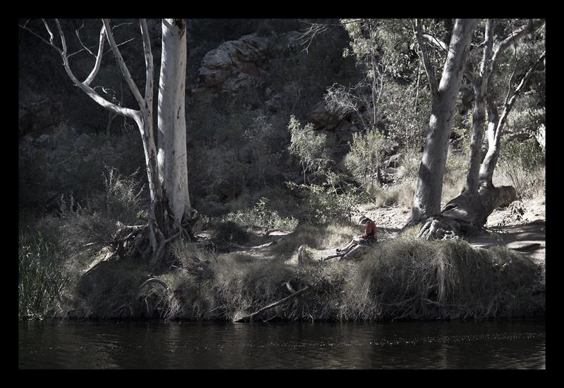
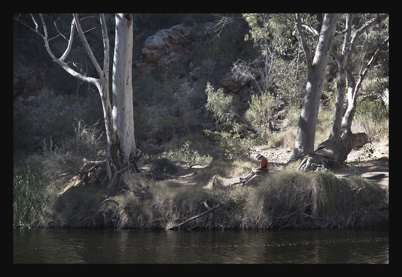
I am having trouble deciding between 2 versions of an image and would appreciate any thoughts or comments.

This is a discussion on Just Chillin' within the Critiques forums, part of the Photography & Fine art photography category; I am having trouble deciding between 2 versions of an image and would appreciate any thoughts or comments....
 Senior Member
I am having trouble deciding between 2 versions of an image and would appreciate any thoughts or comments.
Moderator
I really can't decide either, but I am leaning toward the second one because of the softer colors (I would say even something 1/2 way between the two)
Senior Member
Thanks AT - This one is between the 2 and also lightened a little
Administrator
I like the second one as well. 3rd one seems to be a good compromise.
Since you are okay w/critique, The main subject is pretty far from us here and this makes it much harder to feel the chill factor imo.
I would have zoomed in more (40-50%) on this one but i don't recall what lenses you have.
Hope it may help.
- Please connect with me further
Photo tours of Montreal - Private photography courses
- Join the new Photography.ca Facebook page
- Follow me on Twitter http://twitter.com/markokulik
- Follow me on Google+ https://plus.google.com/u/0/111159185852360398018/posts
- Check out the photography podcast
"You have to milk the cow quite a lot, and get plenty of milk to get a little cheese." Henri Cartier-Bresson from The Decisive Moment.
Senior Member
Thanks Marko that is great - I am here to both share and learn so please dont ever hold back on a critique (I also have pretty thick skin and not easily offended).
I did actually take a shot zoomed in further, but that one was too close and lost the frame of the trees (that I like). I will have go at cropping in Photoshop and see what I come up with.
Senior Member
Well, I wanna be different. To me the first one is the stronger image. Seems to tell more of the story this way. The colour in the water is great, this gets lost in the softer image. I also like the way the sun creates the illuminated spot. Much stronger in the first image than the second. But that's just me ...
~~ Beauty is in the eye of the beer holder ~~
Senior Member
Thanks Matt. I think you have articluated the reason for my initial indecision. The light and bright shirt were supposed to draw the attention to the person, and it is lost a bit in the desaturated versions
 Posting Permissions


 Reply With Quote
Bookmarks