Hi my name is Anna and I am new to the forum. I was hoping to get some constructive critiques on my photos. Let me know what you think. Thank you for your time
-Anna
This is a discussion on Please help me out and critique my photos :) within the Critiques forums, part of the Photography & Fine art photography category; Hi my name is Anna and I am new to the forum. I was hoping to get some constructive critiques ...
Hi my name is Anna and I am new to the forum. I was hoping to get some constructive critiques on my photos. Let me know what you think. Thank you for your time
-Anna
Welcome to the forum!!! As far as critiques:
#1 Super sweet Tilt/Shift, maybe crop just to the left of the "F" on the building and crop the top part of the image out to make a better T/S
#2 - Out of focus (maybe due to you uploaded image too big, forum makes it soft). The hard shadow on her cheek takes alot away
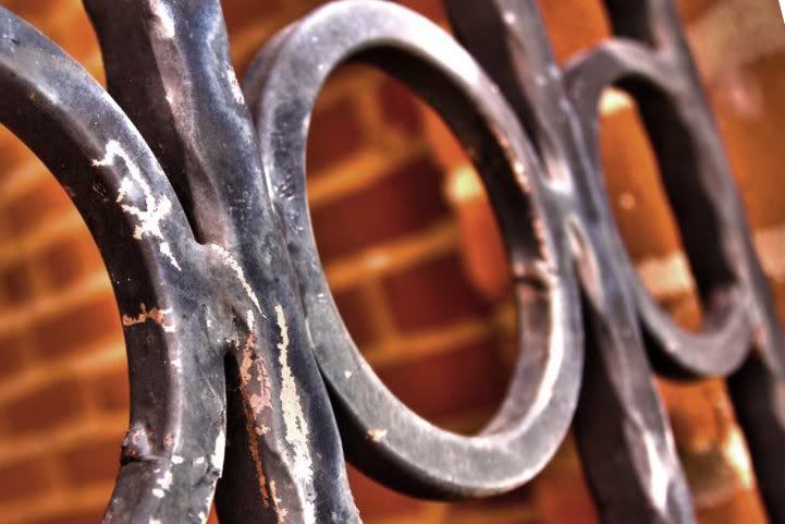
#3 - Very nice find, saturation maybe a little to high. May want to shift the center fence bar out of the middle to the "rule of thirds" line on the left
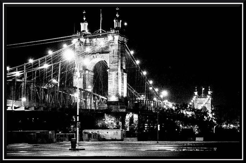
#4 - Very nice. May want to increase exposure in Lightroom, and lower the saturation a little, plus level to river
#5 - Crop just not working for me. It looks like you cropped his tail off (even though you didn't) and it is a little soft (probably due to size of image you uploadrd)
Thank you for the advice! It really helps
Hi anna welcome to the forum!
You'll find the bet critiques will come when only 1-2 photos are posted per thread.
For our forum, when you upload pix they must be 1026 pixels or less in width. They must also be 275k or less per picture, or compression will occur.
Personally I upload my own images at 800-1000 pixels wide and always less that 275k.
here goes a quick critique
1 - Interesting tilt shift or lensbaby image - I like it. If it were mine I might try to burn in the whitest whites on the roofs a bit.
2 - Looks to me like the focus was missed here. The eye should be sharper. Lighting is a bit uncontrolled here to my eye with the brightest highlights landing below the neck and the model's left arm.
3 - I'm afraid shot 3 simply does not work for me compositionally - It also has a strong orange cast.
4 - Shot 4 also is not working for me. Blacks are too black black here, I would have shot this scene earlier in the night. Image slopes to the right.
5 -I like shot 5 - cool bird. The crop seems a bit tight on the bottom though.
Hope that helps! - marko
- Please connect with me further
Photo tours of Montreal - Private photography courses
- Join the new Photography.ca Facebook page
- Follow me on Twitter http://twitter.com/markokulik
- Follow me on Google+ https://plus.google.com/u/0/111159185852360398018/posts
- Check out the photography podcast
"You have to milk the cow quite a lot, and get plenty of milk to get a little cheese." Henri Cartier-Bresson from The Decisive Moment.
You said you don't mind people editing your photos, so I did a couple. These are just samples because I am working with a small image and not the RAW image
This one I cropped where I was talking about and increased the saturation (high saturation helps T/S images)
This one I cropped, rotated slightly, and decreased the saturation

Thank you! Those look awesome!
Thank you so much for your time marko! Yes that does help a lot.
I did one more edit on the bridge. Due to the low exposure, all I could do is convert to B/W, level it, and add some grain. It still has a lot of blacked out areas that I couldn't do much with. Like I said, these are just samples, you are the artist, it is your vision. FYI, I am a novice photographer and even less of an editor, so just a little practice, good post editing can good a long way. there are others on this site that can make a masterpiece out of a completely ruined image.

Anne,
This may help you:
Look at your original image of the iron fence in the first post. Does your eye land anywhere easily on one particular spot? My eye is all over the image, nothing lands easily.
Now look at my edit of your fence. Your eye should easily land on the post to the left and even if you look at another spot on the image, your eye wants to go back to the left post, due to the lines and the placement of the post.
Yes I agree. I was just trying some new things with HDRs just for fun but what you did does look really good and thank you so much for your suggestion

Bookmarks