 LinkBack URL
 About LinkBacks
We went on a very sunny & warm mini-vacation. Please let me know what you think of these.

This is a discussion on 4 from a warm place within the Critiques forums, part of the Photography & Fine art photography category; We went on a very sunny & warm mini-vacation. Please let me know what you think of these....
 Senior Member
We went on a very sunny & warm mini-vacation. Please let me know what you think of these.
Moderator
It's always a bit difficult to critique multiple images at once but I'll give it a go...
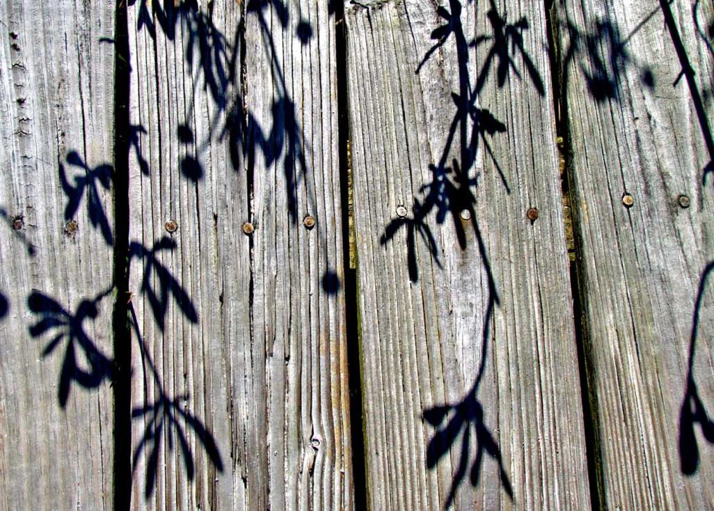
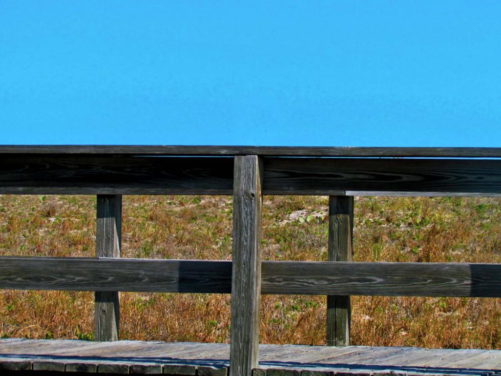
1) That's a very nice blue sky but I don't feel like there's a definite subject here. Is it a photograph of the boardwalk? It just doesn't seem clear.
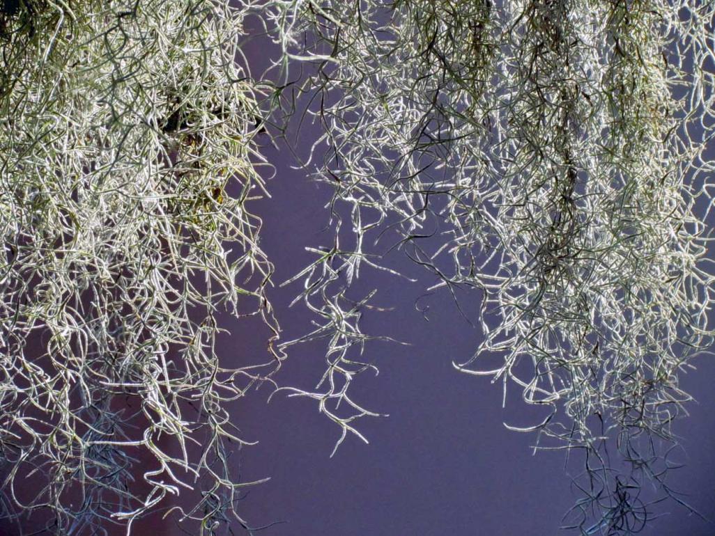
2) I have no idea what this is. I like all the little curly bits but I just don't know what's going on in this image.
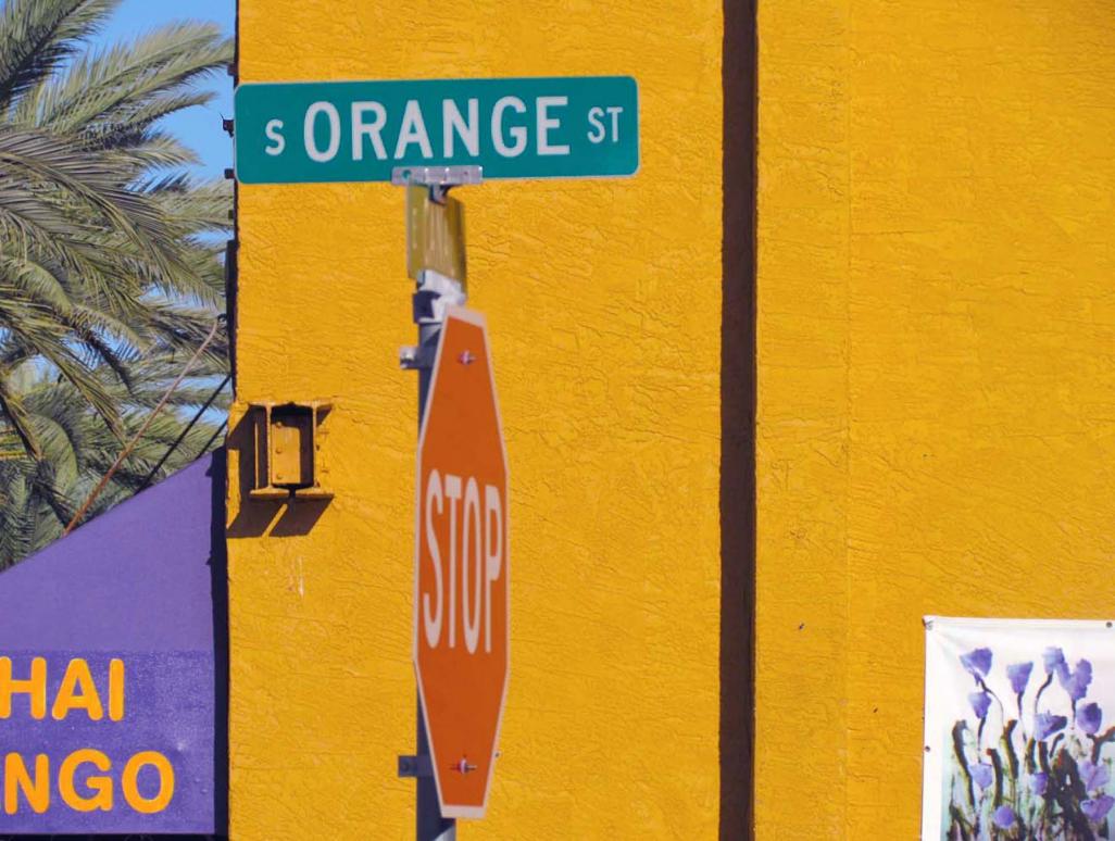
3) I really like the idea of the word "orange" against the orange wall as a background but I find the other elements (tree/sky, words bottom left, and white square bottom right, and stop sign) all a little distracting. Maybe a different angle would have been more "clean"?
4) The boards in the fence or deck are not straight which takes away a bit from this interesting shadow play. I think this one would look better in B&W too as you might be able to bring out the texture a bit more in the wood.
When looking at the images as a set, I think you have to ask yourself why you are taking the photograph such as in #3 which is juxtaposition of the word "orange" on the orange background and then make sure the photograph really defines or "sells" that feeling or thought.
Hope that helps!
Senior Member
Thanks Iguanasan!
I meant them all to read abstractly and maybe I'm not pushing that idea far enough in my images. Yes, the first is a boardwalk, the second is Spanish moss, the third was meant to be a sort of busy composition and the forth is vegetation shadows against a boardwalk.
I guess I should've posted them separately?
Really appreciate your time and comments
Moderator
To me, and remember this is just my, there is a little too much information in the first shot to be considered abstract. It's a photo of a boardwalk but there's too much information to make it abstract and not enough to make it a clean photo of the boardwalk. It's kinda in between.
The moss just doesn't work for me...not sure if I can explain it any better... possibly it's just the composition.
The mind tries to make connections and while you saw it as a jumble I saw Orange and Orange and then everything else became a distraction. Even a jumbled mess has to be presented in an orderly composition.
For abstract, I like the last the best. My only issue is that it's crooked.
You are more than welcome to post multiple shots, however, posting one at a time will make it easier for people to respond as they only have to think about one image rather than taking the time to critique them all.
Senior Member
Thanks again; I understand your points and will keep them in mind while shooting
 Posting Permissions


 Reply With Quote
Bookmarks