aaaaaa
This is a discussion on Driveby within the Critiques forums, part of the Photography & Fine art photography category; aaaaaa...
aaaaaa
Last edited by mellowinman; 10-10-2011 at 06:32 PM.
Sorry, but this one doesn't work well for me I'm afraid.
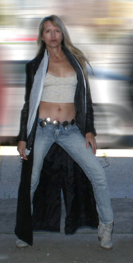
The scene, overall is overexposed, the model and her eyes aren't sharp, her pose looks very much unnatural and forced, and the zoom effect you've applied is not done well at all. It's obvious where the zoom starts and ends.
If you're interested, put up an unprocessed version, and I'll do what I think you were going for here, and explain my technique for you.
I agree w/MA here on all points except the forced pose; I don't mind the pose
- Please connect with me further
Photo tours of Montreal - Private photography courses
- Join the new Photography.ca Facebook page
- Follow me on Twitter http://twitter.com/markokulik
- Follow me on Google+ https://plus.google.com/u/0/111159185852360398018/posts
- Check out the photography podcast
"You have to milk the cow quite a lot, and get plenty of milk to get a little cheese." Henri Cartier-Bresson from The Decisive Moment.
aaaaaa
Last edited by mellowinman; 10-10-2011 at 06:33 PM.
This is just one of those photos where I tried to make something from nothing. Krystal liked her pose in the original, but the overall photo kind of sucks. I took Arthur and Jamie out, and stretched the car, which made me feel the urge to do that motion blur on the edges. It was just my way of trying to get a look out of it. I softened her a bit with some diffusion, and tried to give it sort of a "dreamy" feel.
This is definitely one where I don't care how much anyone goes to town on it. Just don't give her the head of a chicken, or anything. I hate that.
Ok ... here's my efforts.
Going by the title, the idea is to simulate the car racing by rather than parked as it is.
The first shot blurs everything that's not the girl and pavement, the second one goes for a more realistic scene where the background is not blurred, only the car.

What I did is duplicate the layer (photo) in Photoshop and then apply a motion blur to the top layer.
Then I applied a layer mask to the top layer.
Next, using the paint brush, I painted black on the mask (selecting different brush sizes and opacities as needed) which allows the bottom layer to show through. Any mistake is fixed by switching to a white brush.
The second one is cool.
I only titled the thread as I did because the shot gave me that impression a bit. There was no intent behind the editing; just did what I did with little or no thought. I often do that.
What you have done is inspired me to "brush up" on my photoshop masking technique.
Thanks!
Cool
@Richard - I think your rendition is awesome!!! MA's rendition is more of what the OP was going for, but yours is a piece of art!!! Very nice work with little to work with after the crop!!!

Bookmarks