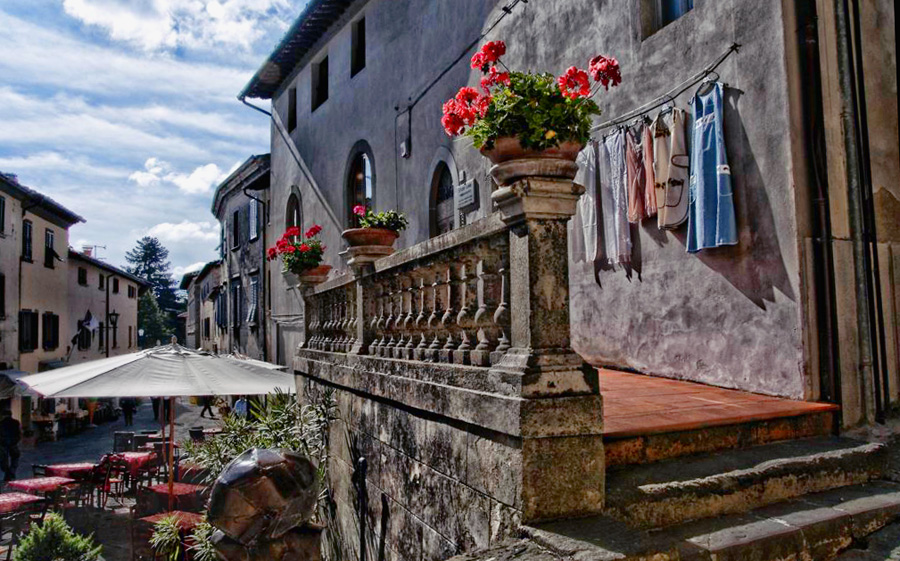
Just returned from Italy...I loved this scene. I "want" a fine art look. Comments?
This is a discussion on Laundry in Chianti within the Critiques forums, part of the Photography & Fine art photography category; Just returned from Italy...I loved this scene. I "want" a fine art look. Comments?...
Just returned from Italy...I loved this scene. I "want" a fine art look. Comments?
First thing that come to eye is it seems not level. Feels sltanted to teh right. I find it a bit dark as well. I can tell it was shot with the sun out with all the shadows but still it has an overall darkness to it. I think I would also up the saturations in the red and blues..get the flowers, clothes, walkway and tables below to stand out a bit more against the bleakness of the stone.
Love the clothes hanging out. I think it's a neat shot overall!
My new blog as of Nov/10
http://katchickloski.wordpress.com/
it looks better to me. I still see the slant though. I might even consider cropping out the left side. I love the detail of the stonework and the laundry. I wish I was there. lol
Feel free to make comments on any of my shots
my blog: http://bambesblog.blogspot.com/
My flickr photostream: http://www.flickr.com/photos/bambe1964/
A painter takes their vision and makes it a reality. A photographer takes reality and makes it their vision.
Hi
I love the detail in this photo especially the dresses and the flower pots on the wall.
It does need straightening slightly as mentioned before.
It's a shame the umbrella obscures the view down the street as the diagonal lines of the buildings would lead your eye into the photograph.
Taffy
I think the second definitely has lightened up. The tilt is still predominant. I did this up really quickly but if I had more time I'd play around more. I dodged under the umbrella so there was some detail brought back out. The colors in the flowers/clothing but it also altered the wall color but that doesn't have to happen if you have time. Not to sure if this helps at all. I say keep playing a bit!

My new blog as of Nov/10
http://katchickloski.wordpress.com/
i agree with everybody, it needs straightening, a bit of lightening and a pity as taffy says the umbrella obscures the view.
i had the time and kept playing around and this came out.

Too busy for my taste ... nothing to really focus on, my eye keeps jumping from place to place ...
I'd crop out the left side considerably ... maybe to the center of the umbrella ... and ditto with the bottom, to get that stone post out of the image. You will still have the beginning of the landing in there, but that post keeps tripping me up ...
Come to think of it: if you cropped the left part between the two flower pots on the railing, then you would still have the entry way in the image, but your focus would now be more on the laundry ... as your title suggests....
~~ Beauty is in the eye of the beer holder ~~
My eye is drawn to the "orb" of light on the eaves above the 3rd flowerpot, and I cant get passed it!
I guess for me, you have to decide what you want the main focus of the image to be about. Right now, in the original, there are two scenes, one of the restaurant and the other of the laundry and as it is,there are just too many elements competing for my interest in the photo which is why I think it does not work as it is. The light is beautiful and the textures of the building are awesome and I can see what made you take the shot, however all the elements happening (the restaurant, the laundry flower pots, buildings chairs, tables etc), make it just too confusing to figure out the central story.
I can see definitely the laundry on the line is way more interesting therefore I agree and think it should be the central focus of the image. I really like what EdB did with the photo in post as I think it is much stronger and tells a better story here.
I hope that helps.
"Life is like photography, we develop from the negatives"-anonymous
My website: www.albertaandbeyond.com

Bookmarks