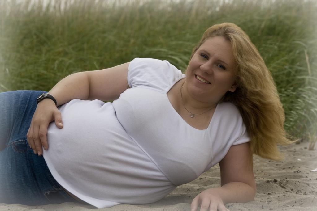
Personally, I don't like how any of these turned out... C&C for future shots would be greatly appreciated....

This is a discussion on My First Maternity Shoot.... C&C? within the Critiques forums, part of the Photography & Fine art photography category; Personally, I don't like how any of these turned out... C&C for future shots would be greatly appreciated.......
Personally, I don't like how any of these turned out... C&C for future shots would be greatly appreciated....

Last edited by PaulaLynn; 09-08-2008 at 08:32 PM. Reason: Too Small
Okay, I like the ideas, and the composition of #1 is nice, BUT there are definitely some issues. First off, it's under-exposed and rather muddy looking. I think this needs to be at least 2/3 maybe one full stop brighter. I think the current image could be greatly improved with some adjustment to contrast and a curves 'tweak'. I would also like to see them looking to image left, or "into" the frame rather than out of it.
The second image is perhaps just a little bit under-exposed, but not bad. I would suggest a saturation boost, and a standard, but slight 's' curve adjustment to the levels. One area where this could be really improved is in the eyes. The use of a reflector or small fill-light to put some catchlights in her eyes would have made a lot of difference. Also, when doing work like this, try and remove things like the wristwatch which isn't all that attractive.
Overall, I like the direction your going, and hope I've provided some insight into some of the technical areas. You may also want to look at doing your shoots earlier in the day, when the sun is low, and the light better.
Just my $00.02 worth - your milage may vary.
~John
Thank you very much for your comments/critique. One thing I have been noticing in PP is that when I process them in Raw, they look right but when I post them/print them they turn out either too bright or too dark. Would that be because my monitor isn't calibrated yet? If I'm just posting them and not printing them though, it shouldn't make a difference should it?
the mothers bra lines are very noticable and distracting. i would 'push' them, to blend it together.

Bookmarks