Results 1 to 10 of 10

Trip through Cajun Country

This is a discussion on Trip through Cajun Country within the Black and White - Monochrome/Monotone - photography forum forums, part of the Photography & Fine art photography category; I decided to just drive south, hit a few nice places, ended up on the shrimp boats dock (of course ...

  1. #1
    theantiquetiger's Avatar
    theantiquetiger is offline Moderator
    Join Date
    Aug 2011
    Location
    Baton Rouge
    Posts
    2,774
    My Photos
    Please feel free to edit my photos
    Critiques
    Critique my photos anywhere in the forum

    Default Trip through Cajun Country

    I decided to just drive south, hit a few nice places, ended up on the shrimp boats dock (of course I had to buy some)

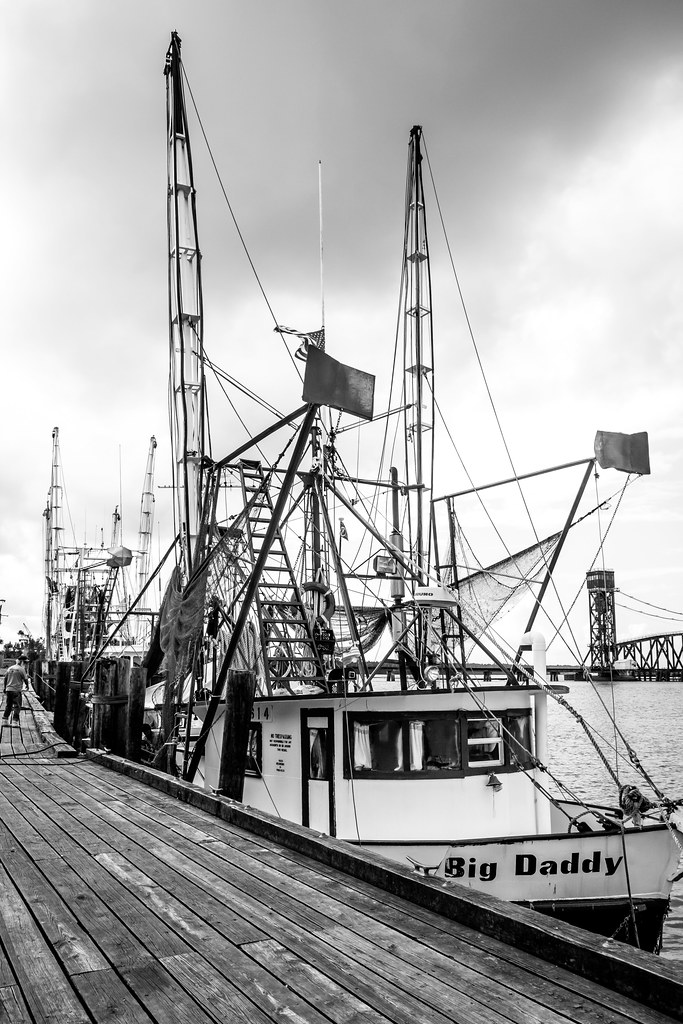
    shrimpboat by Theantiquetiger, on Flickr

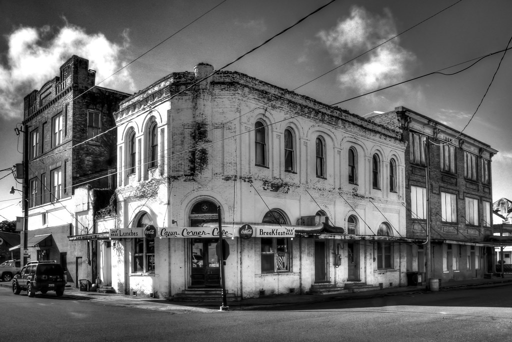
    cajuncorner1 by Theantiquetiger, on Flickr

    cajuncorner2 by Theantiquetiger, on Flickr

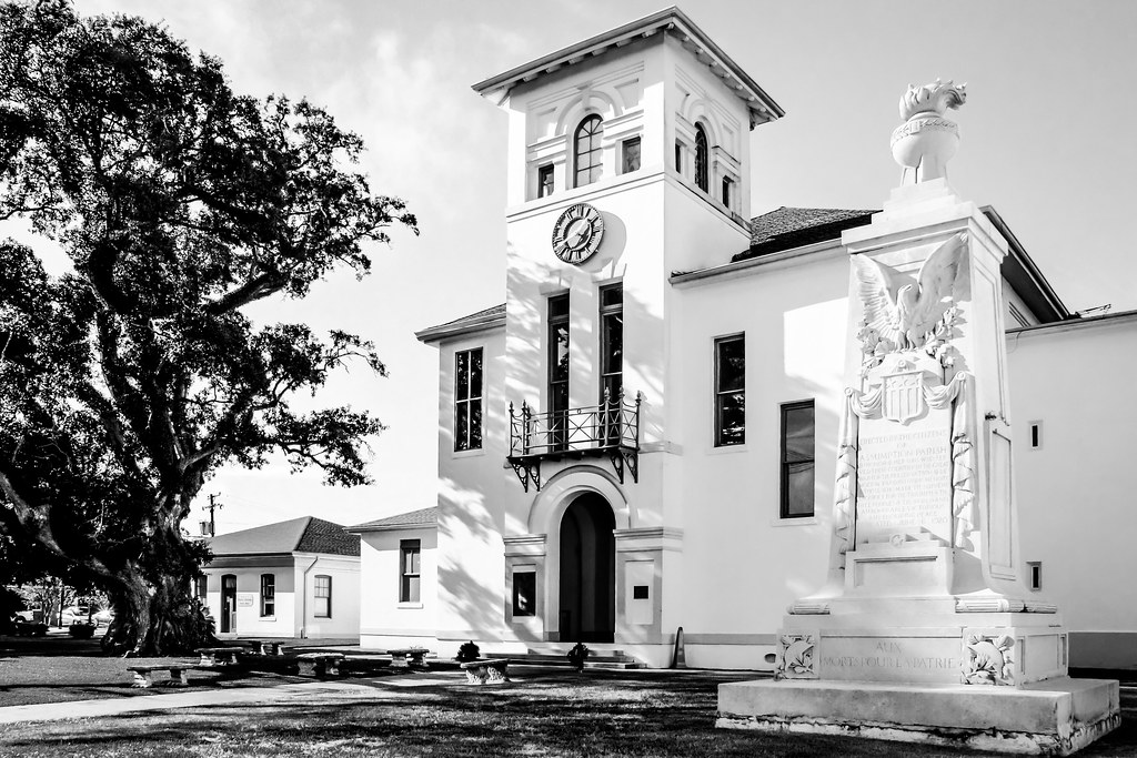
    napvillecourt by Theantiquetiger, on Flickr

    bridge by Theantiquetiger, on Flickr

    lovebirds by Theantiquetiger, on Flickr

    nap clock by Theantiquetiger, on Flickr
    Last edited by theantiquetiger; 10-09-2014 at 10:56 PM.
    "The worst thing about taking a great image is that your next one has to be better!"

  2. #2
    Jim Scrimger is offline Senior Member
    Join Date
    Jun 2013
    Location
    Prescott, Ontario
    Posts
    529
    My Photos
    Please ask before editing my photos
    Critiques
    Critique my photos anywhere in the forum

    Default

    Very strong images, nice work.

  3. #3
    Marko's Avatar
    Marko is offline Administrator
    Join Date
    May 2005
    Location
    Montreal, QC. Canada
    Posts
    14,870
    My Photos
    Please do NOT edit my photos
    Critiques
    Critique my photos anywhere in the forum

    Default

    Shots 2 and 7 are my faves of the set....but the whole set feels underexposed to me.
    Shot 2 can sing so much louder imo (once the shadow detail is saved)
    - Please connect with me further
    Photo tours of Montreal - Private photography courses
    - Join the new Photography.ca Facebook page
    - Follow me on Twitter http://twitter.com/markokulik
    - Follow me on Google+ https://plus.google.com/u/0/111159185852360398018/posts
    - Check out the photography podcast


    "You have to milk the cow quite a lot, and get plenty of milk to get a little cheese." Henri Cartier-Bresson from The Decisive Moment.

  4. #4
    Zenbohemian's Avatar
    Zenbohemian is offline Member
    Join Date
    Mar 2014
    Location
    Toronto, Ontario, Canada
    Posts
    33
    My Photos
    Please ask before editing my photos
    Critiques
    Critique my photos anywhere in the forum

    Default

    I think two is the strongest. I like the mood it invokes, the composition, and for the most part I like the post-processing. My main comment would be that too much detail is lost in the shadows. Is it possible to bring that up a bit?

  5. #5
    theantiquetiger's Avatar
    theantiquetiger is offline Moderator
    Join Date
    Aug 2011
    Location
    Baton Rouge
    Posts
    2,774
    My Photos
    Please feel free to edit my photos
    Critiques
    Critique my photos anywhere in the forum

    Default

    I think I process my images darker (for some reason). None of the images underexposed before PP, just a bad habit that I have.

    Here is a very quick re-edit, just increased the shadow slider and exposure slider just a tad

    cajuncorner3 by Theantiquetiger, on Flickr

    Here it is from the original post
    cajuncorner1 by Theantiquetiger, on Flickr

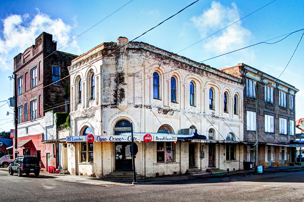
    And I know this is a B/W thread, but I did do a color version

    cajuncornercolor by Theantiquetiger, on Flickr
    "The worst thing about taking a great image is that your next one has to be better!"

  6. #6
    Zenbohemian's Avatar
    Zenbohemian is offline Member
    Join Date
    Mar 2014
    Location
    Toronto, Ontario, Canada
    Posts
    33
    My Photos
    Please ask before editing my photos
    Critiques
    Critique my photos anywhere in the forum

    Default

    I do like the new version better.

    And the colour is interesting -- I like to see how they look originally -- but I don't think it adds anything to the photo. I think the black and white gives it much better ambiance, not to mention the composition and lines pop more. Good call on going with b&w.

  7. #7
    Marko's Avatar
    Marko is offline Administrator
    Join Date
    May 2005
    Location
    Montreal, QC. Canada
    Posts
    14,870
    My Photos
    Please do NOT edit my photos
    Critiques
    Critique my photos anywhere in the forum

    Default

    I like the lighter version better as well. Cool image.
    The SUV could still withstand a good dodge - though u did mention that it was a quick edit.
    - Please connect with me further
    Photo tours of Montreal - Private photography courses
    - Join the new Photography.ca Facebook page
    - Follow me on Twitter http://twitter.com/markokulik
    - Follow me on Google+ https://plus.google.com/u/0/111159185852360398018/posts
    - Check out the photography podcast


    "You have to milk the cow quite a lot, and get plenty of milk to get a little cheese." Henri Cartier-Bresson from The Decisive Moment.

  8. #8
    theantiquetiger's Avatar
    theantiquetiger is offline Moderator
    Join Date
    Aug 2011
    Location
    Baton Rouge
    Posts
    2,774
    My Photos
    Please feel free to edit my photos
    Critiques
    Critique my photos anywhere in the forum

    Default

    a couple more re-edits to ones above

    nap court2 by Theantiquetiger, on Flickr

    bigdaddy3 by Theantiquetiger, on Flickr


    Here are the edits from the original post

    napvillecourt by Theantiquetiger, on Flickr

    shrimpboat by Theantiquetiger, on Flickr
    Last edited by theantiquetiger; 10-11-2014 at 04:03 AM.
    "The worst thing about taking a great image is that your next one has to be better!"

  9. #9
    Marko's Avatar
    Marko is offline Administrator
    Join Date
    May 2005
    Location
    Montreal, QC. Canada
    Posts
    14,870
    My Photos
    Please do NOT edit my photos
    Critiques
    Critique my photos anywhere in the forum

    Default

    Maybe it's just this set, but the blacks have nearly no detail - even in the edits. To me these look (possibly) underexposed at capture.
    - Please connect with me further
    Photo tours of Montreal - Private photography courses
    - Join the new Photography.ca Facebook page
    - Follow me on Twitter http://twitter.com/markokulik
    - Follow me on Google+ https://plus.google.com/u/0/111159185852360398018/posts
    - Check out the photography podcast


    "You have to milk the cow quite a lot, and get plenty of milk to get a little cheese." Henri Cartier-Bresson from The Decisive Moment.

  10. #10
    mbrager's Avatar
    mbrager is offline Senior Member
    Join Date
    Nov 2009
    Location
    Calgary, Canada
    Posts
    1,657
    My Photos
    Please feel free to edit my photos
    Critiques
    Critique my photos anywhere in the forum

    Default

    I like these shots, especially as a set. The Cajun Corner shot has so much detail that comes out in the color version. I would have dodged (or in lightroom set the adjustment brush on Dodge with some added contrast), all the shadow areas in the picture to bring out the detail. I like the color and light in the windows, but this is missing in the BW versions. Have you played with Silver FX Pro?
    Existence has no goal. It is pure journey. The journey in life is so beautiful, who bothers for the destination. B. Rajneesh
    Flickr

Bookmarks

Posting Permissions

  • You may not post new threads
  • You may not post replies
  • You may not post attachments
  • You may not edit your posts
  •  

1 2 3 4 5 6 7 8 9 10 11 12 13 14 15 16 17 18 19 20 21 22 23 24 25 26 27 28 29 30 31 32 33 34 35 36