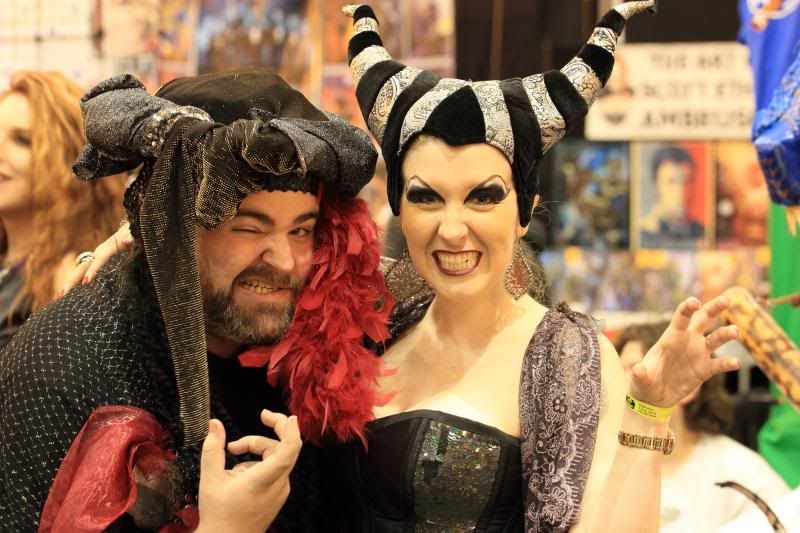
Once again, an image I found in an old folder that I never did process. This is from the ComicCon in New Orleans a few months ago.
evil queen by Theantiquetiger, on Flickr
This is a discussion on Evil Queen!!! within the Black and White - Monochrome/Monotone - photography forum forums, part of the Photography & Fine art photography category; Once again, an image I found in an old folder that I never did process. This is from the ComicCon ...
Once again, an image I found in an old folder that I never did process. This is from the ComicCon in New Orleans a few months ago.
evil queen by Theantiquetiger, on Flickr
"The worst thing about taking a great image is that your next one has to be better!"
First impression is cool shot for sure, great expression! I think I would have tried to get her full hat in the frame, but because her expression and his pose work so well - the shot is still a definite keeper.
Post processing wise - I really like the BW here. If it were ,mine I'd likely try to milk more shadow detail from the deepest blacks in both hats. I'd also dodge the man's face by a good 10-15%
Hope that may help and just my opinion.
- Please connect with me further
Photo tours of Montreal - Private photography courses
- Join the new Photography.ca Facebook page
- Follow me on Twitter http://twitter.com/markokulik
- Follow me on Google+ https://plus.google.com/u/0/111159185852360398018/posts
- Check out the photography podcast
"You have to milk the cow quite a lot, and get plenty of milk to get a little cheese." Henri Cartier-Bresson from The Decisive Moment.
Thanks Marko. One of the reasons I skipped this image when I first shot it, I did capture her entire hat, but she is doing some kind of cat claw pose with her left hand. It looked funny to me, plus, the BG behind her left hand had some bad distractions. This image is cropped quite a bit. Her hat goes further up then you might think. It was a pretty tall hat. plus, his hand is just off frame at the bottom center, making an evil eye gesture. I tried to crop to keep her hand or his hand, but it cut off part of the other hand, so I cropped both of them out.
Here is the original untouched

Last edited by theantiquetiger; 05-13-2014 at 02:55 PM.
"The worst thing about taking a great image is that your next one has to be better!"
Nerds! I like it. The B&W processing is very nice. Seeing the original below it's easy to see that you've grasped the concept of composition well here, especially how what you don't show is as important as what you do.
Thanks for posting the original.
Given that I now see the full hat and part of the environment the shot is different. Your tight crop works in shot 1.
But I think this original also works if toy were to process it BW. Biggest distraction for me is the girl on left edge - I;'d crop her out. Then I'd burn the bottom right.
The background adds to the carnival feeling and 'sense of place' for me.
Hope that may help.
- Please connect with me further
Photo tours of Montreal - Private photography courses
- Join the new Photography.ca Facebook page
- Follow me on Twitter http://twitter.com/markokulik
- Follow me on Google+ https://plus.google.com/u/0/111159185852360398018/posts
- Check out the photography podcast
"You have to milk the cow quite a lot, and get plenty of milk to get a little cheese." Henri Cartier-Bresson from The Decisive Moment.
Nice shot, AT. I like that you posted the original--I completely get your decision making on this one.
Please feel free to critique my work.
Blog:http://jasonneely.com/blog
Facebook: https://www.facebook.com/jasonneelyphotography

Bookmarks