Results 1 to 8 of 8

Ice Tea anyone?

This is a discussion on Ice Tea anyone? within the Black and White - Monochrome/Monotone - photography forum forums, part of the Photography & Fine art photography category; You darn Canadians had to send that arctic blast down here last night, it got to 20 deg (-7 deg ...

  1. #1
    theantiquetiger's Avatar
    theantiquetiger is offline Moderator
    Join Date
    Aug 2011
    Location
    Baton Rouge
    Posts
    2,774
    My Photos
    Please feel free to edit my photos
    Critiques
    Critique my photos anywhere in the forum

    Default Ice Tea anyone?

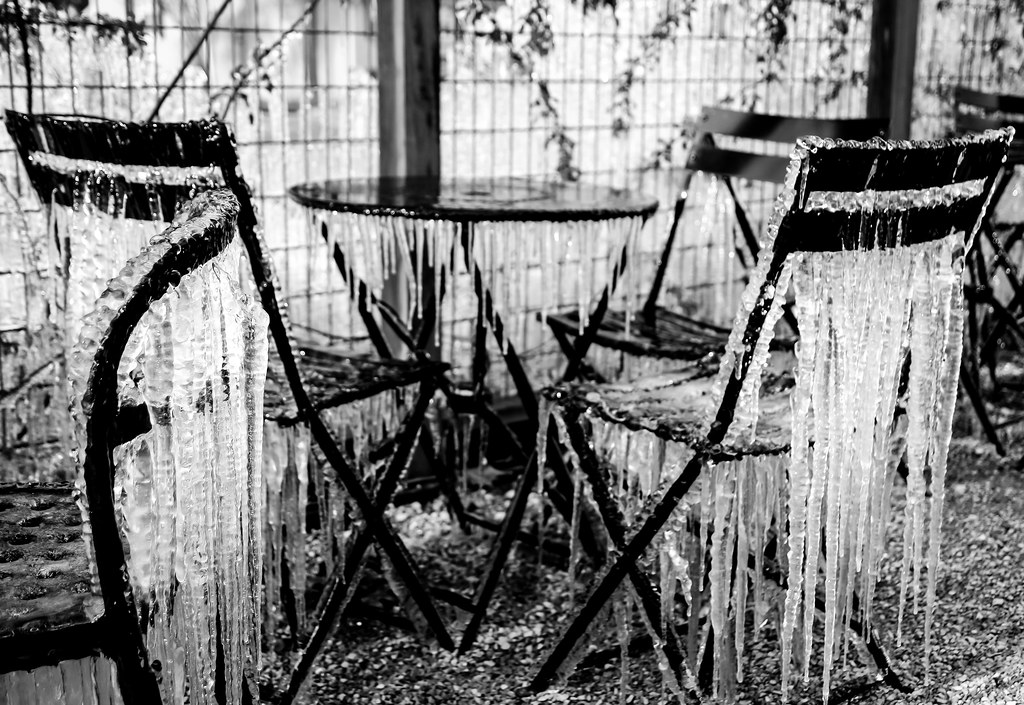
    You darn Canadians had to send that arctic blast down here last night, it got to 20 deg (-7 deg C). This is a small coffee shop that forgot to turn off the auto-sprinkler on the front courtyard


    ice tea by Theantiquetiger, on Flickr


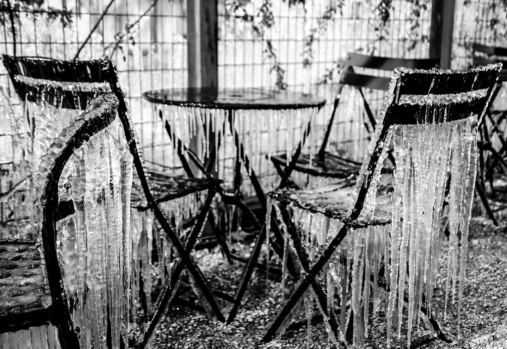
    ice tea2 by Theantiquetiger, on Flickr


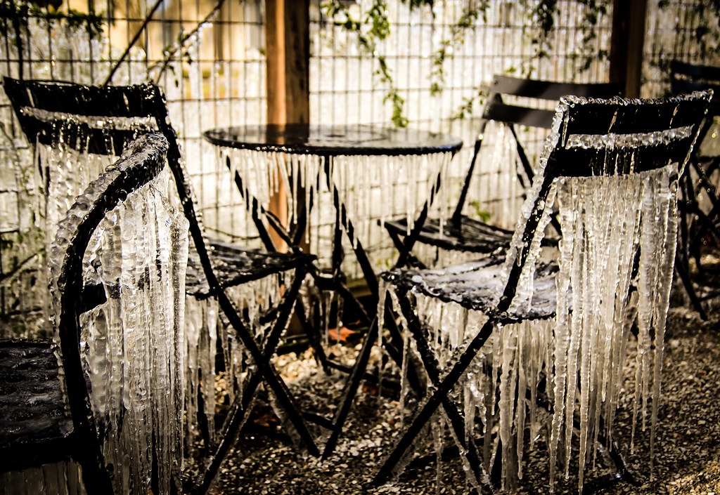
    ice tea color by Theantiquetiger, on Flickr
    Last edited by theantiquetiger; 01-07-2014 at 04:33 PM.
    "The worst thing about taking a great image is that your next one has to be better!"

  2. #2
    aubintbay's Avatar
    aubintbay is offline Senior Member
    Join Date
    Feb 2010
    Location
    Thunder Bay
    Posts
    1,677
    My Photos
    Please feel free to edit my photos
    Critiques
    Critique my photos anywhere in the forum

    Default

    Only too happy to help you get a nice shot like this one! The b/w treatment here is really working.

  3. #3
    Marko's Avatar
    Marko is offline Administrator
    Join Date
    May 2005
    Location
    Montreal, QC. Canada
    Posts
    14,870
    My Photos
    Please do NOT edit my photos
    Critiques
    Critique my photos anywhere in the forum

    Default

    Nice capture AT.
    I really dig the highlight detail in the icicles!
    I like the BW overall here as well though on my monitor, the black chairs and the blacks in general may (not 100% sure) be a bit too black.
    - If you're up for it I'd love to see a version with maybe a 15% or so reduction in the blacks. (meaning the blacks should be globally reduced in intensity by about 15%)
    If this were mine, at the end of it all, to finesse the contrast even further I might burn the shadows in the icicles. This would add contrast and make the details in them pop harder. I find it's always the small details that make photos sing their loudest - and local contrast control is a big part of it (for me anyway).
    Hope you had fun there - Lots of photo ops if u can brace the cold.
    - Please connect with me further
    Photo tours of Montreal - Private photography courses
    - Join the new Photography.ca Facebook page
    - Follow me on Twitter http://twitter.com/markokulik
    - Follow me on Google+ https://plus.google.com/u/0/111159185852360398018/posts
    - Check out the photography podcast


    "You have to milk the cow quite a lot, and get plenty of milk to get a little cheese." Henri Cartier-Bresson from The Decisive Moment.

  4. #4
    theantiquetiger's Avatar
    theantiquetiger is offline Moderator
    Join Date
    Aug 2011
    Location
    Baton Rouge
    Posts
    2,774
    My Photos
    Please feel free to edit my photos
    Critiques
    Critique my photos anywhere in the forum

    Default

    Quote Originally Posted by Marko View Post
    Nice capture AT.
    I really dig the highlight detail in the icicles!
    I like the BW overall here as well though on my monitor, the black chairs and the blacks in general may (not 100% sure) be a bit too black.
    - If you're up for it I'd love to see a version with maybe a 15% or so reduction in the blacks. (meaning the blacks should be globally reduced in intensity by about 15%)
    If this were mine, at the end of it all, to finesse the contrast even further I might burn the shadows in the icicles. This would add contrast and make the details in them pop harder. I find it's always the small details that make photos sing their loudest - and local contrast control is a big part of it (for me anyway).
    Hope you had fun there - Lots of photo ops if u can brace the cold.
    Done, added to the original post. I don't notice much of a change in the black of the chairs because the were a solid metal black. I do notice the big difference in the icicles after burning the shadows of them.

    I also added the color version
    "The worst thing about taking a great image is that your next one has to be better!"

  5. #5
    asnow is offline Senior Member
    Join Date
    Jul 2010
    Location
    mississauga, on
    Posts
    4,977
    My Photos
    Please feel free to edit my photos
    Critiques
    Critique my photos anywhere in the forum

    Default

    You darn Canadians had to send that arctic blast down here last night
    Welcome to our world. I quite like this picture (the B&W one). I have to admit I'm not too fussy with the color one. As you indicate and seem to be quite open to editing your pictures, I thought I'd give it a shot. To be honest I'm not sure if I've improved it or made it worse.

    p.s.
    **Edit**
    Now that I can see both on the screen I think your ice tea2 is better than mine.
    Attached Images Attached Images  


  6. #6
    theantiquetiger's Avatar
    theantiquetiger is offline Moderator
    Join Date
    Aug 2011
    Location
    Baton Rouge
    Posts
    2,774
    My Photos
    Please feel free to edit my photos
    Critiques
    Critique my photos anywhere in the forum

    Default

    Quote Originally Posted by asnow View Post
    Welcome to our world. I quite like this picture (the B&W one). I have to admit I'm not too fussy with the color one. As you indicate and seem to be quite open to editing your pictures, I thought I'd give it a shot. To be honest I'm not sure if I've improved it or made it worse.

    p.s.
    **Edit**
    Now that I can see both on the screen I think your ice tea2 is better than mine.
    No problem editing my images. It appears you lost detail in the icicles. I like my second edit above (which is actually Marko's edit suggestions, it just took me 10 secs to do it)
    "The worst thing about taking a great image is that your next one has to be better!"

  7. #7
    Hillbillygirl is offline Senior Member
    Join Date
    Jan 2010
    Location
    Muskoka, Ontario
    Posts
    5,612
    My Photos
    Please do NOT edit my photos
    Critiques
    Only critique photos posted in the critique forum

    Default

    Nicely done on that 2nd edit AT, and anytime us Canucks can help get ya' a beautiful shot such as this, more than obliged to help. Just a little taste of our winters eh.
    Reality is a nice place to visit, but I wouldn't want to live there!

  8. #8
    Marko's Avatar
    Marko is offline Administrator
    Join Date
    May 2005
    Location
    Montreal, QC. Canada
    Posts
    14,870
    My Photos
    Please do NOT edit my photos
    Critiques
    Critique my photos anywhere in the forum

    Default

    I like your 2nd edit AT. I also like the colour version but the saturation is a bit high.
    Not sure if you did this while you were playing, (This is something i do all the time and highly, highly recommend) but did you see how it would look when you went overboard (maybe 30% increase in shadow detail).?
    I'd love to see additional shadow detail as a test (and I would guess the detail is indeed available in the file)...unless you already tried it and it looks bad. Milking details from the extremes is a fabulous way to make images sing louder. Hope that may help.
    - Please connect with me further
    Photo tours of Montreal - Private photography courses
    - Join the new Photography.ca Facebook page
    - Follow me on Twitter http://twitter.com/markokulik
    - Follow me on Google+ https://plus.google.com/u/0/111159185852360398018/posts
    - Check out the photography podcast


    "You have to milk the cow quite a lot, and get plenty of milk to get a little cheese." Henri Cartier-Bresson from The Decisive Moment.

Bookmarks

Posting Permissions

  • You may not post new threads
  • You may not post replies
  • You may not post attachments
  • You may not edit your posts
  •  

1 2 3 4 5 6 7 8 9 10 11 12 13 14 15 16 17 18 19 20 21 22 23 24 25 26 27 28 29 30 31 32 33 34 35 36