Results 1 to 9 of 9

Macau streets, in mono

This is a discussion on Macau streets, in mono within the Black and White - Monochrome/Monotone - photography forum forums, part of the Photography & Fine art photography category; A few shots from a night in Macau last week. Macau is a sleepy little ex-Portuguese colony 30 miles down ...

  1. #1
    thoughton's Avatar
    thoughton is offline Senior Member
    Join Date
    Mar 2011
    Location
    Essex, UK
    Posts
    363
    My Photos
    Please feel free to edit my photos
    Critiques
    Critique my photos anywhere in the forum

    Default Macau streets, in mono

    A few shots from a night in Macau last week. Macau is a sleepy little ex-Portuguese colony 30 miles down the coast from Hong Kong which has always been a popular weekend destination for the Portuguese flavour and knackered old casinos. It has changed a lot since all the huge flashy Las Vegas casinos recently moved in. We stayed at the Venetian, which was an experience in itself

    Comments or criticism would be welcome.

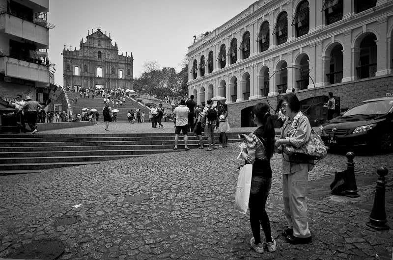
    Saint's walk


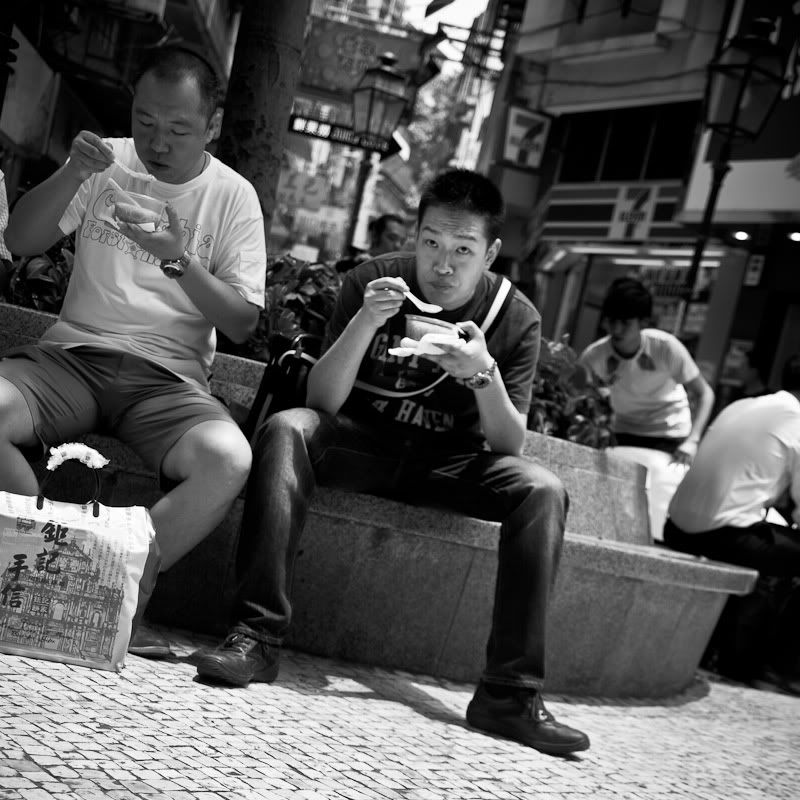
    Streetside soup


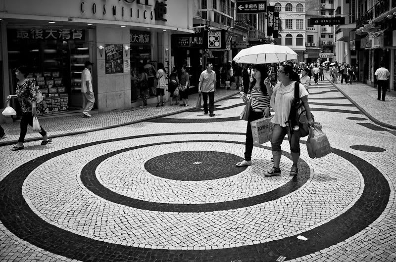
    Approaching target


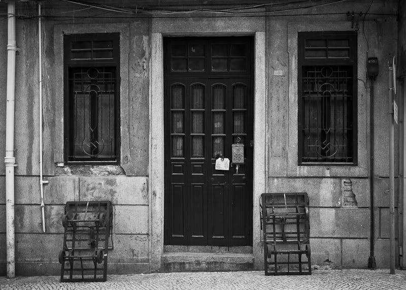
    Two trolleys
  2. #2
    Marko's Avatar
    Marko is offline Administrator
    Join Date
    May 2005
    Location
    Montreal, QC. Canada
    Posts
    14,870
    My Photos
    Please do NOT edit my photos
    Critiques
    Critique my photos anywhere in the forum

    Default

    hey Tim,

    Please PM me for tech probs and it's my pleasure to help.

    I like shot 4 the best here - good comp and tones.

    The people shots just aren't doing it for me I'm afraid, they are just a bit "too" candid for my taste without that much "going on" if that makes sense.

    Shot 2 is the most interesting of the people shots imo, but only because I see a 7-11 in the background which suggests an East meets West Juxtaposition to me.
    If that sign were not there then it would just be people eating soup... Just my 2 cents.
    - Please connect with me further
    Photo tours of Montreal - Private photography courses
    - Join the new Photography.ca Facebook page
    - Follow me on Twitter http://twitter.com/markokulik
    - Follow me on Google+ https://plus.google.com/u/0/111159185852360398018/posts
    - Check out the photography podcast


    "You have to milk the cow quite a lot, and get plenty of milk to get a little cheese." Henri Cartier-Bresson from The Decisive Moment.

  3. #3
    Mad Aussie's Avatar
    Mad Aussie is offline Moderator
    Join Date
    Dec 2008
    Location
    Brisbane, Qld, Australia
    Posts
    14,098
    My Photos
    Please ask before editing my photos

    Default

    I'm going to disagree with Marko on this one ... candid though they may be, I think you've done a great job on making that not apparent.
    Love the lighting in shot 2.
    The positioning of the two women in the bottom corner of the first shot is excellent as one of them is looking straight at the structure/chapel in the top left. This is excellent 'leading' for the viewer!
    I also think the composition in the 3rd shot is good too. The street curves nicely though the photo and the two women walking onto the big circle are well placed also.
    The only one that doesn't do a single thing for me is the last shot. Nothing special or interesting to me in there at all.

    Very nice work.

  4. #4
    thoughton's Avatar
    thoughton is offline Senior Member
    Join Date
    Mar 2011
    Location
    Essex, UK
    Posts
    363
    My Photos
    Please feel free to edit my photos
    Critiques
    Critique my photos anywhere in the forum

    Default

    Thanks for the detailed comments guys! Much appreciated I find it very interesting to see the variety of responses to these (I also posted them on another small forum I visit). 4 seems to be a very love/hate photo

    2 is my favourite, mainly for the lighting, his look, and the soup. I thought it was quite unusual to see people drinking soup on the street, although perhaps not in Montreal

    Sorry it took me so long to respond, I have only just arrived back in the UK. Anyway, thanks again.

  5. #5
    Iguanasan's Avatar
    Iguanasan is offline Moderator
    Join Date
    Jan 2009
    Location
    Halifax, NS
    Posts
    10,917
    My Photos
    Please feel free to edit my photos
    Critiques
    Critique my photos anywhere in the forum

    Default

    I like shot #1 for the exact same reasons as Mad Aussie. I like to shoot on the street and what most of the images seem to be missing for me is what Jay Maisel calls gesture. The first one has that. One woman is looking at the younger an she, in turn, is looking up the hill at the church facade or whatever it is. As you follow her gaze upward you see more people looking up towards it as well and then to see the windows wide open like that makes me curious about such a structure.
    “If you are out there shooting, things will happen for you. If you’re not out there, you’ll only hear about it.” – Jay Maisel
    ~~~~~~~~~~~~~~~~~~~~~~~~~~~~~~~~~~~~~~~
    Feel free to edit my shots ONLY for use on this forum and critique my shots in ANY discussion area.
    Flickr | Blog | Google+

  6. #6
    thoughton's Avatar
    thoughton is offline Senior Member
    Join Date
    Mar 2011
    Location
    Essex, UK
    Posts
    363
    My Photos
    Please feel free to edit my photos
    Critiques
    Critique my photos anywhere in the forum

    Default

    Thanks Iggy!

    The wall is the facade of St Paul's Cathedral which was destroyed by earthquake and fire in the 15 or 1600s. It has essentially become the main tourist attraction of Macau these days (other than casinos of course ).

  7. #7
    edG's Avatar
    edG
    edG is offline Senior Member
    Join Date
    Jan 2010
    Location
    Niagara Falls
    Posts
    2,841
    My Photos
    Please do NOT edit my photos
    Critiques
    Critique my photos anywhere in the forum

    Default

    I see shot # four as an attempt at symmetry to the nth degree: on the left one pipe, one conduit, on the right a different colour conduit and sign post (pipe), two identical symmetrical windows, an entrance based on set of two bifold doors that are identical with two identical carts placed on either side and then it all goes to hell because they hung what looks like a mail box and a sign on one door only.
    " A good photograph is one that communicates a fact, touches the heart and leaves the viewer a changed person for having seen it. " Irving Penn

    " There are no rules for good photographs, there are only good photographs." - Ansel Adams

  8. #8
    Hillbillygirl is offline Senior Member
    Join Date
    Jan 2010
    Location
    Muskoka, Ontario
    Posts
    5,612
    My Photos
    Please do NOT edit my photos
    Critiques
    Only critique photos posted in the critique forum

    Default

    Liking the whole set Tim. Love your candid street photo abilities.
    Will have to agree with Ed. I actually don't mind that last shot. (now if you can clone out the mailbox and sign it would be perfect)
    Reality is a nice place to visit, but I wouldn't want to live there!

  9. #9
    thoughton's Avatar
    thoughton is offline Senior Member
    Join Date
    Mar 2011
    Location
    Essex, UK
    Posts
    363
    My Photos
    Please feel free to edit my photos
    Critiques
    Critique my photos anywhere in the forum

    Default

    Thanks edG and HBG! (see, I'm learning )

Bookmarks

Posting Permissions

  • You may not post new threads
  • You may not post replies
  • You may not post attachments
  • You may not edit your posts
  •  

1 2 3 4 5 6 7 8 9 10 11 12 13 14 15 16 17 18 19 20 21 22 23 24 25 26 27 28 29 30 31 32 33 34 35 36