Results 1 to 10 of 10

I give up...

This is a discussion on I give up... within the Architecture & Man Made (cities, buildings, roads, objects & abstracts) forums, part of the Show your photo (Color) - Landscape & Nature (flowers, mountains, storms etc.) category; I got the idea for this shot one morning while having a late breakfast. The light was pouring in through ...

  1. #1
    Barefoot's Avatar
    Barefoot is offline Senior Member
    Join Date
    Jan 2009
    Location
    Aiken, SC
    Posts
    2,401
    My Photos
    Please do NOT edit my photos
    Critiques
    Critique my photos anywhere in the forum

    Default I give up...

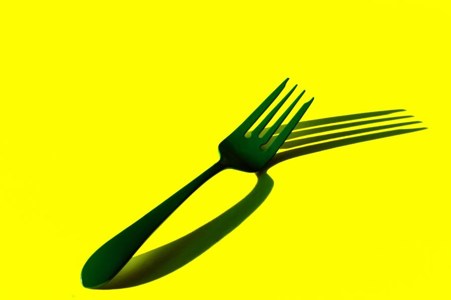
    I got the idea for this shot one morning while having a late breakfast. The light was pouring in through the window and caught a fork laying there on the table. After trying to duplicate what I saw under studio light with absolutely no luck whatsoever, I sort of forgot about it. And then, three mornings ago I saw the same thing again. I went to work on it right away and the first results were posted on the assignments page. It’s the devil to expose for using the fork as it comes from the drawer on a sheet of white in the streaming sunlight, so I decided to alter things a bit. I laid it on some fluorescent poster board thinking that might do it, but it didn’t work out very well as you can see on that other thread. The fork is too dark in most areas. Then I painted the fork green and tried it again. A little better, maybe? Paint the fork a lighter shade of green?

    After three straight mornings of working on this, I’ve finally thrown up my hands and said…Ah, Fork It!
    Last edited by Barefoot; 01-15-2010 at 05:37 PM.
    We don't see things as they are, we see them as we are. -Anaïs Nin

    http://barefoot.pixu.com/

  2. #2
    kat
    kat is offline Senior Member
    Join Date
    Jan 2009
    Location
    Vancouver
    Posts
    4,329
    My Photos
    Please ask before editing my photos
    Critiques
    Only critique photos posted in the critique forum

    Default

    Ha ha..it's neat! I quite like this.

    On a side note..I'm pretty forked at you!!!! GRRR..my next shot was of a fork! I was just given the family china..
    My new blog as of Nov/10
    http://katchickloski.wordpress.com/

  3. #3
    Marko's Avatar
    Marko is offline Administrator
    Join Date
    May 2005
    Location
    Montreal, QC. Canada
    Posts
    14,870
    My Photos
    Please do NOT edit my photos
    Critiques
    Critique my photos anywhere in the forum

    Default

    This is extremely creative, SHARP! and I totally dig it
    - Please connect with me further
    Photo tours of Montreal - Private photography courses
    - Join the new Photography.ca Facebook page
    - Follow me on Twitter http://twitter.com/markokulik
    - Follow me on Google+ https://plus.google.com/u/0/111159185852360398018/posts
    - Check out the photography podcast


    "You have to milk the cow quite a lot, and get plenty of milk to get a little cheese." Henri Cartier-Bresson from The Decisive Moment.

  4. #4
    kat
    kat is offline Senior Member
    Join Date
    Jan 2009
    Location
    Vancouver
    Posts
    4,329
    My Photos
    Please ask before editing my photos
    Critiques
    Only critique photos posted in the critique forum

    Default

    Just out of curiousity..what is it that you aren't too sure of this photo?
    My new blog as of Nov/10
    http://katchickloski.wordpress.com/

  5. #5
    Barefoot's Avatar
    Barefoot is offline Senior Member
    Join Date
    Jan 2009
    Location
    Aiken, SC
    Posts
    2,401
    My Photos
    Please do NOT edit my photos
    Critiques
    Critique my photos anywhere in the forum

    Default

    Quote Originally Posted by kat View Post
    Just out of curiousity..what is it that you aren't too sure of this photo?
    I think it’s the exposure that bothers me. I tried everything I could think of. Matrix metering sure as heck didn’t cut it. Center Weighted was only marginally better. Spot was as good as I was going to get out of the three. I dialed in + exposure compensation and – exposure compensation and of the two, +EV was naturally the best move. There’s just too much contrast between the fork and background to nail it down, I guess. That’s why I was wondering about changing the color of the fork to something lighter.

    Anyway, I want to see your fork. I've shown you mine, now show me yours.
    We don't see things as they are, we see them as we are. -Anaïs Nin

    http://barefoot.pixu.com/

  6. #6
    Barefoot's Avatar
    Barefoot is offline Senior Member
    Join Date
    Jan 2009
    Location
    Aiken, SC
    Posts
    2,401
    My Photos
    Please do NOT edit my photos
    Critiques
    Critique my photos anywhere in the forum

    Default

    Quote Originally Posted by Marko View Post
    This is extremely creative, SHARP! and I totally dig it
    I 'preciate that, Marko.
    We don't see things as they are, we see them as we are. -Anaïs Nin

    http://barefoot.pixu.com/

  7. #7
    Mad Aussie's Avatar
    Mad Aussie is offline Moderator
    Join Date
    Dec 2008
    Location
    Brisbane, Qld, Australia
    Posts
    14,098
    My Photos
    Please ask before editing my photos

    Default

    Your next step might have been a composite BF! Or even HDR

  8. #8
    casil403's Avatar
    casil403 is offline Senior Member
    Join Date
    Feb 2009
    Location
    Calgary Canada
    Posts
    6,612
    My Photos
    Please do NOT edit my photos
    Critiques
    Only critique photos posted in the critique forum

    Default

    I really like the contrast of colour here BF....it's striking.
    "Life is like photography, we develop from the negatives"-anonymous
    My website: www.albertaandbeyond.com

  9. #9
    kat
    kat is offline Senior Member
    Join Date
    Jan 2009
    Location
    Vancouver
    Posts
    4,329
    My Photos
    Please ask before editing my photos
    Critiques
    Only critique photos posted in the critique forum

    Default

    Quote Originally Posted by Mad Aussie View Post
    Your next step might have been a composite BF! Or even HDR
    That is what I was thinking. But to be honest I like what detail you have now!

    Not to sure if you want a cc here.. I really enjoy the overall look. The colors are a bit strong for my taste but the fork..and it's refection are fine to me! I could so see this on a really cool dinners wall!
    My new blog as of Nov/10
    http://katchickloski.wordpress.com/

  10. #10
    jchurill's Avatar
    jchurill is offline Member
    Join Date
    Dec 2009
    Location
    Michigan
    Posts
    71
    My Photos
    Please do NOT edit my photos

    Default

    Love it! The colors and angles are simple great! It's funny how the actual fork looks 2d and the shadow 3d

Bookmarks

Posting Permissions

  • You may not post new threads
  • You may not post replies
  • You may not post attachments
  • You may not edit your posts
  •  

1 2 3 4 5 6 7 8 9 10 11 12 13 14 15 16 17 18 19 20 21 22 23 24 25 26 27 28 29 30 31 32 33 34 35 36