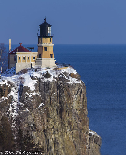
This is a discussion on Splitrock Lighthouse within the Architecture & Man Made (cities, buildings, roads, objects & abstracts) forums, part of the Show your photo (Color) - Landscape & Nature (flowers, mountains, storms etc.) category; On a recent spur-of-the-moment trip down the North Shore of Lake Superior to Duluth, I pulled into a rest stop ...
I like the composition and colors in this but I would remove the person. Just a personal pref.
I really like the comp here also, but have to agree with Lorey. Many times a person adds to scale, but here, i don't know.
Reality is a nice place to visit, but I wouldn't want to live there!
I too like the comp. I'm also sitting on the fence including the person. I think I'd have to see both to decide.
Thx gang....I appreciate the comments. They've got me thinking as well on this....soooooo....without further ado (SP?)... here it is without the person. I am feeling that this one looks a lot cleaner. And the scale isn't really lost at all with all the other surrounding structure. That was my only concern with taking out the person. Thanks for helping me see that! THis is why I love it on here!

I like em both.
- Please connect with me further
Photo tours of Montreal - Private photography courses
- Join the new Photography.ca Facebook page
- Follow me on Twitter http://twitter.com/markokulik
- Follow me on Google+ https://plus.google.com/u/0/111159185852360398018/posts
- Check out the photography podcast
"You have to milk the cow quite a lot, and get plenty of milk to get a little cheese." Henri Cartier-Bresson from The Decisive Moment.

Bookmarks