Results 1 to 8 of 8

West Light Rail Transit Sunalta Station

This is a discussion on West Light Rail Transit Sunalta Station within the Architecture & Man Made (cities, buildings, roads, objects & abstracts) forums, part of the Show your photo (Color) - Landscape & Nature (flowers, mountains, storms etc.) category; A new train line recently opened, and some of the new stations are interesting architecturally. This is the first on ...

  1. #1
    mbrager's Avatar
    mbrager is offline Senior Member
    Join Date
    Nov 2009
    Location
    Calgary, Canada
    Posts
    1,657
    My Photos
    Please feel free to edit my photos
    Critiques
    Critique my photos anywhere in the forum

    Default West Light Rail Transit Sunalta Station

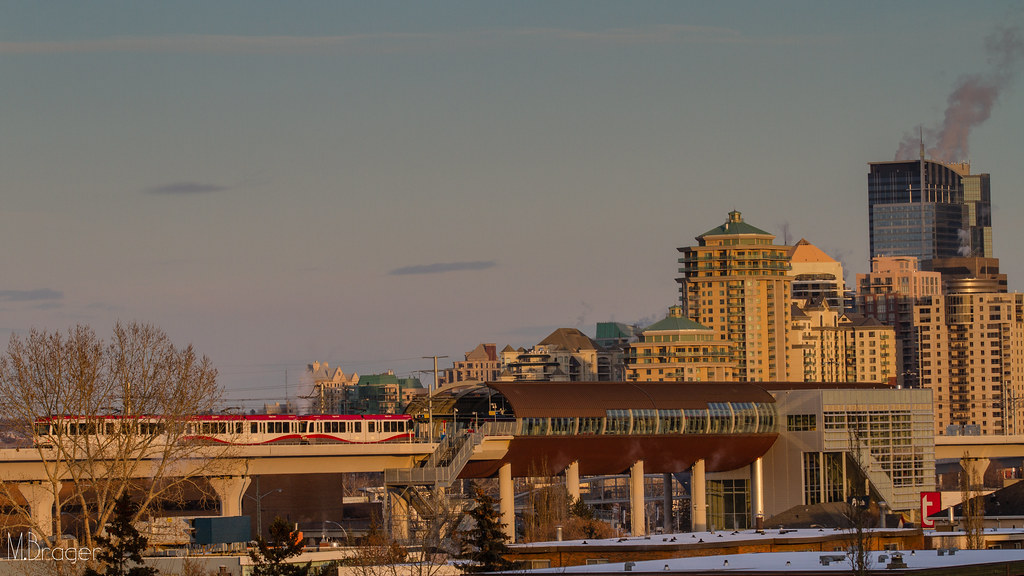
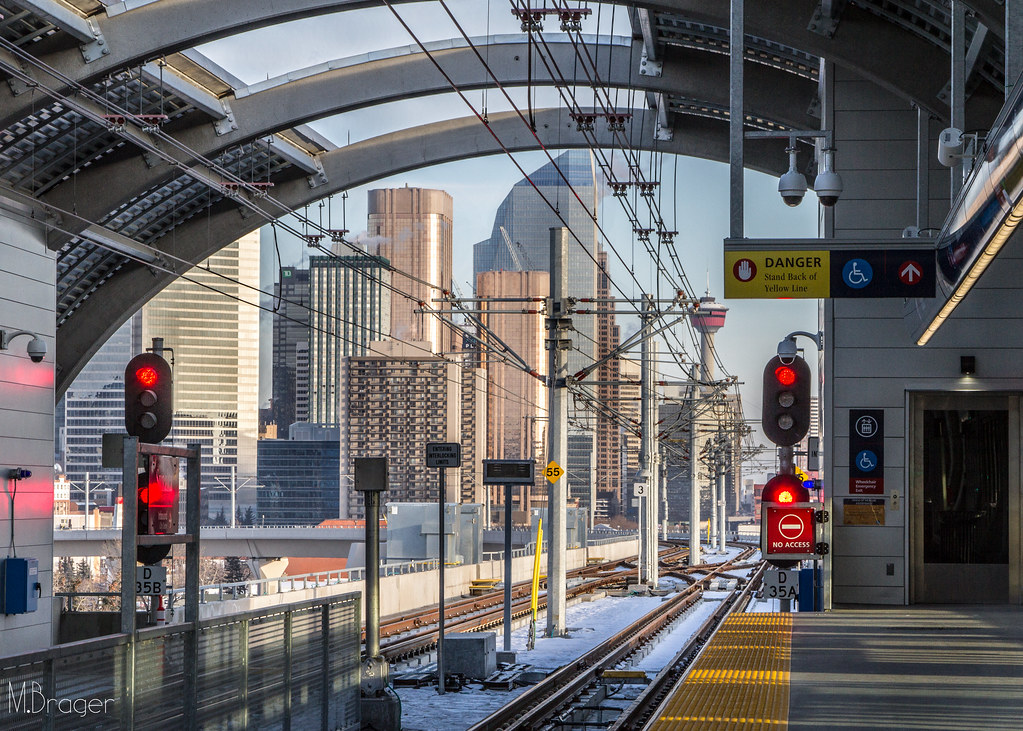
    A new train line recently opened, and some of the new stations are interesting architecturally. This is the first on the line. It's elevated and is large enough to accommodate four train cars.

    1. Sunalta Station at sunset


    2. City view from the platform


    3. Inside at ground level Sunalta Station (10 mm, f/4.5, 1/100)
    Existence has no goal. It is pure journey. The journey in life is so beautiful, who bothers for the destination. B. Rajneesh
    Flickr

  2. #2
    QuietOne is offline Senior Member
    Join Date
    Mar 2010
    Location
    Nampa, Idaho, USA
    Posts
    2,735
    My Photos
    Please ask before editing my photos

    Default

    I like the way the ceiling over the stairs and escalators seems to crowd down, and the way the sunlight washes across the scene.

  3. #3
    Marko's Avatar
    Marko is offline Administrator
    Join Date
    May 2005
    Location
    Montreal, QC. Canada
    Posts
    14,870
    My Photos
    Please do NOT edit my photos
    Critiques
    Critique my photos anywhere in the forum

    Default

    I quite like the comp of shot 2 here
    - Please connect with me further
    Photo tours of Montreal - Private photography courses
    - Join the new Photography.ca Facebook page
    - Follow me on Twitter http://twitter.com/markokulik
    - Follow me on Google+ https://plus.google.com/u/0/111159185852360398018/posts
    - Check out the photography podcast


    "You have to milk the cow quite a lot, and get plenty of milk to get a little cheese." Henri Cartier-Bresson from The Decisive Moment.

  4. #4
    Realist's Avatar
    Realist is offline Senior Member
    Join Date
    Mar 2007
    Location
    Oklahoma
    Posts
    931
    My Photos
    Please ask before editing my photos
    Critiques
    Critique my photos anywhere in the forum

    Default

    Quote Originally Posted by Marko View Post
    I quite like the comp of shot 2 here

    I have to agree with that, good shot.

    Very modern architecture, looks like a nice addition to the city.

  5. #5
    asnow is offline Senior Member
    Join Date
    Jul 2010
    Location
    mississauga, on
    Posts
    4,977
    My Photos
    Please feel free to edit my photos
    Critiques
    Critique my photos anywhere in the forum

    Default

    I like this set Mike

    1. Like that late afternoon lighting.
    2. I like the comp. Really give you that city commuter feel.
    3. I like the architecture in this one. Also the addition of the people give you a sense of perspective.

  6. #6
    Hillbillygirl is offline Senior Member
    Join Date
    Jan 2010
    Location
    Muskoka, Ontario
    Posts
    5,612
    My Photos
    Please do NOT edit my photos
    Critiques
    Only critique photos posted in the critique forum

    Default

    Quote Originally Posted by asnow View Post
    I like this set Mike

    1. Like that late afternoon lighting.
    2. I like the comp. Really give you that city commuter feel.
    3. I like the architecture in this one. Also the addition of the people give you a sense of perspective.
    Agree with everything Al says here. Would also like to add that I love the line work in #2 that draws the eye so deep into different depths/areas of the photo.
    Reality is a nice place to visit, but I wouldn't want to live there!

  7. #7
    Runmonty's Avatar
    Runmonty is offline Senior Member
    Join Date
    Dec 2011
    Location
    Adelaide, South Australia
    Posts
    4,095
    My Photos
    Please do NOT edit my photos
    Critiques
    Critique my photos anywhere in the forum

    Default

    I saw these on Flickr before you posted here and was immediatly drawn to the 2nd shot. I really like the sharp clean lines and framing of the city buildings. It does have a city commuter feel that asnow refers to. I also like the receding lines and triangles created in shot 3.
    I welcome all critique and comments on any of my photos

    Links to other places you can also find me :


  8. #8
    Mad Aussie's Avatar
    Mad Aussie is offline Moderator
    Join Date
    Dec 2008
    Location
    Brisbane, Qld, Australia
    Posts
    14,098
    My Photos
    Please ask before editing my photos

    Default

    I like the exposure and comp of shot 3 myself

Bookmarks

Posting Permissions

  • You may not post new threads
  • You may not post replies
  • You may not post attachments
  • You may not edit your posts
  •  

1 2 3 4 5 6 7 8 9 10 11 12 13 14 15 16 17 18 19 20 21 22 23 24 25 26 27 28 29 30 31 32 33 34 35 36