Results 1 to 10 of 10
Like Tree2Likes
  • 2 Post By theantiquetiger

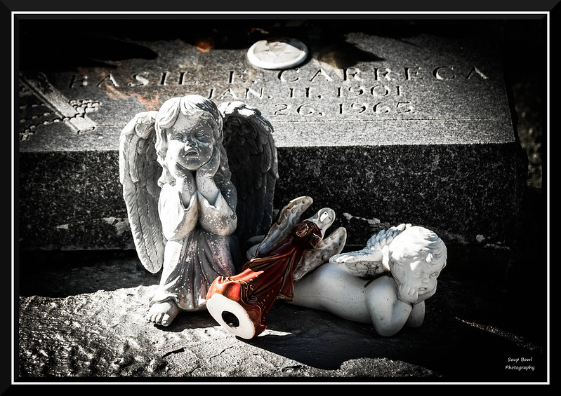
"The Wait"

This is a discussion on "The Wait" within the Architecture & Man Made (cities, buildings, roads, objects & abstracts) forums, part of the Show your photo (Color) - Landscape & Nature (flowers, mountains, storms etc.) category; These were a few little figurines sitting on a grave, left by loved ones. They seem to be just waiting ...

  1. #1
    theantiquetiger's Avatar
    theantiquetiger is offline Moderator
    Join Date
    Aug 2011
    Location
    Baton Rouge
    Posts
    2,774
    My Photos
    Please feel free to edit my photos
    Critiques
    Critique my photos anywhere in the forum

    Default "The Wait"

    These were a few little figurines sitting on a grave, left by loved ones. They seem to be just waiting with the departed for their loved ones to return
    ewaizel and Lucky-Luc like this.

  2. #2
    Bambi's Avatar
    Bambi is offline Senior Member
    Join Date
    Apr 2009
    Location
    Nova Scotia
    Posts
    9,755
    My Photos
    Please ask before editing my photos

    Default

    oh I quite like this. Not sure if it's selected colour or just the way it is, but it works for me.
    Feel free to make comments on any of my shots

    my blog: http://bambesblog.blogspot.com/

    My flickr photostream: http://www.flickr.com/photos/bambe1964/

    A painter takes their vision and makes it a reality. A photographer takes reality and makes it their vision.

  3. #3
    Realist's Avatar
    Realist is offline Senior Member
    Join Date
    Mar 2007
    Location
    Oklahoma
    Posts
    931
    My Photos
    Please ask before editing my photos
    Critiques
    Critique my photos anywhere in the forum

    Default

    Wonderful light here, well captured!

  4. #4
    Marko's Avatar
    Marko is offline Administrator
    Join Date
    May 2005
    Location
    Montreal, QC. Canada
    Posts
    14,870
    My Photos
    Please do NOT edit my photos
    Critiques
    Critique my photos anywhere in the forum

    Default

    Very dramatic - I dig it.
    - Please connect with me further
    Photo tours of Montreal - Private photography courses
    - Join the new Photography.ca Facebook page
    - Follow me on Twitter http://twitter.com/markokulik
    - Follow me on Google+ https://plus.google.com/u/0/111159185852360398018/posts
    - Check out the photography podcast


    "You have to milk the cow quite a lot, and get plenty of milk to get a little cheese." Henri Cartier-Bresson from The Decisive Moment.

  5. #5
    theantiquetiger's Avatar
    theantiquetiger is offline Moderator
    Join Date
    Aug 2011
    Location
    Baton Rouge
    Posts
    2,774
    My Photos
    Please feel free to edit my photos
    Critiques
    Critique my photos anywhere in the forum

    Default

    Quote Originally Posted by Bambi View Post
    oh I quite like this. Not sure if it's selected colour or just the way it is, but it works for me.
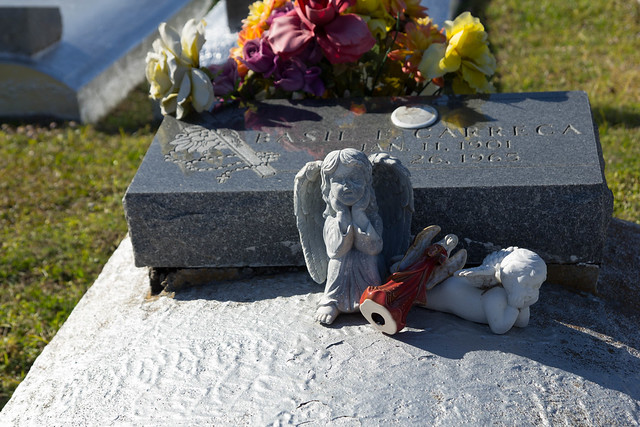
    There is no selected coloring here. The grave was silver, head stone marble, and the two figures are white, the other is red. You can see specs of color on the head stone. That is actually a reflection of some flowers just above the head stone. During my PP, I actually had to go back and look at the original because I didn't know what the color specs were on the headstone. I thought I had goofed something up during PP.

    Here is the original, untouched RAW copy. The grave was painted silver, and VERY reflective, thats why I had to add a ton of vignetting, to get that bottom left corner way down

  6. #6
    Lungelarry's Avatar
    Lungelarry is offline Senior Member
    Join Date
    Nov 2011
    Posts
    273
    My Photos
    Please do NOT edit my photos
    Critiques
    Critique my photos anywhere in the forum

    Default

    I really like this...good job

  7. #7
    ewaizel is offline Senior Member
    Join Date
    Sep 2012
    Location
    Vancouver BC Canada
    Posts
    610
    My Photos
    Please do NOT edit my photos
    Critiques
    Critique my photos anywhere in the forum

    Default

    Nice one. Great contrast. The vignetting also helps.

  8. #8
    QuietOne is offline Senior Member
    Join Date
    Mar 2010
    Location
    Nampa, Idaho, USA
    Posts
    2,735
    My Photos
    Please ask before editing my photos

    Default

    Really nice job. This has such a mournful feel to it.

  9. #9
    Hillbillygirl is offline Senior Member
    Join Date
    Jan 2010
    Location
    Muskoka, Ontario
    Posts
    5,612
    My Photos
    Please do NOT edit my photos
    Critiques
    Only critique photos posted in the critique forum

    Default

    Very nice AT. The subjects composition, and the wonderful PP, really bring out an emotional response to the viewer. Couldn't have made this any more perfect.
    Reality is a nice place to visit, but I wouldn't want to live there!

  10. #10
    Runmonty's Avatar
    Runmonty is offline Senior Member
    Join Date
    Dec 2011
    Location
    Adelaide, South Australia
    Posts
    4,095
    My Photos
    Please do NOT edit my photos
    Critiques
    Critique my photos anywhere in the forum

    Default

    I like it too AT. Your crop, the high contrast and vignette are all spot on.
    I welcome all critique and comments on any of my photos

    Links to other places you can also find me :


Bookmarks

Posting Permissions

  • You may not post new threads
  • You may not post replies
  • You may not post attachments
  • You may not edit your posts
  •  

1 2 3 4 5 6 7 8 9 10 11 12 13 14 15 16 17 18 19 20 21 22 23 24 25 26 27 28 29 30 31 32 33 34 35 36