Results 1 to 9 of 9
Like Tree1Likes
  • 1 Post By vyeko

Painting over photo

This is a discussion on Painting over photo within the Alternative photography forums, part of the Photography & Fine art photography category; This is one of my paintings done with tablet in photoshop....

  1. #1
    vyeko's Avatar
    vyeko is offline Senior Member
    Join Date
    Dec 2011
    Location
    maribor,slovenia,EU
    Posts
    724
    My Photos
    Please do NOT edit my photos
    Critiques
    Critique my photos anywhere in the forum

    Default Painting over photo

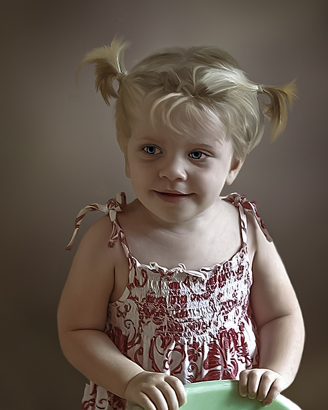
    This is one of my paintings done with tablet in photoshop.
    Name:  1Aa.jpg
Views: 2406
Size:  240.5 KB

  2. #2
    Matt K.'s Avatar
    Matt K. is offline Senior Member
    Join Date
    Feb 2010
    Location
    Calgary, AB
    Posts
    3,547
    My Photos
    Please ask before editing my photos
    Critiques
    Critique my photos anywhere in the forum

    Default

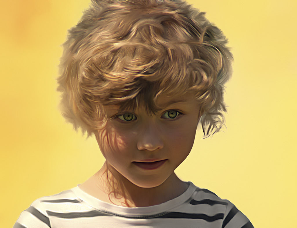
    This one is throwing me for a loop. Not sure what to think of it - almost looks like a porcelain figurine; somewhat un-real. There is a harshness that does not go with the expected soft lines of a child's portrait. I dunno, you must have spent a lot of time with this, but to me it is not all that appealing. I can't get over the harsh lines of the eyes,mouth and hands - the childlike softness is gone, the face looks too old for the actual age of the child .. in my opinion, anyways. I have to say I like your photographs a lot better than your painted over images, Veyko. Love the hair, though, that is great.
    ~~ Beauty is in the eye of the beer holder ~~

  3. #3
    vyeko's Avatar
    vyeko is offline Senior Member
    Join Date
    Dec 2011
    Location
    maribor,slovenia,EU
    Posts
    724
    My Photos
    Please do NOT edit my photos
    Critiques
    Critique my photos anywhere in the forum

    Default

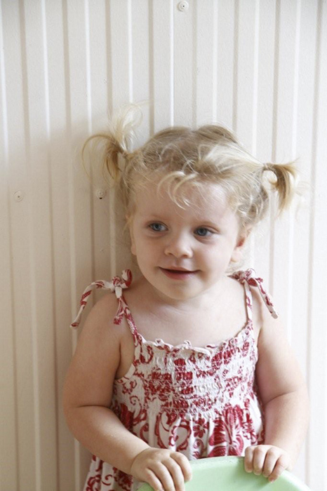
    Thanks Matt. Yes you have right I overdo eyes and contrast a little. About porcelain look that is normal for this oil techniques. This is not my best work ( I will try again) because of quality of client image.
    Image need to be look like painting with brush strokes not like photography. Here you can look master of this technique. I still learn. End Times Art : Jill Greenberg Studio, Inc.
    And here is a original image of my client.
    Name:  3a.jpg
Views: 1437
Size:  161.7 KB

  4. #4
    vyeko's Avatar
    vyeko is offline Senior Member
    Join Date
    Dec 2011
    Location
    maribor,slovenia,EU
    Posts
    724
    My Photos
    Please do NOT edit my photos
    Critiques
    Critique my photos anywhere in the forum

    Default

    Some more.
    Name:  Patrik.jpg
Views: 760
Size:  260.7 KBName:  julija small.jpg
Views: 874
Size:  112.9 KBName:  deklica2AAAA.jpg
Views: 1645
Size:  198.3 KB

  5. #5
    Marko's Avatar
    Marko is offline Administrator
    Join Date
    May 2005
    Location
    Montreal, QC. Canada
    Posts
    14,870
    My Photos
    Please do NOT edit my photos
    Critiques
    Critique my photos anywhere in the forum

    Default

    These are very cool Vyeko and I like the play. I do agree w/matt k's opinion on image 1 though. For me it's a bit creepy.

    Jill Greenberg's work IS fab of course. A very big part of the magic of those images is the studio lighting and sharpness. The processing, which is clearly evident and unusual is the grand finale on the images.
    - Please connect with me further
    Photo tours of Montreal - Private photography courses
    - Join the new Photography.ca Facebook page
    - Follow me on Twitter http://twitter.com/markokulik
    - Follow me on Google+ https://plus.google.com/u/0/111159185852360398018/posts
    - Check out the photography podcast


    "You have to milk the cow quite a lot, and get plenty of milk to get a little cheese." Henri Cartier-Bresson from The Decisive Moment.

  6. #6
    Matt K.'s Avatar
    Matt K. is offline Senior Member
    Join Date
    Feb 2010
    Location
    Calgary, AB
    Posts
    3,547
    My Photos
    Please ask before editing my photos
    Critiques
    Critique my photos anywhere in the forum

    Default

    Wow, Veyko, these three are quite fabulous. I am starting to "get" the effect you are looking for. The light in the curly haired girl is fabulous, and the image does not look "artificially sterile", it is very well done. Keep them coming, Veyko!
    ~~ Beauty is in the eye of the beer holder ~~

  7. #7
    vyeko's Avatar
    vyeko is offline Senior Member
    Join Date
    Dec 2011
    Location
    maribor,slovenia,EU
    Posts
    724
    My Photos
    Please do NOT edit my photos
    Critiques
    Critique my photos anywhere in the forum

    Default

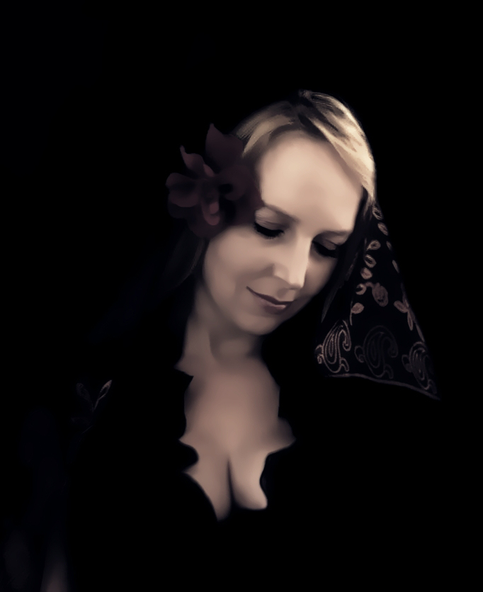
    Thank you Marko and Matt. I try not to copy other works.Wish to develop my own style. Hope will happen one day. LoL Here is one more with little different approach.
    Name:  blue down.jpg
Views: 701
Size:  136.6 KB

  8. #8
    AntZ's Avatar
    AntZ is offline Senior Member
    Join Date
    Mar 2009
    Location
    Australia
    Posts
    2,290
    My Photos
    Please feel free to edit my photos
    Critiques
    Critique my photos anywhere in the forum

    Default

    I think these are cool images too, and I think image 1 would be great if not for the eyes. I am OK with the "un-real" nature of it...except for the eyes.

  9. #9
    Join Date
    Sep 2012
    Location
    NE US
    Posts
    31
    My Photos
    Please ask before editing my photos
    Critiques
    Critique my photos anywhere in the forum

    Default

    V. Nice!!

Bookmarks

Posting Permissions

  • You may not post new threads
  • You may not post replies
  • You may not post attachments
  • You may not edit your posts
  •  

1 2 3 4 5 6 7 8 9 10 11 12 13 14 15 16 17 18 19 20 21 22 23 24 25 26 27 28 29 30 31 32 33 34 35 36