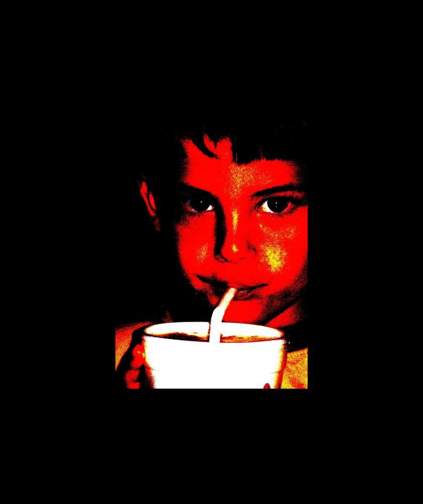
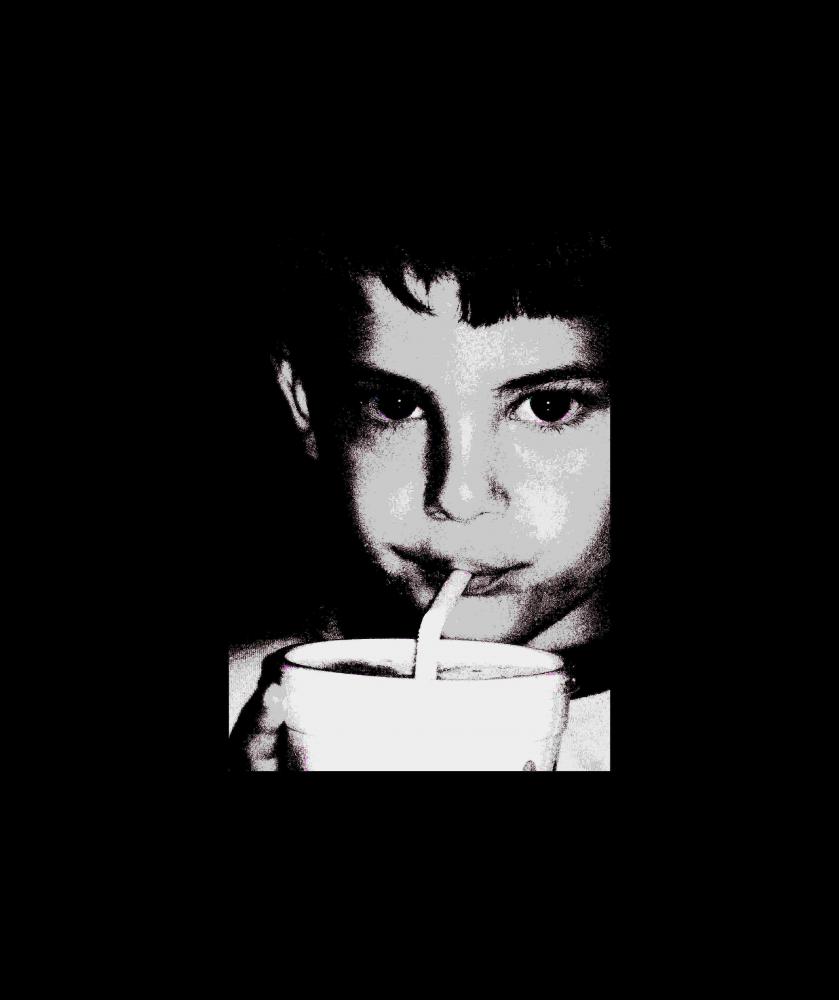
Tired, hot and sweaty, this little enjoys a sprite.... Which one do you favor?

This is a discussion on Wharhol meets 3 year old within the Alternative photography forums, part of the Photography & Fine art photography category; Tired, hot and sweaty, this little enjoys a sprite.... Which one do you favor?...
Tired, hot and sweaty, this little enjoys a sprite.... Which one do you favor?

First one, although I would work on the eyes to make sure both were totally in the photo, bright and with adequate colour. Good, somewhat graphic simplistic portrayal that works. What technique did you use?
Tegan
"Photographic art requires the technical aspects of photography and the design aspects of art, both at an outstanding level."
I don't like the yellow with the pink.... so I'm game for the second one....
Although I like the pink base better..
______________________
Nikon D300, Nikkor 24-70 2.8 . Nikkor 70-200 2.8 . Nikkor 50mm 1.8 . Sigma 105mm 2.8 . Tokina 12-24 4 . SB-600 . 2xVivitar 285
Tegan: Thanks for asking and suggestion. I did the red one back in April, then edited the red one tonight into the pink one.
I think that I only used the posterizer on PSP x2. The pink one was a quick use of the color changer, then, duplicating that image after changing the red to pink, then color changer to make the cheek change to peach.
Suggestions on how to make the eyes stand alone???? As far as the Digital stuff goes, I am very much an experimenting newbie.
Travis: The pink and peach defiantly needs some experimentation. Thanks for input!
I like these much better...
Travis, I am glad you said something about the pink and peach.

neat edits tomorrow...
i think i like the 1st one the best... if you can whiten the eyes a bit more, and smudge the yellow bits on cheeks & forehead, i think itd be super! (i agree with travis, they arent too complimentary to each other)
i do, however, find the giant black borders really distracting. maybe half that size would emphasize the photo more, and thats really what its all about anyways, right!
I very much like the graphic quality of these shots - well done.
I'm not crazy about the reddish shot but I like all the the others.
In terms of fussing with the eyes, for me in this "posterized" case I think they are fine
I agree with kiley that the black borders are too wide though, for me they are about 50% too wide.
Nice shots - thanks for sharing!
Marko
- Please connect with me further
Photo tours of Montreal - Private photography courses
- Join the new Photography.ca Facebook page
- Follow me on Twitter http://twitter.com/markokulik
- Follow me on Google+ https://plus.google.com/u/0/111159185852360398018/posts
- Check out the photography podcast
"You have to milk the cow quite a lot, and get plenty of milk to get a little cheese." Henri Cartier-Bresson from The Decisive Moment.

Bookmarks