Vintage photograph of the day

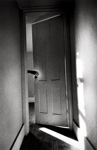
Today’s image of the day is called Hand on Door from the Som­nam­bu­list series by mas­ter fine art Amer­i­can pho­tog­ra­pher Ralph Gib­son;  it was shot in 1968. Many of Gibson’s most famous pho­tographs are high con­trast images, and this high con­trast has become part of his sig­na­ture style. Gibson’s pho­tographs were cre­ated through metic­u­lous film devel­op­ing (by Gib­son him­self) and printing.

What attracts me to this and many other Gib­son images is the strong sense of story and the very strik­ing graphic qual­ity of the image.

Hand on Door from the Somnambulist series by Ralph Gibson - 1968

Hand on Door from the Som­nam­bu­list series by Ralph Gib­son — 1968

Vintage photo of the day March 17, 2011

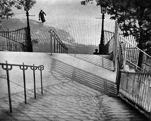
Today’s image of the day is called Stairs of Mont­martre, Paris by the late mas­ter Hun­gar­ian pho­tog­ra­pher Andre Kertesz, and it was shot in 1925. Kertesz is one of my all time favorite pho­tog­ra­phers and more of his work will surely be fea­tured in the future.

Stairs of Montmartre, Paris - 1925 by Andre Kertesz

Stairs of Mont­martre, Paris — 1925 by Andre Kertesz

What makes this, and tons of other Kertesz images fan­tas­tic is the pre­cise and delib­er­ate com­po­si­tion. Kertesz was sim­ply a mas­ter at guid­ing your eye to inter­est­ing places in the pho­to­graph. The shapes of the shad­ows and the posi­tion of the rail­ings are both delight­ful to look at and they guide your eye per­fectly toward the humans in the photo.

Kertesz was also keenly aware of all planes of focus in an image and how they work together. The con­nec­tion between the fore­ground, midground and the back­ground ele­ments of this image helps to sug­gest a story as well as make the image graph­i­cally striking.

Vintage photo of the day Feb. 15, 2011

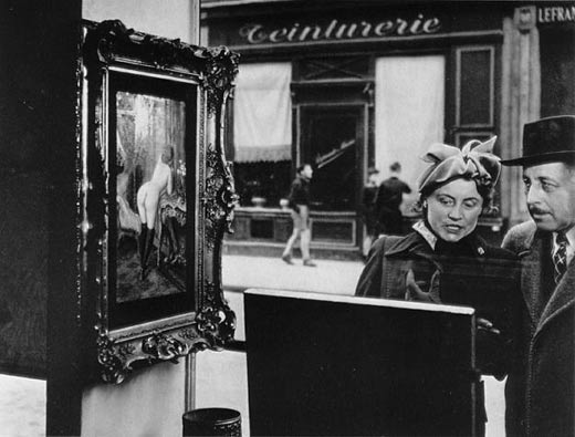
The vin­tage photo of the day is Side­long Glance by French‚photographer‚Robert Dois­neau and was taken in 1948. Dois­neau is one of France’s most famous pho­tog­ra­phers and many of his images like Kiss by the Hotel de Ville are con­sid­ered iconic.

Sidelong Glance by Robert Doisneau - 1948

Side­long Glance by Robert Dois­neau — 1948

What makes this pho­to­graph so appeal­ing is the sense of story and sense of humour. The woman is look­ing at the art in the‚foreground painting‚but the man sees ‘art’ in a dif­fer­ent paint­ing off to the side. The model’s bare bot­tom in the paint­ing is the bright­est ele­ment in the image so our eye (as well as the man’s rov­ing eye) goes right to it. The point of view of the image, the fab­u­lous tim­ing, as well as the fact that the sub­jects seem unaware that they are being pho­tographed all add to this image’s appeal.

Vintage photo of the day Jan. 25, 2011

The Vin­tage photo of the day is Rayo­g­ra­phy [Kiss] and was taken by Man Ray in 1922. Man Ray is well known for his pho­to­graphic exper­i­men­ta­tion and for being an “avant-garde” pho­tog­ra­pher in Paris in the Twen­ties and Thir­ties. He also exper­i­mented in sev­eral other dis­ci­plines includ­ing paint­ing an sculpture.

Rayography [Kiss] - Man Ray 1922

Rayo­g­ra­phy — [Kiss] by Man Ray 1922

The image above is a pho­togram which means it was taken with­out a cam­era. Faces and hands were placed over pho­to­graphic paper and exposed to light. Man Ray pre­ferred to call the pho­tograms he cre­ated Rayo­graphs (after himself).

Vintage photo of the day Jan. 17, 2011

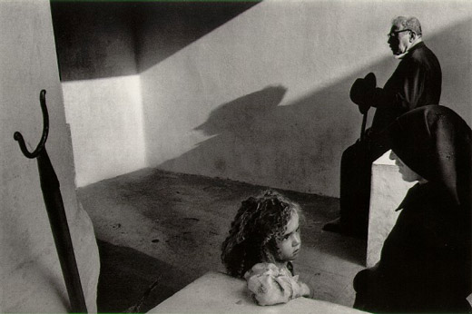
The vin­tage photo of the day is from the series Por­tu­gal by Mas­ter Czech pho­tog­ra­pher Josef Koudelka and was taken in 1976. Koudelka is well known for his work pho­tograph­ing Gyp­sies in Slo­va­kia and Roma­nia as well as cap­tur­ing the daily‚interactions‚of peo­ple from many dif­fer­ent (mostly) Euro­pean countries.

Joseph Koudelka - Portugal - 1976

Joseph Koudelka — Por­tu­gal — 1976

What attracts us to this image is the sense of story com­bined with bril­liant com­po­si­tion. I don’t know what the story is here but it’s a drama. Older man waits in back­ground with a shad­owed pro­file over­look­ing a pri­vate con­ver­sa­tion. The woman is smil­ing in pro­file, per­haps try­ing to soothe or coax the young girl, and the child is con­cerned. What is hap­pen­ing to her? For me, this scene is filled with tension.

Com­po­si­tion­ally, this image is a master-class. Angu­lar lines add to the ten­sion in the image. Tri­an­gles (our eyes love‚triangles) are every­where . Cor­ners, angled light rays, noses, table ends, knee bends, elbows are just a few of the tri­an­gles that we see. Look harder and you’ll see more of them…it’s no acci­dent that they are there. Even the inter­ac­tion (both obvi­ous and sub­tle) between the 3‚individuals‚is tri­an­gu­lar. Some fine black and white print­ing with a rich assort­ment of tones further‚adds to this image’s impact.

Vintage photo of the day Jan. 8, 2011

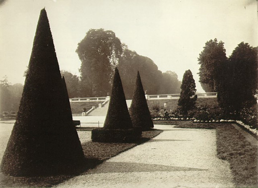
The vin­tage photo of the day is called Saint-Cloud (a sub­urb of Paris, France) by Eugene Atget and was taken in the early 1920’s. Atget is well known for for doc­u­ment­ing the land­scape, urban­scape, parks and street scenes and of ” Old” Paris‚in the late 1800’s and early part of the twen­ti­eth century.

Saint-Cloud by Eugene Atget 1921-1922

Saint-Cloud by Eugene Atget 1921–1922

Although newer pho­tog­ra­phers might look at this image and go “meh”, there’s actu­ally lots of inter­est­ing stuff to look at due to the care­ful com­po­si­tion. The repeat­ing cone-shaped trees and their shad­ows are the focal points of the image and their shapes are some­what repeated by the other trees in the back­ground. Great use of lead­ing lines and shapes cre­ated in both the pos­i­tive and neg­a­tive areas of this pho­to­graph make it far more intrigu­ing than it ini­tially seems.

The‚George‚Eastman‚house also has quite a good col­lec­tion of Atget pho­tographs for those that want to see more of this Master’s work.

http://www.geh.org/fm/atget/htmlsrc/atget_sld00001.html

Vintage photo of the day Jan. 3, 2011

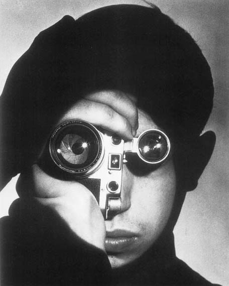
Today’s vin­tage photo of the day is called The Pho­to­jour­nal­ist by Andreas Feininger and was taken in 1951. It has become an iconic por­trait and the sub­ject is pho­to­jour­nal­ist David Stock who won a pho­to­jour­nal­ism com­pe­ti­tion. Feininger shot the image‚for Life Mag­a­zine where he worked for decades.

Feininger is per­haps best known for his‚architectural‚ and street shots of New York City in the for­ties and fifties. This por­trait does not rep­re­sent Feininger’s aver­age sub­ject mat­ter and yet it is amongst his most famous pho­tographs for many good reasons.

The Photojournalist by Andreas Feininger - 1951

The Pho­to­jour­nal­ist by Andreas Feininger — 1951

What draws us to this pho­to­graph is obvi­ously the unique way it’s pre­sented. The Leica cam­era is turned to one side so that the lens and viewfinder act as the subject’s eyes. Both lenses have spec­u­lar high­lights which mimic the catch­lights seen in por­traits. In addi­tion, the image is beau­ti­fully printed with rich blacks and whites with detail. The eye is skill­fully guided to the focal points (lens and viewfinder) in this image, likely through selec­tive dodg­ing and burn­ing (selec­tive dark­en­ing and light­en­ing of spe­cific parts of the image). It’s the com­bi­na­tion of tech­ni­cal skill and well thought out com­po­si­tion that make this image superb.

Vintage photo of the day — Dec. 27, 2010

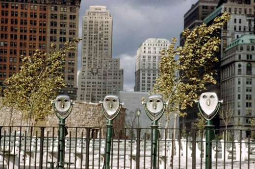
Today’s vin­tage pho­to­graph of the day by mas­ter pho­tog­ra­pher Ernst Haas, is titled Binoc­u­lars and it was taken in Bat­tery Park, NY in 1952. Haas is well known for adopt­ing colour early on in his career before many of his con­tem­po­raries. Famous Haas colour pho­tographs include slow motion studies.

A Haas quote that I really dig is, “The best pic­tures dif­fer­en­ti­ate them­selves by nuances‚¦a tiny rela­tion­ship ‚ either a har­mony or a dishar­mony — that cre­ates a picture.”

Binoculars by Ernst Haas - 1952

Binoc­u­lars by Ernst Haas — 1952

This pho­to­graph works on‚multiple‚levels which is likely why it works so well.
The‚binoculars‚themselves look like human faces so we are‚immediately‚attracted to that aspect. How­ever, other ele­ments also make this image inter­est­ing. These ele­ments include the fence and the build­ings in the back­ground. For me, the fence, binoc­u­lars and back­ground build­ings rep­re­sent the fact that ‘mak­ing it’ in New York is dif­fi­cult. The fence sep­a­rates you from the build­ings but you can see them through the binoc­u­lars. Get­ting there, is a battle…but if you can make it there, you can make it anywhere.