Vintage photo of the day — December 6, 2010

On Decem­ber 3rd I sug­gested that the image of the day on this blog would mostly be my pho­tog­ra­phy and 3 days later I’m here to tell you that it will be a mix of pho­tog­ra­phy that I per­son­ally find inter­est­ing. Some­times it will be my work but often it will be other people’s and on some days, like today it will be the work of a Master.

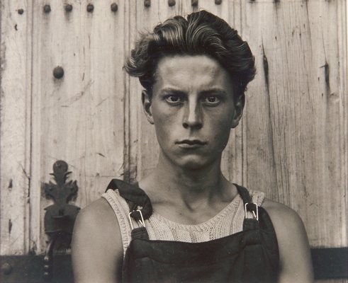
Today’s image is by Mas­ter pho­tog­ra­pher Paul Strand and it’s called Young Boy, Gondev­ille, Char­ente, France . I just love the fact that this image is almost 60 years old. It’s a very intense por­trait of a boy star­ing right into the cam­era. What makes this por­trait work for me are the very intense and sharp eyes along with good light­ing that reveals tex­ture in the fence, boy’s hair, face and cloth­ing. The well cho­sen back­ground suits the sub­ject and sug­gests a work­ing envi­ron­ment to me. The print­ing is also won­der­ful with a full range of tones (that show up bet­ter in repro­duc­tions and books ver­sus here on the web).

Young Boy, Gondeville, Charente, France, 1951 by Paul Strand
Young Boy, Gondev­ille, Char­ente, France, 1951 by Paul Strand
89 — Interview with Joyce Tenneson — Michael Grecco — Notes from Jay Maisel

Pho­tog­ra­phy pod­cast #89 fea­tures 2 inter­views that were recorded at the PDN Pho­to­plus Con­fer­ence and Expo in New York last week­end.‚ This con­fer­ence and show hap­pens yearly and is one of the largest photo shows in North Amer­ica. It’s an AWESOME show/conference with all the lat­est prod­ucts and fab­u­lous sem­i­nars from some of the best pho­tog­ra­phers in North Amer­ica. This post/podcast will cover some of the sem­i­nars and other posts will cover some of the products.
Inter­view 1 is with fine art pho­tog­ra­pher Joyce Ten­neson. I’ve been fol­low­ing her work for close to 20 years so it was a real treat to inter­view her. In this inter­view we talk about find­ing a per­sonal style.

Inter­view 2 is with well know por­traitist and celebrity pho­tog­ra­pher Michael Grecco. In this inter­view Michael shares some of his light­ing secrets to achieve a dra­matic portrait.

Finally I share some of the notes that I took in a sem­i­nar led by mas­ter pho­tog­ra­pher Jay Maisel.

Thanks again to Joyce Ten­neson, Michael Grecco and Jay Maisel for allow­ing us to fea­ture their work and for their won­der­ful seminars.

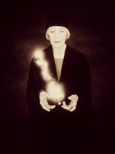
Ingerborg Ten Haeff - From Wise Women ‚© Joyce Tenneson

Inger­borg Ten Haeff — From Wise Women ‚© Joyce Tenneson

Stevie Wonder ‚© Michael Grecco

Ste­vie Won­der ‚© Michael Grecco

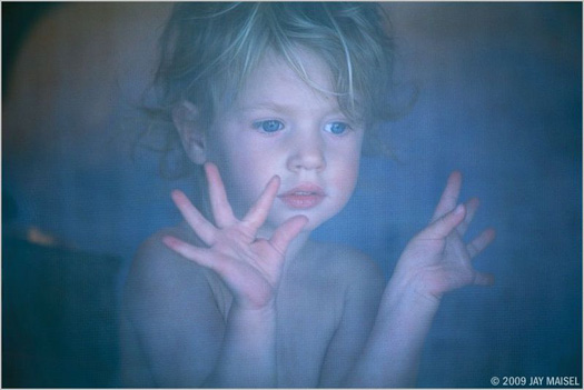
A Jay Maisel image exemplifying 'gesture' ‚©Jay Maisel

A Jay Maisel image exem­pli­fy­ing ‘ges­ture’ ‚© Jay Maisel

Links /resources men­tioned in this pod­cast:
Joyce Ten­neson — fea­ture on Photography.ca
Michael Grecco — fea­ture on Photography.ca
Jay Maisel — fea­ture on Photography.ca
Jay Maisel Doc­u­men­tary
Light tools — for mod­i­fy­ing light
Dynalite kit at B&H
Show us where you live is the reg­u­lar assign­ment this month on our pho­tog­ra­phy forum
Time (No clocks) is the level 2 assign­ment this month on our pho­tog­ra­phy forum

Please join the Photography.ca fan page on Facebook

If you liked this pod­cast and want to review it on Itunes, this link gets you to the main page

My Face­book pro­file — Feel free to “friend” me — please just men­tion Photography.ca
My Twit­ter page — I will fol­low you if you fol­low me — Let’s con­nect — PLEASE email me and tell me who you are in case I don’t rec­i­p­ro­cate because I think you are a spammer.

If you are still lurk­ing on our forum,
feel free to join our friendly :) ¯¿½Pho­tog­ra­phy forum

Thanks to Sean G, Robertv, Shant M, Michael Van der Tol, Ice­Cream­Man and Glenn Euloth who posted a blog com­ment about our last pod­cast. Thanks as always to every­one that sent com­ments by email about our last pod­cast. Although ALL com­ments are appre­ci­ated, com­ment­ing directly in this blog is pre­ferred. Thanks as well to all the new mem­bers of the bul­letin board. Most of the links to actual the prod­ucts are affil­i­ate links that help sup­port this site. Thanks in advance if you pur­chase through those links. In the inter­est of full dis­clo­sure, I did not actu­ally pay to go see the sem­i­nars, I had a press pass. That said, if I did not think the sem­i­nars were great, I sim­ply would not have writ­ten about them.

If you are look­ing at this mate­r­ial on any other site except Photography.ca — Please hop on over to the¯¿½ Photography.ca blog and pod­cast and get this and other pho­tog­ra­phy info directly from the source. |¯¿½Sub­scribe with iTunes |¯¿½Sub­scribe via RSS feed |¯¿½Sub­scribe with Google Reader |Sub­scribe for free to the Pho­tog­ra­phy pod­cast — Photography.ca and get all the posts/podcasts by Email
You can down­load this pho­tog­ra­phy pod­cast directly by click­ing the pre­ced­ing link or lis­ten to it almost imme­di­ately with the embed­ded player below.

88 — Rain photography

Pho­tog­ra­phy pod­cast #88 talks about rain pho­tog­ra­phy and is based on a sug­ges­tion by Mad Aussie, Thanks MA. ‚ In the pod­cast we talk about how to go about‚ pro­tect­ing your­self and your cam­era so that you can enjoy rain pho­tog­ra­phy. We also talk about sub­ject mat­ter, tech­nique, after the rain cam­era care and we touch on light­ing as well.

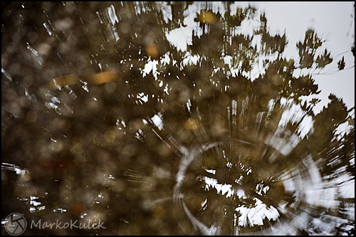
Puddle and Reflection by Marko Kulik

Puddle-drop and Reflec­tion by Marko Kulik

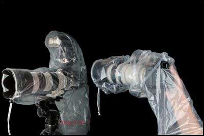
Rainsleeve and Flash rainsleeve

Rainsleeve and Flash rainsleeve

Links /resources men­tioned in this podcast:

Rainsleeve for your DSLR and flash (at B&H)
Rainsleeve for your DSLR (at B&H)

Please join the Photography.ca fan page on Facebook

If you liked this pod­cast and want to review it on Itunes, this link gets you to the main page

My Face­book pro­file — Feel free to “friend” me — please just men­tion Photography.ca
My Twit­ter page — I will fol­low you if you fol­low me — Let’s con­nect — PLEASE email me and tell me who you are in case I don’t rec­i­p­ro­cate because I think you are a spammer.

If you are still lurk­ing on our forum,
feel free to join our friendly :) ¯¿½Pho­tog­ra­phy forum

Thanks to Yise­haq, Jack Label,‚ Robertv and Glenn Euloth who posted a blog com­ment about our last pod­cast. Thanks as always to every­one that sent com­ments by email about our last pod­cast. Although ALL com­ments are appre­ci­ated, com­ment­ing directly in this blog is pre­ferred. Thanks as well to all the new mem­bers of the bul­letin board. Most of the links to actual the prod­ucts are affil­i­ate links that help sup­port this site. Thanks in advance if you pur­chase through those links.

If you are look­ing at this mate­r­ial on any other site except Photography.ca — Please hop on over to the¯¿½ Photography.ca blog and pod­cast and get this and other pho­tog­ra­phy info directly from the source. |¯¿½Sub­scribe with iTunes |¯¿½Sub­scribe via RSS feed |¯¿½Sub­scribe with Google Reader |Sub­scribe for free to the Pho­tog­ra­phy pod­cast — Photography.ca and get all the posts/podcasts by Email
You can down­load this pho­tog­ra­phy pod­cast directly by click­ing the pre­ced­ing link or lis­ten to it almost imme­di­ately with the embed­ded player below.

Photography forum image of the month — August 2010

Every month on our¯¿½ pho­tog­ra­phy forum mem­bers nom­i­nate images that they like. Then at the end of the month I choose an excel­lent image and talk about why it rocks. The photo I choose is not nec­es­sar­ily the best one of the month. I¯¿½ve come to real­ize it¯¿½s not really log­i­cal to pit images from totally dif­fer­ent gen­res against each other. That¯¿½s why there are cat­e­gories in photo con­tests. I just choose a photo that has extremely strong ele­ments that we can learn from.

I Got it! by Iguanasan

I Got it! by Iguanasan

I chose this image for sev­eral reasons:

The deci­sive moment — Igua­nasan cap­tured the deci­sive moment here; 1 sec­ond ear­lier or later and this moment would be gone.

Sim­plic­ity & Story — The back­ground is unclut­tered here so this shot is not busy and there are no dis­trac­tions. This makes the uni­ver­sal story of a boy (let’s call him Stan­ley) play­ing in the water with his shoe even stronger. The story is well cap­tured and it strikes a happy chord in all of us.

Com­po­si­tion — Stanley’s pose is very inter­est­ing to look at and helps make this shot. Despite the water drops every­where, this is a clean look­ing image. I am glad we can see some of the Stanley’s face here. Although I nor­mally like to see more of a face, there are always excep­tions and this is one of them. Stanley’s pose and engage­ment in the activ­ity are uni­ver­sal enough that we don’t need to see the full face.

Expo­sure is well han­dled here and the drops look great. My only teeny nig­gle would be that the boy could be about 10% brighter to my eye.

Sharp­ness — The over­all sharp­ness is very good here. Some of the drops seem sharper than the boy to my eye but for me this still works well. The drops are an inte­gral part of the story and since Stan­ley is not look­ing at us because he is engaged in activ­ity, the sharper drops work for me.

For all these rea­sons, this is my choice for image of the month. Since we all have opin­ions, some mem­bers may dis­agree with my choice. That’s cool but THIS thread is not the place for debate over my pick, NOR is it the place to fur­ther cri­tique the image. The pur­pose here is to sug­gest strong ele­ments in the photo that we may learn from.

Con­grats again Igua­nasan for cap­tur­ing this uni­ver­sal moment!

I¯¿½d also like to include these 2 images as hon­ourable mentions.

Somehow prickly by MoinMoin

Some­how prickly by MoinMoin

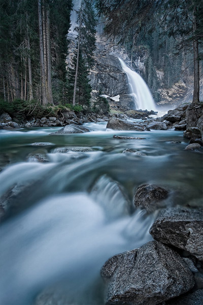
Krimml Cascades - Europe's highest Waterfall

Krimml Cas­cades — Europe’s high­est Waterfall

Photography forum image of the month — July 2010

Every month on our¯¿½ pho­tog­ra­phy forum mem­bers nom­i­nate images that they like. Then at the end of the month I choose an excel­lent image and talk about why it rocks. The photo I choose is not nec­es­sar­ily the best one of the month. I¯¿½ve come to real­ize it¯¿½s not really log­i­cal to pit images from totally dif­fer­ent gen­res against each other. That¯¿½s why there are cat­e­gories in photo con­tests. I just choose a photo that has extremely strong ele­ments that we can learn from.

Time for Sunflowers by mibriet

Time for Sun­flow­ers by mibriet

I chose this image for sev­eral reasons:

Impact — Wow, bang, kapow, this is an extremely strik­ing image and it’s a plea­sure to look at it.

Sharp­ness — Love the sharp­ness here. This is par­tially achieved through focus stack­ing (where mul­ti­ple images with dif­fer­ent focus points are blended together)

Degree of dif­fi­culty — This is no easy shot to get. mibreit waited for the right time of day to get this. Dur­ing the shoot both expo­sure AND focus were shot dif­fer­ently on mul­ti­ple frames. Then in PP these were all blended. A whole lot of love and ded­i­ca­tion went into get­ting this gor­geous image.

Colour — These colours sing. There’s also some great jux­ta­po­si­tion in the colours of the sky ver­sus the colours in the foreground.

Blend­ing — The blend­ing of the var­i­ous expo­sures (and focal points) is taste­fully done here to my eye. Some­times HDRs or DRIs are too over­done and call atten­tion to them­selves. This is not the case here for me. The greens here are the only colour that I may have toned down slightly (but they still work for me and we are in the realm of per­sonal taste at this point). If I have one nig­gle, I can still see a touch of halo­ing around some of the leaves, but I can totally live with it.

Com­po­si­tion — Very inter­est­ing ele­ments through­out the fore­ground, midground and back­ground. Although there are mul­ti­ple things to focus on, the large fore­ground left flower is extra-sharp and just slightly brighter than the other flow­ers, thus mak­ing it one of the main focal points.

For all these rea­sons, this is my choice for image of the month. Since we all have opin­ions, some mem­bers may dis­agree with my choice. That’s cool but THIS post is not the place for debate over my pick, NOR is it the place to fur­ther cri­tique the image. The pur­pose here is to sug­gest strong ele­ments in the photo that we may learn from.

Con­grats again mibreit for cre­at­ing this gor­geous image!

I¯¿½d also like to include these 3 images as hon­ourable mentions.

Crummock Water by Richard

Crum­mock Water by Richard

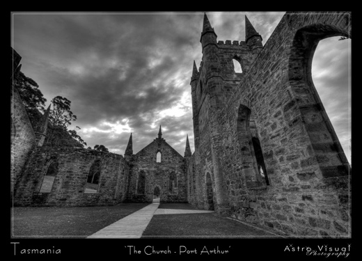
Tasmania - 'The Chrurch Port Arthur' by Mad Aussie

Tas­ma­nia — ‘The Chrurch — Port Arthur’ by Mad Aussie

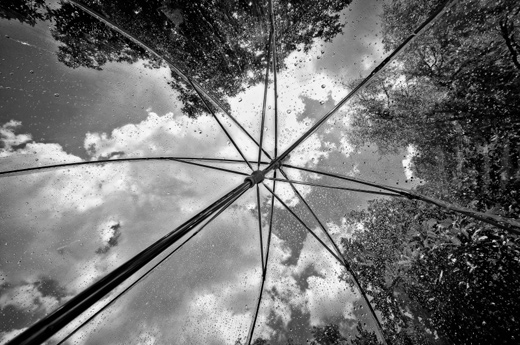
Summer Shower by Barefoot

Sum­mer Shower by Barefoot

85 — Inkjet paper review 1 — German etching — Fine art Baryta by Hahnemuhle

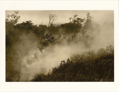
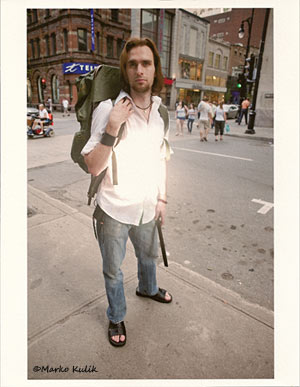
Pho­tog­ra­phy pod­cast #85 is the first of sev­eral pod­casts that will review and dis­cuss inkjet papers. Let me say it right now, I LOVE photo papers (tra­di­tional and dig­i­tal) and I just bought a new Epson 3880 inkjet to test inkjet papers with.…and of course make larger prints. There’s LOADS of cre­ative pos­si­bil­i­ties when you try new inkjet papers so I hope the review of these 2 papers (Ger­man Etch­ing and Fin­eart Baryta by Hah­ne­muhle) is use­ful to many listeners/readers. Both papers are Highly rec­om­mended. Ger­man Etch­ing (310GSM) is a tex­tured matte creamy white paper. Fin­eart Baryta (325 GSM) is a glossy white paper with an ever so slight tex­ture. Ansel Adams called the print ‘the per­for­mance’ and these days there’s tons of paper choices to get your prints to sing.

Detail German Etching

Detail from The Wan­derer II on Ger­man Etch­ing paper by Hah­ne­muhle — ©Marko Kulik

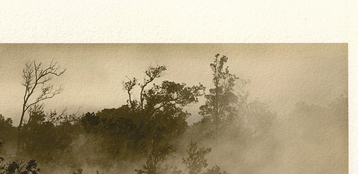
Detail from Steam Vents at VNP

Detail from Steam Vents at VNP — Ger­man Etch­ing paper by Hah­ne­muhle — ©Marko Kulik

Steam Vents at VNP

Steam Vents at VNP — Ger­man Etch­ing Marko Kulik

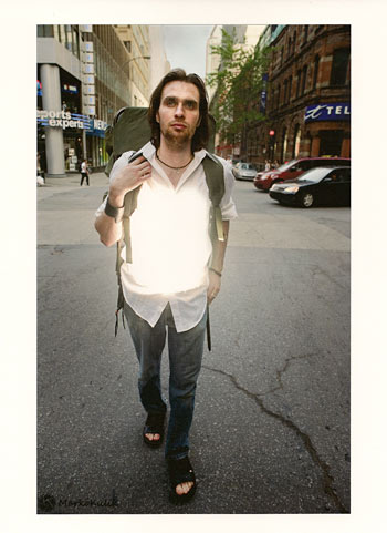
The Wanderer I

The Wan­derer II — Ger­man Etch­ing — © Marko Kulik

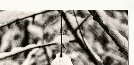
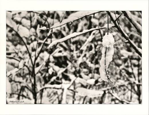
Detail from Snow Pods on Fineart Baryta from Hahnemuhle © Marko Kulik

Detail from Snow Pod on Fin­eart Baryta from Hah­ne­muhle © Marko Kulik

Snow Pods on Fineart Baryta from Hahnemuhle © Marko Kulik

Snow Pod on Fin­eart Baryta from Hah­ne­muhle © Marko Kulik

The wanderer Ion Fineart Baryta from Hahnemuhle

The Wan­derer I — Fin­eart Baryta Hah­ne­muhle © Marko Kulik

Links /resources men­tioned in this podcast:

Epson 3880 at B&H
Pod­cast 62 — Monitor/printer cal­i­bra­tion
Pod­cast 63 — I1 Extreme and Colour­Munki review & printer dia­logue boxes when print­ing.
Hah­ne­muhle papersHah­ne­muhle ICC pro­files
Hah­ne­muhle Ger­man Etch­ing Paper at B&H
Hah­ne­muhle Fine art Baryta Paper at B&H
Com­ment about back but­ton aut­o­fo­cus on Niko­ni­ans — Thx F8&Bthere!
Tes­ti­mo­ni­als link if you’re feel­ing wordy :)

Publicphotograpgy.org
Cel­e­brat­ing the rights of pho­tog­ra­phers -Publicphotography.org — Flickr groupPublicphotography.org — Face­book group

Please join the Photography.ca fan page on Facebook

If you liked this pod­cast and want to review it on Itunes, this link gets you to the main page

My Face­book pro­file — Feel free to “friend” me — please just men­tion Photography.ca
My Twit­ter page — I will fol­low you if you fol­low me — Let’s con­nect — PLEASE email me and tell me who you are in case I don’t rec­i­p­ro­cate because I think you are a spammer.

If you are still lurk­ing on our forum,
feel free to join our friendly :) Pho­tog­ra­phy forum

Thanks to RobvE, f8&Bthere, and Richard who posted a blog com­ment about our last pod­cast. Thanks as always to every­one that sent com­ments by email about our last pod­cast. Although ALL com­ments are appre­ci­ated, com­ment­ing directly in this blog is pre­ferred. Thanks as well to all the new mem­bers of the bul­letin board. Most of the links to actual the prod­ucts are affil­i­ate links that help sup­port this site. Thanks in advance if you pur­chase through those links.

If you are look­ing at this mate­r­ial on any other site except Photography.ca — Please hop on over to thePhotography.ca blog and pod­cast and get this and other pho­tog­ra­phy info directly from the source. ISub­scribe with iTunes ISub­scribe via RSS feed ISub­scribe with Google Reader ISub­scribe for free to the Pho­tog­ra­phy pod­cast — Photography.ca and get all the posts/podcasts by Email
You can down­load this pho­tog­ra­phy pod­cast directly by click­ing the pre­ced­ing link or lis­ten to it almost imme­di­ately with the embed­ded player below.

Photography forum image of the month — June 2010

Every month on our¯¿½pho­tog­ra­phy forum mem­bers nom­i­nate images that they like. Then at the end of the month I choose an excel­lent image and talk about why it rocks. The photo I choose is not nec­es­sar­ily the best one of the month. I¯¿½ve come to real­ize it¯¿½s not really log­i­cal to pit images from totally dif­fer­ent gen­res against each other. That¯¿½s why there are cat­e­gories in photo con­tests. I just choose a photo that has extremely strong ele­ments that we can learn from.

Swirls by Edg

Swirls by Edg

I chose this image for sev­eral reasons:

I love the sharp­ness here and over­all depth of field choice here. Lovely sharp fore­ground flower (the focal point) at left.

The tonal qual­ity of the flow­ers is very unique and well done. It’s a bit darker than I’m used to see­ing, but it adds to the unique tonal qual­ity and mood of the pho­to­graph. Gor­geous palette of pinks and reds. Great high­lights in the flower at left and nice sub­tle high­lights on the right flower as well. I like that the left flower is slightly brighter than the right.

My eye is skill­fully guided around the image and rests on the focal point. This is due to some fine focal point selec­tion and lens selec­tion dur­ing expo­sure and some lovely post pro­cess­ing. The post pro­cess­ing (espe­cially the dark­en­ing of the back­ground) refines the over­all com­po­si­tion here and it totally works.

If I have one small nig­gle, I’d clone out/burn the bright­ish white edge of the petal on the main left flower at lower left, but that’s it.

For all these rea­sons, this is my choice for image of the month. Since we all have opin­ions, some mem­bers may dis­agree with my choice. That’s cool but THIS thread is not the place for debate over my pick, NOR is it the place to fur­ther cri­tique the image. The pur­pose here is to sug­gest strong ele­ments in the photo that we may learn from.

Con­grats again edG for cre­at­ing this gor­geous image!

I¯¿½d also like to include these 3 images as hon­ourable men­tions as they also came close to being picked.

Yummmmm - I Love Pollen by Matt K.

Yum­m­mmm — I Love Pollen by Matt K.

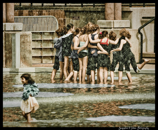
Wading Pool by Jas Photo

Wad­ing Pool by Jas Photo

Descending by Barefoot

Descend­ing by Barefoot

84 — Back (rear) button autofocusing

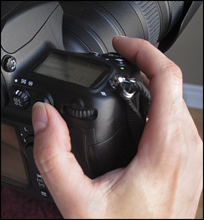
Pho­tog­ra­phy pod­cast #84 is based on a sin­gle com­ment by Richard from our forum where he men­tions rear-button aut­o­fo­cus to aid in sharp­ness. This tech­nique was devel­oped by Canon about 20 years ago but I first heard of this tech­nique on the MPB pod­cast (link in shownotes — thx for find­ing it for me Mar­tin!) about two and a half years ago. Basi­cally this tech­nique REMOVES aut­o­fo­cus­ing from the shut­ter release but­ton and assigns it to a but­ton on the back of the cam­era. Espe­cially when track­ing a mov­ing sub­ject, this is a great tech­nique and will likely get you more keep­ers. It will also STOP your aut­o­fo­cus from track­ing things that you don’t want it to.

Finger positions for rear button autofocus

Fin­ger posi­tions for rear but­ton autofocus

Ducks

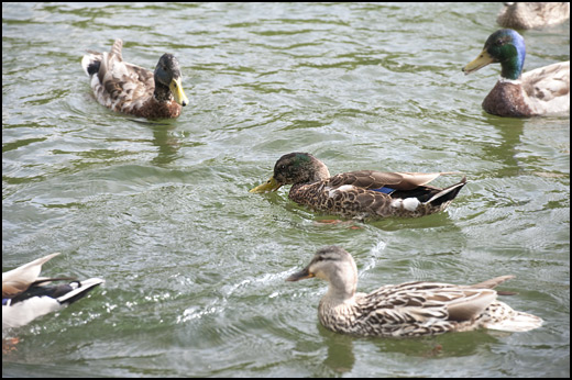
Ducks — Even though ducks are entering/exiting the scene, aut­o­fo­cus is not lost on the cen­tral duck which I was track­ing. The aut­o­fo­cus­ing can­not ‘hunt’ for any other duck because I am track­ing and lock­ing focus on only 1 duck.

Links /resources men­tioned in this podcast:

Excel­lent Rear but­ton aut­o­fo­cus arti­cle by Canon
Rear but­ton aut­o­fo­cus dis­cussed on the Mar­tin Bai­ley Pod­cast
July 2010’s — Per­spec­tive and/or Lead­ing lines assign­ment
Publicphotograpgy.orgCel­e­brat­ing the rights of pho­tog­ra­phers -Publicphotography.org — Flickr groupPublicphotography.org — Face­book group

Please join the Photography.ca fan page on Facebook

If you liked this pod­cast and want to review it on Itunes, this link gets you to the main page

My Face­book pro­file — Feel free to “friend” me — please just men­tion Photography.ca
My Twit­ter page — I will fol­low you if you fol­low me — Let’s con­nect — PLEASE email me and tell me who you are in case I don’t rec­i­p­ro­cate because I think you are a spammer.

If you are still lurk­ing on our forum,
feel free to join our friendly :) Pho­tog­ra­phy forum

Thanks to Jackie Sheen, Jason and Glenn Euloth who posted a blog com­ment about our last pod­cast. Thanks as always to every­one that sent com­ments by email about our last pod­cast. Although ALL com­ments are appre­ci­ated, com­ment­ing directly in this blog is pre­ferred. Thanks as well to all the new mem­bers of the bul­letin board.

If you are look­ing at this mate­r­ial on any other site except Photography.ca — Please hop on over to thePhotography.ca blog and pod­cast and get this and other pho­tog­ra­phy info directly from the source. ISub­scribe with iTunes ISub­scribe via RSS feed ISub­scribe with Google Reader ISub­scribe for free to the Pho­tog­ra­phy pod­cast — Photography.ca and get all the posts/podcasts by Email
You can down­load this pho­tog­ra­phy pod­cast directly by click­ing the pre­ced­ing link or lis­ten to it almost imme­di­ately with the embed­ded player below.

Photography forum image of the month — May 2010

Every month on our¯¿½ pho­tog­ra­phy forum mem­bers nom­i­nate images that they like. Then at the end of the month I choose an excel­lent image and talk about why it rocks. The photo I choose is not nec­es­sar­ily the best one of the month. I¯¿½ve come to real­ize it¯¿½s not really log­i­cal to pit images from totally dif­fer­ent gen­res against each other. That¯¿½s why there are cat­e­gories in photo con­tests. I just choose a photo that has extremely strong ele­ments that we can learn from.

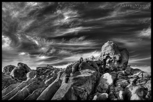
A Black & White Foray by Mad Aussie

A Black & White Foray by Mad Aussie

I chose this image for sev­eral reasons:

First off, it’s a WOW image. A lot of the ‘wow’ comes from the incred­i­ble sky and the way it’s processed. It’s dark­ish, some­what omi­nous and sets an incred­i­ble mood. Had the sky been bor­ing, this shot would not be the same, so good on Mad Aussie for notic­ing the amaz­ing sky.

The tones in this image are very nicely ren­dered and the higher con­trast used here works extremely well to my eye. It’s very dra­matic and makes me think of the Greek Myth involv­ing Atlas. If I have one teeny nig­gle I’d have toned down the brighter rock just under the main boulder.

Lead­ing lines — The rocks at lower left lead upward toward the big rock at cen­ter right which is the focal point of this image. This is NO acci­dent and is the result of care­ful in-camera com­po­si­tion. In terms of over­all com­po­si­tion — just friggen fab. Inter­est­ing fore­ground (jagged rocks) midground (boul­der which is the focal point) and back­ground (awe­some sky) ele­ments. The split between rocks and sky is also inter­est­ing and well thought out with 2/3rds sky and about 1/3rd rocks. Although we often have the dis­cus­sion about the rule of thirds being a mere guideline…that rule is rock­ing this image

For all these rea­sons, this is my choice for image of the month. Since we all have opin­ions, some mem­bers may dis­agree with my choice. That’s cool but THIS thread is not the place for debate over my pick, NOR is it the place to fur­ther cri­tique the image. The pur­pose here is to sug­gest strong ele­ments in the photo that we may learn from.

Con­grats again Mad Aussie for cre­at­ing this strik­ing image!

I¯¿½d also like to include these 2 images as hon­ourable men­tions as they also came close to being picked.

Mountrain Stream by Bambi

Moun­tain Stream by Bambi

Driftwood and clouds by Michaelaw

Drift­wood and clouds by Michaelaw

83 — Photography 20 steps from your door

Pho­tog­ra­phy pod­cast #83 is based on a sug­ges­tion by Casil403 (Thanks Casil!) from our forum. This pod­cast describes the exer­cise of pho­tograph­ing what­ever you want with the restric­tion that it must be 20 steps from your door. This restric­tion forces you to “see”¯¿½ what you are oth­er­wise too busy to see. It’s an excel­lent exer­cise that really gets you to zero in on your sense of sight. Feel free to try this exer­cise for your­self and post the image some­where and link to it in the com­ments for all to see. The pho­tos below are images taken within 20 steps of my own door.

20 steps from my door by Marko Kulik

20 steps from my door by Marko Kulik

20 steps from my door by Marko Kulik

20 steps from my door by Marko Kulik

20 steps from my door by Marko Kulik

20 steps from my door by Marko Kulik

20 steps from my door by Marko Kulik

20 steps from my door by Marko Kulik

20 steps from my door by Marko Kulik

20 steps from my door by Marko Kulik


Links /resources men­tioned in this podcast:

Rain cover for your DSLR and flash (at B&H)
Rain cover for your DSLR (at B&H)
June 2010’s — Motion assign­ment on the Photography.ca forum

Please join the Photography.ca fan page on Facebook

If you liked this pod­cast and want to review it on Itunes, this link gets you to the main page

My Face­book pro­file — Feel free to “friend” me — please just men­tion Photography.ca
My Twit­ter page — I will fol­low you if you fol­low me — Let’s con­nect — PLEASE email me and tell me who you are in case I don’t rec­i­p­ro­cate because I think you are a spammer.

If you are still lurk­ing on our forum,
feel free to join our friendly :) ¯¿½Pho­tog­ra­phy forum

Thanks to Bill Sorensen, Benny, Michael Van der Tol and Kat­rina Chick­loski who posted a blog com­ment about our last pod­cast. Thanks as always to every­one that sent com­ments by email about our last pod­cast. Although ALL com­ments are appre­ci­ated, com­ment­ing directly in this blog is pre­ferred. Thanks as well to all the new mem­bers of the bul­letin board.

If you are look­ing at this mate­r­ial on any other site except Photography.ca — Please hop on over to the¯¿½Photography.ca blog and pod­cast and get this and other pho­tog­ra­phy info directly from the source. I¯¿½Sub­scribe with iTunes I¯¿½Sub­scribe via RSS feed I¯¿½Sub­scribe with Google Reader ISub­scribe for free to the Pho­tog­ra­phy pod­cast — Photography.ca and get all the posts/podcasts by Email
You can down­load this pho­tog­ra­phy pod­cast directly by click­ing the pre­ced­ing link or lis­ten to it almost imme­di­ately with the embed­ded player below.

Photography forum image of the month — April 2010

Every month on our¯¿½ pho­tog­ra­phy forum mem­bers nom­i­nate images that they like. Then at the end of the month I choose an excel­lent image and talk about why it rocks. The photo I choose is not nec­es­sar­ily the best one of the month. I¯¿½ve come to real­ize it¯¿½s not really log­i­cal to pit images from totally dif­fer­ent gen­res against each other. That¯¿½s why there are cat­e­gories in photo con­tests. I just choose a photo that has extremely strong ele­ments that we can learn from.

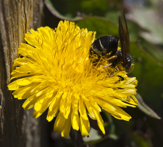
Some Bugs by OWLP - Click to enlarge
Some Bugs by OWLP — Click to enlarge

I chose this image for sev­eral reasons:

The eye is tack tack sharp and that’s hard to do on a sub­ject this small, because focus­ing (and dof) is a chal­leng­ing task at this size and dis­tance to sub­ject. Sharp­ness is lovely in many places; leg hairs, tho­rax, abdomen. Blurred back­ground shows no distractions.

The sub­ject has a def­i­nite impact on the viewer. It’s likely very creepy for many view­ers, prob­a­bly because of sharp­ness. My eye is focused on one thing, that fly.

Good com­po­si­tion all around which can be chal­leng­ing at this size as well.

Nice high­light con­trol on what­ever the fly is rest­ing on and the over­all expo­sure is well han­dled with sup­ple­men­tary lighting.

For all these rea­sons, this is my choice for image of the month. Since we all have opin­ions, some mem­bers may dis­agree with my choice. That’s cool but THIS thread is not the place for debate over my pick, NOR is it the place to fur­ther cri­tique the image. The pur­pose here is to sug­gest strong ele­ments in the photo that we may learn from.

Con­grats again OWLP for cre­at­ing this strik­ing image!

I¯¿½d also like to include these 2 images as hon­ourable men­tions as they also came so so close to being picked.

Col­or­less Beauty by Kat

Colorless Beauty by Kat - Click to enlarge
Col­or­less Beauty by Kat — Click to enlarge

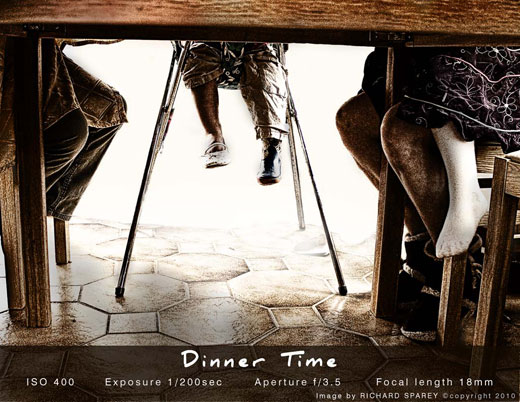
Din­ner time by Richard

Dinner time by Richard - Click to enlarge
Din­ner time by Richard — Click to enlarge

Power At Sun­rise by Mad Aussie

Power at Sunrise by Mad Aussie - Click to enlarge
Power at Sun­rise by Mad Aussie — Click to enlarge

Toronto Contact Photography Festival — May 1–31 2010

Last week I spent 2 days gallery-hopping at theToronto Con­tact Pho­tog­ra­phy fes­ti­val. It’s always a treat to see so many pho­to­graphic works being exhib­ited at the same time. This fes­ti­val shows pho­tog­ra­phy work all around the city of Toronto (from local and Inter­na­tional artists) but it’s mostly con­cen­trated downtown.

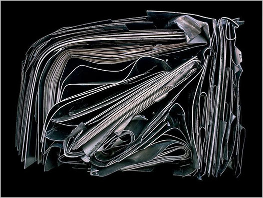
Heidi Leverty - Tincarnation 13
Heidi Lev­erty — Tin­car­na­tion 13

I go to these events purely to see good pho­tog­ra­phy and to get inspired. I LOVE see­ing work that moves me even if it is out­side what I nor­mally con­sider to be ‘my’ sub­ject mat­ter. As with most pho­tog­ra­phy fes­ti­vals, the major­ity of the work doesnot appeal to me. Pho­tog­ra­phy for the most part is a one frame deal and if I have to look too hard for the deeper mean­ing, or work to see the great­ness of the shot, then for me the pho­to­graph makes me go “meh”. Don’t get me wrong, I LOVE sym­bol­ism, I love images laden with themes and I love dou­ble or triple mean­ings in an image but SHOW it to me. Don’t embed the gold too deeply in the image, make the gold shine. Don’t make me go back to a text on mythol­ogy with an obscurely titled pho­to­graph, show me some­thing uni­ver­sal that moves me now.

There were far too many exhi­bi­tions to see them all but I did see a good 20 exhi­bi­tions. I should say that I missed at least 3 shows purely because I could not find them.Her­man & Audrey is a show that I would have LOVED to have seen. I drove to address the on Duf­ferin, in fact I planned part of my day on that show since the gallery opened at 4pm.…nothing there to indi­cate any exhi­bi­tion there folks…and no phone num­ber either.

So here were the shows that intrigued me the most with a brief review:

-Bar­bara Probst — Expo­sures — This was a cool show; 12 cam­eras all set up in dif­fer­ent loca­tions, pho­to­graph the same scene from dif­fer­ent angles. The result­ing large scale pho­tographs all taken at the same moment, are pre­sented in an inter­est­ing and cohe­sive way. 1450 Dun­das St. W — 416–537-3125

-The Skin you Love to Touch — Jodi Bieber, Lau­ren Green­field, Zed Nel­son — I thought this one was very intrigu­ing show­ing the ‘skins’ of very dif­fer­ent peo­ple and their rela­tion to mar­ket­ing, con­sumerism, per­cep­tion and self-perception. 80 Spad­ina suite 310

Ben Ng -Exposed: Per­va­sive Influ­ence — Glad­stone Hotel on the sec­ond floor ( a great venue at 1214 Queen St. W. with MANY exhi­bi­tions). I found Ben’s land­scapes extremely well done and very strik­ing. In par­tic­u­lar the print­ing qual­ity is just fab­u­lous. Most of the images were hand-painted; mean­ing they started off as black and white images and then selected parts were hand-painted. It looked to me like they were hand-painted old school (as opposed to doing this much more eas­ily in Pho­to­shop) which means that you apply paint to the actual photograph.

My fave — Some­times you’ll walk into a Gallery that is show­ing one main artist and other artists intrigue you even more. This is what hap­pened atBau-Xi Photo with their main exhi­bi­tion At this Moment by Zoe Jare­mus, which over­all, I liked. Bau-Xi is located at 324 Dun­das tel # 416–977-0400 and their gallery was my favorite stop of the entire exhi­bi­tion. I dis­cov­ered 2 artists there whose work struck me imme­di­ately;Heidi Lev­erty (whose image is fea­tured in this post) andAnthony Red­path. Heidi’s work is AWESOME and has tremen­dous impact. She only had 2 (large — around 32 x40 inches) images that were exhib­ited but Robyn who works at the gallery showed me some addi­tional work. Her work depicts large scale recy­cled mate­ri­als pre­sented in an abstract yet extremely com­pelling way. Anthony’s work was even larger in scale and his exhib­ited image Trailer Park Party (64.5 x 96 inches) is excel­lent and incred­i­bly sharp. Spe­cial thanks toRobyn McCal­lum for the extra infor­ma­tion she gave me.

My apolo­gies to all the artists whose work I missed. If you are read­ing this and want to send me some links to your work, I’m all eyes. Spe­cial thanks toJoe Cormier who gallery-hopped (lit­er­ally — he has a sore leg) with me on day 1. He also showed some fab work at this fes­ti­val atMoos Gallery.