Photographing Cityscapes — A City Mouse in Winter By Jacqueline A. Sheen

I love to pho­to­graph the city in win­ter. The light is like no other time of year since the sun is always low in the sky. Long shad­ows crawl across the snow cre­at­ing inter­est­ing lines. The light often has a sub­tle pink­ish glow that you only see in sum­mer at day­break. There is a clean crisp­ness to the air and the land­scape. The bare trees and snow cov­ered streets cre­ate a clean min­i­mal­ism you don’t have in summer.

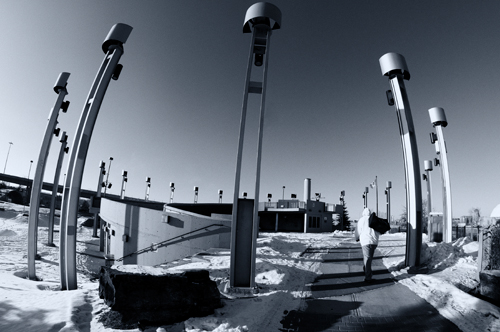
I was out wan­der­ing about with my newly pur­chased 8mm fish­eye lens on a crisp Sun­day after­noon. The tem­per­a­ture was hov­er­ing at minus 20 C with the bit of wind chill. It was sunny and the snow was reflect­ing the light back on every sur­face. I was in the skate park with the idea I could try out some inter­est­ing exper­i­ments with the snow cov­ered skate domes. The new C Train over­pass also runs along the edge of the park, so I thought it would work well with the lens’s dis­tor­tion as well.

Urban Trek by Jacqueline A. Sheen

Urban Trek by Jacque­line A. Sheen

The prob­lems that a cityscape pho­tog­ra­pher faces in win­ter are not much dif­fer­ent than what a land­scape pho­tog­ra­pher would expe­ri­ence. Our ter­rain is gen­er­ally a bit smoother but it is equally as cold, so I always dress about the same as you would expect to dress if you were out in the moun­tains. I am usu­ally out for a few hours at a time, so I make sure I am pre­pared for the weather.  The advan­tage I have over the rugged land­scape pho­tog­ra­pher is that I can find a Star­bucks to warm up in pretty quickly when the going gets too cold!

If you are out in sub-zero tem­per­a­tures for extended peri­ods of time, you will have to con­sider how to care for your gear.  I usu­ally carry an extra bat­tery in my pocket but so far I have not had to use it. Recently, while out on the street on a crisp day of about minus 10 C, I noticed the sun shin­ing into one of our plus 15s that is acces­si­ble from the street. I thought it might make for an inter­est­ing shot from the inside and climbed up the stairs to go inside. Well– myself, (I wear glasses) the cam­era LCD screen and the lens fil­ter all fogged up as you might expect. After a few min­utes the fog­gi­ness cleared and I was able to get the shot. I am told that hav­ing a fil­ter on the front of your lens helps keep mois­ture off the lens itself so you may want to con­sider a UV fil­ter for that rea­son. Also when I come in from shoot­ing on a cold day,  I remove the mem­ory cards  from my cam­era,  pack up the cam­era and lenses  in the bag, then I zip it up tightly. I let every­thing return to room tem­per­a­ture for sev­eral hours before remov­ing the gear  from my bag. That way I avoid the prob­lem of con­den­sa­tion on my cam­era and lenses.  Hav­ing a well padded cam­era bag is use­ful for this reason.

For this photo, which I call “Urban Trek”, I was lin­ing up the 8mm fish­eye lens to show off the cir­cle of street lights in the park. Some­one walked into my frame and I snapped the pic­ture.  The idea of the urban trekker appealed to me. Here we have an urban­ite fac­ing the harsh cold ele­ments sur­rounded by this stark bright land­scape. His dress and pos­ture fur­ther empha­size the cold tem­per­a­tures as he quickly walks to his destination.

Jacque­line A. Sheen is a pho­tog­ra­pher liv­ing in Cal­gary Alberta, Canada. You can check out more of her work at www.jasphoto.ca and she also goes by the han­dle JAS_Photo on our pho­tog­ra­phy forum.

Photography forum image of the month February 2011

Every month on our pho­tog­ra­phy forum mem­bers nom­i­nate images that they like. Then at the end of the month I choose an excel­lent image and talk about why it rocks. The photo I choose is not nec­es­sar­ily the best one of the month. I’ve come to real­ize it’s not really log­i­cal to pit images from totally dif­fer­ent gen­res against each other. That’s why there are cat­e­gories in photo con­tests. I just choose a photo that has extremely strong ele­ments that we can learn from.

Junk Yard Cat by Barefoot

Junk Yard Cat by Barefoot

This month’s choice is Junk Yard Cat by Barefoot

I chose this image for sev­eral reasons:

Mood — Light­ing — This image has a great mood due to the won­der­ful light­ing. The light­ing is on the low key side and it’s totally work­ing for me here. Even though the light­ing is low-keyish there’s still quite a bit of deli­cious shadow detail.

Good sug­ges­tion of a story — This is also related to the mood but it looks to me like this car is in an old garage or barn. The car is also way old with loads of rust but it still serves a pur­pose, it’s not dead yet. It serves as a poten­tial favourite rest­ing spot for the cat.

Sub­tlety — Mys­tery — Sur­prise — I love the fact that my eye did NOT go straight to the cat in this shot and this is due to the fact that the bright cir­cu­lar thing on top of the head­light at right is the first thing we look at. I love that. Had the cat been brighter, the shot would have been more about the cat and our eye would have gone straight for the cat. This way, we get a bet­ter sur­prise when we notice the cat.

Com­po­si­tion — I dig the repeat­ing cir­cles and lines in this image as well as the point of view from which the image was taken.

For all these rea­sons, this is my choice for image of the month. Since we all have opin­ions, some mem­bers may dis­agree with my choice. That’s cool but THIS thread is not the place for debate over my pick, NOR is it the place to fur­ther cri­tique the image. The pur­pose here is to sug­gest strong ele­ments in the photo that we may learn from.

Con­grats again Bare­foot for see­ing and cap­tur­ing this won­der­ful scene!

94 — Turning day into night

Pho­tog­ra­phy pod­cast #94 teaches how to turn day into night or late after­noon for por­trait pur­poses. This tech­nique is often used by wed­ding, fash­ion and por­trait pho­tog­ra­phers. The goal of the tech­nique is to make the sky look darker so that the model pops against the sky. This often adds mood and/or drama to a shot. We dis­cuss 2 tech­niques; using flash and cam­era in man­ual non TTL (Through the lens) mode as well as TTL mode. We also touch on flash sync speeds.

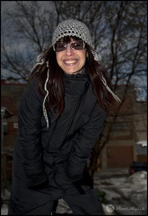
This image looks like it was shot in the late after­noon but it was shot at 1pm. Cam­era mode was aper­ture pri­or­ity using TTL flash. Expo­sure com­pen­sa­tion was set to –3 on cam­era and +2 for the direct on cam­era flash. I would have taken the flash off cam­era for a bet­ter light­ing pat­tern but it was minus 15 C and my model only had 5 min­utes in her.

Links /resources men­tioned in this podcast:

Show us your parks is the reg­u­lar assign­ment this month on our pho­tog­ra­phy forum
Macro — closeup  is the level 2 assign­ment this month on our pho­tog­ra­phy forum
If you are inter­ested in writ­ing for our blog please con­tact me photography.ca (   A   T  ) G m ail  Dot co m (using stan­dard email formatting)

Please join the Photography.ca fan page on Facebook

If you liked this pod­cast and want to review it on Itunes, this link gets you to the main page

My Face­book pro­file — Feel free to “friend” me — please just men­tion Photography.ca
My Twit­ter page — I will fol­low you if you fol­low me — Let’s con­nect — PLEASE email me and tell me who you are in case I don’t rec­i­p­ro­cate because I think you are a spammer.

If you are still lurk­ing on our forum,
feel free to join our friendly :)  Pho­tog­ra­phy forum

Thanks to kat, Wicked Dark and Shant M who posted a blog com­ment about our last pod­cast. Thanks as always to every­one that sent com­ments by email about our last pod­cast. Although ALL com­ments are appre­ci­ated, com­ment­ing directly in this blog is pre­ferred. Thanks as well to all the new mem­bers of the bul­letin board. Most of the links to actual the prod­ucts are affil­i­ate links that help sup­port this site. Thanks in advance if you pur­chase through those links.

If you are look­ing at this mate­r­ial on any other site except Photography.ca — Please hop on over to the Photography.ca blog and pod­cast and get this and other pho­tog­ra­phy info directly from the source. |Sub­scribe with iTunes |Sub­scribe via RSS feed |Sub­scribe with Google Reader|Sub­scribe for free to the Pho­tog­ra­phy pod­cast — Photography.ca and get all the posts/podcasts by Email
You can down­load this pho­tog­ra­phy pod­cast directly by click­ing the pre­ced­ing link or lis­ten to it almost imme­di­ately with the embed­ded player below.

Thanks for lis­ten­ing and keep on shooting!

Photography forum image of the month January 2011

Every month on our pho­tog­ra­phy forum mem­bers nom­i­nate images that they like. Then at the end of the month I choose an excel­lent image and talk about why it rocks. The photo I choose is not nec­es­sar­ily the best one of the month. I’ve come to real­ize it’s not really log­i­cal to pit images from totally dif­fer­ent gen­res against each other. That’s why there are cat­e­gories in photo con­tests. I just choose a photo that has extremely strong ele­ments that we can learn from.

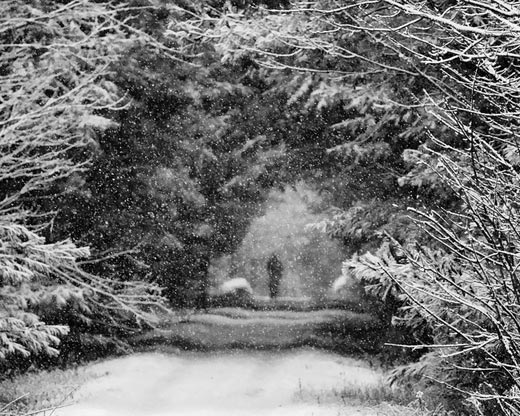
A snowy morning by Bambi

A snowy morn­ing by Bambi

This month’s choice is‚A snowy morn­ing by Bambi

I chose this image for sev­eral reasons:

Mood — This image has a won­der­ful mood and this mood is cre­ated by the falling snow, the snow cov­ered branches in the fore­ground against the darker toned trees in the midground and of course the fig­ure in the back­ground. A shal­lower depth of field with the sharpest ele­ments in the fore­ground might not have been the obvi­ous choice for many pho­tog­ra­phers, but it is rock­ing this image big-time! The shut­ter speed catch­ing the sus­pended snow is also help­ing the mood. The Black and white con­ver­sion is very well done, and it suits and enhances the other ele­ments con­tribut­ing to the over­all mood.

Com­po­si­tion — Very well done here! There are ‘lay­ers’ of inter­est­ing things for our eyes to look at start­ing from the fore­ground and con­tin­u­ing to the back­ground where the focal point (the per­son) is. Our eye is well guided through this win­tery ‘tunnel’.

Exposure/shutter speed — Both are well han­dled here. The shut­ter speed ‘freezes‚ ’ the falling snow here. A good expo­sure keeps the whites in check and offers up won­der­ful tonal­ity with a good range of tones. If I have 1 teeny nig­gle I might burn in the light­est branches at top right by maybe 5%.
For all these rea­sons, this is my choice for image of the month. Since we all have opin­ions, some mem­bers may dis­agree with my choice. That’s cool but THIS post is not the place for debate over my pick, NOR is it the place to fur­ther cri­tique the image. The pur­pose here is to sug­gest strong ele­ments in the photo that we may learn from.

Con­grats again Bambi for cap­tur­ing this gor­geous scene!

Photographing Cityscapes — A City Mouse Perspective by Jacqueline A. Sheen

I am a city mouse; there is no get­ting around it. Not for me get­ting up in the predawn hours to drive for hours out to coun­try vis­tas wait­ing for the per­fect sun­rise. No. My milieu is the city. I live uptown and love it here. I walk just about every­where I go. I encounter inter­est­ing char­ac­ters almost daily and the bus­tle of rush hour makes my heart flut­ter just a lit­tle. When I leave the city, upon return­ing, the moment I see the city sky­line in the dis­tance my heart races just a lit­tle with the feel­ing one gets when they know they will soon see an old love once again.

Calgary Cityscape by Jacqueline A. Sheen

Cal­gary Cityscape by Jacque­line A. Sheen

Cal­gary is not a big city although it suf­fers a bit from urban sprawl. It sits nicely on the prairies, where the Bow River runs through it. The CPR rail­way also runs through the down­town core. This is a vibrant, wealthy city, that was built on a ‚“can do‚ pio­neer spirit.

Calgary‚„s many sky­scrap­ers afford some won­der­ful sky­line pho­tog­ra­phy. Because the city core runs east to west along the core, some really won­der­ful late day pho­tos can be had from the west­ern side of down­town fac­ing east. The glass tow­ers lit­er­ally glow pink and gold. The down­town core itself is located near the riverbed in a bit of a val­ley, which makes for some awe­some van­tage points both at river level and from higher van­tage points.

When pho­tograph­ing the city, I walk every­where. It is not really much dif­fer­ent than land­scape pho­tog­ra­phy in that respect. To see, really see what you are look­ing at, you have to slow down. I try to pho­to­graph the city in a way that shows off its beauty but at the same time, shows it in a way that the com­mon com­muter may not notice in their race to get down­town. Look up. Did you notice the clas­sic art deco styling on that old build­ing? ‚Did you see those gar­goyles way high up on another?

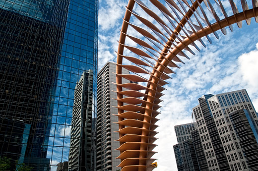
Cal­gary is blessed in that the down­town core is vibrant and alive. There is an active arts com­mu­nity and there is much pub­lic and pri­vate funded art. The photo above shows a por­tion of a large sculp­ture that graces the side­walk in front of one of the ‚“Oil Tow­ers‚ down­town. It looks like a styl­ized dinosaur skele­ton, which makes sense as all the oil reserves come from ‚“dinosaur bones‚ so to speak. Although the own­ers of the sculp­ture may not like my use of it to frame a sky­scraper other than their own, when I saw the photo, the title came imme­di­ately to mind. ‚“This City was Built On Dinosaur Bones.‚

Jacque­line A. Sheen is a pho­tog­ra­pher liv­ing in Cal­gary Alberta, Canada. You can check out more of her work at www.jasphoto.ca and she also goes by the han­dle JAS_Photo on our pho­tog­ra­phy forum.

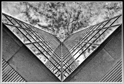
Photographing Architectural Abstracts by Lisa Couldwell

Liv­ing in the down­town core of a large city with some inter­est­ing glass tow­ers makes for great oppor­tu­ni­ties to shoot urban archi­tec­tural abstracts. The beauty of this type of pho­tog­ra­phy is that some­times unco­op­er­a­tive weather or light can make for some great oppor­tu­ni­ties to catch build­ing reflec­tions. So any day I feel the need to get out for a walk, I take my cam­era and head down­town to see what the tow­ers will offer up for opportunities.

I guess the most impor­tant aspect of shoot­ing these types of sub­jects is the abil­ity to look up, ver­ti­cal, side­ways, basi­cally any way that gives one a dif­fer­ent per­spec­tive. When shoot­ing, look for inter­est­ing shapes and reflec­tions off the glass win­dows of the tow­ers. This can be any­thing from the reflec­tions of the other parts of the build­ings them­selves, to reflec­tions of the sky or clouds, sun­light or other build­ings in the area.

Energy Plaza - Calgary, Alberta by Lisa Couldwell

Energy Plaza — Cal­gary, Alberta by Lisa Couldwell

If you see some­thing that catches your eye, try turn­ing your head, body in a way that might per­haps give you a dif­fer­ent per­spec­tive and if you see some­thing, get the cam­era ready. I usu­ally set my Pen­tax into auto-bracket mode because I like to have the option of an HDR shot to play around with when I get home. Put the cam­era to the eye and again turn the cam­era, side­ways, on an angle or basi­cally any way that inten­si­fies the abstract­ness of what you see through the lens. Take your time and don’t be afraid to take sev­eral ver­sions of the shot while mov­ing the cam­era and your body into dif­fer­ent angles as you never know what may work and what may not. When com­pos­ing the image in cam­era, I often com­pose lines to move on the diag­o­nal as this moves the eye through the photo and cre­ates a pleas­ing per­spec­tive. I look for sym­met­ri­cal and geo­met­ric shapes when I move and pho­to­graph. I will go across the street and try from a dif­fer­ent street cor­ner as well. The beauty of this kind of pho­tog­ra­phy is any­thing goes and you never know what you may end up with just by mov­ing either a few cen­time­ters or sev­eral feet. (Just as an FYI, some­times you may get has­sled from secu­rity peo­ple but in Canada as long as you are on a pub­lic side­walk and not on pri­vate prop­erty you have the right to con­tinue to photograph.)

In this image, I really was attracted to the V shaped angle of the build­ing, van­ish­ing per­spec­tive, sym­me­try, and the reflec­tions of the other win­dows and the clouds. I pointed the cam­era straight up and tried to angle it so it was per­fectly sym­met­ri­cal. I then auto­brack­eted 3 shots at expo­sures of +.5/0/-.5 stops, com­bined them into an HDR image in Pho­tomatix, con­verted to BW in Sil­ver Efex and minor touch ups in Light­room to really bring out the cloud detail.

Lisa Could­well is a pho­tog­ra­pher liv­ing in Cal­gary Alberta, Canada. You can check out more of her work in the Pen­tax Gallery, on flu­idr,‚and on Smug­mug. She also goes by the han­dle casil403 on our pho­tog­ra­phy forum.

93 — Black and white photography — qualities that make good bw images

Pho­tog­ra­phy pod­cast #93 is based on a thread in our pho­tog­ra­phy forum by mem­ber asnow where he asks about the qual­i­ties make a good black and white photo. A num­ber of other forum mem­bers help answer the ques­tion and I offer up some per­sonal opin­ions as well. One‚piece‚of good advice involves learn­ing to see in black and white using a dig­i­tal cam­era. Most dig­i­tal cam­eras can cap­ture the image in colour but SHOW it to you on your camera’s screen in black and white. This allows you to learn how coloured tones under a given light look in black and white. (Look up the word mono­chrome in your camera’s instruc­tion man­ual for instruc­tions on how to do this). Live view is also fan­tas­tic as it shows you how the scene will look in BW even before you click the shut­ter. (Many thanks to asnow, raven4ns, Wicked Dark and Andrew for their con­tri­bu­tions to the thread and podcast.)

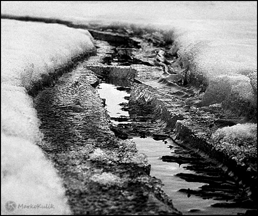
Snow Tracks - Marko Kulik

Snow Tracks — Marko Kulik

Links /resources men­tioned in this podcast:

The Zone Sys­tem — Wikipedia | The Zone sys­tem on Lumin­ious land­scape
Wicked Dark’s arti­cle Black and White 101

Emo­tion is the reg­u­lar assign­ment this month on our pho­tog­ra­phy forum

Back­light­ing is the level 2 assign­ment this month on our pho­tog­ra­phy forum
If you are inter­ested in writ­ing for our blog please con­tact me photography.ca ( ‚ A ‚ T ‚) G m ail ‚Dot co m (using stan­dard email formatting)

Please join the Photography.ca fan page on Facebook

If you liked this pod­cast and want to review it on Itunes, this link gets you to the main page

My Face­book pro­file — Feel free to “friend” me — please just men­tion Photography.ca
My Twit­ter page — I will fol­low you if you fol­low me — Let’s con­nect — PLEASE email me and tell me who you are in case I don’t rec­i­p­ro­cate because I think you are a spammer.

If you are still lurk­ing on our forum,
feel free to join our friendly :)Pho­tog­ra­phy forum

Thanks to kawarthabob, and kat‚who posted a blog com­ment about our last pod­cast. Thanks as always to every­one that sent com­ments by email about our last pod­cast. Although ALL com­ments are appre­ci­ated, com­ment­ing directly in this blog is pre­ferred. Thanks as well to all the new mem­bers of the bul­letin board. Most of the links to actual the prod­ucts are affil­i­ate links that help sup­port this site. Thanks in advance if you pur­chase through those links.

If you are look­ing at this mate­r­ial on any other site except Photography.ca — Please hop on over to the‚Photography.ca blog and pod­cast and get this and other pho­tog­ra­phy info directly from the source. |Sub­scribe with iTunes |Sub­scribe via RSS feed |Sub­scribe with Google Reader |Sub­scribe for free to the Pho­tog­ra­phy pod­cast — Photography.ca and get all the posts/podcasts by Email
You can down­load this pho­tog­ra­phy pod­cast directly by click­ing the pre­ced­ing link or lis­ten to it almost imme­di­ately with the embed­ded player below.

Thanks for lis­ten­ing and keep on shooting!

Vintage photo of the day Jan. 17, 2011

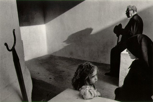
The vin­tage photo of the day is from the series Por­tu­gal by Mas­ter Czech pho­tog­ra­pher Josef Koudelka and was taken in 1976. Koudelka is well known for his work pho­tograph­ing Gyp­sies in Slo­va­kia and Roma­nia as well as cap­tur­ing the daily‚interactions‚of peo­ple from many dif­fer­ent (mostly) Euro­pean countries.

Joseph Koudelka - Portugal - 1976

Joseph Koudelka — Por­tu­gal — 1976

What attracts us to this image is the sense of story com­bined with bril­liant com­po­si­tion. I don’t know what the story is here but it’s a drama. Older man waits in back­ground with a shad­owed pro­file over­look­ing a pri­vate con­ver­sa­tion. The woman is smil­ing in pro­file, per­haps try­ing to soothe or coax the young girl, and the child is con­cerned. What is hap­pen­ing to her? For me, this scene is filled with tension.

Com­po­si­tion­ally, this image is a master-class. Angu­lar lines add to the ten­sion in the image. Tri­an­gles (our eyes love‚triangles) are every­where . Cor­ners, angled light rays, noses, table ends, knee bends, elbows are just a few of the tri­an­gles that we see. Look harder and you’ll see more of them…it’s no acci­dent that they are there. Even the inter­ac­tion (both obvi­ous and sub­tle) between the 3‚individuals‚is tri­an­gu­lar. Some fine black and white print­ing with a rich assort­ment of tones further‚adds to this image’s impact.

Photo of the day Jan. 13, 2011

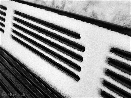
Win­ter is a great time to cap­ture black and whites because most of the colours are cov­ered in snow. ‚It’s also a great time to shoot lines and pat­terns for the same rea­son; the lack of colour empha­sizes their forms. The lines, angles and con­trast caught my eye when I spot­ted this bench and I was happy to have the G11 with me. This was a tricky shot because it was later in the day (less light) and I was hold­ing ‚a loaf of bread and a pie in the other hand as I shot this. While this was on the screen I knew that I’d likely pre­fer the shot if it were flipped as it would make it more abstract.

Bench Lines - ‚© Marko Kulik

Bench Lines — ‚© Marko Kulik

92 — My damn lenses keep vignetting — solving vignetting problems

Pho­tog­ra­phy pod­cast #92 talks about solv­ing vignetting which is the unwanted dark­en­ing around the edges or cor­ners in your pho­tographs. We talk about 2–3 very com­mon rea­sons why even pro­fes­sional lenses that cost a for­tune, STILL suf­fer from vignetting in cer­tain cases. ‚We also talk about why many peo­ple never notice the vignetting in their pho­tographs even though it’s often there.

Mechanical or filter vignetting

This is mechan­i­cal vignetting of a shot of the sky on my F2.8 24mm wide angle lens and is due to too many fil­ters in front of the lens. Shot at left at F2.8. Stop­ping down to F 5.6 (right shot) ‚helps slightly. A bet­ter solu­tion here is to sim­ply use less fil­ters, or wider ones.

Optical vignetting

Opti­cal vignetting on neu­tral sub­ject. Shot at left is at F-5.6 focused on infin­ity using the 300mm end of my 28–300 zoom. Shot at right is at F-11 focused on infin­ity using the 300mm end of my 28–300 zoom‚and the vignetting is almost gone. Both images shot with­out fil­ters of any kind. This type of vignetting can occur in some cases on almost any DSLR lens regard­less of price.‚Listening‚to the pod­cast explains why this happens.

Links /resources men­tioned in this podcast:

Cam­bridge in Colour arti­cle on lenses
Wider Cokin Z fil­ter hold­ers at B&H
Step up rings at B&H
Adapter rings at B&H
Emo­tion is the reg­u­lar assign­ment this month on our pho­tog­ra­phy forum
Back­light­ing is the level 2 assign­ment this month on our pho­tog­ra­phy forum

Please join the Photography.ca fan page on Facebook

If you liked this pod­cast and want to review it on Itunes, this link gets you to the main page

My Face­book pro­file — Feel free to “friend” me — please just men­tion Photography.ca
My Twit­ter page — I will fol­low you if you fol­low me — Let’s con­nect — PLEASE email me and tell me who you are in case I don’t rec­i­p­ro­cate because I think you are a spammer.

If you are still lurk­ing on our forum,
feel free to join our friendly :)Pho­tog­ra­phy forum

Thanks to Jack Label and Sevenwords‚who posted a blog com­ment about our last pod­cast. Thanks as always to every­one that sent com­ments by email about our last pod­cast. Although ALL com­ments are appre­ci­ated, com­ment­ing directly in this blog is pre­ferred. Thanks as well to all the new mem­bers of the bul­letin board. Most of the links to actual the prod­ucts are affil­i­ate links that help sup­port this site. Thanks in advance if you pur­chase through those links.

If you are look­ing at this mate­r­ial on any other site except Photography.ca — Please hop on over to the‚Photography.ca blog and pod­cast and get this and other pho­tog­ra­phy info directly from the source. |Sub­scribe with iTunes |Sub­scribe via RSS feed |Sub­scribe with Google Reader |Sub­scribe for free to the Pho­tog­ra­phy pod­cast — Photography.ca and get all the posts/podcasts by Email
You can down­load this pho­tog­ra­phy pod­cast directly by click­ing the pre­ced­ing link or lis­ten to it almost imme­di­ately with the embed­ded player below.

Happy New Year every­one and only the best for 2011 — thanks for lis­ten­ing and keep on shooting!

Vintage photo of the day Jan. 8, 2011

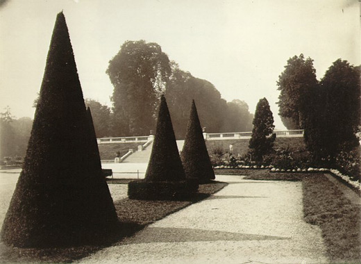
The vin­tage photo of the day is called Saint-Cloud (a sub­urb of Paris, France) by Eugene Atget and was taken in the early 1920’s. Atget is well known for for doc­u­ment­ing the land­scape, urban­scape, parks and street scenes and of ” Old” Paris‚in the late 1800’s and early part of the twen­ti­eth century.

Saint-Cloud by Eugene Atget 1921-1922

Saint-Cloud by Eugene Atget 1921–1922

Although newer pho­tog­ra­phers might look at this image and go “meh”, there’s actu­ally lots of inter­est­ing stuff to look at due to the care­ful com­po­si­tion. The repeat­ing cone-shaped trees and their shad­ows are the focal points of the image and their shapes are some­what repeated by the other trees in the back­ground. Great use of lead­ing lines and shapes cre­ated in both the pos­i­tive and neg­a­tive areas of this pho­to­graph make it far more intrigu­ing than it ini­tially seems.

The‚George‚Eastman‚house also has quite a good col­lec­tion of Atget pho­tographs for those that want to see more of this Master’s work.

http://www.geh.org/fm/atget/htmlsrc/atget_sld00001.html

Photography forum image of the month December 2010

Every month on ourpho­tog­ra­phy forum mem­bers nom­i­nate images that they like. Then at the end of the month I choose an excel­lent image and talk about why it rocks. The photo I choose is not nec­es­sar­ily the best one of the month. I’ve come to real­ize it’s not really log­i­cal to pit images from totally dif­fer­ent gen­res against each other. That’s why there are cat­e­gories in photo con­tests. I just choose a photo that has extremely strong ele­ments that we can learn from.

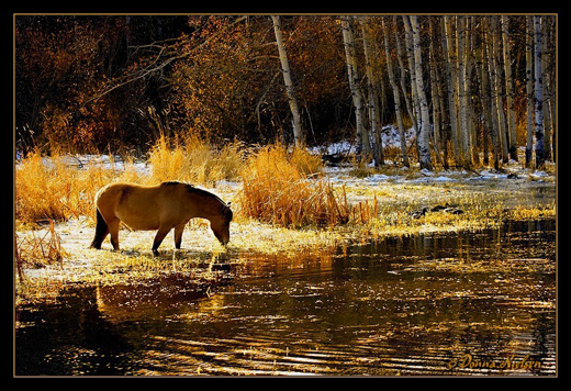
Golden Glitter by Donna

Golden Glit­ter by Donna

This month’s choice is‚Golden Glit­ter by Donna

I chose this image for sev­eral reasons:

Com­po­si­tion — I just love the com­po­si­tion here, it’s so pleas­ing to the eye. The rule of thirds is work­ing well for me here with approx­i­mately 1/3 fore­ground, 1/3 midground and 1/3 back­ground when you look hor­i­zon­tally. When you look ver­ti­cally it’s a clas­sic 1/3rd left and 2/3rds to the right. Some peo­ple scoff at the rule of thirds.…scoff away…if the horse were cen­tered here, the image would not be as visu­ally inter­est­ing. The horse was likely delib­er­ately cap­tured in an excel­lent spot which is the bright­est spot in the image. Our eye goes right to the horse. The water line in the midground is another inter­est­ing element.

Colour palette/tonal qual­ity — These are WOW colours for me even though they are quite con­trasty in parts of the image. The colour palette is golden warm, well bal­anced, and the tones are harmonious.

Lighting/exposure — This is tricky light­ing which means tricky expo­sure and it is very well han­dled. The backlighting/sidelighting on the horse has just enough detail on its side to make it inter­est­ing and pro­vide a bit of reflec­tion in the water. The head is par­tially sil­hou­et­ted which adds drama and grabs our eye as pre­vi­ously mentioned.

For all these rea­sons, this is my choice for image of the month. Since we all have opin­ions, some mem­bers may dis­agree with my choice. That’s cool but THIS thread is not the place for debate over my pick, NOR is it the place to fur­ther cri­tique the image. The pur­pose here is to sug­gest strong ele­ments in the photo that we may learn from.

Con­grats again Donna for cap­tur­ing this gor­geous scene!