136 — Lube up your Old Filters

Pho­tog­ra­phy pod­cast #136 talks about cre­at­ing dreamy images by plac­ing Vase­line or petro­leum jelly on an old UV fil­ter attached to your lens. By doing this you are often able to cre­ate dreamy, impres­sion­is­tic images. The pro­ce­dure is sim­ple; take an OLD UV fil­ter (because remov­ing the vase­line from the fil­ter after use might dam­age its coat­ing) and screw it onto a lens. Then place a wee bit of petro­leum jelly (just a bit goes a long way) on your fin­ger and apply it to the front of the UV fil­ter. Take a few images and see what you get. Play with the level and posi­tion of the blur by remov­ing some Vase­line or mov­ing it around with your finger.

It goes with­out say­ing that you need to do this care­fully so as not to allow the Vase­line to touch your cam­era or lens. The Vase­line should only be on the front of the fil­ter. When you’re done shoot­ing, remove the fil­ter imme­di­ately and place it in a plas­tic bag. Then clean it (I just used reg­u­lar dish soap) when you get home. If you have a few wet wipes along with a dry cloth (to thor­oughly wipe your fin­ger between mov­ing the vase­line around and touch­ing the shut­ter release but­ton) and an extra plas­tic bag or two, you should have no prob­lem doing this.

Feel free to add to the con­ver­sa­tion by leav­ing a com­ment or sharing/liking this post in some way.

Click the player at the end of this post to lis­ten to (or down­load) this 9.5 minute podcast.

Here are some of the pho­tographs I was able to make with this technique;
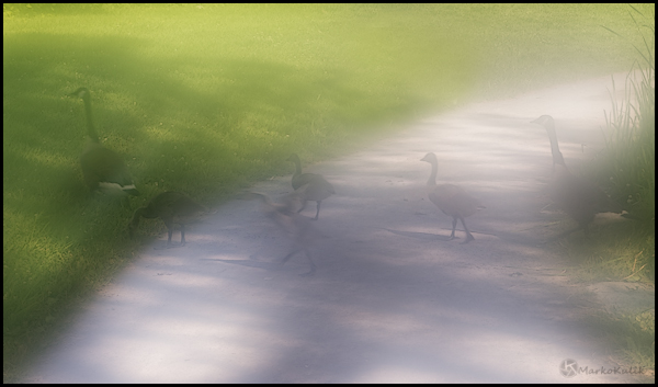
 

Crossing Ducks - Lafontaine Park Montreal

Cross­ing Ducks — Lafontaine Park Mon­treal — Image shot with a 50mm lens using a UV fil­ter coated with petro­leum jelly


Dreamy Carmy - Laurier Park Montreal

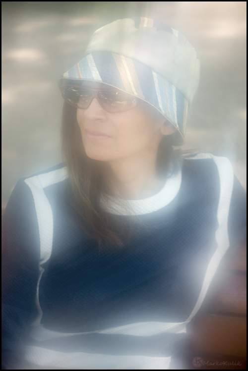
Dreamy Carmy — Lau­rier Park Mon­treal — Vase­line in front of an old polar­iz­ing filter


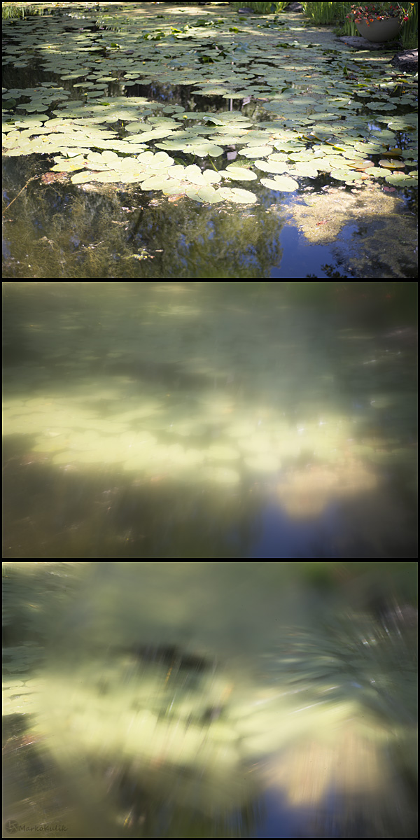
Lily pads - Centre de la Nature - Laval, QC.

Lily pads — In this series of images I took a straight shot and then 2 vase­line shots over the UV fil­ter. You can see how com­pletely dif­fer­ent the 2 vase­line images look from one another. This dif­fer­ence is sim­ply due to the quan­tity and position/pattern of the Vase­line on the filter


Links /resources men­tioned in this pod­cast:
Exhi­bi­tion and Film on Impres­sion­ism and Pho­tog­ra­phy (Lorin’s com­ment from pod­cast 135)
Pic­to­r­ial Com­po­si­tion and the Crit­i­cal Judge­ment of Pic­tures by Henry Rankin Poore

If you liked this pod­cast and want to review it on Itunes, this link gets you to the main page

Please join the Photography.ca fan page on Facebook

My Face­book pro­file — Feel free to “friend” me — please just men­tion Photography.ca
My Twit­ter page — I will fol­low you if you fol­low me — Let’s con­nect — PLEASE email me and tell me who you are in case I don’t rec­i­p­ro­cate because I think you are a spammer.

If you are still lurk­ing on our forum,
feel free to join our friendly :)  Pho­tog­ra­phy forum

Although ALL com­ments are appre­ci­ated, com­ment­ing directly in this blog is pre­ferred — Thanks Lorin Duck­man, Dave John­son and Jane Chese­brough! Thanks for all the sup­port emails and wel­come to all the new mem­bers of the photography.ca forum!

If you are look­ing at this mate­r­ial on any other site except Photography.ca — Please hop on over to the Photography.ca blog and pod­cast and get this and other pho­tog­ra­phy info directly from the source. |Sub­scribe with iTunes|Sub­scribe via RSS feed |Sub­scribe for free to the Pho­tog­ra­phy pod­cast — Photography.ca and get all the posts/podcasts by Email

You can down­load this pho­tog­ra­phy pod­cast directly by click­ing the pre­ced­ing link or lis­ten to it almost imme­di­ately with the embed­ded player.

Thanks for lis­ten­ing and keep on shooting!


126 — 6 Tips to Improve the Edges of Your Photos

Pho­tog­ra­phy pod­cast #126 dis­cusses the impor­tance of the four edges of your pho­tographs. They are seri­ously impor­tant and pay­ing atten­tion to them will improve your pho­tog­ra­phy. The pod­cast offers up 6 (actu­ally a few more than 6) prac­ti­cal tips on how to improve the edges of your photographs.

Thanks to The Cam­era Store (The largest cam­era store in Cal­gary, Alberta, Canada)  for spon­sor­ing the Photography.ca podcast.

A sneak peek to one of the 6 tips which is use­ful to pho­tog­ra­phers of all lev­els is to check out the work of mas­ter painters. They knew about the edges, about the over­all com­po­si­tion, and the rules of com­po­si­tion. Those rules directly apply to pho­tog­ra­phy. This famous paint­ing below done by Rem­brandt shows dark edges all around which is of course no acci­dent. He did it all the time. Notice where your eye ends up in the paint­ing; on the wave at left and this too is no acci­dent. When we can apply some of these prin­ci­ples to pho­tog­ra­phy, our images almost always improve.


1633 - Rembrandt (1606-1669) Christ in the Storm on the Lake of Galilee.

1633 — Rem­brandt (1606–1669) Christ in the Storm on the Lake of Galilee.


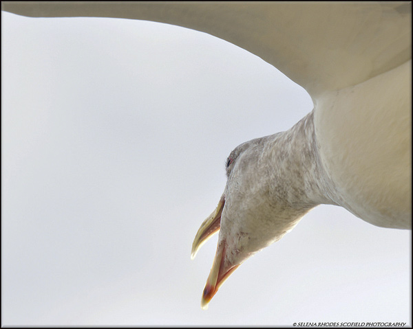
Talk about how edges can add inter­est! This image by Selena Rhodes Scofield from our forum is framed in an extremely cre­ative way and the unusual per­spec­tive just adds to the visual inter­est. In addi­tion, both the seagull’s neck and its wing are cre­at­ing inter­est­ing pos­i­tive and neg­a­tive shapes as they inter­sect with the edges and the rest of the image. Being on the look­out for these shapes is another way to spi­cify your photography.


seagull 3 by Selena Rhodes Scofield

seag­ull 3 by Selena Rhodes Scofield


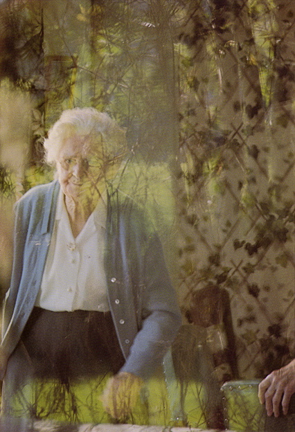
Of course when you want to break guide­lines, you break them when­ever you want to. Just be aware that you are doing so. In this image below, Cana­dian Mas­ter pho­tog­ra­pher and teacher Free­man Pat­ter­son does just that.

From his book Pho­tog­ra­phy and the Art of See­ing he wrote: “I saw this elderly lady as pass­ing away from me and my world, so I pho­tographed her through a win­dow clouded by reflec­tions and cur­tains. The shal­low depth of field, which throws the reflec­tions and cur­tains out of focus, cre­ates a sense of the sur­real and the unknown. The hand of the woman’s friend appears in the lower right cor­ner. By all tra­di­tional stan­dards of com­po­si­tion, the hand should not be there because it looks ampu­tated. Yet it seems strangely appro­pri­ate, rep­re­sent­ing sup­port that may be needed in the present, while at the same time adding to the impres­sion of the world dissolving”


Photograph by Freeman Patterson from The Art of Seeing.

Pho­to­graph by Free­man Pat­ter­son from The Art of Seeing.


Links /resources men­tioned in this podcast:

Pho­tog­ra­phy and the Art of See­ing by Free­man Pat­ter­son. If you can only afford one pho­tog­ra­phy book this year, buy this one.
Com­po­si­tion Basics by oopoomoo

If you liked this pod­cast and want to review it on Itunes, this link gets you to the main page

If you are inter­ested in writ­ing for our blog please con­tact me photography.ca ( A T ) G m ail Dot co m (using stan­dard email formatting)

Please join the Photography.ca fan page on Facebook

My Face­book pro­file — Feel free to “friend” me — please just men­tion Photography.ca
My Twit­ter page — I will fol­low you if you fol­low me — Let’s con­nect — PLEASE email me and tell me who you are in case I don’t rec­i­p­ro­cate because I think you are a spammer.

If you are still lurk­ing on our forum,
feel free to join our friendly :)  Pho­tog­ra­phy forum

Thanks as well to Don Crasco and Daniel Cybul­skie who posted com­ments directly on the blog.  Although ALL com­ments are appre­ci­ated, com­ment­ing directly in this blog is pre­ferred. Thanks as well to all the new mem­bers of the bul­letin board.

If you are look­ing at this mate­r­ial on any other site except Photography.ca — Please hop on over to the Photography.ca blog and pod­cast and get this and other pho­tog­ra­phy info directly from the source. |Sub­scribe with iTunes|Sub­scribe via RSS feed |Sub­scribe for free to the Pho­tog­ra­phy pod­cast — Photography.ca and get all the posts/podcasts by Email

You can down­load this pho­tog­ra­phy pod­cast directly by click­ing the pre­ced­ing link or lis­ten to it almost imme­di­ately with the embed­ded player.

Thanks for lis­ten­ing and keep on shooting!

A Good Day by Michael Orton

Today was one of those days.  After 35 years of car­ry­ing a cam­era I con­sider myself for­tu­nate indeed to have expe­ri­enced some of these days, when every­thing seems to align, the weather, the light, the sea­son, the loca­tion, and let’s not for­get, the pho­tog­ra­pher. After all, with­out the act of mak­ing the deci­sion to set out, noth­ing will be cre­ated. While work­ing in the stock photo busi­ness my work­flow was quite dif­fer­ent from today . My goal was to cre­ate mar­ketable con­cept images and I would research loca­tions to shoot spe­cific images. I would have to place myself in the right loca­tion, at the right time with the best light which was not always easy. Remark­ably I did have some of ” those days ” back then, but not like the ones that have occurred since I became immersed in ICM (Inten­tional Cam­era Move­ment) these last years. I have an inti­mate knowl­edge of the land­scape within a close dis­tance from home and can almost visu­al­ize before set­ting out the like­li­hood of there being the type of sub­ject mat­ter that will feed my imag­i­na­tion. And of course the more I explore the more data I have to draw from. With ICM the required “raw mate­r­ial”, unlike mak­ing a con­ven­tional pho­to­graph, is not a spe­cific object or rec­og­niz­able scene, but rather the start­ing point, like a piece of clay , shape­less until forged and formed into shape. This is the essence of work­ing in this fash­ion. It has lit­tle to do with the actual tech­nique of mov­ing the cam­era and every­thing to do with how you can imag­ine and explore that which is the start­ing point, the raw material.

Today is a late fall day. Leaves had been falling for weeks, morn­ing mists were begin­ning to appear, skies were a patchy blue. If I’m lucky this time of year lasts a few weeks. I love work­ing when there are spaces in the trees and the branches con­trast with the inter­spersed leaves. I set out to walk the edge of a river not far away. There are a vari­ety of trees, bushes and growth, with logs, large and small stones lin­ing the shore­line. (And the salmon are run­ning ) I made many more than the four images shown, but these I selected because they were made stand­ing in almost the same spot.


"A Good Day" - Image 1 by Michael Orton

A Good Day” — Image 1 by Michael Orton


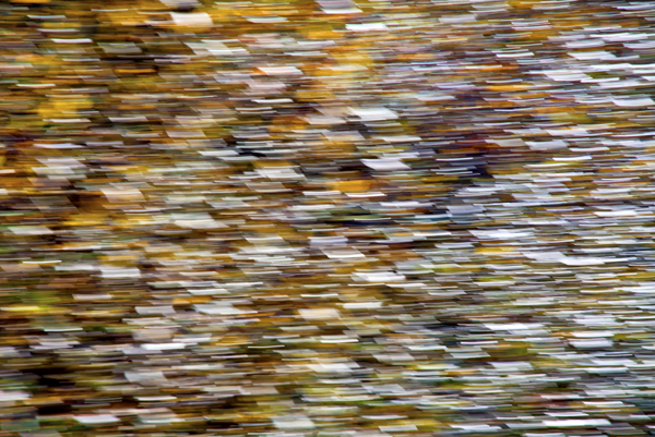
Image one is the light reflected off of the leaves of a small bush , which I ren­dered into hun­dreds of shards of light with a fast cam­era move­ment and short shut­ter speed. When viewed at full size this image has remark­able com­plex­ity and blend­ing . The bush was a short dis­tance to my left.


"A Good Day" - Image 2 by Michael Orton

A Good Day” — Image 2 by Michael Orton


Image two is sim­ply fallen leaves on a spread of medium sized round stones with the sand washed from between them. They are in the shade , and the blue comes from the reflected blue of the sky. The sky had some clouds which occa­sion­ally gave me over­cast light. - 1/2 sec­ond with what I refer to as medium cam­era move­ment speed , using a some­what oblique line and chang­ing focal length dur­ing expo­sure. When I move my cam­era most often I do not swivel from a fixed point but move it in a sim­i­lar fash­ion to a movie cam­era on a track. These stones and leaves where just to my right.


"A Good Day" - Image 3 by Michael Orton

A Good Day” — Image 3 by Michael Orton


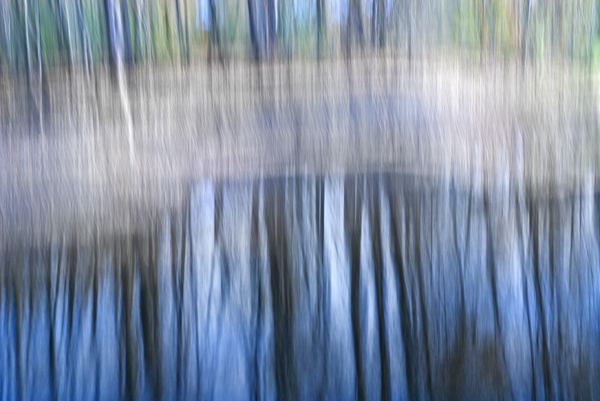
Image three is look­ing across the river . You can see the sandy embank­ment ren­dered as a soft­ened wash while the trees and their reflec­tion remain some­what rec­og­niz­able. I used an extended oval motion at 2 sec­onds to retain the ver­ti­cal lines.


"A Good Day" - Image 4 by Michael Orton

A Good Day” — Image 4 by Michael Orton


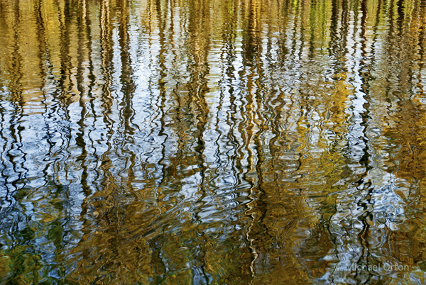
Image four is, yes wait for it, a pho­to­graph, and was taken stand­ing in exactly the same spot as # 3 . Some­times you just take what you are given and make the best of it. I took the polar­izer and ND fil­ter off, kneeled down and scooped this image from the sur­face of the river.The intri­cate, jagged lines of the reflected trees and a hint blue from the sky were to good to pass up. Hand­held at 1/125.

So yes it was a good day. One that I wish every pho­tog­ra­pher could expe­ri­ence, because when you do, it will fuel your pas­sion . This is what keeps us looking.

The video ” A Walk In The Palm Grove ” on our web­site is another good exam­ple of what can be cre­ated at one location.

There is no sub­sti­tute for see­ing… Michael

The pre­ced­ing arti­cle is copy­righted and writ­ten by Cana­dian fine art land­scape pho­tog­ra­pher Michael Orton. You can see more of his work at michaelortonphotography.com

Le Mois de la Photo à Montréal — Photo Month in Montreal

Every two years, Mon­treal, Que­bec, Canada fea­tures a major, month-long major con­tem­po­rary pho­tog­ra­phy fes­ti­val called Le mois de la photo à Mon­tréal. This year’s fes­ti­val runs from Sep­tem­ber 5 — Octo­ber 5, 2013 and fea­tures 25 pho­tog­ra­phy exhi­bi­tions in dif­fer­ent parts of the city.

This year the theme of the fes­ti­val is Drone — The auto­mated image and it is guest curated by Paul Wombell. I’ve been going to this fes­ti­val pretty much since it started and the exhi­bi­tions are almost always laden with exper­i­men­tal (less con­ven­tional) pho­tog­ra­phy and themes that require reflec­tion. If you’re look­ing for more con­ven­tional pho­tog­ra­phy (beau­ti­ful land­scapes, still lifes, street pho­tog­ra­phy) you nor­mally won’t find it at this festival.

Although Le mois de la photo is a pho­tog­ra­phy fes­ti­val, many exhi­bi­tions will be video based and some will fea­ture instal­la­tions. I always find a few exhi­bi­tions that I really like and will report back on my faves.  Feel free to check out the exhi­bi­tions here.

Le mois de la photo

121 — Make Better Self Portraits

Pho­tog­ra­phy pod­cast #121 offers up 6 tips on how to make bet­ter self por­traits in pho­tog­ra­phy. Mak­ing a self por­trait, some­times known as an auto­por­trait has a long his­tory in pho­tog­ra­phy and many past and mod­ern pho­tog­ra­phy Mas­ters (Man Ray, Robert Map­plethorpe and the extremely pro­lific self por­traitist Cindy Sher­man for exam­ple) have pro­duced fab­u­lous self por­traits. Please know in advance that we are not refer­ring to ‘selfies’…which I rant on about for a lit­tle bit in this pod­cast. We are refer­ring to self-portraits which require delib­er­ate fram­ing and think­ing about the light, envi­ron­ment etc.

Thanks to  The Cam­era Store (The largest cam­era store in Cal­gary, Alberta, Canada)  for spon­sor­ing the Photography.ca podcast!

Angst - Self portrait by Marko Kulik - 2000

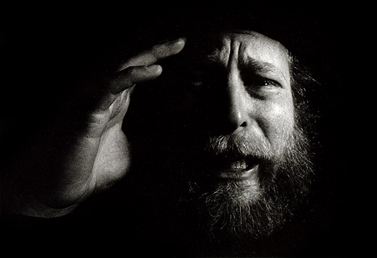
Angst — Self por­trait by Marko Kulik — 2000


Self Portrait as a Parisian by Marko and Carmy - 2009

Self Por­trait as a Parisian by Marko and Carmy — 2009


Self Portrait as a Dock Worker by Marko and Carmy - 2013

Self Por­trait as a Dock Worker by Marko and Carmy — 2013


Links /resources men­tioned in this pod­cast:
Sty­ro­foam heads on Google (helps with focus­ing the cam­era)
Cindy Sherman’a 2012 exhi­bi­tion at MoMA

If you liked this pod­cast and want to review it on Itunes, this link gets you to the main page

If you are inter­ested in writ­ing for our blog please con­tact me photography.ca ( A T ) G m ail Dot co m (using stan­dard email formatting)

Please join the Photography.ca fan page on Facebook

My Face­book pro­file — Feel free to “friend” me — please just men­tion Photography.ca
My Twit­ter page — I will fol­low you if you fol­low me — Let’s con­nect — PLEASE email me and tell me who you are in case I don’t rec­i­p­ro­cate because I think you are a spammer.

If you are still lurk­ing on our forum,
feel free to join our friendly :)  Pho­tog­ra­phy forum

Thanks to Royce How­land, Ken Wolter and Alvin who posted a blog com­ment about our last pod­cast. Thanks as well to every­one that sent com­ments by email about our last pod­cast. Although ALL com­ments are appre­ci­ated, com­ment­ing directly in this blog is pre­ferred. Thanks as well to all the new mem­bers of the bul­letin board. Most of the links to actual the prod­ucts are affil­i­ate links that help sup­port this site. Thanks in advance if you pur­chase through those links.

If you are look­ing at this mate­r­ial on any other site except Photography.ca — Please hop on over to the Photography.ca blog and pod­cast and get this and other pho­tog­ra­phy info directly from the source. |Sub­scribe with iTunes|Sub­scribe via RSS feed |Sub­scribe for free to the Pho­tog­ra­phy pod­cast — Photography.ca and get all the posts/podcasts by Email

You can down­load this pho­tog­ra­phy pod­cast directly by click­ing the pre­ced­ing link or lis­ten to it almost imme­di­ately with the embed­ded player below.

Thanks for lis­ten­ing and keep on shooting!

120 — How to Create Interesting Stories Through Your Photography

Pho­tog­ra­phy pod­cast #120 pro­vides tips on how to cre­ate, craft and tell more inter­est­ing sto­ries through pho­tog­ra­phy.  Some of the aspects we talk about include being active with fram­ing, hunt­ing down the ges­tures and watch­ing the edges.

I’m super-pleased to wel­come  The Cam­era Store (The largest cam­era store in Cal­gary, Alberta, Canada)  as a spon­sor of The Photography.ca pod­cast! I’ve been buy­ing my own gear there and rec­om­mend­ing them for a few years now, and I’m a fussy bug­ger when it comes to both gear and rec­om­men­da­tions. Their cus­tomer ser­vice is sim­ply awe­some and I often find that they have the best prices in Canada. They ship all over Canada.


Both these images were taken within the same minute. The bottom image however, tells a stronger story due to the dramatic gesture of the axe in the air.

Both these images were taken within the same minute. The bot­tom image how­ever, tells a stronger story due to the dra­matic ges­ture of the axe in the air, the smoke com­ing from the side of the roof and the fire­man on the right of the roof that’s fac­ing the cam­era. The top image isn’t bad, but it eas­ily loses in a poker match when it goes head to head with the bot­tom image.


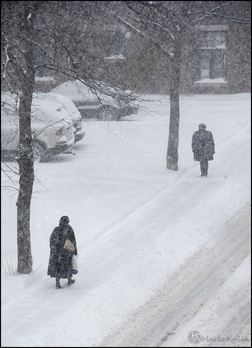
Meeting - I waited in my window and actively composed this scene last winter. There is a strong suggestion of story here because the person in the background appears to be waiting for the foreground woman. I clicked the shutter only when I felt the timing was right compositionally.

Winter’s Meet­ing — I waited in a win­dow and actively com­posed this scene last win­ter. There is a strong sug­ges­tion of story here because the per­son in the back­ground appears to be wait­ing for the fore­ground woman. I clicked the shut­ter only when I felt the tim­ing was right compositionally.


Links /resources men­tioned in this pod­cast:
Long expo­sure images — Photography.ca forum’s reg­u­lar assign­ment — July 2013
Macro pho­tog­ra­phy — Photography.ca forum’s level 2 assign­ment — June 2013
Lay­er­ing images with inter­est­ing ele­ments — Pho­tog­ra­phy pod­cast #102
Shoot in any light - Pho­tog­ra­phy pod­cast #100

If you liked this pod­cast and want to review it on Itunes, this link gets you to the main page

If you are inter­ested in writ­ing for our blog please con­tact me photography.ca ( A T ) G m ail Dot co m (using stan­dard email formatting)

Please join the Photography.ca fan page on Facebook

My Face­book pro­file — Feel free to “friend” me — please just men­tion Photography.ca
My Twit­ter page — I will fol­low you if you fol­low me — Let’s con­nect — PLEASE email me and tell me who you are in case I don’t rec­i­p­ro­cate because I think you are a spammer.

If you are still lurk­ing on our forum,
feel free to join our friendly :)  Pho­tog­ra­phy forum

Thanks to Ben W who posted a blog com­ment about our last pod­cast. Thanks as well to every­one that sent com­ments by email about our last pod­cast. Although ALL com­ments are appre­ci­ated, com­ment­ing directly in this blog is pre­ferred. Thanks as well to all the new mem­bers of the bul­letin board. Most of the links to actual the prod­ucts are affil­i­ate links that help sup­port this site. Thanks in advance if you pur­chase through those links.

If you are look­ing at this mate­r­ial on any other site except Photography.ca — Please hop on over to the Photography.ca blog and pod­cast and get this and other pho­tog­ra­phy info directly from the source. |Sub­scribe with iTunes|Sub­scribe via RSS feed |Sub­scribe for free to the Pho­tog­ra­phy pod­cast — Photography.ca and get all the posts/podcasts by Email

You can down­load this pho­tog­ra­phy pod­cast directly by click­ing the pre­ced­ing link or lis­ten to it almost imme­di­ately with the embed­ded player below.

Thanks for lis­ten­ing and keep on shooting!

99 — Controlling brightness in photography

Pho­tog­ra­phy pod­cast #99 dis­cusses how to con­trol bright­ness in your images. Our eye tends to fol­low or rest upon bright objects in a pho­to­graph and very often these objects or ele­ments are not the focal point of the image thus caus­ing our eyes to wander.

Con­trol­ling the brighter ele­ments in a scene takes some plan­ning dur­ing shoot­ing, and some work in post-processing but ulti­mately your images will be stronger. You’ll also have way more con­trol over the final image where you the cre­ator of the image guide the viewer’s eye purposefully.

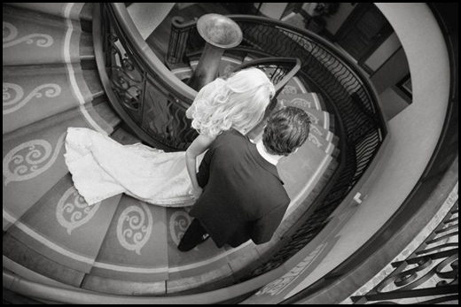
Bright­ness is well con­trolled in this image. Along with com­po­si­tional curves, part of what makes this image work is that other bright ele­ments in the scene are not com­pet­ing with the bride. All eyes are on her as she makes her entrance. Image by Dominic Fuizzotto

Image by Richard Sparey — This lovely image of deli­cious pears suf­fers slightly from what I call weak edges. This causes our eye to wan­der out of the frame. It’s more notice­able on printed white paper or on a pure white background.

The same image with the edges burnt in (dark­ened) quite a bit to show the effect. This helps keep our eyes from wan­der­ing. Thanks to Richard for allow­ing me to use this image.

Links /resources men­tioned in this pod­cast:
– August’s reg­u­lar assign­ment on the Photography.ca forum — Num­bers — Pho­to­graph some­thing with a num­ber
– August’s level 2 assign­ment on the Photography.ca forum — Cre­at­ing coun­ter­points
– Bright­ness prob­lems and dis­tract­ing ele­ments — Pod­cast #44
– Neu­tral den­sity fil­ters and grad­u­ated ND fil­ters — Inter­view with Dar­win Wiggett —  Pod­cast #77
– Dominic Fuiz­zotto Pho­tog­ra­phy
– Richard Sparey Photography


If you liked this pod­cast and want to review it on Itunes, this link gets you to the main page

If you are inter­ested in writ­ing for our blog please con­tact me photography.ca (   A   T  ) G m ail  Dot co m (using stan­dard email formatting)

Please join the Photography.ca fan page on Facebook

My Face­book pro­file — Feel free to “friend” me — please just men­tion Photography.ca
My Twit­ter page — I will fol­low you if you fol­low me — Let’s con­nect — PLEASE email me and tell me who you are in case I don’t rec­i­p­ro­cate because I think you are a spammer.

If you are still lurk­ing on our forum,
feel free to join our friendly :)  Pho­tog­ra­phy forum

Thanks to forum mem­bers North­stone,  Scorpio_e, Howard J, Yise­haq, Bill Sorensen and use­akme who posted  blog com­ments about our last pod­cast. Thanks as always to every­one that sent com­ments by email about our last pod­cast. Although ALL com­ments are appre­ci­ated, com­ment­ing directly in this blog is pre­ferred. Thanks as well to all the new mem­bers of the bul­letin board. Most of the links to actual the prod­ucts are affil­i­ate links that help sup­port this site. Thanks in advance if you pur­chase through those links.

If you are look­ing at this mate­r­ial on any other site except Photography.ca — Please hop on over to the Photography.ca blog and pod­cast and get this and other pho­tog­ra­phy info directly from the source. |Sub­scribe with iTunes|Sub­scribe via RSS feed |Sub­scribe with Google Reader|Sub­scribe for free to the Pho­tog­ra­phy pod­cast — Photography.ca and get all the posts/podcasts by Email
You can down­load this pho­tog­ra­phy pod­cast directly by click­ing the pre­ced­ing link or lis­ten to it almost imme­di­ately with the embed­ded player below.

Thanks for lis­ten­ing and keep on shooting!

97 — How to photograph with hard light

Pho­tog­ra­phy pod­cast #97 is a primer on how to use hard light. Hard light is trick­ier to use than soft light but there is NO rea­son to avoid using it. It just needs to be used appro­pri­ately. Part of using hard light and shadow in pho­tog­ra­phy is being very aware of where the shad­ows will fall and chang­ing your posi­tion or your light­ing if you don’t like where they fall.

Here’s a cou­ple of basic points when using hard light in photography:

- Hard light comes from a small light source rel­a­tive to your sub­ject. The sun IS a small light source in this respect because it is 93 mil­lion miles away from the earth.
- Hard light pro­duces hard shad­ows which are good in many cases espe­cially to reveal form.
- The far­ther the light source is from the sub­ject, the HARDER the shad­ows.
- The far­ther away the light source is from the sub­ject, the SHORTER the shadows.

To prove this to your­self take a flash­light into the bath­room and shut off the lights. Shine the light on your fin­ger in front of the wall. Move the light around and you will learn a ton about shadows.

Hard light demo

Hard light demo — The image at left shows a shadow from direct hard sun­light. Moments later some very light clouds dif­fuse the sun­light to cre­ate a softer shadow at right. Had the sky been com­pletely over­cast (very soft light) almost no shad­ows would be present and this image would lose its punch and be totally bor­ing. © Marko Kulik

Image by BzdegaPhotography

Image by Bzde­gaPho­tog­ra­phy — The hard light totally works in this image despite the flare.

Carmy Working

Carmy Work­ing by Marko Kulik — One hard light at cam­era left cre­ates a shadow that adds to the gritty flavour of the shot

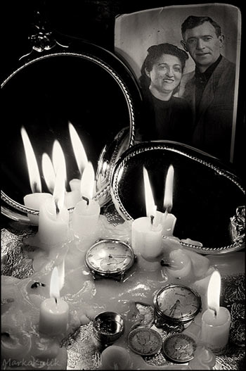
Their Objects by Marko Kulik

Their Objects by Marko Kulik — Can­dle light is hard light. This shot took quite a while to set up due to think­ing about where the shad­ows would fall.

Judy Garland by George Hurrell - 1944

Judy Gar­land by George Hur­rell — 1944. This strik­ing por­trait was shot 67 years ago by light­ing mas­ter George Hur­rell. The very dark shad­ows attest to the hard light used here.

Links /resources men­tioned in this pod­cast:
June’s reg­u­lar assign­ment on the Photography.ca forum — Break­ing the rules
June’s level 2 assign­ment on the Photography.ca forum — Cre­ative self portraits


If you liked this pod­cast and want to review it on Itunes, this link gets you to the main page

If you are inter­ested in writ­ing for our blog please con­tact me photography.ca (   A   T  ) G m ail  Dot co m (using stan­dard email formatting)

Please join the Photography.ca fan page on Facebook

My Face­book pro­file — Feel free to “friend” me — please just men­tion Photography.ca
My Twit­ter page — I will fol­low you if you fol­low me — Let’s con­nect — PLEASE email me and tell me who you are in case I don’t rec­i­p­ro­cate because I think you are a spammer.

If you are still lurk­ing on our forum,
feel free to join our friendly :)  Pho­tog­ra­phy forum

Thanks to forum mem­bers North­Stone, Wicked Dark, Howard J,  KawarthaBob and Jonny Hot­shoe who posted  blog com­ments about our last pod­cast. Thanks as always to every­one that sent com­ments by email about our last pod­cast. Although ALL com­ments are appre­ci­ated, com­ment­ing directly in this blog is pre­ferred. Thanks as well to all the new mem­bers of the bul­letin board. Most of the links to actual the prod­ucts are affil­i­ate links that help sup­port this site. Thanks in advance if you pur­chase through those links.

If you are look­ing at this mate­r­ial on any other site except Photography.ca — Please hop on over to the Photography.ca blog and pod­cast and get this and other pho­tog­ra­phy info directly from the source. |Sub­scribe with iTunes |Sub­scribe via RSS feed |Sub­scribe with Google Reader|Sub­scribe for free to the Pho­tog­ra­phy pod­cast — Photography.ca and get all the posts/podcasts by Email
You can down­load this pho­tog­ra­phy pod­cast directly by click­ing the pre­ced­ing link or lis­ten to it almost imme­di­ately with the embed­ded player below.

Thanks for lis­ten­ing and keep on shooting!

Photography forum image of the month April 2011

Every month on our pho­tog­ra­phy forum mem­bers nom­i­nate images that they like. Then at the end of the month I choose an excel­lent image and talk about why it rocks. The photo I choose is not nec­es­sar­ily the best one of the month. I’ve come to real­ize it’s not really log­i­cal to pit images from totally dif­fer­ent gen­res against each other. That’s why there are cat­e­gories in photo con­tests. I just choose a photo that has extremely strong ele­ments that we can learn from.

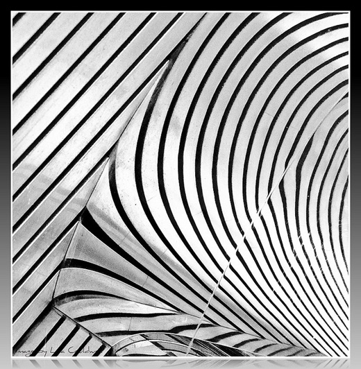
Repetition in Monochrome by Casil403

Rep­e­ti­tion in Mono­chrome by Casil403

This month’s choice is Rep­e­ti­tion in Mono­chrome by casil403.

I chose this image for sev­eral reasons:

Spot­ting the scene — Abstracts like this are often all around us, and the vast major­ity of us will never ever see them. Look­ing is not the same as see­ing. See­ing takes longer, it takes more time and more patience. Hats off to Casil for see­ing this fab­u­lous abstract.

Com­po­si­tion — Even though we are not sure what we are look­ing at, this abstract scene is very well com­posed and very delib­er­ate. Both the curved lines and the straight lines in this image intrigue and suc­cess­fully guide our eye through the image. The repet­i­tive qual­ity of the curves and lines is also very pleas­ing. In case peo­ple are won­der­ing what the abstract actu­ally is, Casil wrote …“it’s the reflec­tion of a sof­fit ceil­ing on a mir­rored pole.”

Post pro­cess­ing — Black and white was an excel­lent choice for this scene. The lack of colour empha­sizes the graphic qual­ity of the lines and pat­terns that we see. The tonal qual­ity of the scene (good rep­re­sen­ta­tion of tones) as well as the frame around the scene suits this image extremely well.

For all these rea­sons, this is my choice for image of the month. Since we all have opin­ions, some mem­bers may dis­agree with my choice. That’s cool but THIS thread is not the place for debate over my pick, NOR is it the place to fur­ther cri­tique the image. The pur­pose here is to sug­gest strong ele­ments in the photo that we may learn from.

Con­grats again Casil for see­ing, cap­tur­ing and pro­cess­ing this won­der­ful find!

96 — Tripods for photography (the good stuff)

Pho­tog­ra­phy pod­cast #96 is a primer on how to buy a great tri­pod, what to look for in a tri­pod and why you should buy a great tri­pod. (In the lon­grun, if you stick with pho­tog­ra­phy long enough, you will be buy­ing a great tri­pod even­tu­ally anyway)

If you are seri­ous enough about your pho­tog­ra­phy that you save money to buy great lenses, then this pod­cast won’t scare the crap out of you.

If you are into the cheap stuff, and are more con­cerned about over­all price ver­sus over­all qual­ity, be afraid — be very afraid.

Tripods and heads for photography

Tripods and heads for photography

Links /resources men­tioned in this pod­cast:
Tri­pod arti­cle by Thom Hogan — a must read
Gitzo GT2540LLVL tri­pod at B&H
Man­frotto 055 Tri­pod plus 3-Way Pan/Tilt Head w/ Quick Release at B&H
The fol­low­ing com­pa­nies make rec­om­mended ball­heads — Arca Swiss — Acrat­echReally Right Stuff - MarkinsGitzoMan­frotto
Cheaper Car­bon fiber tripods by Induro — Benbo (Remem­ber to research and TRY spe­cific indi­vid­ual mod­els)
April’s reg­u­lar assign­ment on the Photography.ca forum — Geo­met­ric shapes
April’s level 2 assign­ment on the Photography.ca forum — Cre­ative underexposure


If you liked this pod­cast and want to review it on Itunes, this link gets you to the main page

If you are inter­ested in writ­ing for our blog please con­tact me photography.ca (   A   T  ) G m ail  Dot co m (using stan­dard email formatting)

Please join the Photography.ca fan page on Facebook

My Face­book pro­file — Feel free to “friend” me — please just men­tion Photography.ca
My Twit­ter page — I will fol­low you if you fol­low me — Let’s con­nect — PLEASE email me and tell me who you are in case I don’t rec­i­p­ro­cate because I think you are a spammer.

If you are still lurk­ing on our forum,
feel free to join our friendly :)  Pho­tog­ra­phy forum

Thanks to forum mem­ber Benny who posted a blog com­ment about our last pod­cast. Thanks as always to every­one that sent com­ments by email about our last pod­cast. Although ALL com­ments are appre­ci­ated, com­ment­ing directly in this blog is pre­ferred. Thanks as well to all the new mem­bers of the bul­letin board. Most of the links to actual the prod­ucts are affil­i­ate links that help sup­port this site. Thanks in advance if you pur­chase through those links.

If you are look­ing at this mate­r­ial on any other site except Photography.ca — Please hop on over to the Photography.ca blog and pod­cast and get this and other pho­tog­ra­phy info directly from the source. |Sub­scribe with iTunes |Sub­scribe via RSS feed |Sub­scribe with Google Reader|Sub­scribe for free to the Pho­tog­ra­phy pod­cast — Photography.ca and get all the posts/podcasts by Email
You can down­load this pho­tog­ra­phy pod­cast directly by click­ing the pre­ced­ing link or lis­ten to it almost imme­di­ately with the embed­ded player below.

Thanks for lis­ten­ing and keep on shooting!

95 — Larry King family portrait — Interview with Laszlo of Montreal

Pho­tog­ra­phy pod­cast #95 fea­tures an inter­view with Cana­dian pho­tog­ra­pher Las­zlo of Mon­treal. In this inter­view Las­zlo talks about a recent por­trait ses­sion with Larry King and his fam­ily. In an effort to illus­trate how keep­ing it sim­ple can yield great results, Las­zlo decon­structs this pho­to­graph while talk­ing about light­ing, com­po­si­tion and technique.

Larry King family portrait by Laszlo of Montreal

Larry King fam­ily © Las­zlo of Montreal

Links /resources men­tioned in this podcast:

Show us your parks is the reg­u­lar assign­ment this month on our pho­tog­ra­phy forum
Macro — closeup  is the level 2 assign­ment this month on our pho­tog­ra­phy forum
If you liked this pod­cast and want to write a tes­ti­mo­nial, it’s a great way to say “Thanks” and it’s super-appreciated

If you liked this pod­cast and want to review it on Itunes, this link gets you to the main page

If you are inter­ested in writ­ing for our blog please con­tact me photography.ca (   A   T  ) G m ail  Dot co m (using stan­dard email formatting)

Please join the Photography.ca fan page on Facebook

My Face­book pro­file — Feel free to “friend” me — please just men­tion Photography.ca
My Twit­ter page — I will fol­low you if you fol­low me — Let’s con­nect — PLEASE email me and tell me who you are in case I don’t rec­i­p­ro­cate because I think you are a spammer.

If you are still lurk­ing on our forum,
feel free to join our friendly :)  Pho­tog­ra­phy forum

Thanks to forum mem­ber Glenn Euloth (AKA Igua­nasan on our forum) who posted a blog com­ment about our last pod­cast. Thanks as always to every­one that sent com­ments by email about our last pod­cast. Although ALL com­ments are appre­ci­ated, com­ment­ing directly in this blog is pre­ferred. Thanks as well to all the new mem­bers of the bul­letin board. Most of the links to actual the prod­ucts are affil­i­ate links that help sup­port this site. Thanks in advance if you pur­chase through those links.

If you are look­ing at this mate­r­ial on any other site except Photography.ca — Please hop on over to the Photography.ca blog and pod­cast and get this and other pho­tog­ra­phy info directly from the source. |Sub­scribe with iTunes |Sub­scribe via RSS feed |Sub­scribe with Google Reader|Sub­scribe for free to the Pho­tog­ra­phy pod­cast — Photography.ca and get all the posts/podcasts by Email
You can down­load this pho­tog­ra­phy pod­cast directly by click­ing the pre­ced­ing link or lis­ten to it almost imme­di­ately with the embed­ded player below.

Thanks for lis­ten­ing and keep on shooting!

Vintage photo of the day March 17, 2011

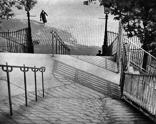
Today’s image of the day is called Stairs of Mont­martre, Paris by the late mas­ter Hun­gar­ian pho­tog­ra­pher Andre Kertesz, and it was shot in 1925. Kertesz is one of my all time favorite pho­tog­ra­phers and more of his work will surely be fea­tured in the future.

Stairs of Montmartre, Paris - 1925 by Andre Kertesz

Stairs of Mont­martre, Paris — 1925 by Andre Kertesz

What makes this, and tons of other Kertesz images fan­tas­tic is the pre­cise and delib­er­ate com­po­si­tion. Kertesz was sim­ply a mas­ter at guid­ing your eye to inter­est­ing places in the pho­to­graph. The shapes of the shad­ows and the posi­tion of the rail­ings are both delight­ful to look at and they guide your eye per­fectly toward the humans in the photo.

Kertesz was also keenly aware of all planes of focus in an image and how they work together. The con­nec­tion between the fore­ground, midground and the back­ground ele­ments of this image helps to sug­gest a story as well as make the image graph­i­cally striking.