Aside from taking a ‘winning shot’ myself, I love to help people get the most from their images and I try to provide daily advice to those people that post on our forum. Sometimes people take my advice and sometimes they don’t and that’s totally cool. The photographer of course decides the ultimate fate of his/her photograph.
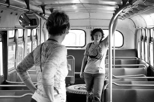
Here is an example image that I wanted to share taken by JJelling a member of our photography forum.

When I first looked at this image, I immediately liked it. I like the environment and the exposure is very well handled here. The thing I like about the shot the most though is the expression of the girl on the right. It suggests daydreaming, vegging out or‚pensive thought during the daily commute.‚ What I like least about this shot is the woman on the left. She’s just not doing anything that contributes to the photo, she is shot from behind and takes up a prominent position in the photograph. I wish she was not there.
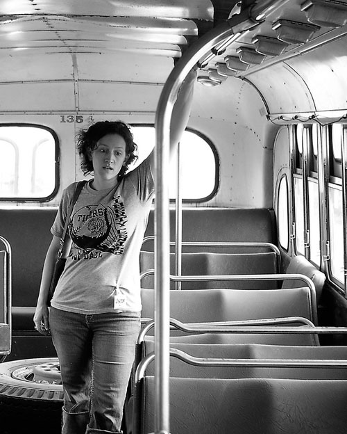
My suggestion to JJelling was to simply crop her out and MAKE the shot about the girl on the right. Here’s my crop of his photograph which he graciously allowed me to do.

For me, this image tells a stronger and tighter story, it’s clearer. But what about those beautiful windows on the left that get cropped out along with the girl?‚ Although I liked those windows and the lighting, for me they needed to be sacrificed to get the strongest image possible, albeit a different image. Cropping out extraneous parts of images is a great way to guide the eye of the viewer and make the image stronger. Sometimes the resulting crop is obviously better. Other times (like in this shot perhaps) we may be less sure.
What do other people think?‚ Which shot do YOU prefer? here’s the original link to the thread.


