Every month on our photography forum members nominate images that they like. Then at the end of the month I choose an excellent image and talk about why it rocks. The photo I choose is not necessarily the best one of the month. I’ve come to realize it’s not really logical to pit images from totally different genres against each other. That’s why there are categories in photo contests. I just choose a photo that has extremely strong elements that we can learn from.
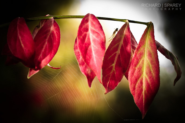
This month’s choice is (click to see the larger version of this image) Autumn Web by Richard
I chose this image for several reasons:
1 — Planning and execution — This striking image is the result of planning, it didn’t “just happen” and it wasn’t a quick snap. The lighting, comp and post-processing are all well thought out here. The result is a striking moody fall image.
2 — Composition — details — postprocessing — Lovely rendered details like the spider as well as the spider’s web all contribute to the composition here. Spider is framed nicely between the red leaves and against the backlight. The postprocessing including the vignette and possible selective sharpening are guiding our eyes thoughtfully without distractions.
3 — Lighting — Mood — Backlighting is a challenging light to deal with, but Richard balances it well with off camera flash. The end result is an image with a lovely mood that would likely have felt too dark without the added light.
4 — Selective focus — A wide aperture is well used here to get the dreamy background bokeh. It adds another ‘layer’ to the image.
For all these reasons, this is my choice for image of the month. Since we all have opinions, some members may disagree with my choice. That’s cool but THIS thread is not the place for debate over my pick, NOR is it the place to further critique the image. The purpose here is to suggest strong elements in the photo that we may learn from.
Congrats again Richard for creating this striking image!


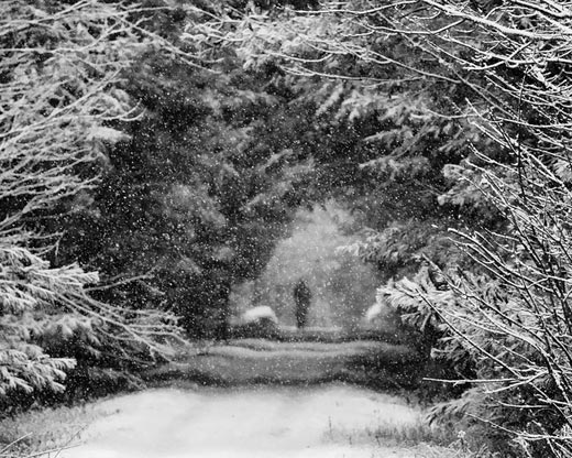
 ’ the falling snow here. A good exposure keeps the whites in check and offers up wonderful tonality with a good range of tones. If I have 1 teeny niggle I might burn in the lightest branches at top right by maybe 5%.