Photography forum winning images of the month — Round two 2015

Hi photo lovers,

In case you are new around here this is where the Admin (me) chooses one excel­lent photo nom­i­nated by other mem­bers from the Member’s monthly choice forum. Once 10 images are nom­i­nated, I choose a ‘winner’.

Just so it’s clear, the photo I choose are not nec­es­sar­ily the best ones of the month. I’ve come to real­ize it’s not log­i­cal to pit images from totally dif­fer­ent gen­res against each other. That’s why there are cat­e­gories in photo con­tests. My goal is to sim­ply choose an excel­lent photo and talk about why I think it rocks. 

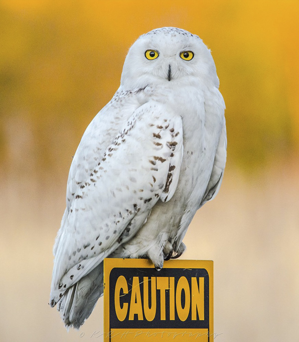
This round of nom­i­na­tions, once again yielded images of excep­tional qual­ity and I waf­fled for a few it was very dif­fi­cult to choose just one. This round’s win­ner is Late Snowy Owl for the GTA by Rdben­der. I chose these images for sev­eral reasons;

1 — Colour/exposure — The colour here was well seen with the yel­low sign match­ing the owl’s yel­low eyes and blend­ing into the yel­lowy back­ground. Expo­sure is well han­dled with lovely non-clipped white tones.
2 — Sharpness/aperture — The eyes look razor sharp as they should be and I really like the super-shallow depth of field that sep­a­rates the owl from the back­ground.
3 — Framing/composition — Unlike many com­po­si­tions that include words that become a dis­trac­tion, here the word ‘cau­tion’ on the sign com­pli­ments this com­po­si­tion big time. We see the owl’s direct intense stare as well as its sharp claws and we should indeed take cau­tion. I very much like the scratch marks on the sign that may well have been the result of those sharp claws.

For all these rea­sons, this is my choice for this round. Since we all have opin­ions, some mem­bers may dis­agree with my choice. That’s cool but THIS thread is not the place for debate over my pick, NOR is it the place to fur­ther cri­tique the image. The pur­pose here is to sug­gest strong ele­ments in the photo that we may learn from.

Con­grats again Rdben­der!


 Late Snowy Owl for the GTA by Rdbender
Late Snowy Owl for the GTA by Rdbender
Photography forum winning images of the month — Round five 2014/2015

Hi pho­tog­ra­phy lovers,

In case you are new around here this is where the Admin (me) chooses one (occa­sion­ally 2) excel­lent pho­tos nom­i­nated by other mem­bers from the Member’s monthly choice forum. Once 10 images are nom­i­nated, I choose a ‘winner’.

Just so it’s clear, the photo(s) I choose are not nec­es­sar­ily the best ones of the month. I’ve come to real­ize it’s not really log­i­cal to pit images from totally dif­fer­ent gen­res against each other. That’s why there are cat­e­gories in photo con­tests. My goal is to sim­ply choose an excel­lent photo and talk about why I think it rocks.

This round of nom­i­na­tion yielded images of excep­tional qual­ity and now for the sec­ond time in a row I was unable to choose just one.

This round’s two win­ners are “If you wait by the river long enough, the bod­ies of your ene­mies will float by.” by mbrager and Fort Myer’s Beach Bird­ing by Mike Bons

I chose these images for sev­eral reasons;

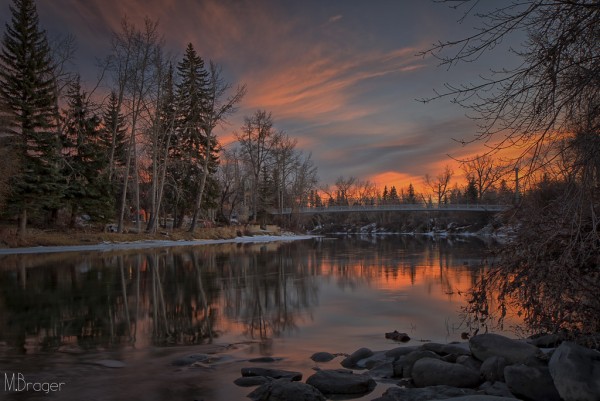
“If you wait by the river long enough, the bod­ies of your ene­mies will float by.” by mbrager


“If you wait by the river long enough, the bodies of your enemies will float by.” by mbrager

If you wait by the river long enough, the bod­ies of your ene­mies will float by.” by mbrager


1 — Mood/Contrast/Exposure — I like every­thing about this image but it’s the expo­sure itself and the sub­se­quent post-processing (which I’ll get to) that are the stars for me. This is a late sun­set shot and it looks and feels like it. The con­trast is low, as it should be, and yet beau­ti­ful shadow detail dances with vary­ing degrees of high­light detail. This cre­ates the won­der­fully gor­geous and thought­ful mood of the image.

2 — Com­po­si­tion — Extremely well framed image and I can see the delib­er­ate think­ing that went into mak­ing it. Very thought­ful place­ment of the focal points and other ele­ments that make up the image. I love the dark moody reflec­tions at fore­ground left that seem to play diag­o­nally with the brighter high­light reflec­tions in the water as well as in the sky. There are lots of gor­geous lines for our eyes to fol­low in this pho­to­graph. These include the snow­line at midground left toward the cen­ter, bridge­line in the cen­ter, ver­ti­cal lines in the trees and reflec­tions. There are even lines in the sky for our eye to explore and enjoy.

3 — Post pro­cess­ing — Fab­u­lous choices were made in this regard. Temp­ta­tion was surely there to pull addi­tional high­light detail as well as shadow detail from the water in par­tic­u­lar. This would have made the tones more dra­matic and excit­ing, but it would have for­ever changed the mood and turned this into a com­pletely dif­fer­ent, and less inter­est­ing photograph.

(4) — The title — I don’t think it influ­enced my deci­sion, but I’m a sucker for per­fect titles like this one.


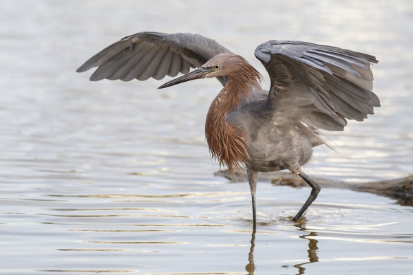
Fort Myer’s Beach Bird­ing by Mike Bons (Red­dish Egret)

Fort Myer's Beach Birding by Mike Bons (Reddish Egret)

Fort Myer’s Beach Bird­ing by Mike Bons (Red­dish Egret)


1– Colour, Clar­ity and sharp­ness — All 3 are superb in this image. I really like the tones of grey in the feath­ers and the red­dish feather tones as well. The colours and con­trast look natural.

2 — Ges­tur­ing and deci­sive moment — The bird’s ges­ture is grand and Mike’s quick trig­ger fin­ger was there to cap­ture it.

3 — Expo­sure — Expo­sure is bang on for me. A nice high shut­ter speed cap­tures the lovely feather detail and a medium aper­ture on a long lens gets good eye and feather sharp­ness while blur­ring the back­ground for good fore­ground to back­ground separation.

For all these rea­sons, these are my choices for this round. Since we all have opin­ions, some mem­bers may dis­agree with my choices. That’s cool but THIS thread is not the place for debate over my picks, NOR is it the place to fur­ther cri­tique the image. The pur­pose here is to sug­gest strong ele­ments in the pho­tos that we may learn from.

Con­grats again to Mike Bons and mbrager!

Photography forum image of the month — July 2014

Hi Photo lovers!

Every month on our pho­tog­ra­phy forum mem­bers nom­i­nate images that they like. Then at the end of the month I choose an excel­lent image and talk about why it rocks. The photo I choose is not nec­es­sar­ily the best one of the month. I’ve come to real­ize it’s not really log­i­cal to pit images from totally dif­fer­ent gen­res against each other. That’s why there are cat­e­gories in photo con­tests. I just choose a photo that has extremely strong ele­ments that we can learn from.

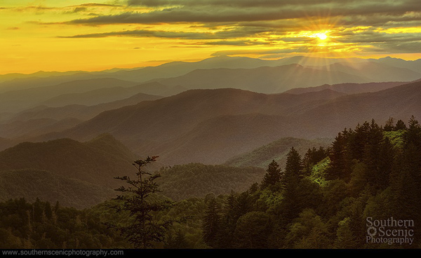
This month’s choice goes to Lizardqing for cap­tur­ing Sun­set on the Blue Ridge Parkway

I chose this image for sev­eral reasons:

1. Composition/Framing — This sun­set image has many strong com­po­si­tional ele­ments going for it. The lay­ing of the fore­ground trees, midground hills and back­ground clouds/sky and sun works really well for me. My eye really enjoys the lines and curves in the moun­tains and hills. There are also no major dis­trac­tions on the edges in this scene for me. My eye goes straight to the sun, then straight below it to the midground sun patch, and then it explores the rest of the pho­to­graph with delight.

2 . Exposure/lighting — The light is just plain lovely here due to the par­tial cloud cover. That said, shoot­ing into the sun is often chal­leng­ing and often yields under­ex­po­sure. Cor­rect­ing it often leaves lots of shadow noise but this image looks clean and the tones in the fore­ground and midground have lovely shadow detail.

3.  Colour and post pro­cess­ing — The colours are warm and bright in the sky but not too over­done. Sharp­ness works well for me and looks very natural.

For all these rea­sons, this is my choice for image of the month. Since we all have opin­ions, some mem­bers may dis­agree with my choice. That’s cool but THIS thread is not the place for debate over my pick, NOR is it the place to fur­ther cri­tique the image. The pur­pose here is to sug­gest strong ele­ments in the photo that we may learn from.

Con­grats again to Lizardqing for cap­tur­ing this fab­u­lous moment!

Photography forum image of the month – September 2013

Hi Photo lovers!

Every month on our pho­tog­ra­phy forum mem­bers nom­i­nate images that they like. Then at the end of the month I choose an excel­lent image and talk about why it rocks. The photo I choose is not nec­es­sar­ily the best one of the month. I’ve come to real­ize it’s not really log­i­cal to pit images from totally dif­fer­ent gen­res against each other. That’s why there are cat­e­gories in photo con­tests. I just choose a photo that has extremely strong ele­ments that we can learn from.

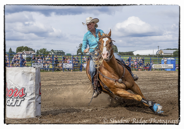
This month’s choice goes to Hill­bil­ly­girl for cap­tur­ing this image from Rodeo Action

I chose this image for sev­eral reasons:

1 — Deci­sive moment and ges­tur­ing — This cap­tured moment is extremely well timed and the cap­tured ges­tures are superb. Look at the mus­cu­la­ture and the angle and stretched out leg of the horse in mid–maneu­ver — It’s fab. The con­cen­tra­tion on the rider is also fab.

2 — Sharp­ness — The sharp­ness here is bloody gor­geous and any­one who has tracked mov­ing tar­gets knows it’s not easy. A nice fast shut­ter speed cou­pled with pre­cise focus­ing has frozen an intense moment. Even the kicked-up dirt in the air and on the ground is sharp — love it.

3 — Com­po­si­tion — Com­po­si­tion works really well here with the fence of spec­ta­tors in the back­ground, The Coors barrel/obstacle on the left and the intense ges­tures of the cen­tral main focal points.

4 — Post processing/exposure — I like the fairly real­is­tic pro­cess­ing in this image with good well con­trolled tones in the sky and good clar­ity in the faces of the horse and rider.

For all these rea­sons, this is my choice for image of the month. Since we all have opin­ions, some mem­bers may dis­agree with my choice. That’s cool but THIS thread is not the place for debate over my pick, NOR is it the place to fur­ther cri­tique the image. The pur­pose here is to sug­gest strong ele­ments in the photo that we may learn from.

Con­grats again to Hill­bil­ly­girl for cap­tur­ing this fab­u­lous moment!

Rodeo Action by Hillbillygirl

Rodeo Action by Hill­bil­ly­girl — Click to see larger version

Photography forum image of the month – July 2013

Hi Photo lovers!

Every month on our pho­tog­ra­phy forum mem­bers nom­i­nate images that they like. Then at the end of the month I choose an excel­lent image and talk about why it rocks. The photo I choose is not nec­es­sar­ily the best one of the month. I’ve come to real­ize it’s not really log­i­cal to pit images from totally dif­fer­ent gen­res against each other. That’s why there are cat­e­gories in photo con­tests. I just choose a photo that has extremely strong ele­ments that we can learn from.

Just so it’s clear, the photo I choose is not nec­es­sar­ily the best one of the month. I’ve come to real­ize it’s not really log­i­cal to pit images from totally dif­fer­ent gen­res against each other. That’s why there are cat­e­gories in photo contests.

My goal is to sim­ply choose an excel­lent photo and talk about why I think it rocks. This month was another crazy hard month though as the nom­i­na­tions from dif­fer­ent gen­res were of very high quality.

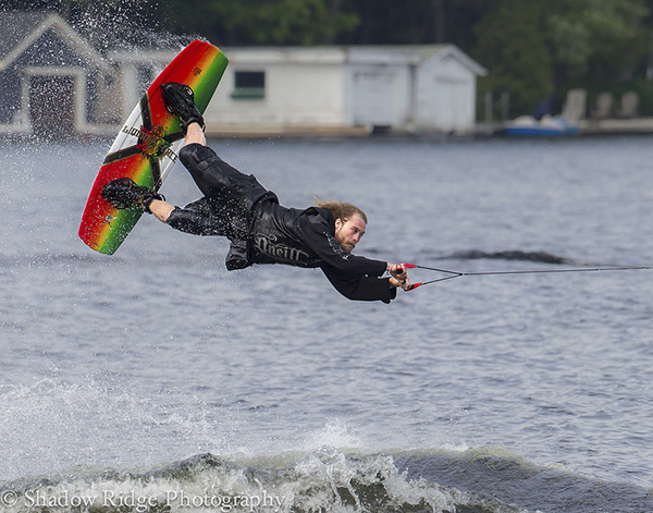
This month’s choice goes to Hill­bil­ly­girl  is for cap­tur­ing Air Time .

Air Time by Hillbillygirl

Air Time by Hillbillygirl

I chose this image for a few reasons:

1 –Deci­sive moment and tim­ing — The moment cap­tured is very excit­ing! The wake­boarder is par­al­lel with the water and yet he looks per­fectly calm and con­cen­trated even though he is fly­ing through the air.

2– Com­po­si­tion — I really like the fram­ing here. The frozen wave at the bot­tom, the spray com­ing off the wake­board at top left, the line pulling the wake­boarder at right — it’s all work­ing well. I like that the back­ground has gone medium soft which high­lights the wake­boarder so nice aper­ture choice as well.

3 — Sharp­ness and high shut­ter speed — I really like that the eyes are nice and sharp. It’s a tes­ta­ment to good track­ing skills and the use of an appro­pri­ately high shut­ter speed to nail this scene. The eyes are sharp enough to see and feel the con­cen­tra­tion. The whole body ges­ture is won­der­fully frozen.

For all these rea­sons, this is my choice for image of the month. Since we all have opin­ions, some mem­bers may dis­agree with my choice. That’s cool but THIS thread is not the place for debate over my pick, NOR is it the place to fur­ther cri­tique the image. The pur­pose here is to sug­gest strong ele­ments in the photo that we may learn from.

Con­grats Hill­bil­ly­girl on this excit­ing capture!

Photography forum image of the month – June 2013

Hi Photo lovers!

Every month on our pho­tog­ra­phy forum mem­bers nom­i­nate images that they like. Then at the end of the month I choose an excel­lent image and talk about why it rocks. The photo I choose is not nec­es­sar­ily the best one of the month. I’ve come to real­ize it’s not really log­i­cal to pit images from totally dif­fer­ent gen­res against each other. That’s why there are cat­e­gories in photo con­tests. I just choose a photo that has extremely strong ele­ments that we can learn from.

Just so it’s clear, the photo I choose is not nec­es­sar­ily the best one of the month. I’ve come to real­ize it’s not really log­i­cal to pit images from totally dif­fer­ent gen­res against each other. That’s why there are cat­e­gories in photo contests. 

My goal is to sim­ply choose an excel­lent photo and talk about why I think it rocks. This month was another crazy hard month though as the nom­i­na­tions from dif­fer­ent gen­res were of very high quality.

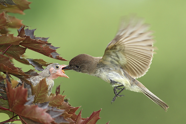
This month’s choice is Fos­ter­ing by Mike Bons Fos­ter­ing.

Fostering by Mike Bons

Fos­ter­ing by Mike Bons


I chose this image for a few reasons:

1 — Focal point sharp­ness and deci­sive moment — Look at the sharp­ness on the eye of the baby bird, it’s just gor­geous. The tim­ing is equally gor­geous; the hummingbird’s beak is inside the chick’s mouth and we can see a hint of a bug. The hummingbird’s legs are won­der­fully frozen. Mike explains in his post that he used a ‘trig­ger­trap’ to trig­ger the shut­ter from yards away and I just love the use of this new tech­nol­ogy to help us make bet­ter images. I also applaud the ded­i­ca­tion to set­ting this all up and wait­ing patiently.

2– Com­po­si­tion — Fram­ing here is bang on as is the guid­ing of our eyes which go right to the chick. I really like the shape of the hummingbird’s blurred wings. I also like the leaves that are included at the oppo­site side of the frame and the free space around the hummingbird.

3 — Shut­ter speed — Won­der­ful choice of high shut­ter speed to get sharp­ness like that on the chick and the frozen hum­ming­bird legs. The motion-blurred hum­ming­bird wings add to this image big­time and are a tes­ta­ment to how fast that lit­tle bug­ger flaps its wings per second.

For all these rea­sons, this is my choice for image of the month. Since we all have opin­ions, some mem­bers may dis­agree with my choice. That’s cool but THIS thread is not the place for debate over my pick, NOR is it the place to fur­ther cri­tique the image. The pur­pose here is to sug­gest strong ele­ments in the photo that we may learn from.

Con­grats Mike Bons!

Photography forum image of the month – July 2012

Every month on our pho­tog­ra­phy forum mem­bers nom­i­nate images that they like. Then at the end of the month I choose an excel­lent image and talk about why it rocks. The photo I choose is not nec­es­sar­ily the best one of the month. I’ve come to real­ize it’s not really log­i­cal to pit images from totally dif­fer­ent gen­res against each other. That’s why there are cat­e­gories in photo con­tests. I just choose a photo that has extremely strong ele­ments that we can learn from.

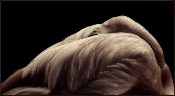
Pink by Barefoot

Pink by Barefoot

This month’s choice is Pink by Barefoot

I chose this image for sev­eral reasons:

1 — Com­po­si­tion — The is a very inter­est­ing and unusual com­po­si­tion of a gor­geous bird sleep­ing. I really like the curve all around the bird’s body and where the eye falls in the image. The fram­ing is also inter­est­ing here and Bare­foot has clearly ‘made this his own’. The pure black back­ground also cre­ates inter­est­ing neg­a­tive space here.

2 — Light­ing — The lovely light­ing here is soft over­all and reveals lovely detail in most of the bird’s plumage. That said, cer­tain areas of the pho­to­graph are quite dark but not too dark for my eye. I really like the dra­matic aspect of the light in those selec­tive zones.

3 — Post pro­cess­ing — The post pro­cess­ing here is lovely. Mak­ing the back­ground go to pure black doesn’t always work but it works very well here to com­pli­ment the form of the bird. I dare say that some of the darker areas in the bird’s plumage actu­ally match the back­ground and this works for me. The bird is ren­dered in desat­u­rated tones that I find very strik­ing and suit­able to the sub­ject and mood of the image.

For all these rea­sons, this is my choice for image of the month. Since we all have opin­ions, some mem­bers may dis­agree with my choice. That’s cool but THIS thread is not the place for debate over my pick, NOR is it the place to fur­ther cri­tique the image. The pur­pose here is to sug­gest strong ele­ments in the photo that we may learn from.

Con­grats again Barefoot!

Photography forum image of the month – May 2012

Every month on our pho­tog­ra­phy forum mem­bers nom­i­nate images that they like. Then at the end of the month I choose an excel­lent image and talk about why it rocks. The photo I choose is not nec­es­sar­ily the best one of the month. I’ve come to real­ize it’s not really log­i­cal to pit images from totally dif­fer­ent gen­res against each other. That’s why there are cat­e­gories in photo con­tests. I just choose a photo that has extremely strong ele­ments that we can learn from.

Male RTH Hummingbird by Mike Bons

Male RTH Hum­ming­bird by Mike Bons

This month’s choice is Male RTH Hum­ming­bird Mike Bons

I chose this image for sev­eral reasons:

Com­po­si­tion — The com­po­si­tion here is very pleas­ing. The bird’s eye lines up on right near one of the lines of the thirds which is visu­ally inter­est­ing. The plant and the bird are cap­tured on a diag­o­nal which is also visu­ally inter­est­ing. Bright­ness is very well han­dled here and I find no dis­trac­tions that bother me.

Colour — What a rich pleas­ing colour palette used here. The colours of the bird and the flower even seem to match. Reds in the flower might be a hint too bright and over­sat­u­rated for me, but I can eas­ily live with it.

Sharp­ness — I love how sharp the bird is here (espe­cially the eye and the beak) ver­sus the out of focus back­ground, it totally pops.

Exposure/lighting — Again both are well han­dled. The com­bi­na­tion of flash and ambi­ent light is what is freez­ing the bird in mid-feeding here. I like how the bird is well lit with­out being ‘over-lit’ by the flash.

For all these rea­sons, this is my choice for image of the month. Since we all have opin­ions, some mem­bers may dis­agree with my choice. That’s cool but THIS thread is not the place for debate over my pick, NOR is it the place to fur­ther cri­tique the image. The pur­pose here is to sug­gest strong ele­ments in the photo that we may learn from.

Con­grats again Mike Bons for cap­tur­ing this lit­tle beauty.

Photography forum image of the month — February 2012

Every month on our pho­tog­ra­phy forum mem­bers nom­i­nate images that they like. Then at the end of the month I choose an excel­lent image and talk about why it rocks. The photo I choose is not nec­es­sar­ily the best one of the month. I’ve come to real­ize it’s not really log­i­cal to pit images from totally dif­fer­ent gen­res against each other. That’s why there are cat­e­gories in photo con­tests. I just choose a photo that has extremely strong ele­ments that we can learn from.

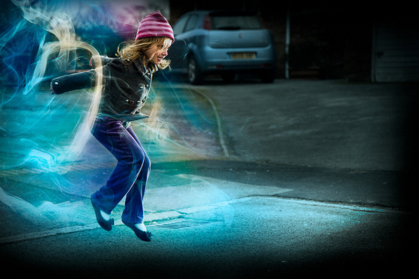
Jump - behind the shot by Richard

Jump — behind the shot by Richard

This month’s choice is Jump — behind the shot by Richard

I chose this image for sev­eral reasons:

Colour — Light­ing — Expo­sure — The cool colours in this image work extremely well with the sub­ject mat­ter. I really like the bluish qual­ity to the light­ing in this image as it is in sync with the with colder sea­son. The over­all light­ing which Richard gra­ciously explains is also well done and I like the hues of the gelled speed­lights. The speed­lights high­light the child’s move­ments very well and cap­ture an excel­lent ges­ture. In terms of the expo­sure, Richard con­fesses to to using an ND fil­ter over the lens to bal­ance the strobes and ambi­ent light and this makes the shut­ter­speed longer. This was a very smart move that allows us to see a hint of blurred move­ment in the feet and dif­fer­ent posi­tion of the hat.

Ges­ture and Story — The child is caught in mid-jump, play­ing and smil­ing. Even though the child is basi­cally told to jump, Richard catches a moment that looks com­pletely nat­ural. For me this is a suc­cess­ful image of a child hav­ing a great time just being a child.

Post pro­cess­ing — the added wisps of smoke in the post pro­cess­ing are a lovely touch and blend in really well with the image and the intended con­cept of the image. The vignetting keeps our eyes well focused on the child and the child’s activity.

For all these rea­sons, this is my choice for image of the month. Since we all have opin­ions, some mem­bers may dis­agree with my choice. That’s cool but THIS thread is not the place for debate over my pick, NOR is it the place to fur­ther cri­tique the image. The pur­pose here is to sug­gest strong ele­ments in the photo that we may learn from.

Con­grats again Richard for cre­at­ing this won­der­ful image!

Photography forum image of the month — January 2012

Every month on our pho­tog­ra­phy forum mem­bers nom­i­nate images that they like. Then at the end of the month I choose an excel­lent image and talk about why it rocks. The photo I choose is not nec­es­sar­ily the best one of the month. I’ve come to real­ize it’s not really log­i­cal to pit images from totally dif­fer­ent gen­res against each other. That’s why there are cat­e­gories in photo con­tests. I just choose a photo that has extremely strong ele­ments that we can learn from.

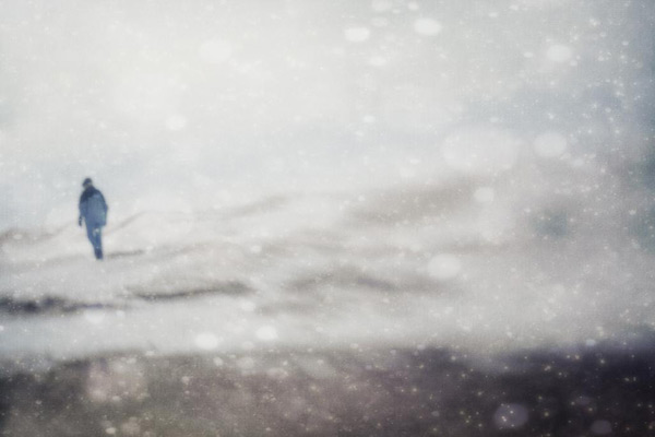
And miles to go before I sleep... And miles to go before I sleep by jumpinjimmyjava

And miles to go before I sleep… And miles to go before I sleep by jumpinjimmyjava


This month’s choice is (Click to see the larger ver­sion of this image) And miles to go before I sleep… And miles to go before I sleep by jumpinjimmyjava

I chose this image for sev­eral reasons:

1 — It tells or sug­gests a strong story & Com­po­si­tion — The title of the image is a well known phrase from a poem that many of us stud­ied in High School (Stop­ping by Woods on a Snowy Evening by Robert frost). Just read­ing the title helps to sup­port this image and veers our inter­pre­ta­tion of it in a cer­tain direc­tion both with visual and the­matic ele­ments. I love the posi­tion of the man in this image. It’s close to the edge but not quite at the edge. This adds ten­sion to the image and helps sup­port the theme that “there’s still work to be done”, it’s not over just yet) .The win­try scene also sup­ports the theme of a per­son in their sun­set years but the image is bright, not dark, again sup­port­ing a the­matic element.

I like the lay­ered aspect of the image where the bot­tom of the image is darker than the rest. The mid­dle part of the image shows lines mov­ing from right to left. The top part of the image shows more sky and is dis­tinct from the other 2 parts of the image. These ‘divi­sions’ or lay­ers as I like to call them add visual inter­est to the image. Our eyes like them.

2 — Colour — The sub­tle colour palette in this image works very well for me, the colours are very har­mo­nious. For me they are calm, well cho­sen colours. The blue of the jacket stands out really well against the white and brings our full atten­tion to the focal point of the image. In addi­tion, the blue of the jacket is com­pli­mented by other sub­tle blue tones in the image, again help­ing to cre­ate the over­all visual harmony.

3 — Post pro­cess­ing — This image is a com­pos­ite of sev­eral images or tex­tures. I don’t know exactly how many but I’d say at least 3 (the snow flakes, the man, the win­try land­scape). Either way the blend­ing of the images is well done to my eye and each part of the image com­pli­ments the other parts.

And the whole image, is greater than the sum of its parts.

For all these rea­sons, this is my choice for image of the month. Since we all have opin­ions, some mem­bers may dis­agree with my choice. That’s cool but THIS thread is not the place for debate over my pick, NOR is it the place to fur­ther cri­tique the image. The pur­pose here is to sug­gest strong ele­ments in the photo that we may learn from.

Con­grats again jump­in­jim­my­java for cre­at­ing this won­der­ful themed image!

Photography forum image of the month December 2011

Every month on our pho­tog­ra­phy forum mem­bers nom­i­nate images that they like. Then at the end of the month I choose an excel­lent image and talk about why it rocks. The photo I choose is not nec­es­sar­ily the best one of the month. I’ve come to real­ize it’s not really log­i­cal to pit images from totally dif­fer­ent gen­res against each other. That’s why there are cat­e­gories in photo con­tests. I just choose a photo that has extremely strong ele­ments that we can learn from.

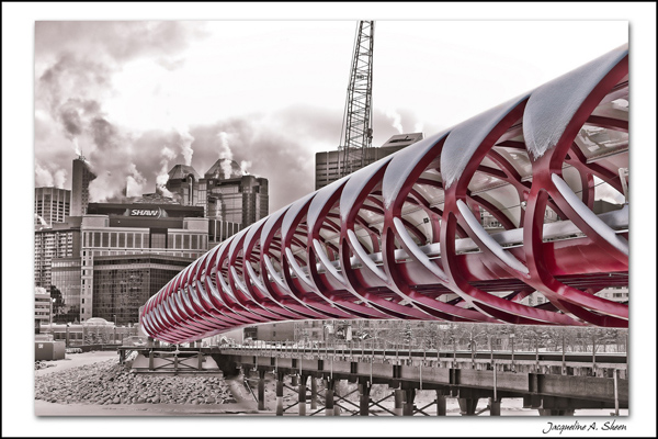
The Peace Bridge - At Last!  by JAS_Photo

The Peace Bridge — At Last! by JAS_Photo

This month’s choice is (click to see the larger ver­sion of this image)  The Peace Bridge — At Last! by JAS_Photo

I chose this image for sev­eral reasons:

1 — Com­po­si­tion — This is a very strong com­po­si­tion and the bridge itself acts as a fan­tas­tic lead­ing line. It guides our eye beau­ti­fully into the image. In addi­tion, aside from the shape of the bridge itself, there are also other “mini-shapes” in the bridge itself as well as all around the image. These other mini-shapes add a lot of inter­est to the image.

2 — Tones and post pro­cess­ing — The bridge itself is selec­tively coloured in this image and I like that very much in this case. I feel it works and offers a new take on what is likely a heav­ily pho­tographed piece of infra-structure. For me it sug­gests ‘some­thing new’ being intro­duced into a city. The desat­u­ra­tion of the back­ground com­pli­ments the bridge and really makes the bridge pop.

3 — Story and per­spec­tive — This bridge is still a work in progress and we can see a crane in the back­ground that sug­gests this. We see the bridge “mov­ing” toward the back­ground which sug­gests to me some­thing new being intro­duced to some­thing older. The angle or per­spec­tive from which the image was taken was very well cho­sen to sug­gest this story.

For all these rea­sons, this is my choice for image of the month. Since we all have opin­ions, some mem­bers may dis­agree with my choice. That’s cool but THIS thread is not the place for debate over my pick, NOR is it the place to fur­ther cri­tique the image. The pur­pose here is to sug­gest strong ele­ments in the photo that we may learn from.

Con­grats again JAS_Photo for cre­at­ing this won­der­ful image!


Photography forum image of the month November 2011

Every month on our pho­tog­ra­phy forum mem­bers nom­i­nate images that they like. Then at the end of the month I choose an excel­lent image and talk about why it rocks. The photo I choose is not nec­es­sar­ily the best one of the month. I’ve come to real­ize it’s not really log­i­cal to pit images from totally dif­fer­ent gen­res against each other. That’s why there are cat­e­gories in photo con­tests. I just choose a photo that has extremely strong ele­ments that we can learn from.

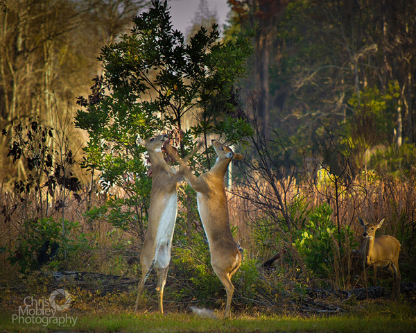
Fight Club! by Lizardqing

Fight Club! by Lizardqing


This month’s choice is (click to see the larger ver­sion of this image) Fight Club! by Lizardqing

I chose this image for sev­eral reasons:

1 — Timing/Decisive moment. You gotta have a quick trig­ger fin­ger to catch a moment like this or you will miss it. We’ve all missed fab oppor­tu­ni­ties like this, or mis­framed oppor­tu­ni­ties like this; good on Lizardquing for this fab capture.

2 — Com­po­si­tion — I really like the com­po­si­tion here. It is espe­cially impres­sive given the speed needed to catch this image. I really like the faun at the right side as well as the posi­tion of the trees.

3 — Exposure/lighting/colour — Expo­sure looks very good here and could eas­ily have been missed given the light­ing. Good choice of shutter-speed to keep things fairly sharp but still reveal motion in the deers’ front legs. Lovely colour palette as well. The light­ing is won­der­ful in this image, good on Lizardqing for being there early enough to capture.

For all these rea­sons, this is my choice for image of the month. Since we all have opin­ions, some mem­bers may dis­agree with my choice. That’s cool but THIS thread is not the place for debate over my pick, NOR is it the place to fur­ther cri­tique the image. The pur­pose here is to sug­gest strong ele­ments in the photo that we may learn from.

Con­grats again Lizardqing for cap­tur­ing this won­der­ful moment!