Vintage photo of the day — Dec. 27, 2010

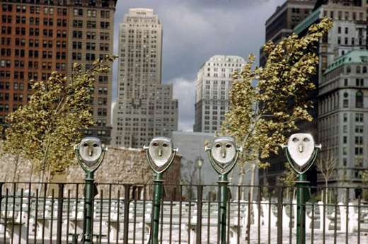
Today’s vin­tage pho­to­graph of the day by mas­ter pho­tog­ra­pher Ernst Haas, is titled Binoc­u­lars and it was taken in Bat­tery Park, NY in 1952. Haas is well known for adopt­ing colour early on in his career before many of his con­tem­po­raries. Famous Haas colour pho­tographs include slow motion studies.

A Haas quote that I really dig is, “The best pic­tures dif­fer­en­ti­ate them­selves by nuances‚¦a tiny rela­tion­ship ‚ either a har­mony or a dishar­mony — that cre­ates a picture.”

Binoculars by Ernst Haas - 1952

Binoc­u­lars by Ernst Haas — 1952

This pho­to­graph works on‚multiple‚levels which is likely why it works so well.
The‚binoculars‚themselves look like human faces so we are‚immediately‚attracted to that aspect. How­ever, other ele­ments also make this image inter­est­ing. These ele­ments include the fence and the build­ings in the back­ground. For me, the fence, binoc­u­lars and back­ground build­ings rep­re­sent the fact that ‘mak­ing it’ in New York is dif­fi­cult. The fence sep­a­rates you from the build­ings but you can see them through the binoc­u­lars. Get­ting there, is a battle…but if you can make it there, you can make it anywhere.

Photography forum image of the month ‚” Feb. 2010

Every month on our pho­tog­ra­phy forum mem­bers nom­i­nate images that they like. Then at the end of the month I choose an excel­lent image and talk about why it rocks. The photo I choose is not nec­es­sar­ily the best one of the month. Ižve come to real­ize itžs not really log­i­cal to pit images from totally dif­fer­ent gen­res against each other. Thatžs why there are cat­e­gories in photo con­tests. I just choose a photo that has extremely strong ele­ments that we can learn from.

Message delivered by Michaelaw - Click for a larger version

Mes­sage deliv­ered by Michaelaw — Click for a larger version

This month’s choice Mes­sage deliv­ered is by Michaelaw.

I chose this image for sev­eral reasons.

First off look at the great mood Michaelaw has cre­ated here. This is no acci­dent; it’s a prod­uct of Michael’s atten­tion to the the light­ing. This mood helps cre­ate the story that ‘makes’ this shot. What IS the story? That’s up to the viewer, it’s helped by the title, but there is a story here. The bot­tle is with­out a clas­sic paper mes­sage in it, it’s empty save for some water. Who sent it, why? Maybe the beer bot­tle itself IS the mes­sage — “hey I’m on a ben­der; that’s my mes­sage”. Maybe the shot is really about the envi­ron­ment and Man’s lack of con­cern over it. But there IS a story here, you just have to choose it for yourself.

Com­po­si­tion­ally I like this very much. The curved pat­terned for­ma­tions in the sand add inter­est to the shot. The diag­o­nal slant of the bot­tle with spec­u­lar edge high­lights really give my eye some­thing to cling to. The focus also works very well for me here and I’m dig­ging the back­ground blur. My eye is skill­fully guided along the bot­tle toward the slanted water level col­lected at the bot­tom. At bot­tom of the bot­tle we see the sun’s reflec­tion and it grabs you.

Expo­sure is han­dled very well here with a good range of tones and excel­lent high­light control.

For all these rea­sons, this is my choice for image of the month.

Since we all have opin­ions, some mem­bers may dis­agree with my choice. That’s cool but THIS thread is not the place for debate over my pick, NOR is it the place to fur­ther cri­tique the image. The pur­pose here is to sug­gest strong ele­ments in the photo that we may learn from.

Con­grats again Michaelaw for cre­at­ing this beau­ti­ful image!

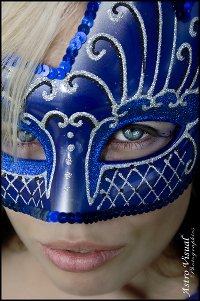
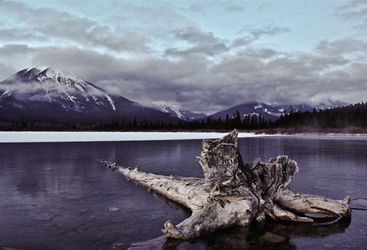
I’d also like to include these 2 images as hon­ourable men­tions as they also came so so close to being picked.

Behind the mask by Chantelle

Day 3 — Banff‚ by casil403

Day 3 - Banff

Photography forum image of the month – Feb. 2010

Every month on our pho­tog­ra­phy forum mem­bers nom­i­nate images that they like. Then at the end of the month I choose an excel­lent image and talk about why it rocks. The photo I choose is not nec­es­sar­ily the best one of the month. I’ve come to real­ize it’s not really log­i­cal to pit images from totally dif­fer­ent gen­res against each other. That’s why there are cat­e­gories in photo con­tests. I just choose a photo that has extremely strong ele­ments that we can learn from.

Message delivered by Michaelaw - Click for a larger version

Mes­sage deliv­ered by Michaelaw — Click for a larger version

This month’s choice Mes­sage deliv­ered is by Michaelaw.

I chose this image for sev­eral reasons.

First off look at the great mood Michaelaw has cre­ated here. This is no acci­dent; it’s a prod­uct of Michael’s atten­tion to the the light­ing. This mood helps cre­ate the story that ‘makes’ this shot. What IS the story? That’s up to the viewer, it’s helped by the title, but there is a story here. The bot­tle is with­out a clas­sic paper mes­sage in it, it’s empty save for some water. Who sent it, why? Maybe the beer bot­tle itself IS the mes­sage — “hey I’m on a ben­der; that’s my mes­sage”. Maybe the shot is really about the envi­ron­ment and Man’s lack of con­cern over it. But there IS a story here, you just have to choose it for yourself.

Com­po­si­tion­ally I like this very much. The curved pat­terned for­ma­tions in the sand add inter­est to the shot. The diag­o­nal slant of the bot­tle with spec­u­lar edge high­lights really give my eye some­thing to cling to. The focus also works very well for me here and I’m dig­ging the back­ground blur. My eye is skill­fully guided along the bot­tle toward the slanted water level col­lected at the bot­tom. At bot­tom of the bot­tle we see the sun’s reflec­tion and it grabs you.

Expo­sure is han­dled very well here with a good range of tones and excel­lent high­light control.

For all these rea­sons, this is my choice for image of the month.

Since we all have opin­ions, some mem­bers may dis­agree with my choice. That’s cool but THIS thread is not the place for debate over my pick, NOR is it the place to fur­ther cri­tique the image. The pur­pose here is to sug­gest strong ele­ments in the photo that we may learn from.

Con­grats again Michaelaw for cre­at­ing this beau­ti­ful image!

I’d also like to include these 2 images as hon­ourable men­tions as they also came so so close to being picked.

Behind the mask by Chantelle

Day 3 — Banff  by casil403

Day 3 - Banff

Is it still art?

This photo, and oth­ers of sim­i­lar nature are con­sid­ered ‘art’ by some, but far from it by oth­ers. So is it Art? Or can you argue that this, along with an ad for tooth­paste, is just a form of pub­lic­ity and not artistic?

Well,‚ Art has dif­fer­ent mean­ings for dif­fer­ent peo­ple and there is no one answer for this issue. Think about it… have you ever been to a museum and seen a can­vas com­pletely painted in indigo blue? This is top of the line art accord­ing to avid artists. To oth­ers, this is sim­ply a waste of paint and can­vas. Or how about those early black & white nudes, oth­er­wise known as “early porn”. Time man­aged to some­how evolve these pho­tos into art. Or let us reflect on thou­sands of years back, when the cave­men wrote on the cave walls to com­mu­ni­cate and tell a story. Today, these draw­ings are etched in all art his­to­ri­ansž minds as the works of masters.

So truly, art and beauty is in the eye of the beholder and accord­ing to Edward Degas: “Art is not what you see, but what you make oth­ers see”.

Obvi­ously the ‘artist’ of this photo wanted us to see some­thing… A LOT of something.

FORUM LINK: http://www.photography.ca/Forums/showthread.php?t=570

57 — Interview with photographer Phil Borges — Photography podcast

Pho­tog­ra­phy pod­cast #57 fea­tures an Inter­view with pho­tog­ra­pher Phil Borges at the 2008 Pho­to­plus con­fer­ence and expo in New York. (That conference/expo was excel­lent and packed full of cool new prod­ucts and world renowned photographers/instructors includ­ing Phil Borges as guest speakers/lecturers — Very much rec­om­mended and I’m going back in 2009).
In the inter­view Phil very briefly dis­cusses his career and some of his bod­ies of work in pho­tog­ra­phy, talks about his artis­tic style and tech­nique, and shares the way he cur­rently prints his work.

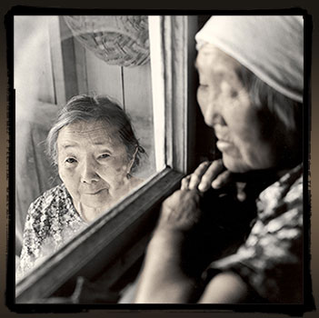
Chema, 77 of Bulava, Siberia from the series Spirit of Place - Siberia

Pho­to­graph by Phil Borges — Chema, 77 of Bulava, Siberia. From the series: Spirit of Place — Siberia

Links men­tioned in this pod­cast:
Cur­rent exhibits by Phil Borges
Phil Borges’s fea­ture on photography.ca
HP Z3100 printer
Hah­ne­muhle papers

Thanks as always to Jen, Steven K, Clusty, JD and‚ Susan who posted a blog com­ment about our last pod­cast. Thanks also to dmag­ick, wdaw­son, Lisa Scott, blove­less, dudley206098, Soft­ServeCo., Duane, Saarto1221, Elle, jmay­off, krpho­togs, jason­high­tower,‚ omhub­bard, aophoto, Ama­ranth, bar­bi­epurl, jill­ca­t­rina, johnyy­mathew, jayps, fsendel, Mike Guil­bault, jecky55, and DAVIS125 who recently joined the photography.ca forum and posted a few times. We LOVE com­ments and sug­ges­tions so please send more.

If you are look­ing at this mate­r­ial on any other site except Photography.ca — Please hop on over to the Photography.ca blog and pod­cast and get this and other pho­tog­ra­phy info directly from the source. I Sub­scribe with iTunes I Sub­scribe via RSS feed I Sub­scribe with Google Reader I Sub­scribe for free to the Pho­tog­ra­phy pod­cast — Photography.ca and get all the posts/podcasts by Email
You can down­load this pho­tog­ra­phy pod­cast directly by click­ing the pre­ced­ing link or lis­ten to it almost imme­di­ately with the embed­ded player below.

Presenting photography to galleries — Photography podcast #53

Pho­tog­ra­phy pod­cast #53 talks about how to present your pho­tog­ra­phy port­fo­lio to pho­tog­ra­phy gal­leries. There’s a right way and a wrong way to approach gal­leries with your work and this pod­cast offers up a few tips on what the right way is. One cru­cial tip that I’ll men­tion right here is to make SURE your work fits with what the gallery is show­ing. If it doesn’t, don’t waste your time and choose another gallery.

Links men­tioned in this pod­cast:
Robert Miller gallery (New York) — Thanks Karl
Stephen Bul­ger gallery (Toronto) — Thanks Jes­sica
Bul­ger gallery port­fo­lio sub­mis­sion guidelines

Thanks as always to Benny who posted a blog com­ment about our last pod­cast and to Spriter who recently joined the photography.ca forum and posted a few times. We LOVE com­ments and sug­ges­tions so please send more.

If you are look­ing at this mate­r­ial on any other site except Photography.ca — Please hop on over to the Photography.ca blog and pod­cast and get this and other pho­tog­ra­phy info directly from the source. I Sub­scribe with iTunes I Sub­scribe via RSS feed I Sub­scribe with Google Reader I

You can down­load this pho­tog­ra­phy pod­cast directly by click­ing the pre­ced­ing link or lis­ten to it almost imme­di­ately with the embed­ded player below.

Lith printing in photography — Photography podcast #39

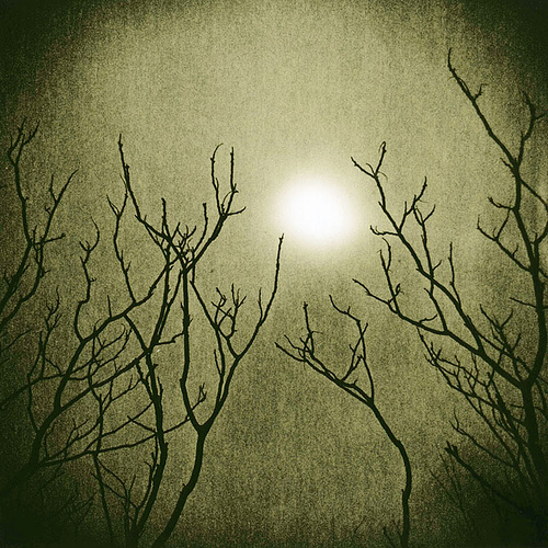
Pho­tog­ra­phy pod­cast #39 fea­tures an inter­view with fine art pho­tog­ra­pher Vicki Reed aka hol­ga­girl on Flickr. In this inter­view we talk about lith print­ing which is an alter­na­tive print­ing tech­nique using a tra­di­tional dark­room. For those that only want to try this dig­i­tally, see the links below.


Sumac and Sun — Vicki Reed

Pho­tog­ra­phy links men­tioned in this pod­cast:
Vicki’s fea­ture on Photography.ca
Holga cam­eras
Foto­speed lith paper Do a search for lith on this site to get more lith prod­ucts
Ken­tona paper
2 Tim Rud­man videos on Lith print­ing
The World of Lith Print­ing
Dig­i­tal lith print­ing
Dig­i­tal lith print­ing action for pho­to­shop
Dig­i­tal lith print­ing by Adobe

Is it still art — what is art — thread on photography.ca forum

Thanks as always for the com­ments by‚Gary H,‚‚seyDoggy, Yves Janse and Mikael. We LOVE com­ments and sug­ges­tions so please send more.

You can down­load this pho­tog­ra­phy pod­cast directly by click­ing the pre­ced­ing link or lis­ten to it almost imme­di­ately with the embed­ded player below.