126 — 6 Tips to Improve the Edges of Your Photos

Pho­tog­ra­phy pod­cast #126 dis­cusses the impor­tance of the four edges of your pho­tographs. They are seri­ously impor­tant and pay­ing atten­tion to them will improve your pho­tog­ra­phy. The pod­cast offers up 6 (actu­ally a few more than 6) prac­ti­cal tips on how to improve the edges of your photographs.

Thanks to The Cam­era Store (The largest cam­era store in Cal­gary, Alberta, Canada)  for spon­sor­ing the Photography.ca podcast.

A sneak peek to one of the 6 tips which is use­ful to pho­tog­ra­phers of all lev­els is to check out the work of mas­ter painters. They knew about the edges, about the over­all com­po­si­tion, and the rules of com­po­si­tion. Those rules directly apply to pho­tog­ra­phy. This famous paint­ing below done by Rem­brandt shows dark edges all around which is of course no acci­dent. He did it all the time. Notice where your eye ends up in the paint­ing; on the wave at left and this too is no acci­dent. When we can apply some of these prin­ci­ples to pho­tog­ra­phy, our images almost always improve.


1633 - Rembrandt (1606-1669) Christ in the Storm on the Lake of Galilee.

1633 — Rem­brandt (1606–1669) Christ in the Storm on the Lake of Galilee.


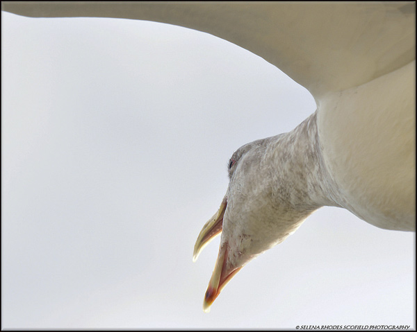
Talk about how edges can add inter­est! This image by Selena Rhodes Scofield from our forum is framed in an extremely cre­ative way and the unusual per­spec­tive just adds to the visual inter­est. In addi­tion, both the seagull’s neck and its wing are cre­at­ing inter­est­ing pos­i­tive and neg­a­tive shapes as they inter­sect with the edges and the rest of the image. Being on the look­out for these shapes is another way to spi­cify your photography.


seagull 3 by Selena Rhodes Scofield

seag­ull 3 by Selena Rhodes Scofield


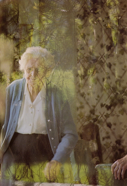
Of course when you want to break guide­lines, you break them when­ever you want to. Just be aware that you are doing so. In this image below, Cana­dian Mas­ter pho­tog­ra­pher and teacher Free­man Pat­ter­son does just that.

From his book Pho­tog­ra­phy and the Art of See­ing he wrote: “I saw this elderly lady as pass­ing away from me and my world, so I pho­tographed her through a win­dow clouded by reflec­tions and cur­tains. The shal­low depth of field, which throws the reflec­tions and cur­tains out of focus, cre­ates a sense of the sur­real and the unknown. The hand of the woman’s friend appears in the lower right cor­ner. By all tra­di­tional stan­dards of com­po­si­tion, the hand should not be there because it looks ampu­tated. Yet it seems strangely appro­pri­ate, rep­re­sent­ing sup­port that may be needed in the present, while at the same time adding to the impres­sion of the world dissolving”


Photograph by Freeman Patterson from The Art of Seeing.

Pho­to­graph by Free­man Pat­ter­son from The Art of Seeing.


Links /resources men­tioned in this podcast:

Pho­tog­ra­phy and the Art of See­ing by Free­man Pat­ter­son. If you can only afford one pho­tog­ra­phy book this year, buy this one.
Com­po­si­tion Basics by oopoomoo

If you liked this pod­cast and want to review it on Itunes, this link gets you to the main page

If you are inter­ested in writ­ing for our blog please con­tact me photography.ca ( A T ) G m ail Dot co m (using stan­dard email formatting)

Please join the Photography.ca fan page on Facebook

My Face­book pro­file — Feel free to “friend” me — please just men­tion Photography.ca
My Twit­ter page — I will fol­low you if you fol­low me — Let’s con­nect — PLEASE email me and tell me who you are in case I don’t rec­i­p­ro­cate because I think you are a spammer.

If you are still lurk­ing on our forum,
feel free to join our friendly :)  Pho­tog­ra­phy forum

Thanks as well to Don Crasco and Daniel Cybul­skie who posted com­ments directly on the blog.  Although ALL com­ments are appre­ci­ated, com­ment­ing directly in this blog is pre­ferred. Thanks as well to all the new mem­bers of the bul­letin board.

If you are look­ing at this mate­r­ial on any other site except Photography.ca — Please hop on over to the Photography.ca blog and pod­cast and get this and other pho­tog­ra­phy info directly from the source. |Sub­scribe with iTunes|Sub­scribe via RSS feed |Sub­scribe for free to the Pho­tog­ra­phy pod­cast — Photography.ca and get all the posts/podcasts by Email

You can down­load this pho­tog­ra­phy pod­cast directly by click­ing the pre­ced­ing link or lis­ten to it almost imme­di­ately with the embed­ded player.

Thanks for lis­ten­ing and keep on shooting!

120 — How to Create Interesting Stories Through Your Photography

Pho­tog­ra­phy pod­cast #120 pro­vides tips on how to cre­ate, craft and tell more inter­est­ing sto­ries through pho­tog­ra­phy.  Some of the aspects we talk about include being active with fram­ing, hunt­ing down the ges­tures and watch­ing the edges.

I’m super-pleased to wel­come  The Cam­era Store (The largest cam­era store in Cal­gary, Alberta, Canada)  as a spon­sor of The Photography.ca pod­cast! I’ve been buy­ing my own gear there and rec­om­mend­ing them for a few years now, and I’m a fussy bug­ger when it comes to both gear and rec­om­men­da­tions. Their cus­tomer ser­vice is sim­ply awe­some and I often find that they have the best prices in Canada. They ship all over Canada.


Both these images were taken within the same minute. The bottom image however, tells a stronger story due to the dramatic gesture of the axe in the air.

Both these images were taken within the same minute. The bot­tom image how­ever, tells a stronger story due to the dra­matic ges­ture of the axe in the air, the smoke com­ing from the side of the roof and the fire­man on the right of the roof that’s fac­ing the cam­era. The top image isn’t bad, but it eas­ily loses in a poker match when it goes head to head with the bot­tom image.


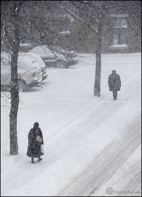
Meeting - I waited in my window and actively composed this scene last winter. There is a strong suggestion of story here because the person in the background appears to be waiting for the foreground woman. I clicked the shutter only when I felt the timing was right compositionally.

Winter’s Meet­ing — I waited in a win­dow and actively com­posed this scene last win­ter. There is a strong sug­ges­tion of story here because the per­son in the back­ground appears to be wait­ing for the fore­ground woman. I clicked the shut­ter only when I felt the tim­ing was right compositionally.


Links /resources men­tioned in this pod­cast:
Long expo­sure images — Photography.ca forum’s reg­u­lar assign­ment — July 2013
Macro pho­tog­ra­phy — Photography.ca forum’s level 2 assign­ment — June 2013
Lay­er­ing images with inter­est­ing ele­ments — Pho­tog­ra­phy pod­cast #102
Shoot in any light - Pho­tog­ra­phy pod­cast #100

If you liked this pod­cast and want to review it on Itunes, this link gets you to the main page

If you are inter­ested in writ­ing for our blog please con­tact me photography.ca ( A T ) G m ail Dot co m (using stan­dard email formatting)

Please join the Photography.ca fan page on Facebook

My Face­book pro­file — Feel free to “friend” me — please just men­tion Photography.ca
My Twit­ter page — I will fol­low you if you fol­low me — Let’s con­nect — PLEASE email me and tell me who you are in case I don’t rec­i­p­ro­cate because I think you are a spammer.

If you are still lurk­ing on our forum,
feel free to join our friendly :)  Pho­tog­ra­phy forum

Thanks to Ben W who posted a blog com­ment about our last pod­cast. Thanks as well to every­one that sent com­ments by email about our last pod­cast. Although ALL com­ments are appre­ci­ated, com­ment­ing directly in this blog is pre­ferred. Thanks as well to all the new mem­bers of the bul­letin board. Most of the links to actual the prod­ucts are affil­i­ate links that help sup­port this site. Thanks in advance if you pur­chase through those links.

If you are look­ing at this mate­r­ial on any other site except Photography.ca — Please hop on over to the Photography.ca blog and pod­cast and get this and other pho­tog­ra­phy info directly from the source. |Sub­scribe with iTunes|Sub­scribe via RSS feed |Sub­scribe for free to the Pho­tog­ra­phy pod­cast — Photography.ca and get all the posts/podcasts by Email

You can down­load this pho­tog­ra­phy pod­cast directly by click­ing the pre­ced­ing link or lis­ten to it almost imme­di­ately with the embed­ded player below.

Thanks for lis­ten­ing and keep on shooting!

Composition in Photography

We all hear of cer­tain rules in pho­tog­ra­phy that one may want to abide by. It is not to say these rules are set in stone but if fol­lowed, nor­mally your pho­tos stand out that much more.


The ‘Rule of Thirds’ is used reg­u­larly by most advanced pho­tog­ra­phers. The rule states that an image should be imag­ined as divided into nine equal parts (like a tick tack toe board) by two equally-spaced hor­i­zon­tal lines and two equally-spaced ver­ti­cal lines, and that impor­tant com­po­si­tional ele­ments should be placed along these lines or their inter­sec­tions. The shot above is a good exam­ple. Most new­bies would have placed the model dead cen­ter in this image. The image works much bet­ter com­po­si­tion­al­ly  with the model to to right of cen­ter on one of the lines with the yel­low dot. Play with this ‘rule’ for your­self just to test it out.

Depth of Field (oth­er­wise known as DOF), is the area from the fore­ground to the back­ground within your photo that is in focus. A nar­row DOF (F-2.0 or F-2.8 for exam­ple) will allow the main sub­ject of your photo in be in focus while the back­ground is blurred. A wider DOF allows one’s eyes to wan­der over the whole image as there are more details that are in focus.

Other ‘rules’ to con­sider include lead­ing lines, fram­ing, fore­ground inter­est and more.

Orig­i­nal link from our Pho­tog­ra­phy forum

Composition in Photography

We all hear of cer­tain rules in pho­tog­ra­phy that one may want to abide by. It is not to say these rules are set in stone but if fol­lowed, nor­mally your pho­tos stand out that much more.


The ‘Rule of Thirds’ is used reg­u­larly by most advanced pho­tog­ra­phers. The rule states that an image should be imag­ined as divided into nine equal parts (like a tick tack toe board) by two equally-spaced hor­i­zon­tal lines and two equally-spaced ver­ti­cal lines, and that impor­tant com­po­si­tional ele­ments should be placed along these lines or their inter­sec­tions. The shot above is a good exam­ple. Most new­bies would have placed the model dead cen­ter in this image. The image works much bet­ter com­po­si­tion­ally‚ with the model to to right of cen­ter on one of the lines with the yel­low dot. Play with this ‘rule’ for your­self just to test it out.

Depth of Field (oth­er­wise known as DOF), is the area from the fore­ground to the back­ground within your photo that is in focus. A nar­row DOF (F-2.0 or F-2.8 for exam­ple) will allow the main sub­ject of your photo in be in focus while the back­ground is blurred. A wider DOF allows one’s eyes to wan­der over the whole image as there are more details that are in focus.

Other ‘rules’ to con­sider include lead­ing lines, fram­ing, fore­ground inter­est and more.

Orig­i­nal link from our Pho­tog­ra­phy forum