Photography forum image of the month July 2011

Every month on our pho­tog­ra­phy forum mem­bers nom­i­nate images that they like. Then at the end of the month I choose an excel­lent image and talk about why it rocks. The photo I choose is not nec­es­sar­ily the best one of the month. I’ve come to real­ize it’s not really log­i­cal to pit images from totally dif­fer­ent gen­res against each other. That’s why there are cat­e­gories in photo con­tests. I just choose a photo that has extremely strong ele­ments that we can learn from.

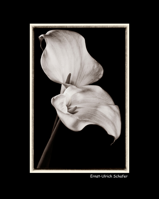
Today’s Calla Lil­lies by Ernst Ulrich-Schafer

This month’s choice is Today’s Calla Lil­lies by Ernst Ulrich-Schafer.

I chose this image for sev­eral reasons:

Com­po­si­tion — Com­po­si­tion here is very pleas­ing to the eye! Diag­o­nal stems from bot­tom left guide the eye to the focal point of the image which are the flow­ers’ inte­ri­ors. The shapes of the flow­ers them­selves are won­der­ful and won­der­fully placed in the image. The flow­ers even cre­ate quite an inter­est­ing neg­a­tive space due the con­trast against a black background.

Light­ing and Post-processing — Lovely light­ing here shows off the flow­ers very well. The light­ing is soft­ish but doesn’t look over­soft. Shad­ows are well con­trolled here with the deep­est blacks being the back­ground itself. This helps the flow­ers “pop” big-time against that back­ground. Post-processing is also well done here with lovely details in the whites. If I have one nit, I’d nix the black frame as this changes the over­all per­spec­tive of the flow­ers mak­ing them look smaller. That said, I know Ernst put it there 100% on pur­pose and it works for him.

Tonal qual­ity — I really like the mono­chrome (light sepia to my eye) qual­ity of this image. Mono­chrome really helps show off the strong shapes of these flow­ers, as well as give them a nos­tal­gic feel.

For all these rea­sons, this is my choice for image of the month. Since we all have opin­ions, some mem­bers may dis­agree with my choice. That’s cool but THIS thread is not the place for debate over my pick, NOR is it the place to fur­ther cri­tique the image. The pur­pose here is to sug­gest strong ele­ments in the photo that we may learn from.

Con­grats again Ernst Ulrich-Schafer for cre­at­ing this won­der­ful image!

Watch Your Backgrounds by Kristen Smith

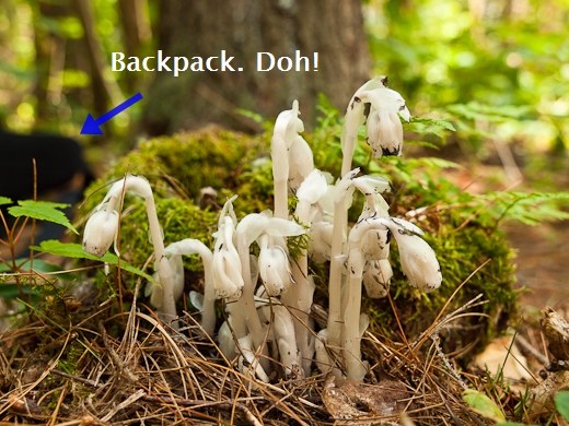
Watch­ing what is going on in the back­ground is use­ful advice, not only for cops in urban shoot-outs, but also for close up and macro pho­tog­ra­phers.  Because bokeh and depth of field are such promi­nent aspects of these types of shots, you really have to watch the back­ground to make sure it com­ple­ments your sub­ject and doesn’t com­pete with it.  Some­times I get so focused on the sub­ject itself that the back­ground just fades away.  And because often times a sub­ject is far away from the back­ground, things just don’t get noticed.

With this shot, I was so intensely involved with the flow­ers that I didn’t really “see” my back­pack which was about 4 feet away and clearly in view.  I really needed to stop and look at the whole scene, but I didn’t.  Some­times it can take a few min­utes to set­tle into the groove and start prac­tic­ing good habits and by the time I got dili­gent, it was too late for this one.

Pho­to­graph by Kris­ten Smith

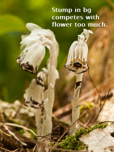
In addi­tion to watch­ing the far back­ground, keep an eye out for stray items close to the sub­ject that might dis­tract the eye.  So many times I get my pic­tures home only to find some annoy­ing leaf, pine nee­dle or branch.  Ugh.  I find that using Live View not only makes tak­ing the photo eas­ier, but gives you a 2D image to look at right away. Many times I catch bad com­po­si­tional ele­ments this way.  Check out this series of shots that illus­trate how I cleaned up my shot –

Pho­to­graph by Kris­ten Smith

Hmm that back­ground doesn’t do the flower any favors, does it?  I need to make the flower really pop out of the bokeh, not just sit there in it.  That stump has got to go. Luck­ily at this mag­ni­fi­ca­tion and per­spec­tive, very small move­ments make for very big changes.

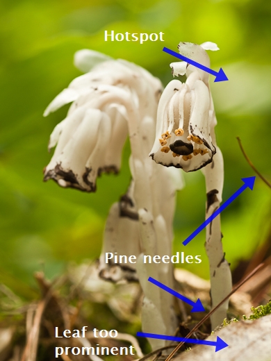
Pho­to­graph by Kris­ten Smith

I barely moved my cam­era, but the dif­fer­ence in back­ground works so much bet­ter.  But this time I notice two things – one, there’s a lot of light play­ing the back­drop and I have to time the shot right so that it is more uni­form back there and there aren’t any hot spots to detract from the flow­ers, two, there are a few stray pine nee­dles and that leaf in the bot­tom right isn’t con­tribut­ing any­thing good.  I pluck those out of the way and lo and behold there’s moss under that leaf and when I judge the light to be the best — Presto!

Pho­to­graph by Kris­ten Smith

So as you can see, the process can take a few steps to get a use­able image.  The key is to develop good habits.

  1. Stop and look at the whole scene, back­ground and fore­ground and eval­u­ate each aspect includ­ing the light if it’s variable
  2. Remove dis­tract­ing things like sticks and leaves
  3. Change cam­era posi­tion for more har­mo­nious back­grounds and foregrounds
  4. Use Live View to see how the 3D trans­lates to 2D

Hope­fully this helps you in the field the next time you’re doing close-up and macro work.  Got any to share?  Feel free to log in to the Photography.ca forum and start a thread.

For more of Kristen’s out­door pho­tog­ra­phy and other arti­cles visit wickeddarkphotography.com

Vintage photograph of the day

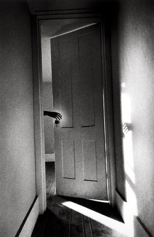
Today’s image of the day is called Hand on Door from the Som­nam­bu­list series by mas­ter fine art Amer­i­can pho­tog­ra­pher Ralph Gib­son;  it was shot in 1968. Many of Gibson’s most famous pho­tographs are high con­trast images, and this high con­trast has become part of his sig­na­ture style. Gibson’s pho­tographs were cre­ated through metic­u­lous film devel­op­ing (by Gib­son him­self) and printing.

What attracts me to this and many other Gib­son images is the strong sense of story and the very strik­ing graphic qual­ity of the image.

Hand on Door from the Somnambulist series by Ralph Gibson - 1968

Hand on Door from the Som­nam­bu­list series by Ralph Gib­son — 1968

Photography forum image of the month June 2011

Every month on our pho­tog­ra­phy forum mem­bers nom­i­nate images that they like. Then at the end of the month I choose an excel­lent image and talk about why it rocks. The photo I choose is not nec­es­sar­ily the best one of the month. I’ve come to real­ize it’s not really log­i­cal to pit images from totally dif­fer­ent gen­res against each other. That’s why there are cat­e­gories in photo con­tests. I just choose a photo that has extremely strong ele­ments that we can learn from.

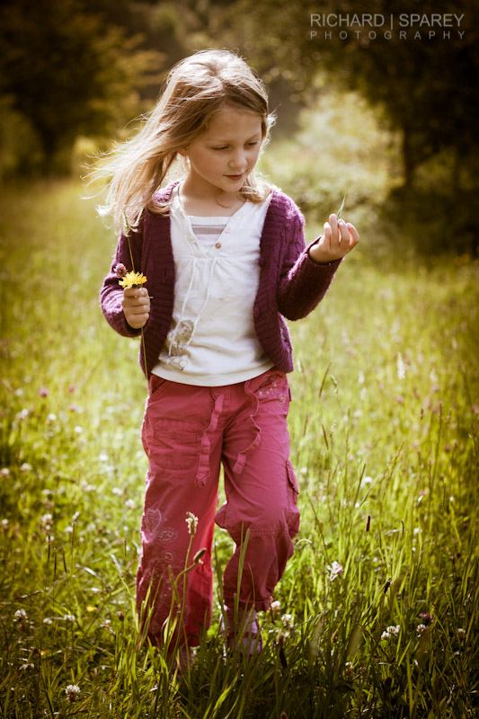
Flower Pick­ing at Ast­bury Mere by Richard

This month’s choice is Flower Pick­ing at Ast­bury Mere by Richard

I chose this image for sev­eral reasons:

Gesture/Mood — The over­all ‘ges­ture’ is beau­ti­fully cap­tured in this image. Richard cap­tured his daugh­ter in mid-step while walk­ing through nature play­ing with a leaf and a flower. It feels as though she may have been day­dream­ing; in fact the whole image has a day­dreamy qual­ity due in good part to the ‘ges­ture’ and won­der­ful backlighting.

Post-Processing — The (PP) post-processing here works very well to sup­port the image. I really like the vignetting all around the girl as it empha­sizes the girl’s walk through a field of flow­ers and sunshine.

Selec­tive focus — Shal­low depth of field is clas­si­cally used to have the girl stand out against the dreamy background.

Lighting/exposure — Back­light­ing was well cho­sen here as the light is quite harsh but the image doesn’t have a very harsh feel. The girl’s face looks well exposed and appears com­fort­able and nat­ural because the sun is not blast­ing it directly. The spec­u­lar high­lights on the hair, hand and around the cloth­ing are won­der­ful warm accents and do not distract.

For all these rea­sons, this is my choice for image of the month. Since we all have opin­ions, some mem­bers may dis­agree with my choice. That’s cool but THIS thread is not the place for debate over my pick, NOR is it the place to fur­ther cri­tique the image. The pur­pose here is to sug­gest strong ele­ments in the photo that we may learn from.

Con­grats again Richard for see­ing and cap­tur­ing this won­der­ful photo!

98 — 3 reasons you SHOULD crop photos

Pho­tog­ra­phy pod­cast #98 talks about why it’s OK to crop pho­tos.
Many pho­tog­ra­phers on the Net and through­out Photography’s his­tory seem to be against crop­ping and in this pod­cast I explain why I am NOT one of them.

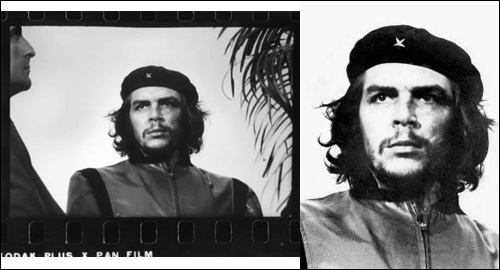
Guer­rillero Hero­ico by Alberto Korda — The cropped pho­to­graph of Che Gue­vara is one of the most rec­og­niz­able pho­tos on planet earth. Although the orig­i­nal is still a strong pho­to­graph, unlikely it would have become the icon it is with­out the crop.

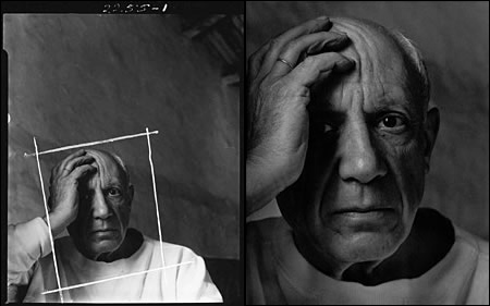
Pablo Picasso by Arnold New­man — Arnold New­man was a strong believer in doing what­ever worked to improve his pho­tographs. This obvi­ously included crop­ping out about 65% of this very famous portrait.

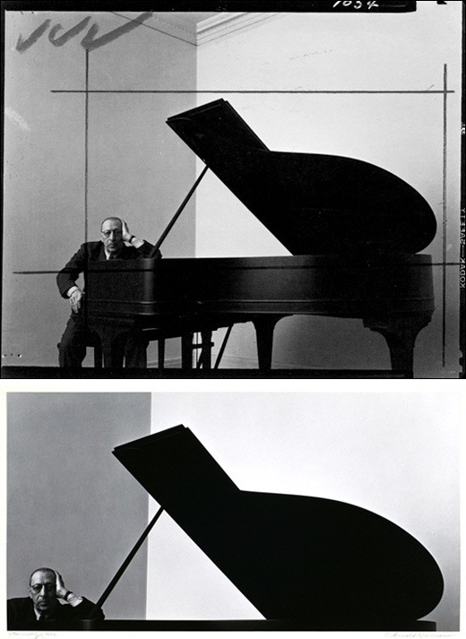
Igor Stravin­sky by Arnold New­man — Most peo­ple would agree that the cropped ver­sion of this pho­to­graph is much stronger. In this case, less is WAY more in this unusual but extremely effec­tive crop.

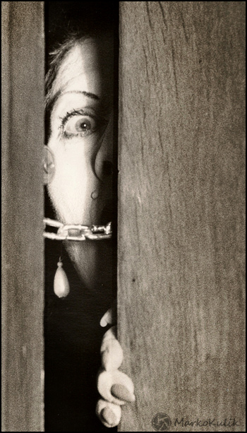
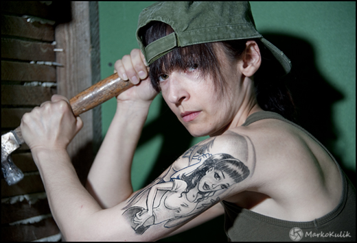
Woman at the Door by Marko Kulik — This crop is uncon­ven­tional and delib­er­ate but I feel it helps the image and that’s the only rea­son it’s there.

Links /resources men­tioned in this pod­cast:
July’s reg­u­lar assign­ment on the Photography.ca forum — My city OR my coun­try
July’s level 2 assign­ment on the Photography.ca forum — Cre­ative use of my country’s flag


If you liked this pod­cast and want to review it on Itunes, this link gets you to the main page

If you are inter­ested in writ­ing for our blog please con­tact me photography.ca (   A   T  ) G m ail  Dot co m (using stan­dard email formatting)

Please join the Photography.ca fan page on Facebook

My Face­book pro­file — Feel free to “friend” me — please just men­tion Photography.ca
My Twit­ter page — I will fol­low you if you fol­low me — Let’s con­nect — PLEASE email me and tell me who you are in case I don’t rec­i­p­ro­cate because I think you are a spammer.

If you are still lurk­ing on our forum,
feel free to join our friendly :)  Pho­tog­ra­phy forum

Thanks to forum mem­bers Jimmy, Scorpio_e, and Bren­dan who posted  blog com­ments about our last pod­cast. Thanks as always to every­one that sent com­ments by email about our last pod­cast. Although ALL com­ments are appre­ci­ated, com­ment­ing directly in this blog is pre­ferred. Thanks as well to all the new mem­bers of the bul­letin board. Most of the links to actual the prod­ucts are affil­i­ate links that help sup­port this site. Thanks in advance if you pur­chase through those links.

If you are look­ing at this mate­r­ial on any other site except Photography.ca — Please hop on over to the Photography.ca blog and pod­cast and get this and other pho­tog­ra­phy info directly from the source. |Sub­scribe with iTunes|Sub­scribe via RSS feed |Sub­scribe with Google Reader|Sub­scribe for free to the Pho­tog­ra­phy pod­cast — Photography.ca and get all the posts/podcasts by Email
You can down­load this pho­tog­ra­phy pod­cast directly by click­ing the pre­ced­ing link or lis­ten to it almost imme­di­ately with the embed­ded player below.

Thanks for lis­ten­ing and keep on shooting!

Backgrounds Matter Dammit

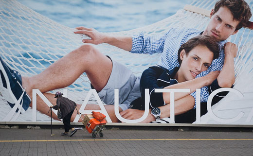
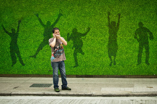
One of the things that sep­a­rates new­bie pho­tog­ra­phers from expe­ri­enced pho­tog­ra­phers is the abil­ity to see beyond the fore­ground or main sub­ject. Most pho­tog­ra­phers that are start­ing out for­get that 2 dimen­sional pho­tos had mul­ti­ple planes (fore­ground, midground and back­ground) before the shut­ter release but­ton was clicked. This is espe­cially true of street photography.

Image by thoughton

Thoughton, a mem­ber of our fine art pho­tog­ra­phy forum recently uploaded a gor­geous set of travel pho­tos where the back­grounds share equal or greater impor­tance to the fore­ground or the main focal point. In some of the images the back­ground IS the focal point.

Part of the skill here is of course antic­i­pa­tion, desire and patience. Some­times we can spot a great street back­ground but we need to hunt down (sounds bet­ter and less bor­ing than ‘wait for’) a fore­ground sub­ject to com­plete the scene.

Image by thoughton

Click to see the photo thread that con­tains thoughton’s whole set in a larger size.

Happy hunt­ing :)

Gaia Nudes — Workshop w/ Darwin Wiggett & Samantha Chrysanthou

Good friend to Photography.ca Dar­win Wiggett is offer­ing a work­shop (about 1/2 hour west of Cal­gary, Alberta) on August 12–14, 2011  on how to shoot land­scape nude pho­tog­ra­phy, called Gaia Nudes. Dar­win is a fab­u­lous pho­tog­ra­pher and teacher so it’s my plea­sure to help spread the word. Read on if you are inter­ested in learn­ing how to shoot nudes with Dar­win and Saman­tha. As always, Dar­win only works with small groups so spots fill up fast.

Q: What is Gaia Nudes?

A: Gaia Nudes is the name of our project for pho­tograph­ing artis­tic nudes in the land­scape.  As land­scape shoot­ers, we have an appre­ci­a­tion for nat­ural beauty.  Meld­ing the human form into the land­scape seemed a fun and chal­leng­ing way to merge our appre­ci­a­tion of the land­scape with recog­ni­tion of the beauty inher­ent in the nat­ural human form.  The results of our work are show­cased on our web­site, www.gaianudes.com.

Q: As you say, you are pri­mar­ily nature and land­scape shoot­ers; how did you come to develop this web­site and con­cept behind Gaia Nudes?

A: Well, there are many, many won­der­ful land­scape scen­ics out there online, in mag­a­zines and in other forms of pub­li­ca­tions.  There are also a lot of pic­tures of nude or naked peo­ple online:  just try search­ing for qual­ity, fine art nude pho­tog­ra­phy and you are inun­dated with what is often just soft porn!  We real­ized that there are much fewer exam­ples of images that com­bine a well-composed land­scape with an artis­tic inter­pre­ta­tion of the human form.  We thought this would be a chal­leng­ing yet reward­ing way to broaden our skills as photographers.

Q: How is Gaia Nudes dif­fer­ent from say, boudoir or glam­our nude photography?

It really boils down to one key word:  sex.  Fine art nude pho­tog­ra­phy is not there to sell a sex­ual idea.  Sure, there is inti­macy and sen­su­al­ity in fine art nude land­scape images, but we are appeal­ing to these sen­si­bil­i­ties more than we are appeal­ing to people’s inter­est in sex.  Boudoir pho­tog­ra­phy is as its name implies:  shot in a pri­vate, inti­mate set­ting with props such as sexy cloth­ing, mood light­ing, makeup and provoca­tive pos­tures.  The empha­sis is on the phys­i­cal desir­abil­ity of the per­son being pho­tographed rather than on a gen­eral aes­thetic appre­ci­a­tion of the fig­ure.  Glam­our nudes sell sex pack­aged up with fash­ion.  Both are respectable forms of expres­sion, but they are not what Gaia Nudes is about.  A Gaia Nudes shoot may show the fragility of the body when exposed to the ele­ments, it may be a story in the con­trast in tex­tures, or it may high­light the par­al­lel forms of the human body and its echo in the line of a tree, hill­side or jagged rock.

When we are out pho­tograph­ing with our mod­els, we are all hav­ing fun.  We laugh at our mis­takes, spin cre­ative ideas off each other, and exper­i­ment with poses that con­nect the body to the land­scape.  It’s a phys­i­cal and men­tal workout!

Q: Why would other pho­tog­ra­phers be inter­ested in this area of photography?

We have heard many times from our work­shop par­tic­i­pants that they are ‘in a rut’ or bored with their pho­tog­ra­phy.  For shoot­ers look­ing for a chal­lenge, pho­tograph­ing nudes out­doors brings into play many skills and chal­lenges, forc­ing pho­tog­ra­phers who think of them­selves as ‘peo­ple’ shoot­ers or ‘nature’ shoot­ers to think out­side of the box.  If you enjoy pho­tograph­ing beauty in any form, then you would be inter­ested in this kind of photography!

As well, because we have avoided the need to ‘sell sex’, the pho­tog­ra­pher has a much wider range of emo­tion and story to work with.  By free­ing the shooter and the model from the boudoir or bed­room, we’ve freed them to work together to chan­nel orig­i­nal and unique expres­sions or stories.

Q: What do you look for in a land­scape for a Gaia Nudes model shoot?

Good ques­tion!  We look for a land­scape that has a bit of mobil­ity in terms of it can sup­port more than one pose or idea.  Ide­ally, a land­scape that has sev­eral fea­tures of inter­est, such as some open land, rolling hills, some for­est, per­haps some rocky ter­rain….  Prac­ti­cally speak­ing, we need land fea­tures that are capa­ble of sup­port­ing safely both pho­tog­ra­pher and model (so no swamps, wil­low thick­ets or scree slopes!).  Pri­vacy is also crit­i­cal so both model and pho­tog­ra­pher can con­cen­trate.  The land­scape should also be some­thing that we would pho­to­graph for its own sake.  Too often when a pho­tog­ra­pher takes a model out­doors for nude work, the land­scape gets short shift and is rel­e­gated to a few sticks or a rocky water­fall.  We want both nature and the model to be appre­ci­ated since their sto­ries are interwoven.

Q: What do you look for in models?

There are a few char­ac­ter­is­tics that are crit­i­cal.  The most impor­tant is atti­tude.  We are seek­ing a fun and reward­ing expe­ri­ence for both model and pho­tog­ra­pher, so a per­son with a pos­i­tive atti­tude and a will­ing­ness to get a bit dirty or work a lit­tle harder for the shot are crit­i­cal.  In terms of phys­i­cal char­ac­ter­is­tics, we look for a slim, fit and healthy body that looks nat­ural.  The cam­era appre­ci­ates mod­els who can elon­gate their limbs and carry an ele­gant line from head to toe.  We love yogis, dancers, and gym­nasts for this form of work.  The model should have a good kines­thetic aware­ness and an abil­ity to under­stand a direc­tion from the pho­tog­ra­pher so that he or she can trans­late a ver­bal sug­ges­tion into a pose.  This is def­i­nitely a tal­ent!  We avoid mod­els that are too mus­cu­lar, too endowed (remem­ber, we’re not sell­ing sex!) or dis­pro­por­tional.  We don’t have height require­ments, we aren’t gender-biased, and we don’t really care about the model’s facial beauty since we’re not sell­ing glam­our, fash­ion or boudoir.

Q: Describe a typ­i­cal shoot.

This is one area where we are land­scape shoot­ers, through and through!  We start early (just after sun­rise is best) and work in the lovely early morn­ing light for a cou­ple of hours.  We usu­ally break for mid­day both for health (heat­stroke, any­one?) and then resume in the long, golden light of the evening.  Each ses­sion is usu­ally about three hours long.  Both of us work one model and encour­age sug­ges­tions or ideas from the model as well as each other.  We rarely use sup­ple­men­tal light, but some­times we share hold­ing a reflec­tor to brighten parts of the model’s body.

Q: What are some of the chal­lenges and rewards of this form of photography?

The chal­lenges of this form of pho­tog­ra­phy is that it is like an ‘all over’ work­out:  so many skills are at play!  Men­tally, you need cre­ative vision to pic­ture a con­cept.  You need good com­mu­ni­ca­tion skills to trans­late this vision to the model so that he or she can pic­ture what you have in mind and exe­cute your sug­ges­tions.  You also need to be flex­i­ble to respond to chang­ing poses, other’s ideas and vari­able weather and light con­di­tions.  There is a bit of phys­i­cal exer­cise too.  Fine art out­door nude pho­tog­ra­phy com­bines skills from the tra­di­tions of both por­trai­ture and land­scape pho­tog­ra­phy.  The rewards are increased skill lev­els, com­pelling imagery and that sat­is­fac­tion you feel when you work together as a team with your model to cre­ate an amaz­ing image.

Q: Can you pro­vide any tips for com­pos­ing the scene?

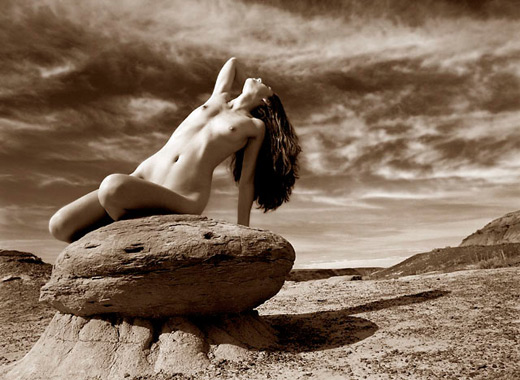
You have to work within an idea.  Just plunk­ing a per­son into a scene is going to look arti­fi­cial.  Try and think of the model as another fea­ture of the envi­ron­ment.  Where would this fea­ture look best in the over­all scene?  Look for shapes or ele­ments in the scene that might mir­ror the shape and form of the human body, or con­trast with the human form.  If you are really stuck, try hav­ing your model make dif­fer­ent forms (rounded or long, arms and limbs out or close to the body) next to another dis­tinc­tive ele­ment in the scene.  For exam­ple, a round rock in a prairie scene might sug­gest a curved form on or around the rock, or you could angle for con­trast and have your model in a sit­ting tri­an­gu­lar pose to con­trast with the rounded form of the rock.

Lens choice and point of view are also impor­tant when com­pos­ing the scene.  Since this is about the land­scape and the model, we often use wider angle lenses and shoot fur­ther back than tra­di­tional boudoir or fash­ion photography.

Q: Where do you look for inspi­ra­tion on how to pose mod­els within the scene?  Is com­mu­ni­ca­tion of your vision easy or difficult?

A lot of our inspi­ra­tion comes from the land­scape itself.  There are always inter­est­ing shapes, tex­tures and lines in nature that you can work with.  We encour­age our mod­els to come up with ideas as well since they know what their bod­ies are capa­ble of doing in terms of reach, bal­ance etc.  Com­mu­ni­ca­tion depends each time on the rela­tion­ship between the pho­tog­ra­pher and the model.  We try to be very clear and descrip­tive with our lan­guage to trans­late our vision in what we want the model to do.  So, instead of say­ing, “Can you just move that arm a bit more over there?” which is a ter­ri­bly unin­for­ma­tive way of putting it, we would be more spe­cific:  “Can you lift your right arm about 90 degrees out from your side and bend your elbow so that your right hand rests behind your right ear?”

We have also wan­dered across some excep­tional fine art nudes in the land­scape and those are also always an inspiration.

Q: What equip­ment do you use in the field?

We mostly use nat­ural light as it is very beau­ti­ful and flat­ter­ing to both land­scape and model if you shoot in bright over­cast light or when the sun is lower in the sky.  We may use a reflec­tor for some fill, and on some occa­sions we break out off-camera flash with a soft box for other effects.

Q: You are also both photo instruc­tors with eBooks and work­shops on offer.  I under­stand you have an upcom­ing work­shop on this form of fine art pho­tog­ra­phy.  Can you describe that for any view­ers who may be inter­ested to learn more?

We greatly enjoy teach­ing, so we do have some eBooks on generic pho­tog­ra­phy top­ics, along with our busi­ness part­ners Jay and Varina Patel, at www.visualwilderness.com But our Gaia Nudes work is pri­mar­ily on our Gaia Nudes web­site.  We are offer­ing a work­shop this sum­mer, in Alberta near where we live, on how to cre­ate this form of artis­tic pho­tog­ra­phy.  The work­shop takes place August 12–14, 2011 on gor­geous, pri­vate ranch­land in the foothills.  We have sev­eral mod­els and a very lim­ited num­ber of par­tic­i­pant spots.  We’ll be cov­er­ing how to com­mu­ni­cate your cre­ative vision, com­po­si­tional tips and tech­niques and essen­tial equip­ment, and we have a Ladies Only day spe­cially set aside for female shoot­ers who appre­ci­ate com­raderie and com­pany in learn­ing new forms of photography.

Dar­win Wiggett and Saman­tha Chrysan­thou are both cre­ative and life part­ners.  They spe­cial­ize in high-quality, acces­si­ble instruc­tion on pho­to­graphic top­ics.  Their work has been pub­lished in both national and inter­na­tional mag­a­zines and pub­li­ca­tions; Dar­win is a reg­u­lar colum­nist for Out­door Pho­tog­ra­phy Canada mag­a­zine.  You can read more about them by vis­it­ing their web­sites (www.darwinwiggett.com , www.chrysalizz.smugmug.com) or their blogs (www.darwinwiggett.wordpress.com , www.samsrant.wordpress.com)

Short Photography Excursions by Ron Cardinale

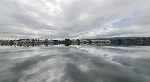
For a lot of us, one big way we work on our pho­tog­ra­phy skills is by mak­ing short excur­sions that may be only a few hours long or even less. These brief sojourns can help us refine our craft. There’s a famous say­ing that luck favors the pre­pared. I’ve got some favorite loca­tions, which have changed over the years. Being famil­iar with them at var­i­ous times of the day, var­i­ous times of the year, and with dif­fer­ent weather con­di­tions is really help­ful. Some­times, these prac­tice shots have had a drama that wasn’t in my mind when I left the house. This pic­ture resulted from both pre­pared­ness and luck. (The loca­tion is in Fos­ter City which isn’t too far south of San Francisco.)

Image by Ron Cardinale

Image by Ron Cardinale

I’ve walked the shore of this lagoon many times. On this morn­ing, a storm was approach­ing from the Pacific. I had an idea of what to expect so I had my wide angle zoom with me and used it at 12mm for this shot. The luck part of it was being there at the right time to catch these dra­matic clouds with unusu­ally still water. I’d taken a few other shots around the lagoon that morn­ing but I like this one the best because the clouds and their reflec­tion appear to con­verge directly across the lagoon. Despite the calm con­di­tions on the ground, the clouds were mov­ing along so I didn’t have a lot of time. The con­verg­ing pat­tern was van­ish­ing and I could see that the clouds that were mov­ing in weren’t as dra­matic as these.

One issue with such a wide angle lens when shoot­ing a scene with bright clouds is that the lens sees a lot of those clouds so the camera’s meter very often reduces the expo­sure and the shot ends-up too dark. In pre­vi­ous shots, I had increased the expo­sure but that caused the loss of too much high­light detail in the clouds. The clouds are a key part of the image so it was impor­tant to hold detail in them. For this shot, I used the camera’s nor­mal meter­ing. The expo­sure was 1/500 at f/8 with ISO 100.  The result­ing image was dark but it held details in the clouds except right were the sun was.

I made some adjust­ments later at the com­puter. I made a quasi HDR photo from dif­fer­ent pro­cess­ings of the sin­gle raw image and also made a curves adjust­ment. A real HDR image sequence wasn’t fea­si­ble in this sit­u­a­tion because the clouds were mov­ing and the water wasn’t com­pletely still.   Have fun and keep shoot­ing!
Read a lit­tle more from Ron Car­di­nale at http://roncardinale.110mb.com

97 — How to photograph with hard light

Pho­tog­ra­phy pod­cast #97 is a primer on how to use hard light. Hard light is trick­ier to use than soft light but there is NO rea­son to avoid using it. It just needs to be used appro­pri­ately. Part of using hard light and shadow in pho­tog­ra­phy is being very aware of where the shad­ows will fall and chang­ing your posi­tion or your light­ing if you don’t like where they fall.

Here’s a cou­ple of basic points when using hard light in photography:

- Hard light comes from a small light source rel­a­tive to your sub­ject. The sun IS a small light source in this respect because it is 93 mil­lion miles away from the earth.
- Hard light pro­duces hard shad­ows which are good in many cases espe­cially to reveal form.
- The far­ther the light source is from the sub­ject, the HARDER the shad­ows.
- The far­ther away the light source is from the sub­ject, the SHORTER the shadows.

To prove this to your­self take a flash­light into the bath­room and shut off the lights. Shine the light on your fin­ger in front of the wall. Move the light around and you will learn a ton about shadows.

Hard light demo

Hard light demo — The image at left shows a shadow from direct hard sun­light. Moments later some very light clouds dif­fuse the sun­light to cre­ate a softer shadow at right. Had the sky been com­pletely over­cast (very soft light) almost no shad­ows would be present and this image would lose its punch and be totally bor­ing. © Marko Kulik

Image by BzdegaPhotography

Image by Bzde­gaPho­tog­ra­phy — The hard light totally works in this image despite the flare.

Carmy Working

Carmy Work­ing by Marko Kulik — One hard light at cam­era left cre­ates a shadow that adds to the gritty flavour of the shot

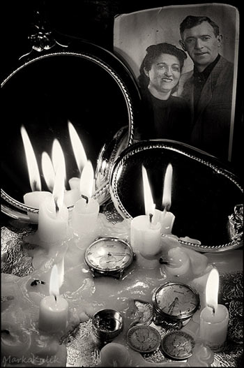
Their Objects by Marko Kulik

Their Objects by Marko Kulik — Can­dle light is hard light. This shot took quite a while to set up due to think­ing about where the shad­ows would fall.

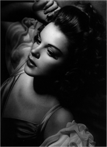
Judy Garland by George Hurrell - 1944

Judy Gar­land by George Hur­rell — 1944. This strik­ing por­trait was shot 67 years ago by light­ing mas­ter George Hur­rell. The very dark shad­ows attest to the hard light used here.

Links /resources men­tioned in this pod­cast:
June’s reg­u­lar assign­ment on the Photography.ca forum — Break­ing the rules
June’s level 2 assign­ment on the Photography.ca forum — Cre­ative self portraits


If you liked this pod­cast and want to review it on Itunes, this link gets you to the main page

If you are inter­ested in writ­ing for our blog please con­tact me photography.ca (   A   T  ) G m ail  Dot co m (using stan­dard email formatting)

Please join the Photography.ca fan page on Facebook

My Face­book pro­file — Feel free to “friend” me — please just men­tion Photography.ca
My Twit­ter page — I will fol­low you if you fol­low me — Let’s con­nect — PLEASE email me and tell me who you are in case I don’t rec­i­p­ro­cate because I think you are a spammer.

If you are still lurk­ing on our forum,
feel free to join our friendly :)  Pho­tog­ra­phy forum

Thanks to forum mem­bers North­Stone, Wicked Dark, Howard J,  KawarthaBob and Jonny Hot­shoe who posted  blog com­ments about our last pod­cast. Thanks as always to every­one that sent com­ments by email about our last pod­cast. Although ALL com­ments are appre­ci­ated, com­ment­ing directly in this blog is pre­ferred. Thanks as well to all the new mem­bers of the bul­letin board. Most of the links to actual the prod­ucts are affil­i­ate links that help sup­port this site. Thanks in advance if you pur­chase through those links.

If you are look­ing at this mate­r­ial on any other site except Photography.ca — Please hop on over to the Photography.ca blog and pod­cast and get this and other pho­tog­ra­phy info directly from the source. |Sub­scribe with iTunes |Sub­scribe via RSS feed |Sub­scribe with Google Reader|Sub­scribe for free to the Pho­tog­ra­phy pod­cast — Photography.ca and get all the posts/podcasts by Email
You can down­load this pho­tog­ra­phy pod­cast directly by click­ing the pre­ced­ing link or lis­ten to it almost imme­di­ately with the embed­ded player below.

Thanks for lis­ten­ing and keep on shooting!

Photography forum image of the month May 2011

Every month on our pho­tog­ra­phy forum mem­bers nom­i­nate images that they like. Then at the end of the month I choose an excel­lent image and talk about why it rocks. The photo I choose is not nec­es­sar­ily the best one of the month. I’ve come to real­ize it’s not really log­i­cal to pit images from totally dif­fer­ent gen­res against each other. That’s why there are cat­e­gories in photo con­tests. I just choose a photo that has extremely strong ele­ments that we can learn from.

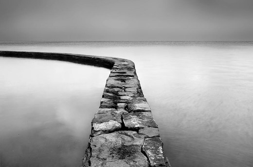
Lake Wall by taffy

Lake Wall by taffy

This month’s choice is Lake Wall by taffty.

I chose this image for sev­eral reasons:

Mood — The over­all mood here (which I inter­pret as as “ethe­real”) is cre­ated by many fac­tors includ­ing; the soft light, the com­po­si­tion and of course the black and white post pro­cess­ing. The whitish clouds reflect­ing in the water as well as what looks to be a really gen­tle surf also give you the feeling/illusion that the wall is float­ing on air.

Com­po­si­tion — The lines, curves, shapes, sub-shapes cre­ated by the lines and curves, and the use of neg­a­tive space are all well used here. They please our eyes and intrigue our eyes. The curved wall-path that starts with medium/light tones in the fore­ground to darker at left midground leads our eye beau­ti­fully as it ‘cuts’ through the lighter tones on the left..

Expo­sure and post pro­cess­ing — Both well han­dled here. Even though the light is soft, reflec­tions off the water make for a trick­ier expo­sure. Whites hold their sub­tle detail on my mon­i­tor and I like that. Sil­very mid­tones in the sky (back­ground) and imme­di­ate fore­ground match each other for won­der­ful effect.

For all these rea­sons, this is my choice for image of the month. Since we all have opin­ions, some mem­bers may dis­agree with my choice. That’s cool but THIS thread is not the place for debate over my pick, NOR is it the place to fur­ther cri­tique the image. The pur­pose here is to sug­gest strong ele­ments in the photo that we may learn from.

Con­grats again taffy for see­ing and and cre­at­ing this won­der­ful photo!