Photography forum image of the month December 2011

Every month on our pho­tog­ra­phy forum mem­bers nom­i­nate images that they like. Then at the end of the month I choose an excel­lent image and talk about why it rocks. The photo I choose is not nec­es­sar­ily the best one of the month. I’ve come to real­ize it’s not really log­i­cal to pit images from totally dif­fer­ent gen­res against each other. That’s why there are cat­e­gories in photo con­tests. I just choose a photo that has extremely strong ele­ments that we can learn from.

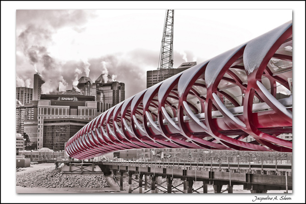
The Peace Bridge - At Last!  by JAS_Photo

The Peace Bridge — At Last! by JAS_Photo

This month’s choice is (click to see the larger ver­sion of this image)  The Peace Bridge — At Last! by JAS_Photo

I chose this image for sev­eral reasons:

1 — Com­po­si­tion — This is a very strong com­po­si­tion and the bridge itself acts as a fan­tas­tic lead­ing line. It guides our eye beau­ti­fully into the image. In addi­tion, aside from the shape of the bridge itself, there are also other “mini-shapes” in the bridge itself as well as all around the image. These other mini-shapes add a lot of inter­est to the image.

2 — Tones and post pro­cess­ing — The bridge itself is selec­tively coloured in this image and I like that very much in this case. I feel it works and offers a new take on what is likely a heav­ily pho­tographed piece of infra-structure. For me it sug­gests ‘some­thing new’ being intro­duced into a city. The desat­u­ra­tion of the back­ground com­pli­ments the bridge and really makes the bridge pop.

3 — Story and per­spec­tive — This bridge is still a work in progress and we can see a crane in the back­ground that sug­gests this. We see the bridge “mov­ing” toward the back­ground which sug­gests to me some­thing new being intro­duced to some­thing older. The angle or per­spec­tive from which the image was taken was very well cho­sen to sug­gest this story.

For all these rea­sons, this is my choice for image of the month. Since we all have opin­ions, some mem­bers may dis­agree with my choice. That’s cool but THIS thread is not the place for debate over my pick, NOR is it the place to fur­ther cri­tique the image. The pur­pose here is to sug­gest strong ele­ments in the photo that we may learn from.

Con­grats again JAS_Photo for cre­at­ing this won­der­ful image!


103 — Photography umbrella for rain and snow

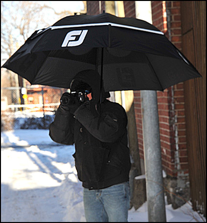
Pho­tog­ra­phy pod­cast #103 talks about a wet weather pho­tog­ra­phy umbrella con­trap­tion that I recently put together. Basi­cally it’s a GIANT golf umbrella and a sling.
I’ve been shoot­ing a lot in the rain and snow lately and some­times you need to have both hands free. This umbrella con­trap­tion allows you to keep both hands on the cam­era and works well in heavy rain or snow so long as it’s not too windy.

This giant 68″ dou­ble canopy Gust­buster golf umbrella in a sling gives you close to 30 inches of dry shoot­ing when it’s not too windy.


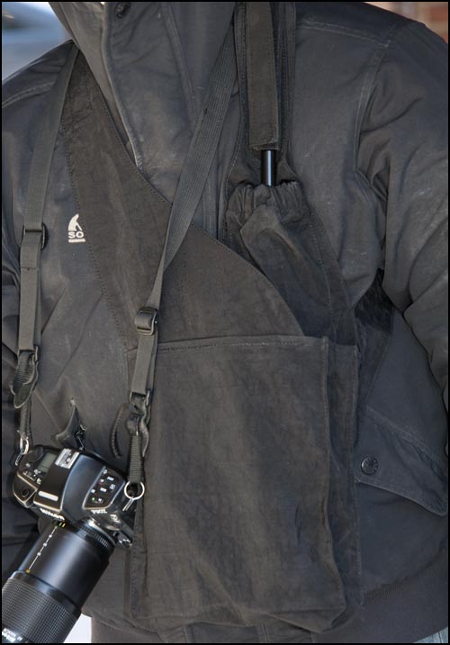
A close-up of the sling I pur­chased from brellabag.com — It’s pricey at $30. but works well when the sling is loaded with heav­ier items like a long lens or bot­tle of water.

Links /resources men­tioned in this pod­cast:
Golftown.com
Gust­buster umbrel­las
Brellabag.com
– Pod­cast #88 — Rain pho­tog­ra­phy
“Lights” is our reg­u­lar forum assign­ment for Decem­ber
– Ugly duck­lings — look­ing for beauty in every­thing  is our level 2 assign­ment for December

If you liked this pod­cast and want to review it on Itunes, this link gets you to the main page

If you are inter­ested in writ­ing for our blog please con­tact me photography.ca (   A   T  ) G m ail  Dot co m (using stan­dard email formatting)

Please join the Photography.ca fan page on Facebook

My Face­book pro­file — Feel free to “friend” me — please just men­tion Photography.ca
My Twit­ter page — I will fol­low you if you fol­low me — Let’s con­nect — PLEASE email me and tell me who you are in case I don’t rec­i­p­ro­cate because I think you are a spammer.

If you are still lurk­ing on our forum,
feel free to join our friendly :)  Pho­tog­ra­phy forum

Thanks to cartman75, Benny and Gale who posted  blog com­ments about our last pod­cast. Thanks as always to every­one that sent com­ments by email about our last pod­cast. Although ALL com­ments are appre­ci­ated, com­ment­ing directly in this blog is pre­ferred. Thanks as well to all the new mem­bers of the bul­letin board. Most of the links to actual the prod­ucts are affil­i­ate links that help sup­port this site. Thanks in advance if you pur­chase through those links.

If you are look­ing at this mate­r­ial on any other site except Photography.ca — Please hop on over to the Photography.ca blog and pod­cast and get this and other pho­tog­ra­phy info directly from the source. |Sub­scribe with iTunes|Sub­scribe via RSS feed |Sub­scribe with Google Reader|Sub­scribe for free to the Pho­tog­ra­phy pod­cast — Photography.ca and get all the posts/podcasts by Email
You can down­load this pho­tog­ra­phy pod­cast directly by click­ing the pre­ced­ing link or lis­ten to it almost imme­di­ately with the embed­ded player below.

Thanks for lis­ten­ing and keep on shooting!

Photography forum image of the month November 2011

Every month on our pho­tog­ra­phy forum mem­bers nom­i­nate images that they like. Then at the end of the month I choose an excel­lent image and talk about why it rocks. The photo I choose is not nec­es­sar­ily the best one of the month. I’ve come to real­ize it’s not really log­i­cal to pit images from totally dif­fer­ent gen­res against each other. That’s why there are cat­e­gories in photo con­tests. I just choose a photo that has extremely strong ele­ments that we can learn from.

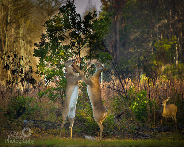
Fight Club! by Lizardqing

Fight Club! by Lizardqing


This month’s choice is (click to see the larger ver­sion of this image) Fight Club! by Lizardqing

I chose this image for sev­eral reasons:

1 — Timing/Decisive moment. You gotta have a quick trig­ger fin­ger to catch a moment like this or you will miss it. We’ve all missed fab oppor­tu­ni­ties like this, or mis­framed oppor­tu­ni­ties like this; good on Lizardquing for this fab capture.

2 — Com­po­si­tion — I really like the com­po­si­tion here. It is espe­cially impres­sive given the speed needed to catch this image. I really like the faun at the right side as well as the posi­tion of the trees.

3 — Exposure/lighting/colour — Expo­sure looks very good here and could eas­ily have been missed given the light­ing. Good choice of shutter-speed to keep things fairly sharp but still reveal motion in the deers’ front legs. Lovely colour palette as well. The light­ing is won­der­ful in this image, good on Lizardqing for being there early enough to capture.

For all these rea­sons, this is my choice for image of the month. Since we all have opin­ions, some mem­bers may dis­agree with my choice. That’s cool but THIS thread is not the place for debate over my pick, NOR is it the place to fur­ther cri­tique the image. The pur­pose here is to sug­gest strong ele­ments in the photo that we may learn from.

Con­grats again Lizardqing for cap­tur­ing this won­der­ful moment!

102 — Layering images with interesting elements

Pho­tog­ra­phy pod­cast #102 dis­cusses lay­er­ing your pho­tographs with inter­est­ing ele­ments. This involves seri­ous atten­tion to the over­all com­po­si­tion of every frame that you take.
If you are tak­ing a shot of a moun­tain for exam­ple, there’s always more to the shot than just the moun­tain. When you are aware of what’s around the moun­tain and take the time to “layer” the image with inter­est­ing ele­ments, the com­po­si­tion as a whole gets much stronger. We also touch on how to refine those “lay­ered ele­ments” in post processing.


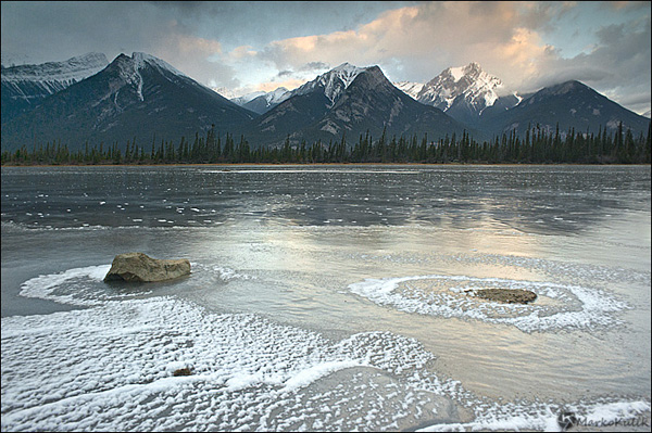
Athabaska River Reflecting Pools at Sunrise - Banff National Park - Alberta., Canada

Athabaska River Reflect­ing Pools at Sun­rise by Marko Kulik — Banff National Park — Alberta, Canada. As you can see this shot is about more than just the moun­tain which is in the back­ground. The fore­ground, midground and back­ground “lay­ered” ele­ments all con­tribute to the over­all com­po­si­tion in this scene.


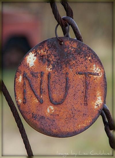
Sometimes you feel like a nut - Image by Lisa Couldwell

Some­times you feel like a nut — Image by Lisa Could­well. Even scenes using larger aper­tures ben­e­fit from “lay­ered ele­ments”. Here, Lisa focuses on the nut medal­lion but the tire in the back­ground is a repeat­ing shape that adds inter­est to the image. The diag­o­nal lines in the image help to guide your eye. The com­po­si­tion here is very deliberate.


Links /resources men­tioned in this pod­cast:
– Improv­ing bor­ing land­scapes
- Images that com­pli­ment SONG titles or Book titles is our reg­u­lar forum assign­ment for Novem­ber
Inten­tional cam­era move­ment  is our level 2 assign­ment for November

If you liked this pod­cast and want to review it on Itunes, this link gets you to the main page

If you are inter­ested in writ­ing for our blog please con­tact me photography.ca (   A   T  ) G m ail  Dot co m (using stan­dard email formatting)

Please join the Photography.ca fan page on Facebook

My Face­book pro­file — Feel free to “friend” me — please just men­tion Photography.ca
My Twit­ter page — I will fol­low you if you fol­low me — Let’s con­nect — PLEASE email me and tell me who you are in case I don’t rec­i­p­ro­cate because I think you are a spammer.

If you are still lurk­ing on our forum,
feel free to join our friendly :)  Pho­tog­ra­phy forum

Thanks to Scorpio_e, Melissa Dorner, Josh G, Math­ias,  Avi­tal Pin­nick, Henry. b, and Jill bayer who posted  blog com­ments about our last pod­cast. Thanks as always to every­one that sent com­ments by email about our last pod­cast. Although ALL com­ments are appre­ci­ated, com­ment­ing directly in this blog is pre­ferred. Thanks as well to all the new mem­bers of the bul­letin board. Most of the links to actual the prod­ucts are affil­i­ate links that help sup­port this site. Thanks in advance if you pur­chase through those links.

If you are look­ing at this mate­r­ial on any other site except Photography.ca — Please hop on over to the Photography.ca blog and pod­cast and get this and other pho­tog­ra­phy info directly from the source. |Sub­scribe with iTunes|Sub­scribe via RSS feed |Sub­scribe with Google Reader|Sub­scribe for free to the Pho­tog­ra­phy pod­cast — Photography.ca and get all the posts/podcasts by Email
You can down­load this pho­tog­ra­phy pod­cast directly by click­ing the pre­ced­ing link or lis­ten to it almost imme­di­ately with the embed­ded player below.

Thanks for lis­ten­ing and keep on shooting!

Photography forum image of the month October 2011

Every month on our pho­tog­ra­phy forum mem­bers nom­i­nate images that they like. Then at the end of the month I choose an excel­lent image and talk about why it rocks. The photo I choose is not nec­es­sar­ily the best one of the month. I’ve come to real­ize it’s not really log­i­cal to pit images from totally dif­fer­ent gen­res against each other. That’s why there are cat­e­gories in photo con­tests. I just choose a photo that has extremely strong ele­ments that we can learn from.

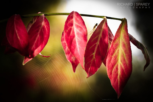
Autumn Web by Richard

Autumn Web by Richard

This month’s choice is (click to see the larger ver­sion of this image)  Autumn Web by Richard

I chose this image for sev­eral reasons:

1 — Plan­ning and exe­cu­tion — This strik­ing image is the result of plan­ning, it didn’t “just hap­pen” and it wasn’t a quick snap. The light­ing, comp and post-processing are all well thought out here. The result is a strik­ing moody fall image.

2 — Com­po­si­tion — details — post­pro­cess­ing — Lovely ren­dered details like the spi­der as well as the spider’s web all con­tribute to the com­po­si­tion here. Spi­der is framed nicely between the red leaves and against the back­light. The post­pro­cess­ing includ­ing the vignette and pos­si­ble selec­tive sharp­en­ing are guid­ing our eyes thought­fully with­out distractions.

3 — Light­ing — Mood — Back­light­ing is a chal­leng­ing light to deal with, but Richard bal­ances it well with off cam­era flash. The end result is an image with a lovely mood that would likely have felt too dark with­out the added light.

4 — Selec­tive focus — A wide aper­ture is well used here to get the dreamy back­ground bokeh. It adds another ‘layer’ to the image.

For all these rea­sons, this is my choice for image of the month. Since we all have opin­ions, some mem­bers may dis­agree with my choice. That’s cool but THIS thread is not the place for debate over my pick, NOR is it the place to fur­ther cri­tique the image. The pur­pose here is to sug­gest strong ele­ments in the photo that we may learn from.

Con­grats again Richard for cre­at­ing this strik­ing image!

101 — Intentional Camera Movement — Interview with Michael Orton

Pho­tog­ra­phy pod­cast #101 fea­tures an inter­view with one of my favorite pho­tog­ra­phers, fine art pho­tog­ra­pher Michael Orton. In this pod­cast we talk about delib­er­ately mov­ing your cam­era dur­ing the expo­sure. Nor­mally, this is FORBIDDEN and you do every­thing in your power to keep the cam­era as still as pos­si­ble while shoot­ing. But Michael has a very unique way of see­ing and has again bro­ken the rules. He has cre­ated a unique and fab­u­lous new port­fo­lio of one-of-a-kind abstract land­scape images, by way of inten­tional cam­era move­ment. This pod­cast dis­cusses inten­tional cam­era move­ments for cre­ative effect.

Michael Orton is a fine art pho­tog­ra­phy pio­neer. First he cre­ated Orton Imagery, AKA the Orton effect some 30ish years ago.  This tech­nique has been used by tens of thou­sands of pho­tog­ra­phers and has become so pop­u­lar that Adobe Ele­ments 10 now fea­tures an action called the Orton Effect. I’d bet hard that Michael’s tech­nique involv­ing com­pound cam­era move­ments also devel­ops a cult-like fol­low­ing in the years to come. Thanks so much Michael!


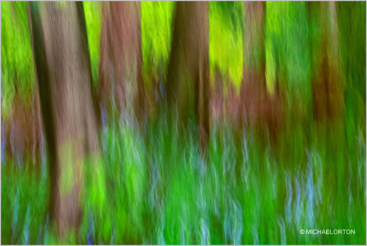
Awakening by Michael Orton
Awak­en­ing by Michael Orton — The abstract painterly feel to this image was cre­ated IN CAMERA by using Inten­tional cam­era movement.


Michael Orton at ‘Work’ — Image by Marko Kulik


Links /resources men­tioned in this pod­cast:
– Michael Orton Pho­tog­ra­phy
Michael Orton’s fea­ture on Photography.ca
– 67 – Orton Imagery – The Orton Effect – Inter­view with Michael Orton and Dar­win Wiggett — Pod­cast #67
– Pho­tograph­ing Cre­ative Land­scapes by Michael Orton: Sim­ple Tools for Artis­tic Images and Enhanced Creativity


If you liked this pod­cast and want to review it on Itunes, this link gets you to the main page

If you are inter­ested in writ­ing for our blog please con­tact me photography.ca (   A   T  ) G m ail  Dot co m (using stan­dard email formatting)

Please join the Photography.ca fan page on Facebook

My Face­book pro­file — Feel free to “friend” me — please just men­tion Photography.ca
My Twit­ter page — I will fol­low you if you fol­low me — Let’s con­nect — PLEASE email me and tell me who you are in case I don’t rec­i­p­ro­cate because I think you are a spammer.

If you are still lurk­ing on our forum,
feel free to join our friendly :)  Pho­tog­ra­phy forum

Thanks to Patrick, Bambi and Glenn Euloth who posted  blog com­ments about our last pod­cast. Thanks as always to every­one that sent com­ments by email about our last pod­cast. Although ALL com­ments are appre­ci­ated, com­ment­ing directly in this blog is pre­ferred. Thanks as well to all the new mem­bers of the bul­letin board. Most of the links to actual the prod­ucts are affil­i­ate links that help sup­port this site. Thanks in advance if you pur­chase through those links.

If you are look­ing at this mate­r­ial on any other site except Photography.ca — Please hop on over to the Photography.ca blog and pod­cast and get this and other pho­tog­ra­phy info directly from the source. |Sub­scribe with iTunes|Sub­scribe via RSS feed |Sub­scribe with Google Reader|Sub­scribe for free to the Pho­tog­ra­phy pod­cast — Photography.ca and get all the posts/podcasts by Email
You can down­load this pho­tog­ra­phy pod­cast directly by click­ing the pre­ced­ing link or lis­ten to it almost imme­di­ately with the embed­ded player below.

Thanks for lis­ten­ing and keep on shooting!

100 — Shoot in any light

Pho­tog­ra­phy pod­cast #100 cel­e­brates our 100th pho­tog­ra­phy pod­cast and focuses on the tag line of the pod­cast which is ‘keep on shoot­ing’ in any light.

I’d like to take this moment to thank all our lis­ten­ers! Your sup­port and encour­age­ment dur­ing these past 100 episodes has been awe­some. Thanks for all the feed­back, all the com­ments and all the con­tri­bu­tions. Spe­cial thanks as well to all the guests that have shared their knowl­edge so freely. More inter­views are planned for the future.

In this pod­cast I offer up tips on how to shoot in any light so long as it suits the subject.


I shot this image at about 2pm. The light that most of the ducks were rest­ing in was bright and harsh. Had I shot this duck in that direct light, the shad­ows would have been too harsh. This par­tic­u­lar duck though was rest­ing under a shel­ter that soft­ened the light and the soft light suited this sub­ject far bet­ter and holds details in the blacks and the whites. Straight shot — No flash was used here.


Links /resources men­tioned in this pod­cast:
– How to pho­to­graph with hard light — Pod­cast #97
– Rain pho­tog­ra­phy — Pod­cast #88 
– Stu­dio light­ing for begin­ners — Pod­cast #33 
– September’s reg­u­lar assign­ment on the Photography.ca forum — Yel­low
– September’s level 2 assign­ment on the Photography.ca forum — Macros of any kind


If you liked this pod­cast and want to review it on Itunes, this link gets you to the main page

If you are inter­ested in writ­ing for our blog please con­tact me photography.ca (   A   T  ) G m ail  Dot co m (using stan­dard email formatting)

Please join the Photography.ca fan page on Facebook

My Face­book pro­file — Feel free to “friend” me — please just men­tion Photography.ca
My Twit­ter page — I will fol­low you if you fol­low me — Let’s con­nect — PLEASE email me and tell me who you are in case I don’t rec­i­p­ro­cate because I think you are a spammer.

If you are still lurk­ing on our forum,
feel free to join our friendly :)  Pho­tog­ra­phy forum

Thanks to Rob vERich, Anuj, Photo art cafe and Best who posted  blog com­ments about our last pod­cast. Thanks as always to every­one that sent com­ments by email about our last pod­cast. Although ALL com­ments are appre­ci­ated, com­ment­ing directly in this blog is pre­ferred. Thanks as well to all the new mem­bers of the bul­letin board. Most of the links to actual the prod­ucts are affil­i­ate links that help sup­port this site. Thanks in advance if you pur­chase through those links.

If you are look­ing at this mate­r­ial on any other site except Photography.ca — Please hop on over to the Photography.ca blog and pod­cast and get this and other pho­tog­ra­phy info directly from the source. |Sub­scribe with iTunes|Sub­scribe via RSS feed |Sub­scribe with Google Reader|Sub­scribe for free to the Pho­tog­ra­phy pod­cast — Photography.ca and get all the posts/podcasts by Email
You can down­load this pho­tog­ra­phy pod­cast directly by click­ing the pre­ced­ing link or lis­ten to it almost imme­di­ately with the embed­ded player below.

Thanks for lis­ten­ing and keep on shooting!

Mois De La Photo in Montreal 2011 — First Impressions

This Sat­ur­day I spent about 3–4 hours going to dif­fer­ent exhi­bi­tions that make up Mois De La Photo (Photo Month) in Mon­treal. I’m not fond of writ­ing about things I don’t like, I MUCH pre­fer to select a few things that I do like and write about those.

I was dis­ap­pointed in the work that I saw over­all. I saw about 8–10 exhi­bi­tions and I won’t name them. It wasn’t because the work was bad or any­thing, it just was not my cup of tea. Almost every­thing I saw was dark-themed, abstract, overly-intellectualized, and WAY too exper­i­men­tal imo. I have noth­ing against exper­i­men­tal, but imag­ine if 99% of every­thing you heard at the Mon­treal Jazz fest was experimental.…it would suck for most peo­ple. Peo­ple expect fes­ti­vals that they go to, to some­what rep­re­sent their idea of what the fes­ti­val is about. Of the 8 Exhi­bi­tions, 3 of them had videos…Video is not pho­tog­ra­phy. I DO have an open mind BTW; I guess I just would have liked even a teeny rep­re­sen­ta­tion of the work that I saw to be sim­i­lar to the fine art pho­tog­ra­phy that I like to see.

So at the end of the day, I guess my issue is with the Title, “Mois de la photo”. Such a con­ven­tional title, it makes you think you will be see­ing ‘some’ con­ven­tional pho­tog­ra­phy. You will not (as far as I can tell from my sam­ple). I’d much rather they title the thing Exper­i­men­tal photo Month.

Of the 8 exhi­bi­tions I saw, the only one I liked a bit was The Dead by Jack Bur­man. Large prints of dead peo­ple pre­served in formalde­hyde. Not try­ing to be face­tious here, but Burman’s exhi­bi­tion was one of the most con­crete, and “acces­si­ble” ones. You know full well what you are look­ing at.

Image from ‘The Dead’ by Jack Burman

Photography forum image of the month August 2011

Every month on our pho­tog­ra­phy forum mem­bers nom­i­nate images that they like. Then at the end of the month I choose an excel­lent image and talk about why it rocks. The photo I choose is not nec­es­sar­ily the best one of the month. I’ve come to real­ize it’s not really log­i­cal to pit images from totally dif­fer­ent gen­res against each other. That’s why there are cat­e­gories in photo con­tests. I just choose a photo that has extremely strong ele­ments that we can learn from.

My Lit­tle Friend by Wicked Dark

This Month’s choice is  (click to see the large ver­sion of this image) My Lit­tle Friend by Wicked Dark.

I chose this image for sev­eral reasons:

Sharp­ness — It’s dif­fi­cult to get this level of sharp­ness when doing macro work and the sharp­ness on the crawler here is won­der­ful and very strik­ing! On the oppo­site end the back­ground out of focus ele­ments also work well to iso­late the pri­mary subject.

Com­po­si­tion — All eyes are on the bug here and this is due to good com­po­si­tion with almost no dis­trac­tions. The curved part of the crawler is well seen due to the comp and the diag­o­nal branch at right act as a frame and helps keep our eyes on the most impor­tant element.

Colour/Lighting — The image busts with colour due to shoot­ing in softer light along with some (likely) pro­cess­ing to enhance the greens.

For all these rea­sons, this is my choice for image of the month. Since we all have opin­ions, some mem­bers may dis­agree with my choice. That’s cool but THIS thread is not the place for debate over my pick, NOR is it the place to fur­ther cri­tique the image. The pur­pose here is to sug­gest strong ele­ments in the photo that we may learn from.

Con­grats again Wicked Dark for cap­tur­ing this strik­ing crawler.

99 — Controlling brightness in photography

Pho­tog­ra­phy pod­cast #99 dis­cusses how to con­trol bright­ness in your images. Our eye tends to fol­low or rest upon bright objects in a pho­to­graph and very often these objects or ele­ments are not the focal point of the image thus caus­ing our eyes to wander.

Con­trol­ling the brighter ele­ments in a scene takes some plan­ning dur­ing shoot­ing, and some work in post-processing but ulti­mately your images will be stronger. You’ll also have way more con­trol over the final image where you the cre­ator of the image guide the viewer’s eye purposefully.

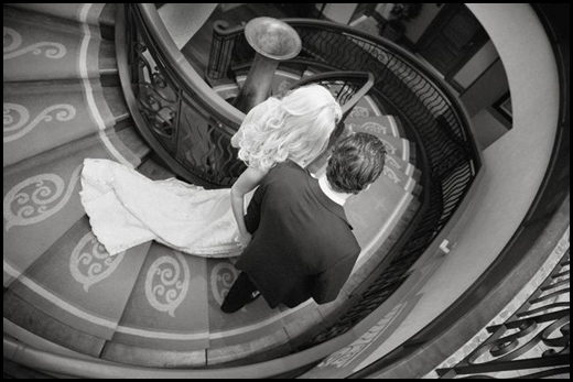
Bright­ness is well con­trolled in this image. Along with com­po­si­tional curves, part of what makes this image work is that other bright ele­ments in the scene are not com­pet­ing with the bride. All eyes are on her as she makes her entrance. Image by Dominic Fuizzotto

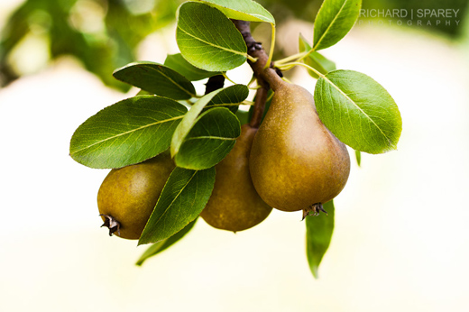
Image by Richard Sparey — This lovely image of deli­cious pears suf­fers slightly from what I call weak edges. This causes our eye to wan­der out of the frame. It’s more notice­able on printed white paper or on a pure white background.

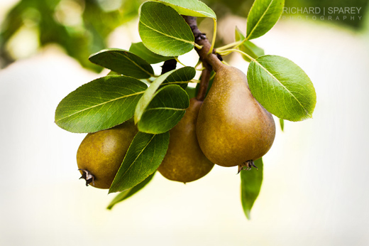
The same image with the edges burnt in (dark­ened) quite a bit to show the effect. This helps keep our eyes from wan­der­ing. Thanks to Richard for allow­ing me to use this image.

Links /resources men­tioned in this pod­cast:
– August’s reg­u­lar assign­ment on the Photography.ca forum — Num­bers — Pho­to­graph some­thing with a num­ber
– August’s level 2 assign­ment on the Photography.ca forum — Cre­at­ing coun­ter­points
– Bright­ness prob­lems and dis­tract­ing ele­ments — Pod­cast #44
– Neu­tral den­sity fil­ters and grad­u­ated ND fil­ters — Inter­view with Dar­win Wiggett —  Pod­cast #77
– Dominic Fuiz­zotto Pho­tog­ra­phy
– Richard Sparey Photography


If you liked this pod­cast and want to review it on Itunes, this link gets you to the main page

If you are inter­ested in writ­ing for our blog please con­tact me photography.ca (   A   T  ) G m ail  Dot co m (using stan­dard email formatting)

Please join the Photography.ca fan page on Facebook

My Face­book pro­file — Feel free to “friend” me — please just men­tion Photography.ca
My Twit­ter page — I will fol­low you if you fol­low me — Let’s con­nect — PLEASE email me and tell me who you are in case I don’t rec­i­p­ro­cate because I think you are a spammer.

If you are still lurk­ing on our forum,
feel free to join our friendly :)  Pho­tog­ra­phy forum

Thanks to forum mem­bers North­stone,  Scorpio_e, Howard J, Yise­haq, Bill Sorensen and use­akme who posted  blog com­ments about our last pod­cast. Thanks as always to every­one that sent com­ments by email about our last pod­cast. Although ALL com­ments are appre­ci­ated, com­ment­ing directly in this blog is pre­ferred. Thanks as well to all the new mem­bers of the bul­letin board. Most of the links to actual the prod­ucts are affil­i­ate links that help sup­port this site. Thanks in advance if you pur­chase through those links.

If you are look­ing at this mate­r­ial on any other site except Photography.ca — Please hop on over to the Photography.ca blog and pod­cast and get this and other pho­tog­ra­phy info directly from the source. |Sub­scribe with iTunes|Sub­scribe via RSS feed |Sub­scribe with Google Reader|Sub­scribe for free to the Pho­tog­ra­phy pod­cast — Photography.ca and get all the posts/podcasts by Email
You can down­load this pho­tog­ra­phy pod­cast directly by click­ing the pre­ced­ing link or lis­ten to it almost imme­di­ately with the embed­ded player below.

Thanks for lis­ten­ing and keep on shooting!